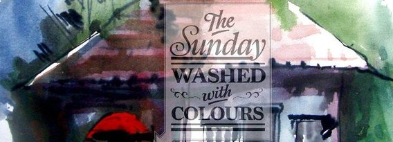
This album will have type treatment of songs we like, No matter what language it is, which era. A playlist that we love and will keep trying reflecting though something we do.
TYPOGRAPHY “for the love of music”


Amidst the busy blue lanes of Jodhpur, during our way to Salawas, we crossed a local market where I picked up these small little souvenirs for my family. It’s almost one year now that I’m back from my Craft Cluster (an initiative by my institute, which provides a platform for us to study on field and understand the craft more deeply) and rediscovered them. One of them bombarded me with ideas and infused the idea of a sculpturing a barbing exercise around it.
It is an interesting holdermake out of wood. It’s amazing how the artisans there think in such a technical and aesthetic manner, the deformed wooden texture only adds up to the holder. Talking about technicality, the holder not only stands stable when you have to use it but also dismantles when not in use making it very user friendly. The whole concept of the holder depends on the principle of bond and linkage. That’s how I came up with the name for the holder – LIGATURE. Completely symmetric and organic in nature.
Ligature will surely catch your attention once you know about it. The thought behind the product is what amazed me and I ended up doing not just some collaterals but a lot of them.
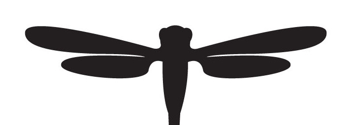
The keywords for this exercise were ‘creepy- crawlies’, ‘typography’ and ‘abstraction’. We wanted to derive initial letters out of insect and animal forms. The idea was to study the creatures’ forms, analyse them, visualize them as alphabets (abstraction) and then represent them keeping in mind the anatomy of the selected alphabet. The final vision was to achieve a typographical form that does justice to both the creature and the selected alphabet’s anatomies. – Manuja Singh Waldia.
My feet were drenched in water and my eyes soaked in all the beauty of the place. I was no where else but in Bahamas. During my visit, I desired a place away from the city and closer to the sea. A much peaceful place to live in.
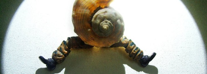
Next morning, I was sitting at the beach and relishing the moment when I discovered a small seashell touching my toes. It was quite beautiful, and reminded me of the Golden spiral which always inspires me in my design processes. I took it back and tried to bind it with my ideas of a healthy & happy life.
In two days what I had in my mind was “atlantis”. Atlantis, a company which will give peace and comfort to the tourists who seek for a blissful time. It also further branches out into three sub categories specifically for services like food & breverage , Health care & a Resort chain.
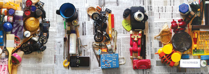
Sometimes its just wired, you get inspired by a lot of things, you want to do a lot of things and you dont have a project which can give you any scope to do Typography. We never take such situations seriously, I am sure most of us we dont… 🙂 But rather use it to charm our selves… here are some explorations & the poster we did again to make ourselves happy when we were a year old.
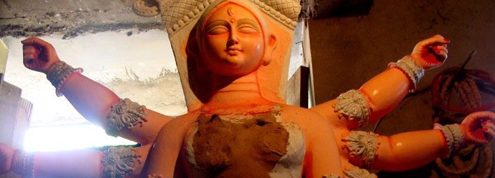
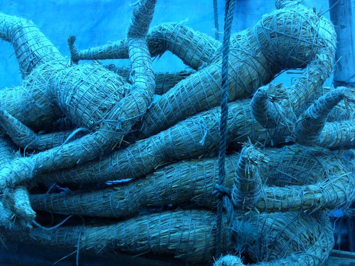
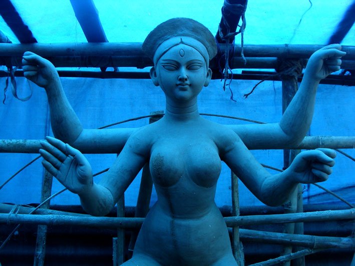
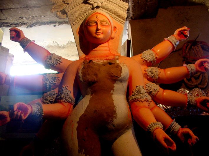
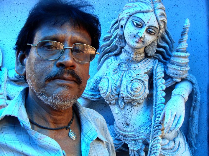
 I saw them putting together a bunch of dried grass-straw and tying them in places to ge the desired anatomy. Two kids by the side smashing clay, with hands & feet deeply laden with it and having the best time of their life. A small group is also not sure if our presence there is of any good to them… Mr. Radhanath the head of the team is quite fine with all is going around..smiles at us coming the hair he is planning to put on one of the gods. We then saw them making the god.

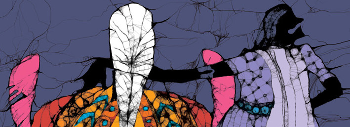
My calling it like “Batik” might not be liked by the fundamentalists but they are anyways not my concern. It does gives a feel of the art that makes you do a lot of effort and can never by substituted by anything. But this online application http://www.zefrank.com/scribbler/scribblertoo/ is quite cool. helps us do something close. Also wanted to share a book cover done, using the same tool + photoshop
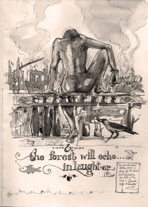
I just tried visualising if its all gonna happen at all ever..! A glimpse of the earth when nearly all what we see around is just going to collapse, A man sits on the high railing of a high building.. sating all around as he might just do everyday, with a smoke in his hand, listening to Led zap.. Today,may be just a little more careless … a crow sits with a seedling in the beak… trying to figure out “…who is gonna begin it this time?”
