Our Art Initiative.
Our Art Initiative.
A humble beginning, Clay Telecom started operations with just five people in a cabin in Central Delhi in the year 2000. Almost two decades later, Clay Telecom is now a dynamic global service provider of wireless telecom solutions with Pan-India presence. Catering to both B2B and B2C market segments with worldwide and country-specific voice and data solutions. Twenty lakh (and growing) happy customers across India swear by its services. The reinvention for Clay adopts a spirit that is modern and bold, yet friendly. The new image for the brand captures the company’s approach towards technology, hospitality and innovation in today’s global times.
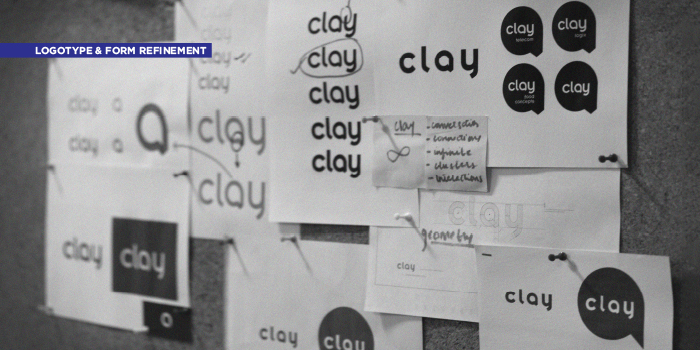
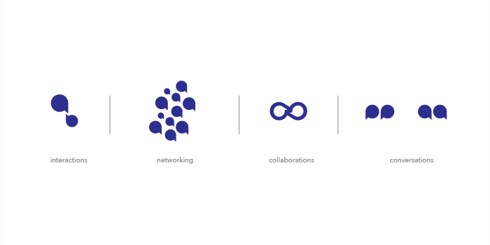
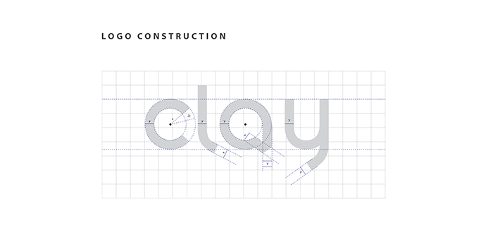
The logo mark “a” stands as the principal identity of the brand, and is also incorporated into the logotype. The letter is shaped like a talk bubble with a visible fold rendered to make the form appear as a continual. The geometric lower-case logotype is affable but professional with close attention to tangential cuts offering a modern sensibility. The language is created based on the essence of space, color, and typography of digital and interactive design. The extended language arising from this logotype is minimal but strong. Elements are restrained to the usage of the brand’s ultramarine blue and balanced grey’s with the logo mark. This approach creates visual homogeneity for the parent brand, thus creating a stronghold in its identity.
. 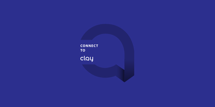
The new language speaks strongly of Clay’s international approach. It not only confers continuity and connectivity but also speaks of the contemporary and utilitarian aspect of the brand. This reinvention communicates a voice that is progressive and strong in its idea of connecting people and providing global solutions.


