In our modern structure of life, food with perfect hygiene, nutritional value and delicious taste, as it could be, is a rare commodity. Especially for toddlers. Heena, founder of “Make My Wishbox” came up with such a concept and a lot of experience in F&B and backend that can support such a noble imagination. The concept is not just Nobel but also to flesh up a great business idea but having said that the idea was to get deeper into what makes our “little clients” happy & healthy.
The layers of research tell us that we were not doing this for one end client but a gamut of different likings and preferences, that actually shapes up the whole deliverable pack. Menus that shall provide satisfaction to all kinds.
So when we got to the drawing board, we realised that the design had to be a dynamic one, just like the product, it needs to be liked by all our end clients. The whole idea from Concept to the end product was backed and reasoned by love, which made us represent it in the most obvious way a “heart” but the fine lines of design and the communication we developed made the whole project come across as really unique.
We designed each piece of communication very carefully getting into the minds of our young audience, helping the brand do really well. Packaging was done as a dynamic system to fit the design & production requirements as well as something that remains new to the kids, each time they receive their box. The design application on print as well as on the web has come alive and the brand and we together are planning newer ways to communicate better to our little stars and to make a better WishBox for them.
The International Science and Evidence-based Education (ISEE) Assessment is an initiative of the UNESCO Mahatma Gandhi Institute of Education for Peace and Sustainable Development (MGIEP), conceived as its contribution to the Futures of Education process launched by UNESCO Paris in September 2019. In order to contribute to re-envisioning the future of education with a science and evidence-based report, UNESCO MGIEP embarked on an ambitious project of the first-ever large-scale assessment of the knowledge on education.”Reimagining Education The International Science and Evidence-based Education (ISEE) Assessment”
A couple of years back, we were approached by the UNESCO MGIEP team to do the logo/ identity for ISEE, which was done and in use. Last year we were approached to share the whole thought process of “Reimagining Education The International Science and Evidence-based Education (ISEE) Assessment ” and how the documentation of this huge thesis can be put across to its audience.
After much discussion and thorough understanding, we devised two key things which were apportioned and used in the process of designing this publication. A. to divide the whole research and evidence into 4 subgroups. and B. They need to have more than just the textural description, each one of them must have a visual depiction, an abstract scene of a process, a story that reflects the same energy, freedom of thought and also the
For, A. The Division of the full publication into four was a major step. The four divisions then stand as 1. Education & Human Flourishing, 2. Education & Context, 3. Education & the Learning Experience and 4. Education – Data and Evidence. They were colour-coded and also have a visual narration of the idea in an abstract way, which brings us to part B. which was to illustrate the 4 stages into 4 very complete structures in themselves, but just like the whole concept of ISEE, we kept the visual narration not too cliche and took a more meditative and mind journey kind of narration.
The four parts of the story as described below: Artwork 01:Exploring the possibilities, from your ecosystem.
The Being is excited and happily surprised to receive so much positive energy and learn from its surroundings. All it concentrates on is to receive it. And slowly all of it starts making sense// forming shape. Still lucid, but now a form, A form that is ever-evolving and the being is discovering new nuances every moment in it.
Artwork 02:The Need to take it to a Better space, to throw light to more people, to share.
The being, take it this newly achieved knowledge to places, in the process the being evolves itself and while it is growing the form grows further as well. The being realises, Sharing is always two ways, when you give, you get something in return if you are open and accepting.
Artwork 03:The idea to make it a process, After all, process is what matters, It needs to be part of a “structure”
The being reaches the pool of knowledge and looks for the Meta Lotus. Lotus represents art, design, mathematics, structural genius and methodology
Thousands of luminations leave the lotus, after being enlightened with some or other kind of knowledge. The Being gentle slides the evolving ball of knowledge into the meta lotus.
The Lotus and the ball of knowledge becomes a seamless force to the awakening of knowledge.
Artwork 04:The idea of “when you give// you also receive”, the universe is watching. comes into play.
The being transforms into a MetaBeing. All wisdom, all acceptance. A new beginning a new source of knowledge.
The rest of the publication and layout design was taken care of with various visual tools of publication design that help us create a great system design for the layouts to adapt to change and also communicate in the best possible way. We also designed a case to keep all four books together, along with the summery and highlights. We also designed a few promotional collaterals, like standees, leaflets and flyers, for the international launch of the publication.
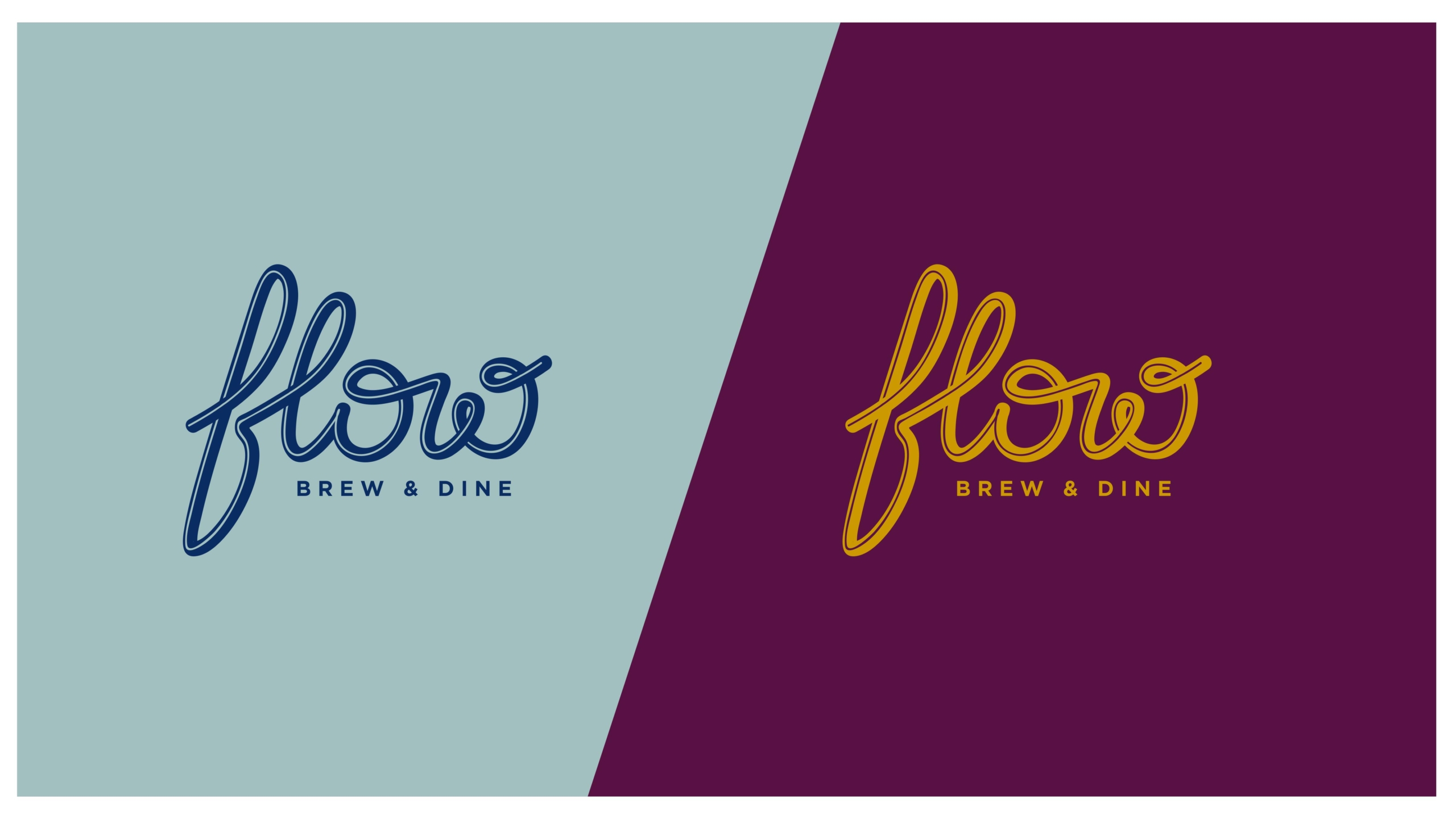
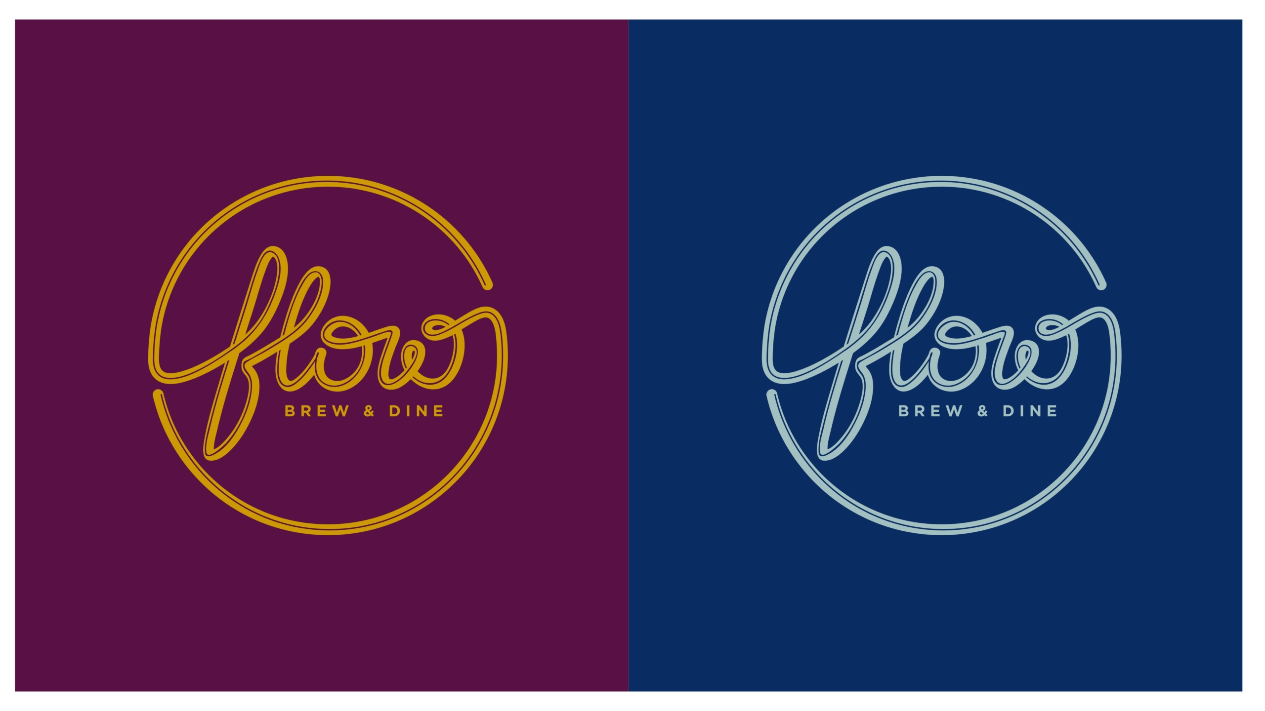
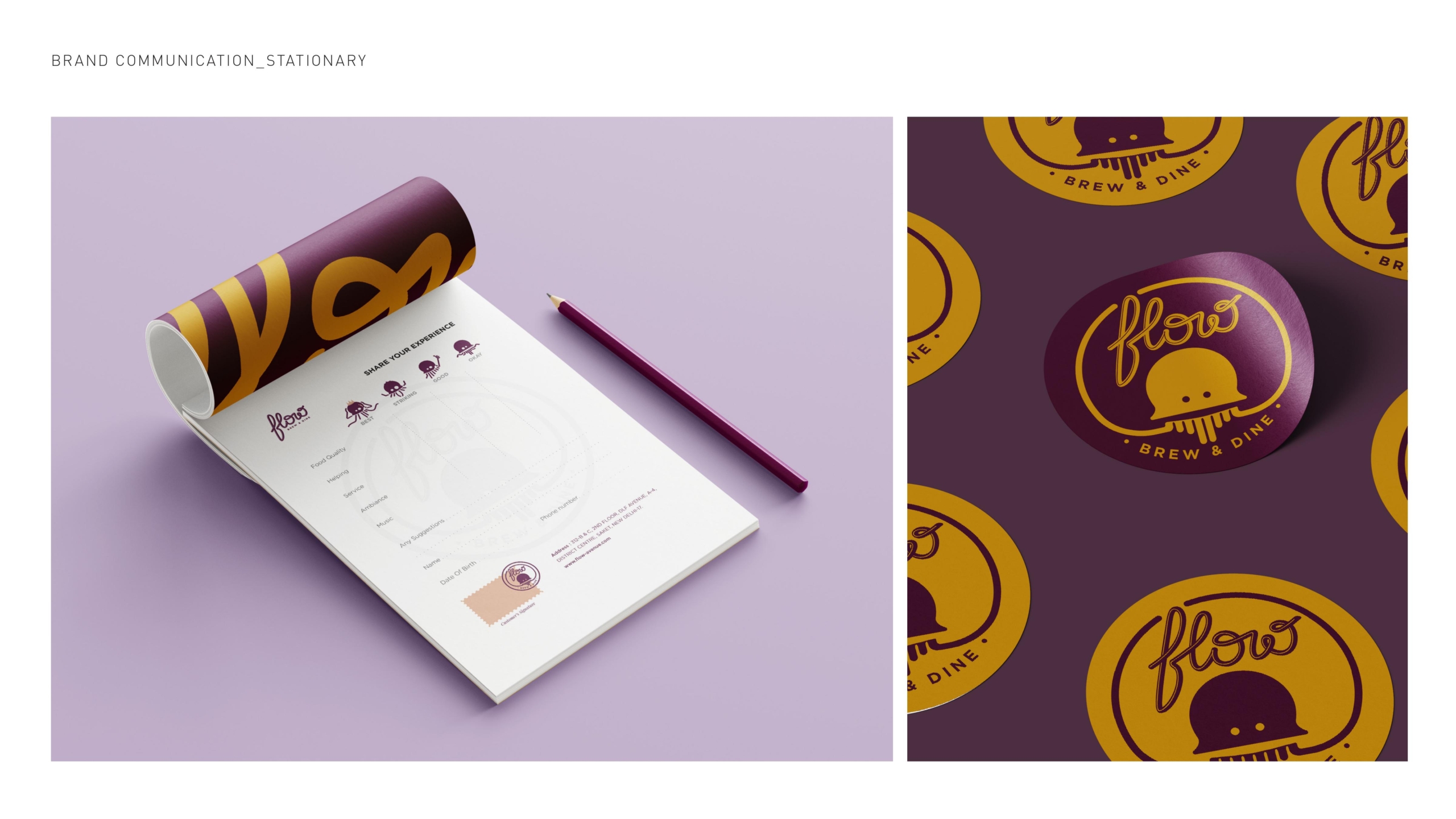
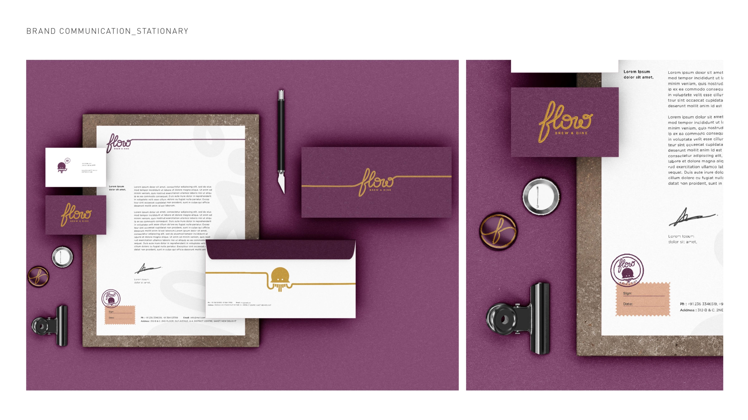
Brand concept: The idea of the word “flow” is universal and ever-existing. The only constant that we understand is the change, and all the change that happens organically has a FLOW.
Flow’s visual language has to be very new yet not too aligned to any style, in particular, We want the Logotype to adapt all features we want in the brand personality We have to look different than anything the TG has seen in the post covid world The fear, that pushes the TG to go “only to known” places shall break The Branding needs to create that curiosity and “happiness” It just can’t look run of the mill The flow needs to look not just flowing, but also need to inspire “the idea of flow”
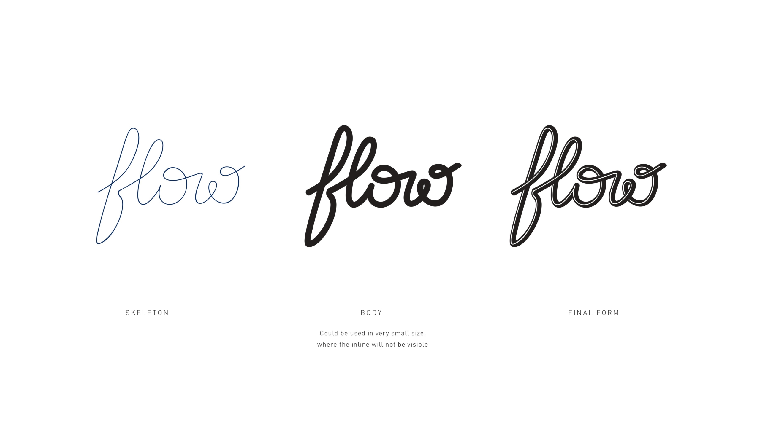
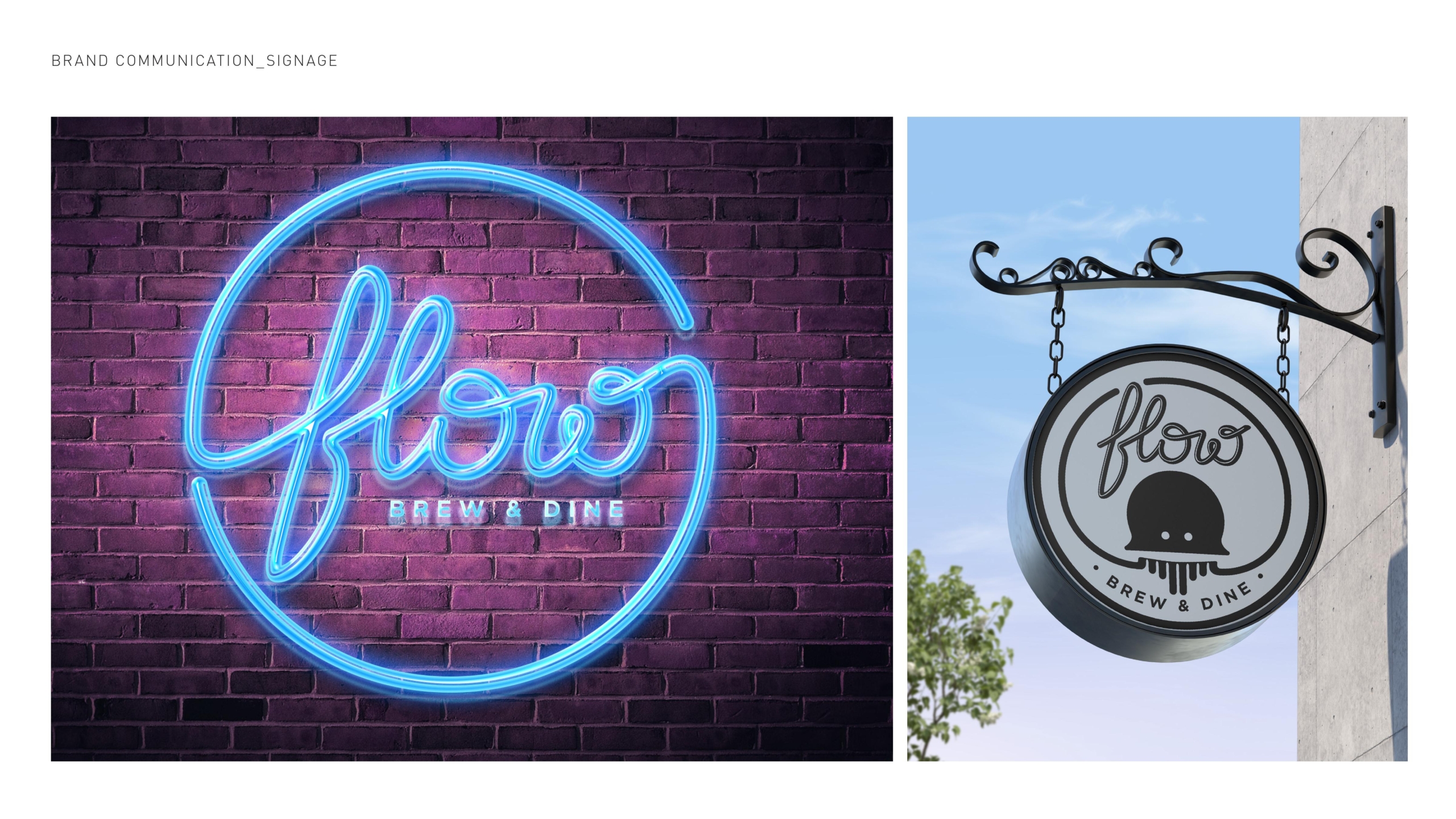
Logo concept: The idea is to make something that not just visually flows through, but also makes the overall adaptation really easy and fluid. One key aspect is that it is not just “running handwriting” it is a continuous and one single line. No need to mention, it is a 100% hand-lettered logotype. This idea is planned, keeping the overall promotion of the brand, and what will attract the TG to our space.
A quirky copy, or a brilliant artwork, might not generate the kind of curiosity this could. As we will simply be putting the brand name (with other smaller information), in various styles to generate curiosity, excitement and its own niche. Something not very unique.
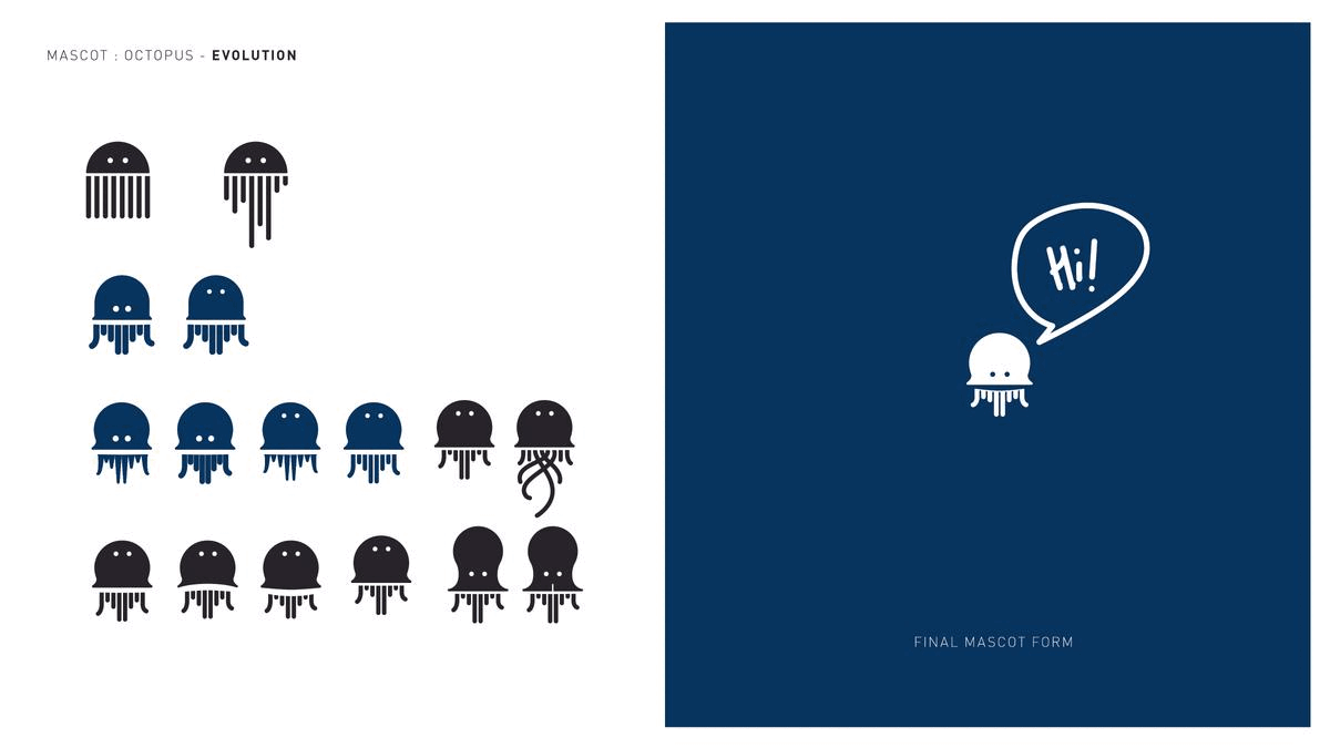
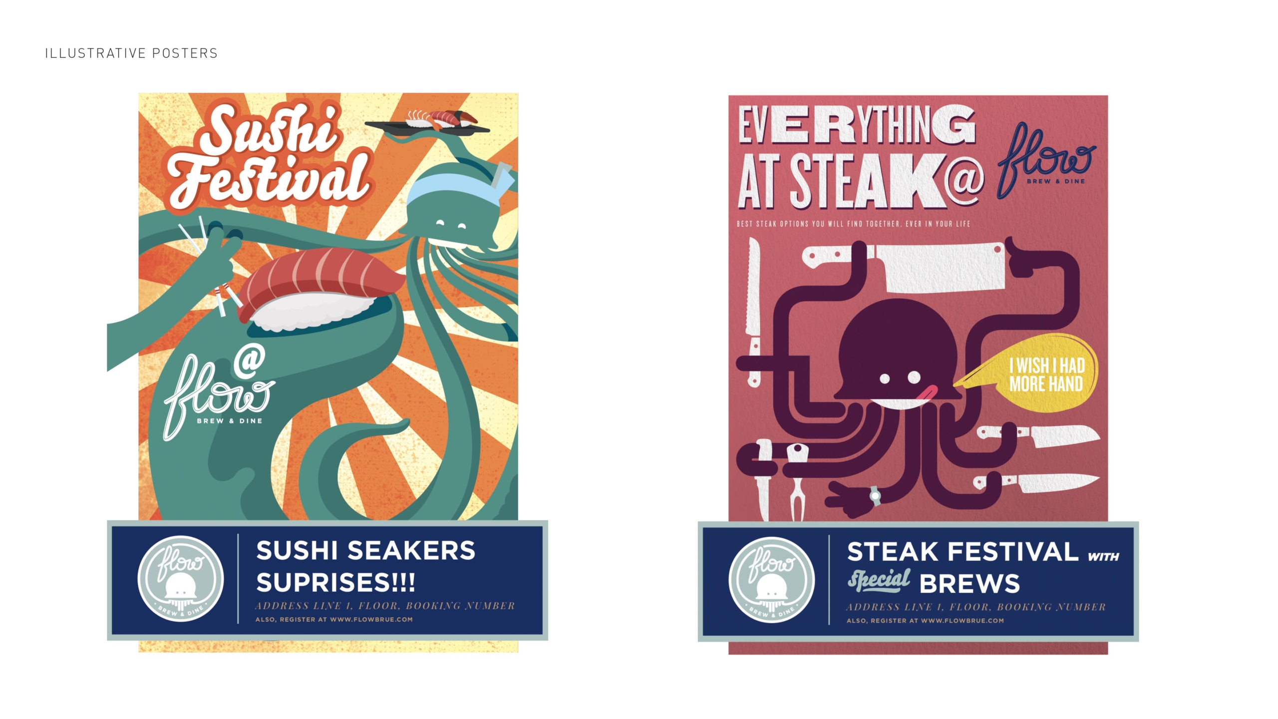
Mascot Concept: When we started brainstorming about the mascot, the first question was “what explains the idea of flow naturally?” The first set of ideas are shapeless, not characters but forms that express the idea of flow. Like, as the flow of water, drapes, lines to show airflow, etc. These might be poetic in nature but we need something that the audience can connect to, easily. The second sets were forms and shapes that have names, but even they are not as memorable and easy for the audience to just see and know, and connect to. Like: A golden spiral or a Sign of infinity. Then we finally came to the very defined space for the mascot, maybe an animal, a bird, a flower, or an object. We Choose “Octopus” Why Octopus? Well, it is the most adaptable, intelligent, shapeshifter, there is a sense of mystery to it and yet most of us know about it. As a mascot it is unique and if can be presented in a unique quirky way, can look really likeable the best thing is It changes itself, with time & feel, just like FLOW
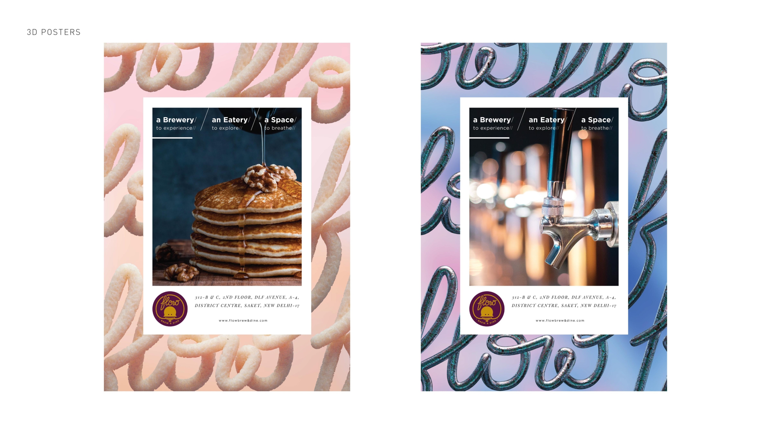
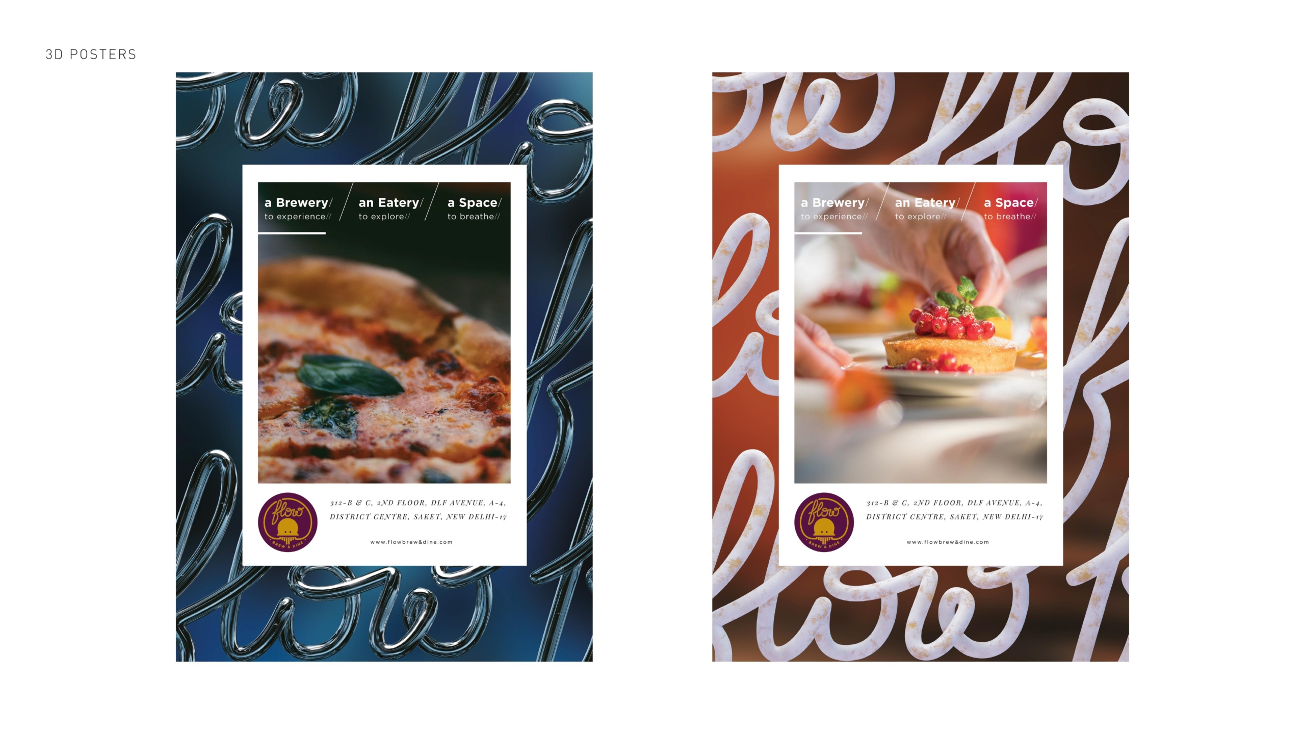
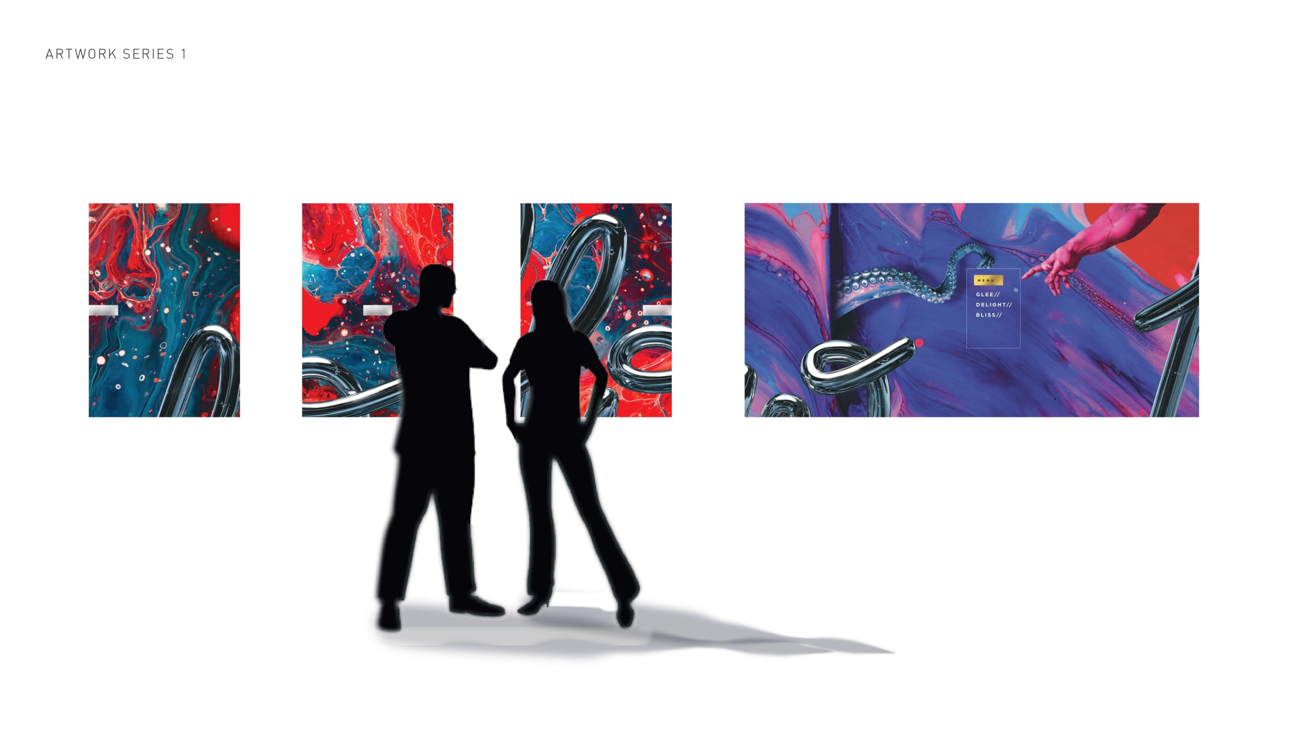
Artworks: Understanding the requirements of the space, in terms of visual aesthetics and interior design, we developed a line of artwork for two stretches of walls.
One leads the audience inside and the other stretch leads the audience towards the outer seating area. The idea was to create something that looks like art/painting but also communicates the brand in a modern way, which helped us come up with something edgy and new.
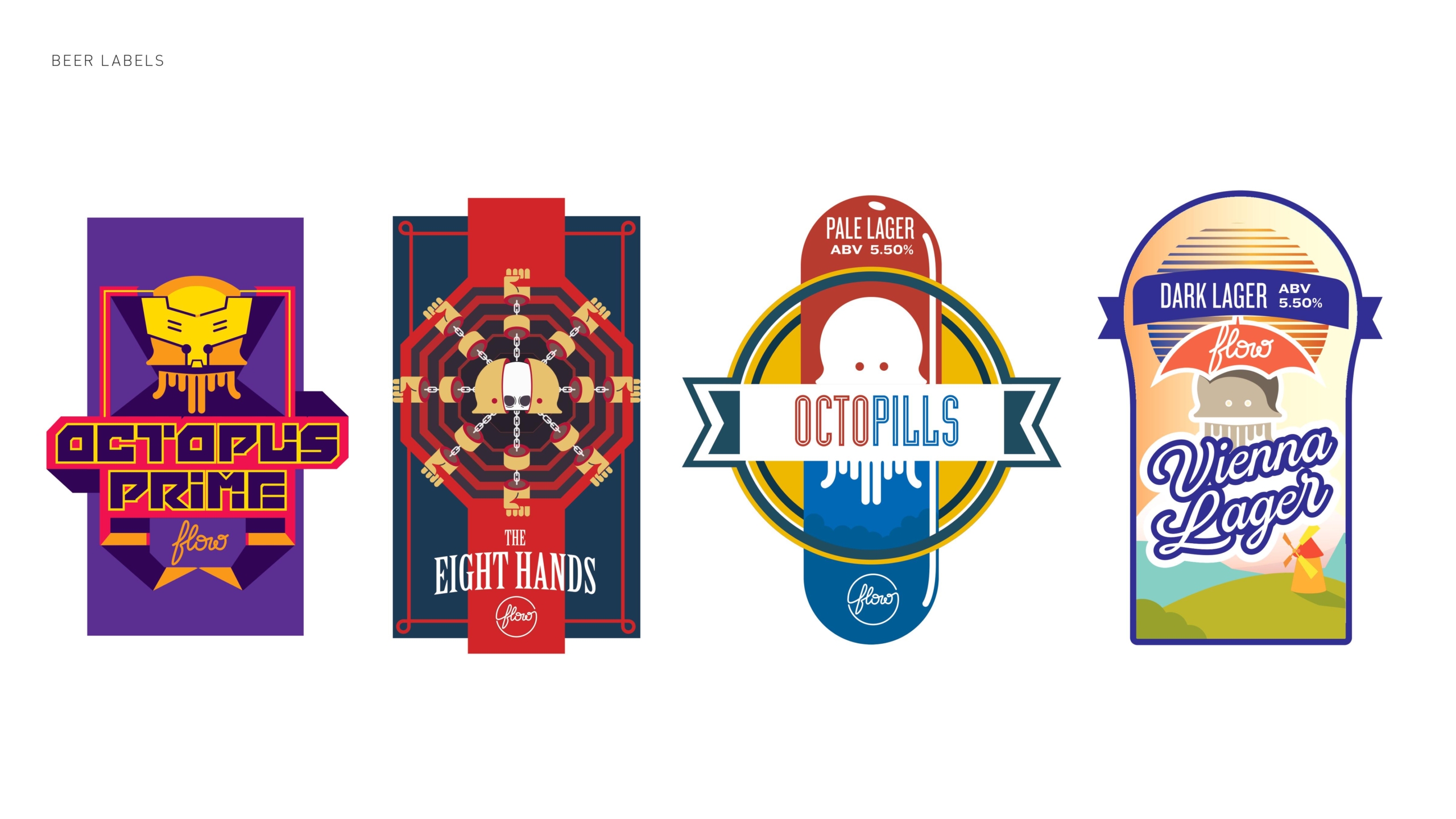
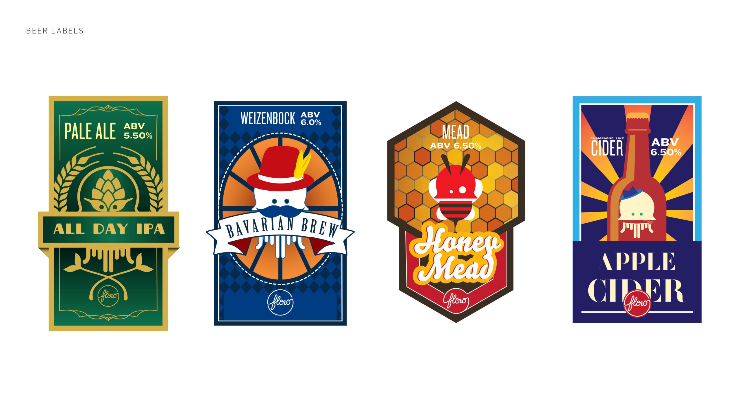
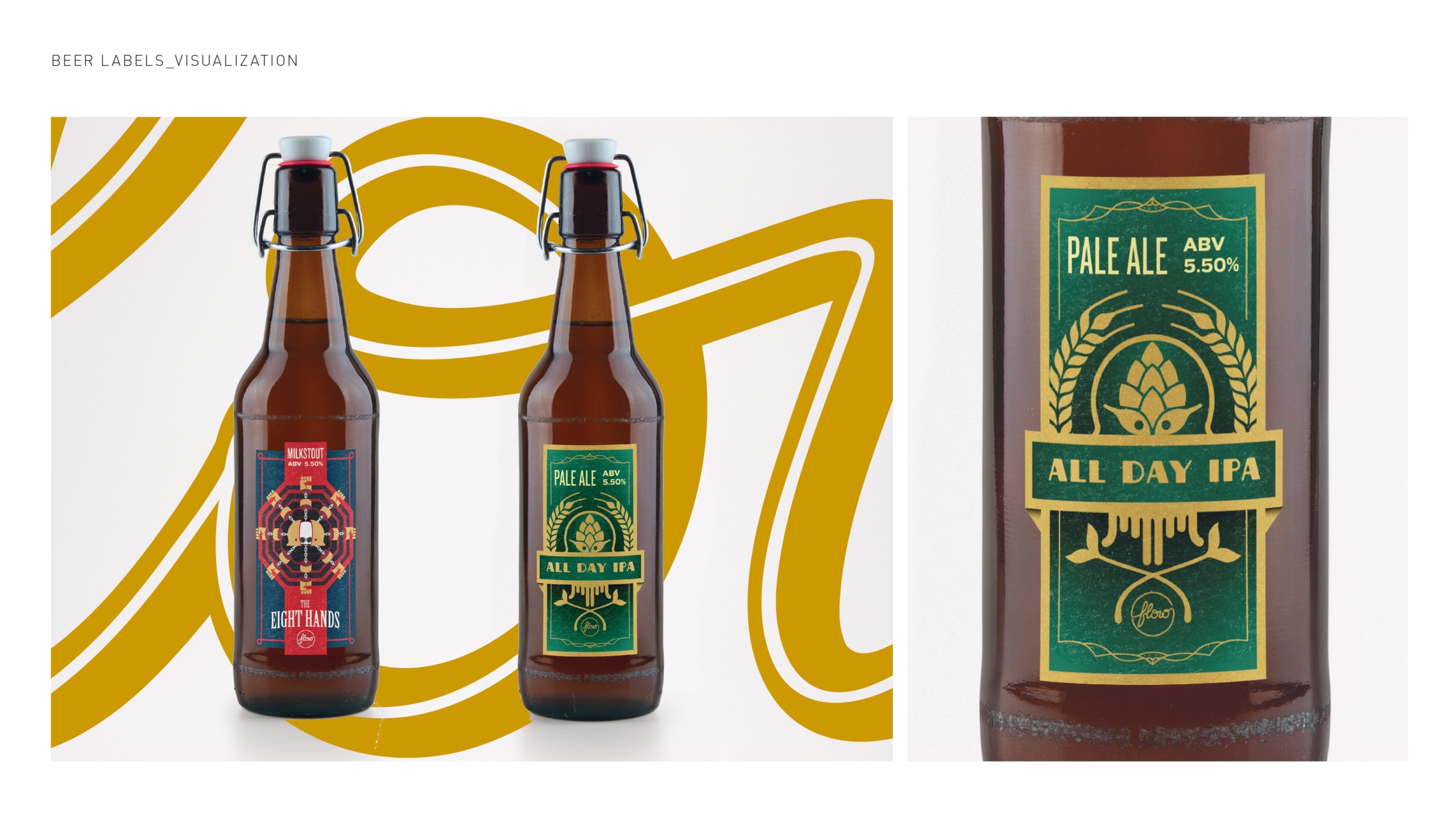
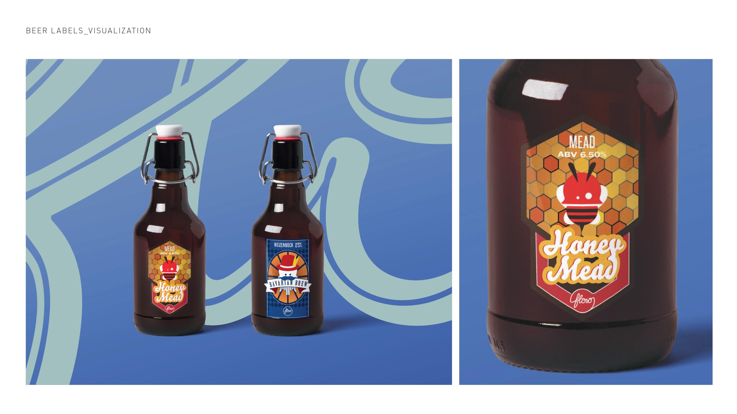
Beer Labels: For the first time in Delhi+NCR, Flow offers its consumers eight different types of curated flavours. These eight flavours were curated, in collaboration with The brewmaster with Flow team and our core team for a long period of 6 months to understand and estimate the likeness with the audience’s likes and dislikes, The supply of ingredients, brew time, and then of course the yeast, and finally, we came up with these 8 beers to offer.
Panchamrit is an ayurvedic supplement company that seeks to bring the benefits of active ayurveda into everyday life.
The Brand came up with a clear motive for their branding and overall communication structure, for panchamrit, we wanted to go more than the idea of 5 (since the name is Pancha-Amrit) or symbolise with just a “nature representation”, like a leaf. We wanted to churn the idea of the product. which strongly speaks about the “science of nature” The core concept of Amrit. A shape or form that will collaborate with the idea of nature and how significantly it can be reinterred or reimagined.
After much brainstorming, we based our idea on the idea of CYMATICS. To combine nature and science and churn the Amrit.
With the understanding of the usage of the branding elements, we understood that the logotype holds a lot of importance. The hand-drawn logotype was designed keeping the overall concept in mind. Later we also developed the Hindi letter “p” which was done to make a bridge between the two major client types.
The brand planned to develop various lines of products. The idea is to make “the scientific knowledge of the natural world available easy to you” literally on your tabletop. In the form of ready-to-use delectables, like teas, herbal infusions, effervescent tablets, gummies and melting strips. The design language was developed keeping in mind this dynamic range and the kind of communication we wanted to put across.
Since the product is a D2C product with the market opening back after covid, also forced the brand to think in B2C and Retail. The moment it turns out to be an FMCG product the packaging was something very important to be seen from all sides and also how to translate the message in the retail environment and the safe to reflect through our website. The website design was a step-wise process with each factor being tested through the lens of retail experience as well as the D2C adaptability of the same.
With the Brand taking newer steps and working on structuring a bigger and more holistic product architecture, we are helping them make a design system to adapt all new verticals and products under each of them.
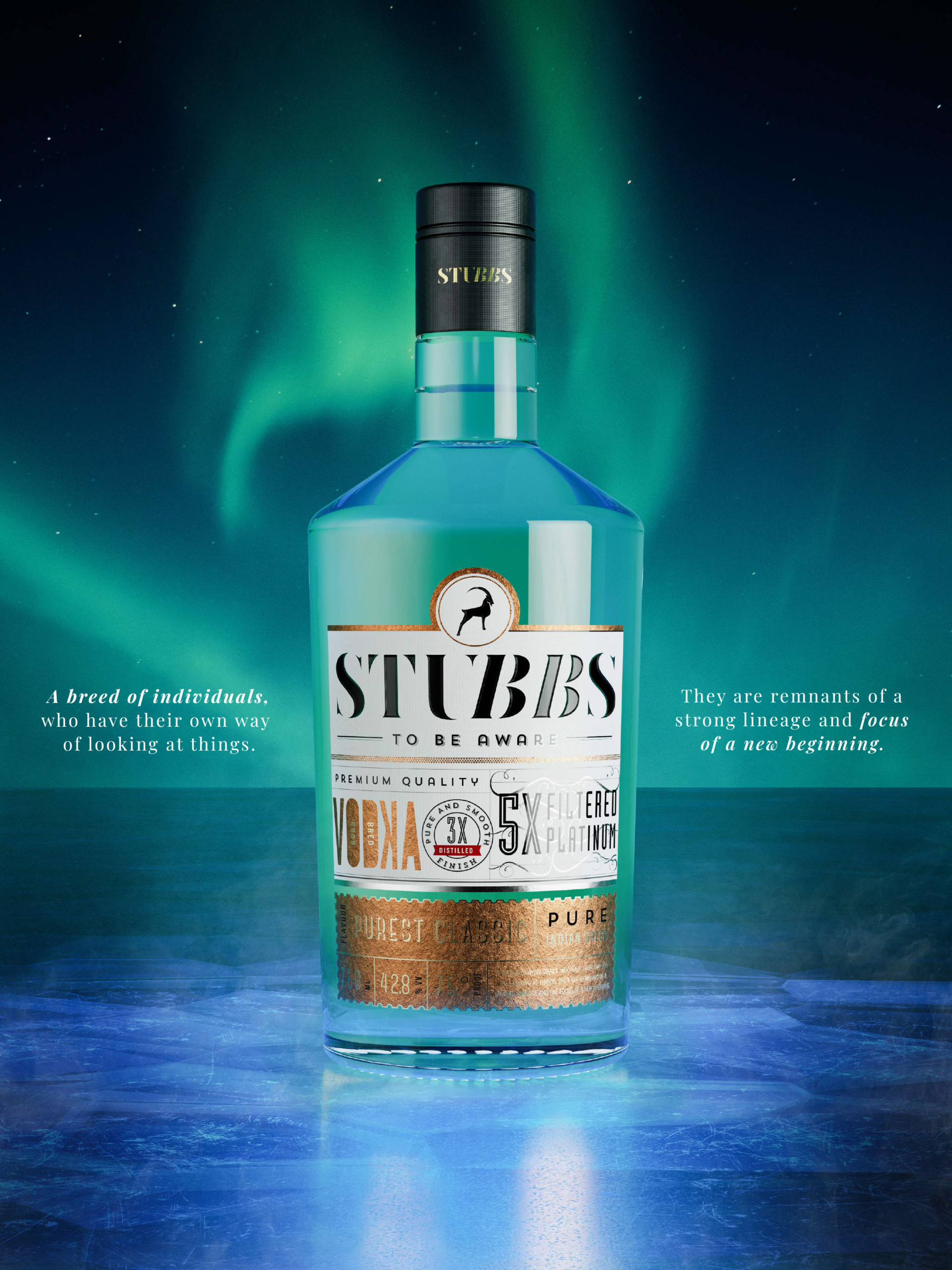
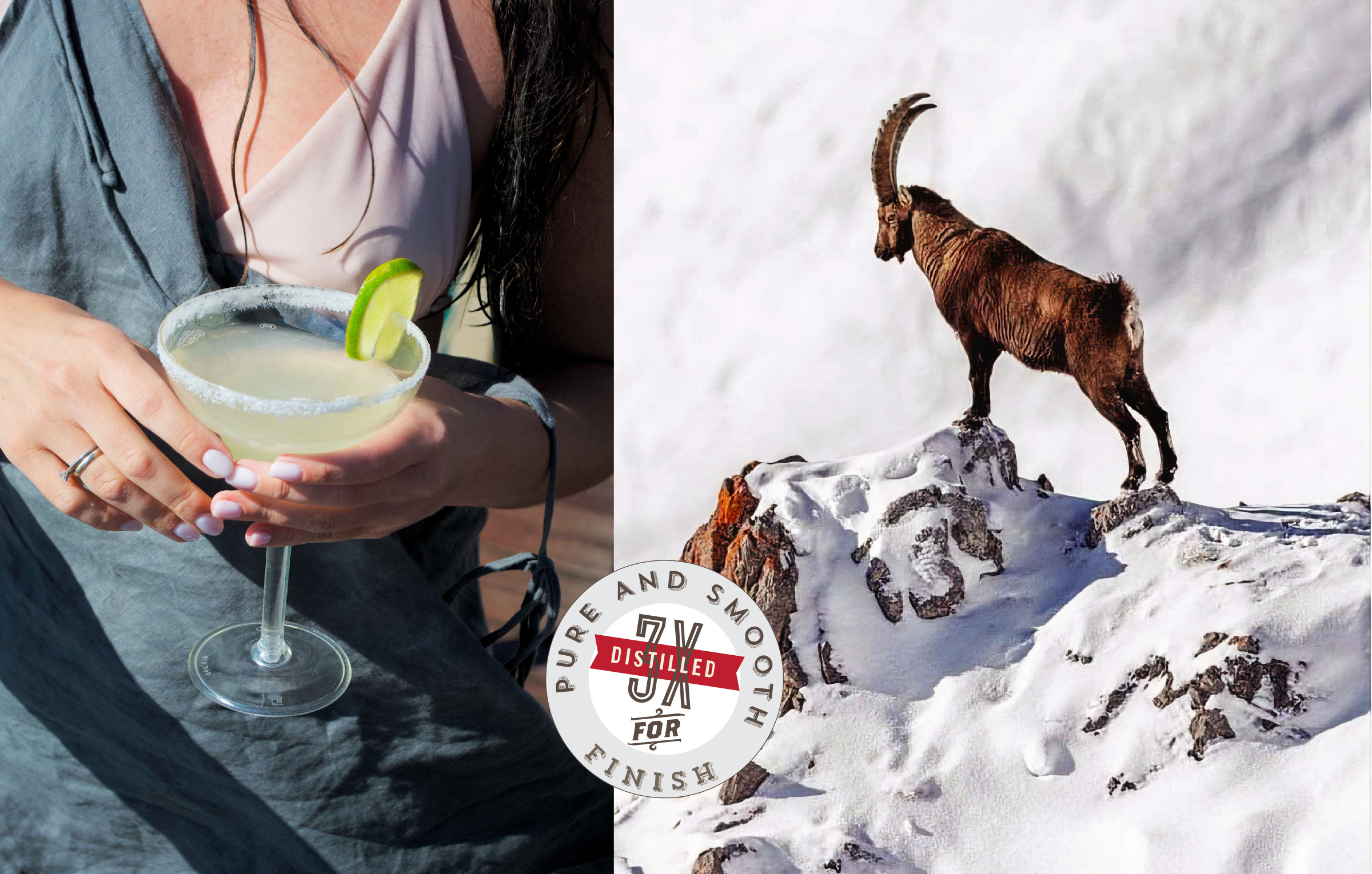
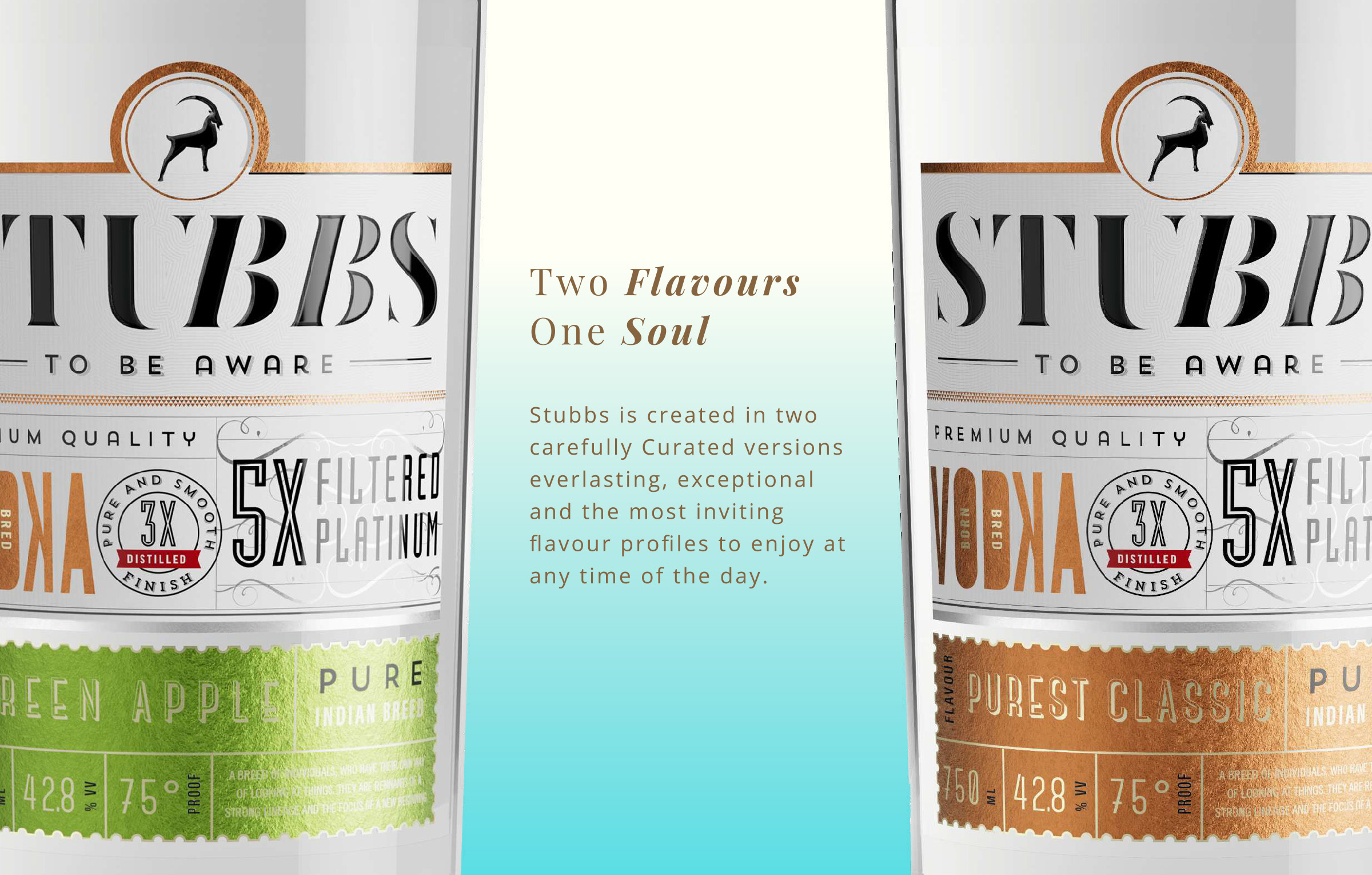
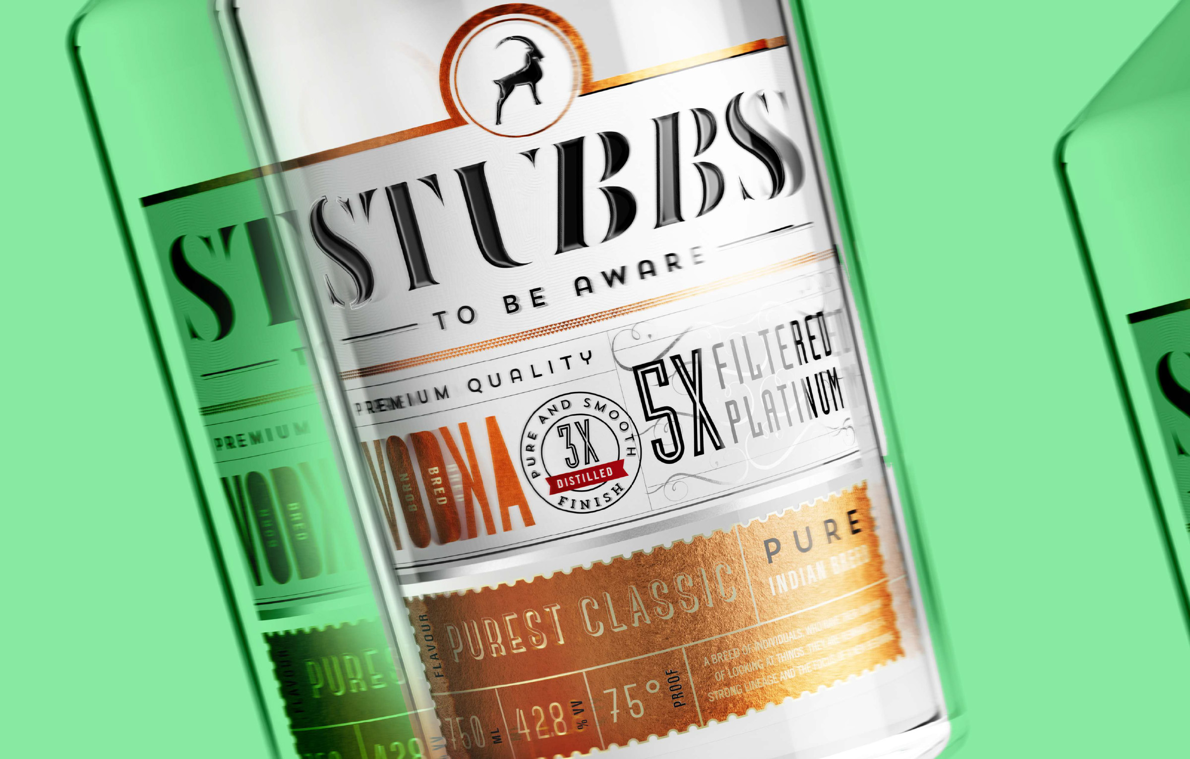
STUBBS is India’s first 5X filtered vodka by Craftsmith and it was supposed to be given the kind of positioning in the segment of vodka brands like none other, yet make it personable to the targeted customer segment.
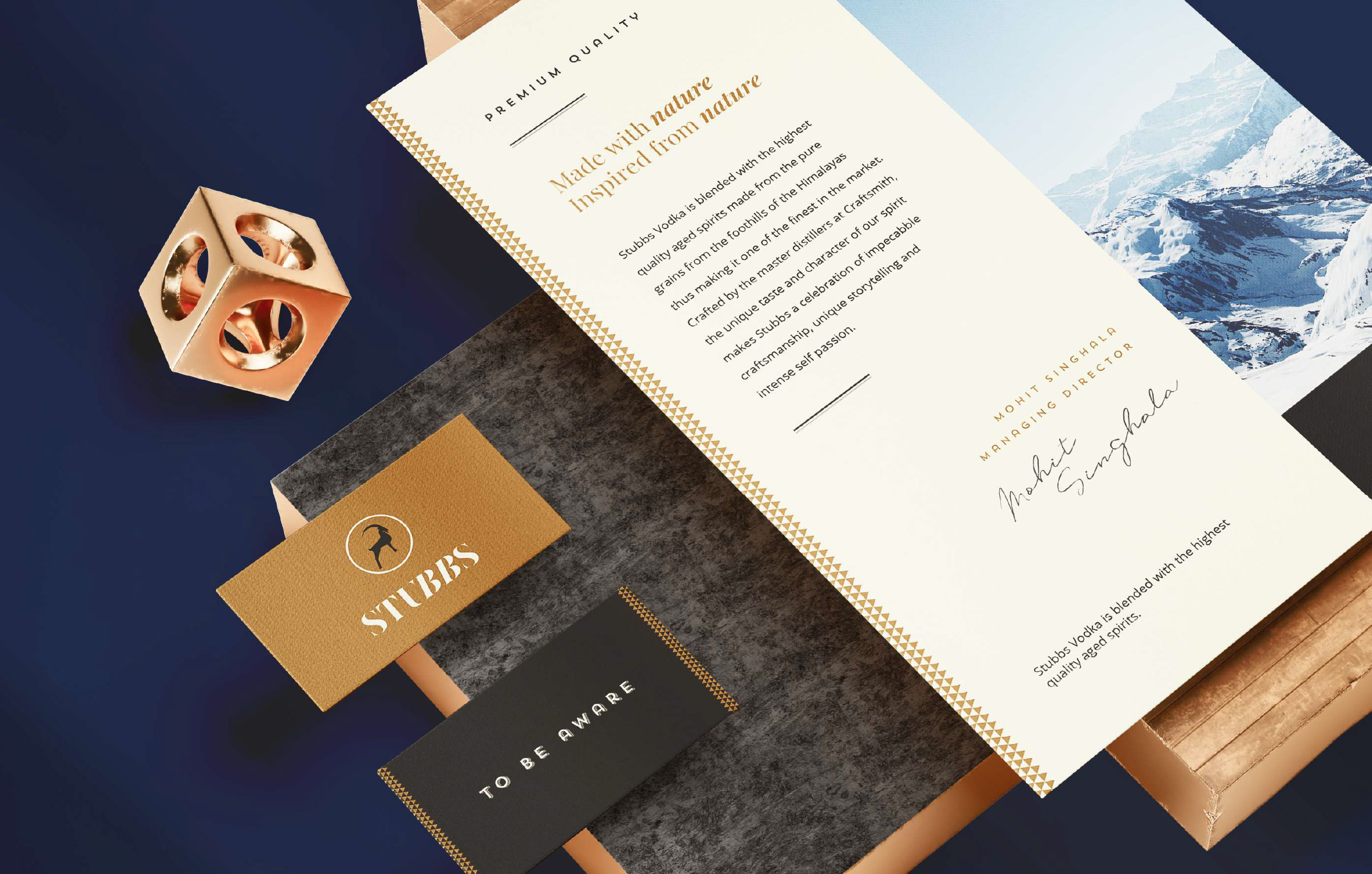
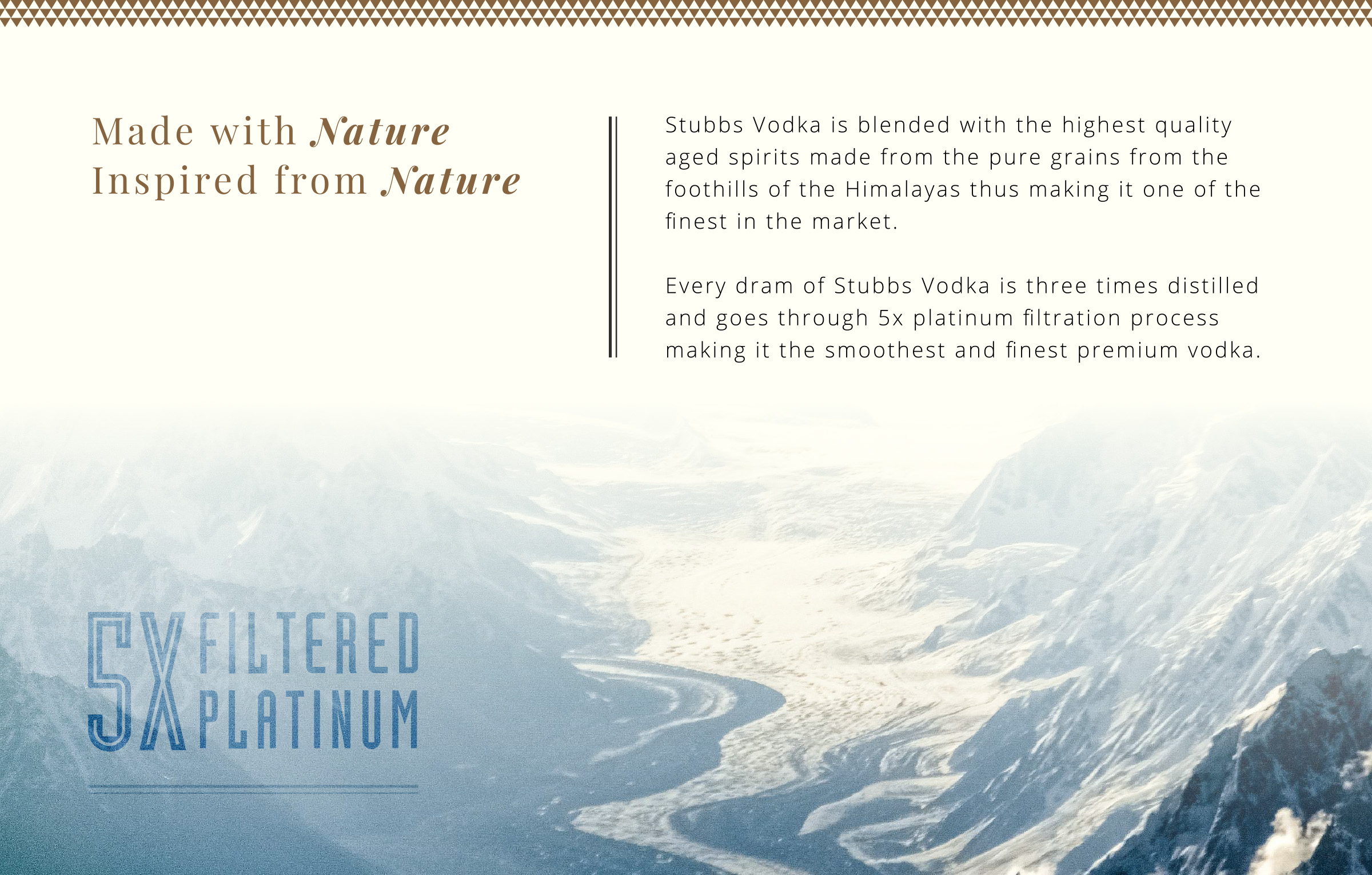
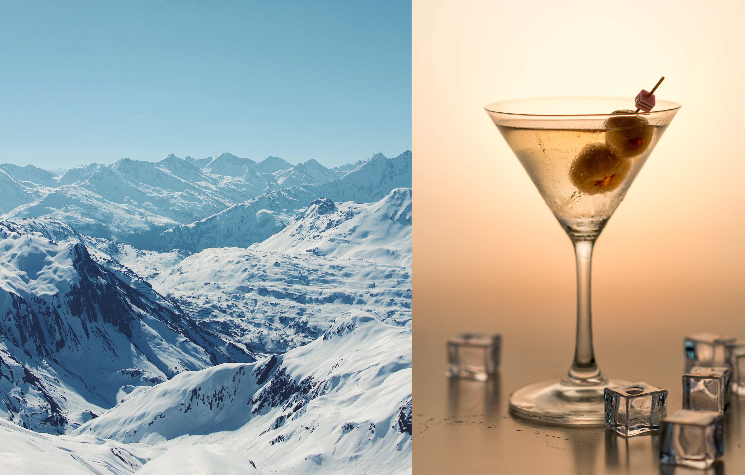
To create a storyline of being explorative to bring in the vibe of vodka consumption, Stubbs Vodka was given a backstory of being blended with the highest quality aged spirits made from the pure grains from the foothills of the Himalayas thus making it one of the finest in the market. Crafted by the master distillers at Craftsmith, the unique taste, and character of our spirit makes Stubbs a celebration of impeccable craftsmanship, unique storytelling, and intense self passion.
Using the major selling point of Stubbs Vodka as it is the first brand to be three times distilled and goes through a 5x platinum filtration process making it the smoothest and finest premium vodka. The colossal flavor simplicity owes to the uncomplicated & simple union of aged grain spirit and purified Himalayan water thus making Stubbs the most extraordinary vodka of distinct taste and character.
In its entirety, Stubbs Vodka could be summarized as the austere neutrality of something as pure as a snowflake is what adds to the distinctive character of this 5X platinum filtered premium Vodka. With balanced notes of smoothness on the palate, unburdened by the alcoholic heat, it is a classic spirit for connoisseurs of drinks on the rock and cocktail lovers alike.
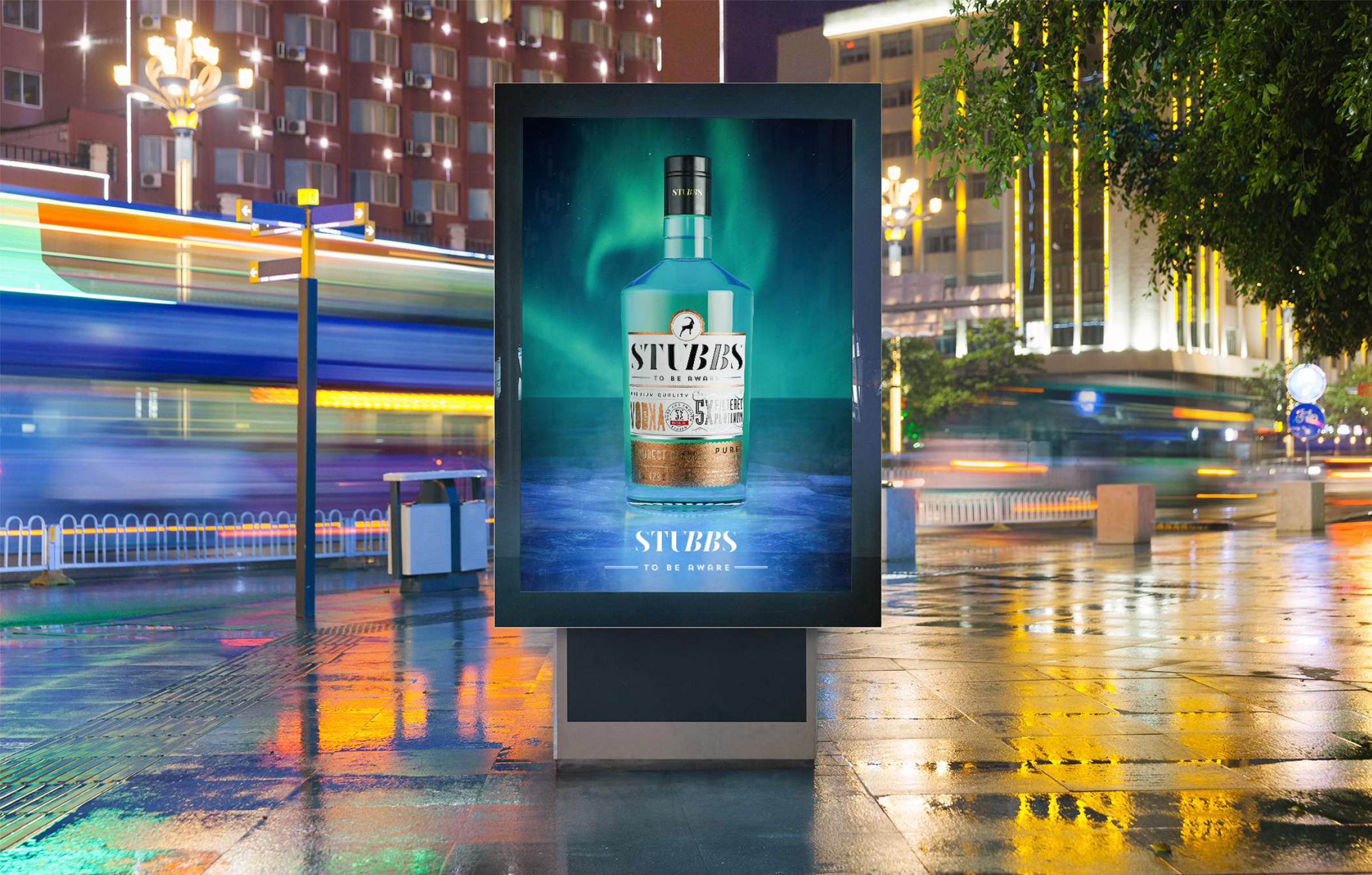
For a brand like STUBBS, mockup generation was crucial. We had to create a digital representation of what the product meant and stood for. We teamed up with @rohitbhong and his team for a combined effort to generate 3D art of the bottles, which were created with a vision to stand out from the rest of the products available in the market.
We also created their website to round off the brand experience as it was ideated for the customer to experience the brand and the product.
TREK is an inspiring story of planning the establishment of a Rum brand in India, which is deeply rooted in holding onto its forefather brands. The team at Craftsmift, the makers of TREK, took all possible steps both fundamentally and communicative about how the product and the brand will be positioned.
We came into the picture at a very early stage when the project was conceived. The product being an all-season rum, is available for 360 days offering itself to be consumed in the OG form and the best of concoctions. This gave us the personality of the brand which made us think, move and understand how wholesome the idea of travel of both mind and body is when we coined the name TREK. The name TREK was chosen based on the idea of the brand being “wholesome”.
This very idea helped us create an overall theme for the label & the monocarton. The look & overall imagery was planned in a way to keep the tagline in mind. We wanted something very broad as the product descriptor to cover our communication approach aptly and hence the tagline was also made keeping the same brand alignment and personality in mind. We came up with “To explore” as the tagline. Initially many members of the core team evaluated this as an incomplete line, but the idea that “what to explore” is not being told, is the whole idea of exploring. We roped in the 3d Artist for a few key renditions that we thought will be necessary for the initial launch. @rohitbhong did a great job of getting things to life in 3d as per our visualization and art direction.
We further created the webpage and overall visual vocabulary for the brand. TREK team also added an international certification of VS to the brand, which is a huge USP as Trek is the 1st Indian brand to have the certificate.
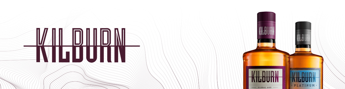
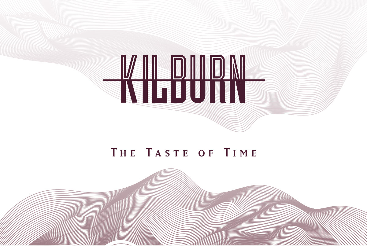
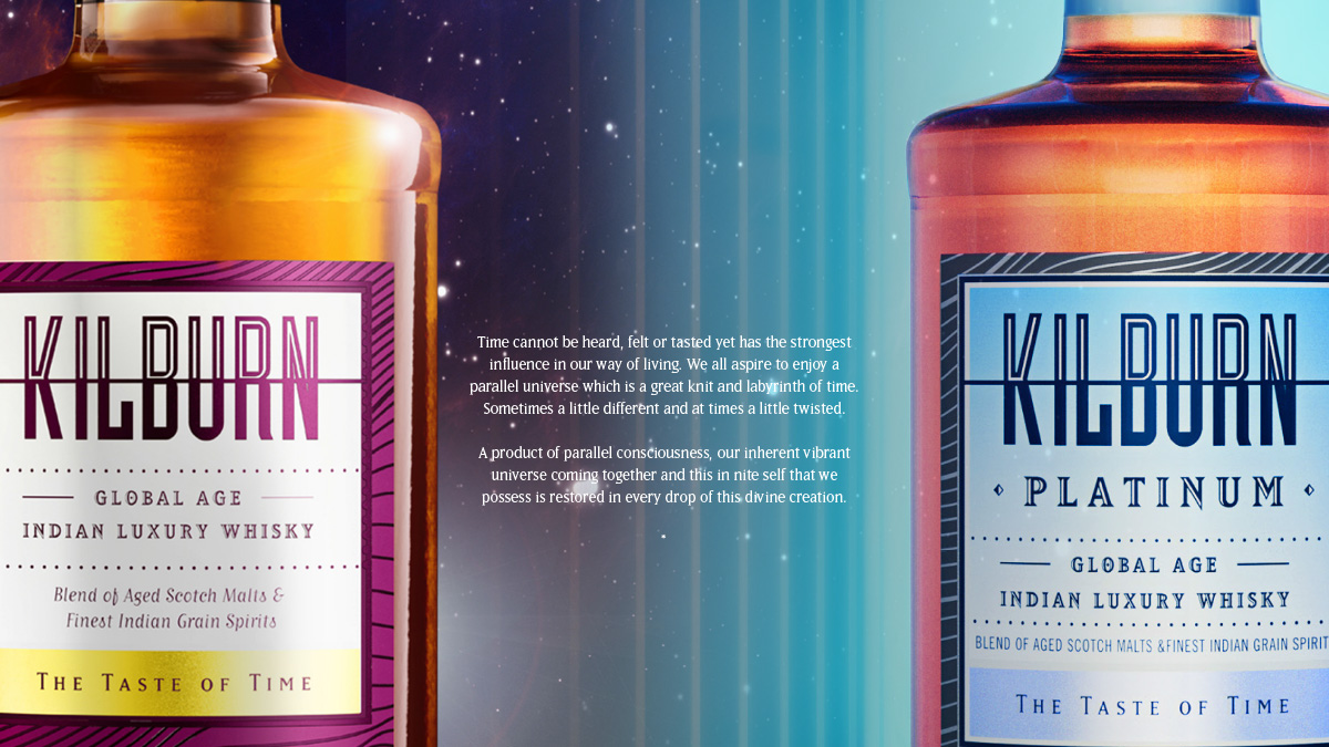
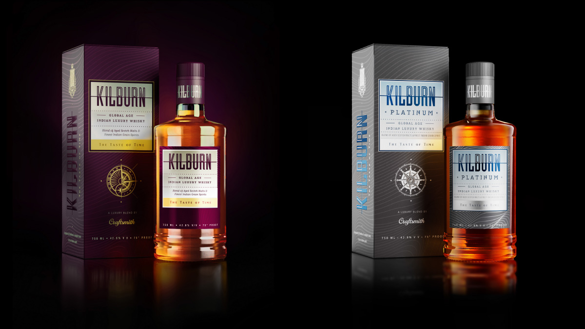
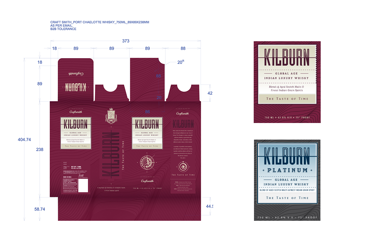
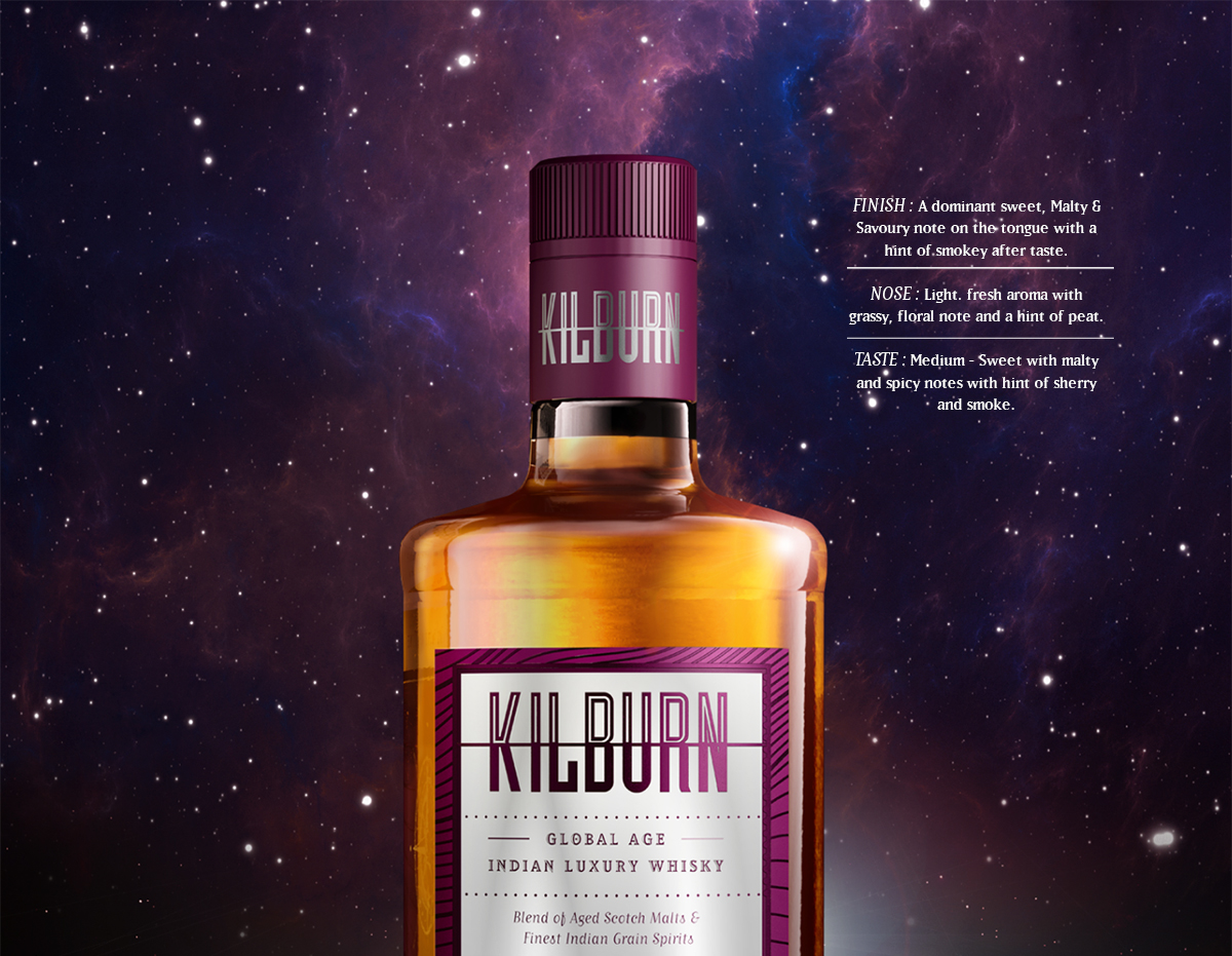
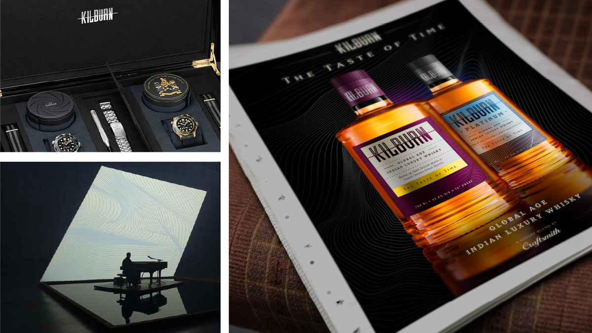
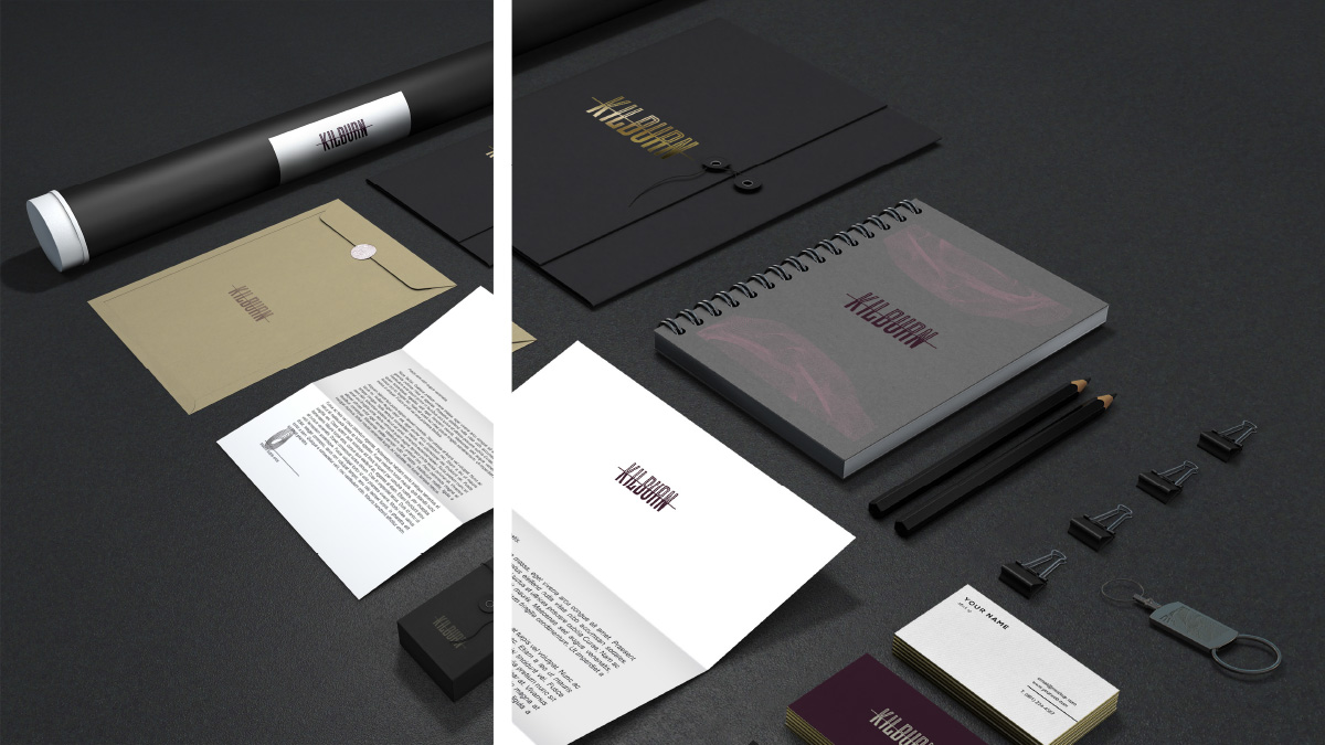
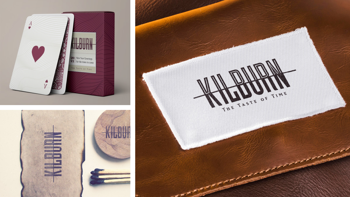
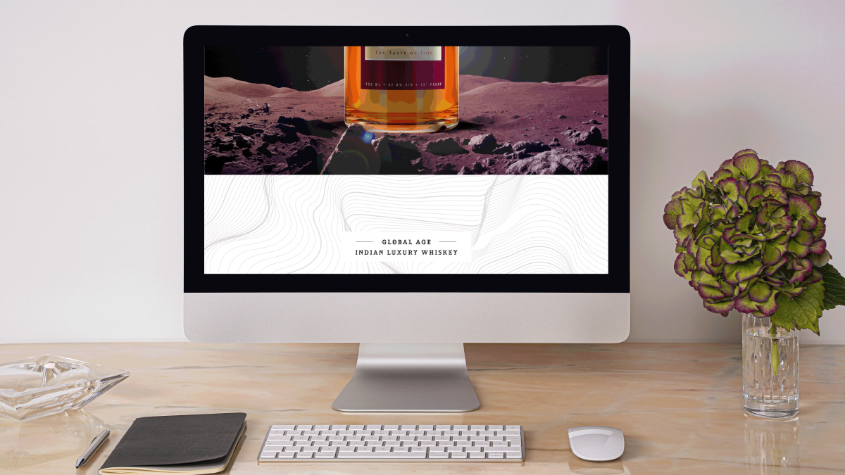
Kilburn is an Indian Luxury Whisky by Craftsmith. A blend of aged malts and the finest Indian grain spirits, we positioned Kilburn in the premium luxury whisky category. Due to its timeless taste, a brand story was created around the “concept of Time”. Since time cannot be heard, felt or tasted yet has the strongest influence in our way of living, the idea seemed to fit the ageless approach for the brand. The story led to Kilburn becoming a product of parallel consciousness, and Craftsmith, the parent brand, a timelord that had a knowledge of fluids that retrieved him to visit our timeline, and sheltered in a hamlet named Kilburn. This story led to the tagline, ‘The Taste of Time’.
As the brand story is related to time, the label and packaging design was created with a simple yet elegant visualization of parallel universes. This concept is also strongly seen in the logo of ‘Kilburn’. Our main focus was to display the qualities of richness and elegance both verbally and visually. The Burgundy of Classic (flavor) and the Prussian Blue of Platinum(flavor) used for the packaging signifies the luxurious aspect of Kilburn. The gold-foiling and embossing printing techniques, on uncultured paper instead of the routine metpets, bring the whole packaging tactile feel to a new level. We collaborated with Rohit Bhongle for the task of creating 3D visualizations and digital images of the bottle and the labels that gave the brand a larger-than-life feel. Even though we hit a space that has a lot of Indian products in the market, we made sure that our modern & edgy look & feel and a few audacious decisions, helped the product look, one of its kind.
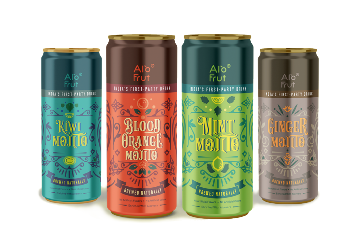
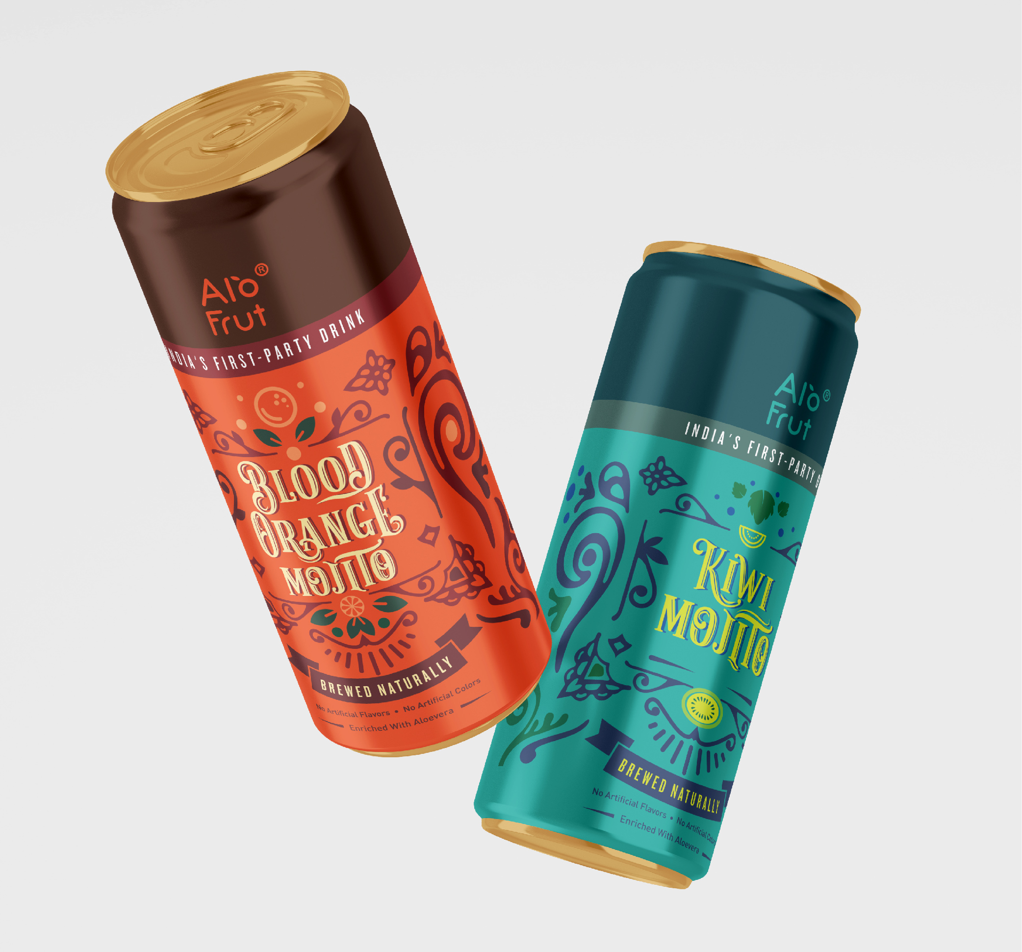
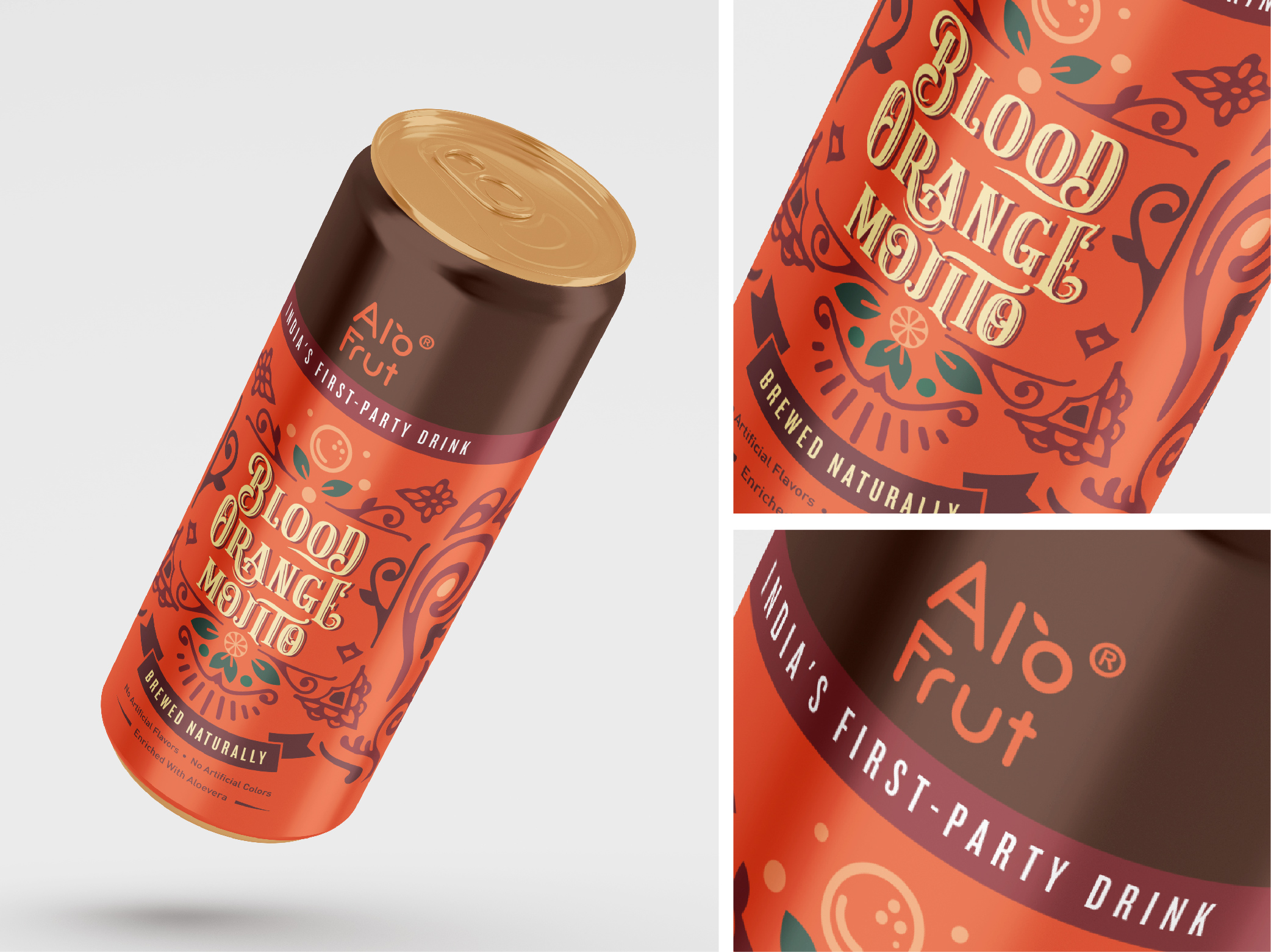
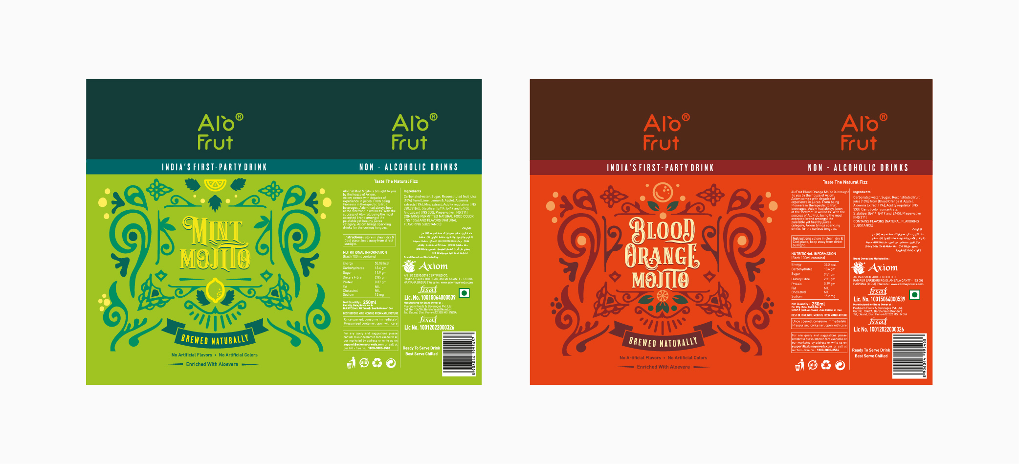
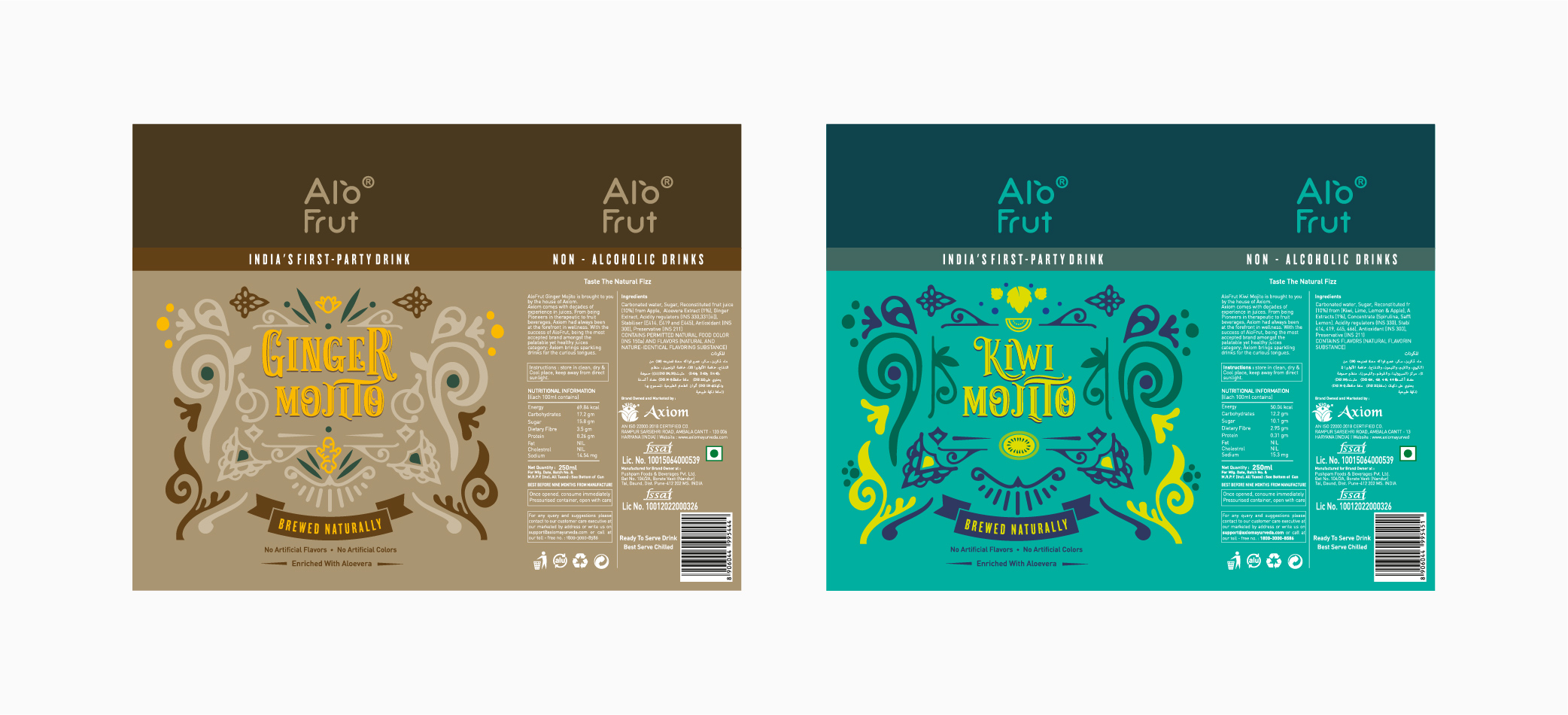
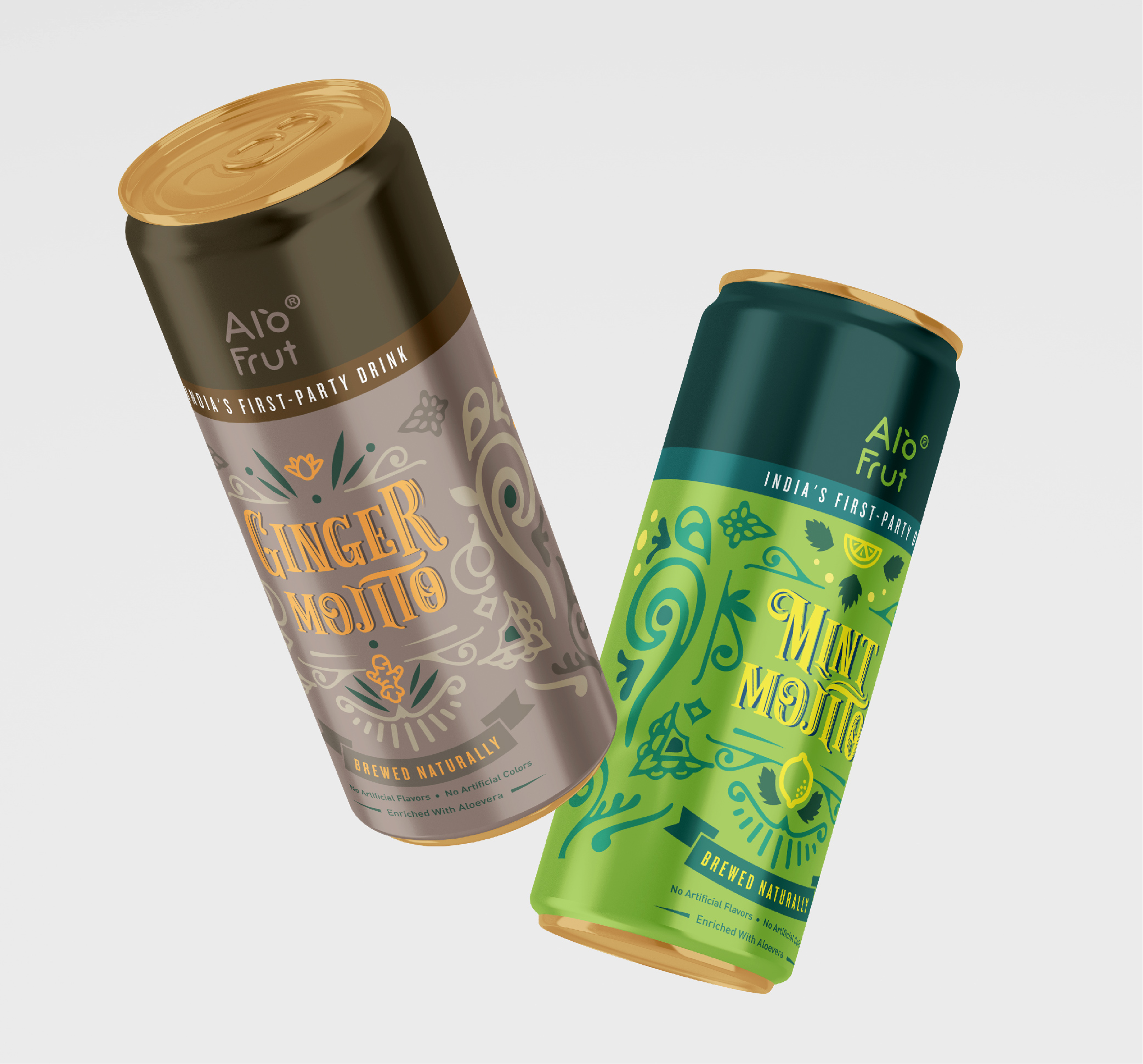
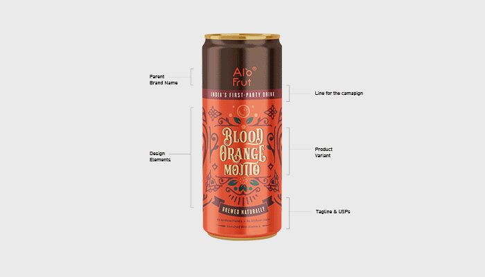
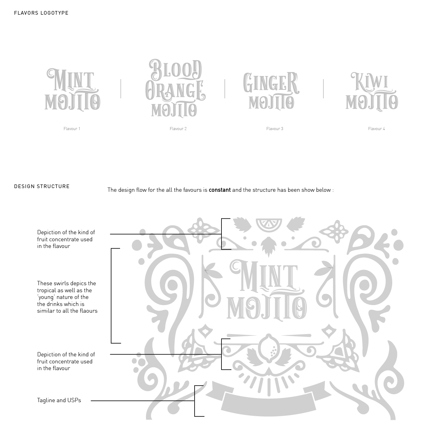
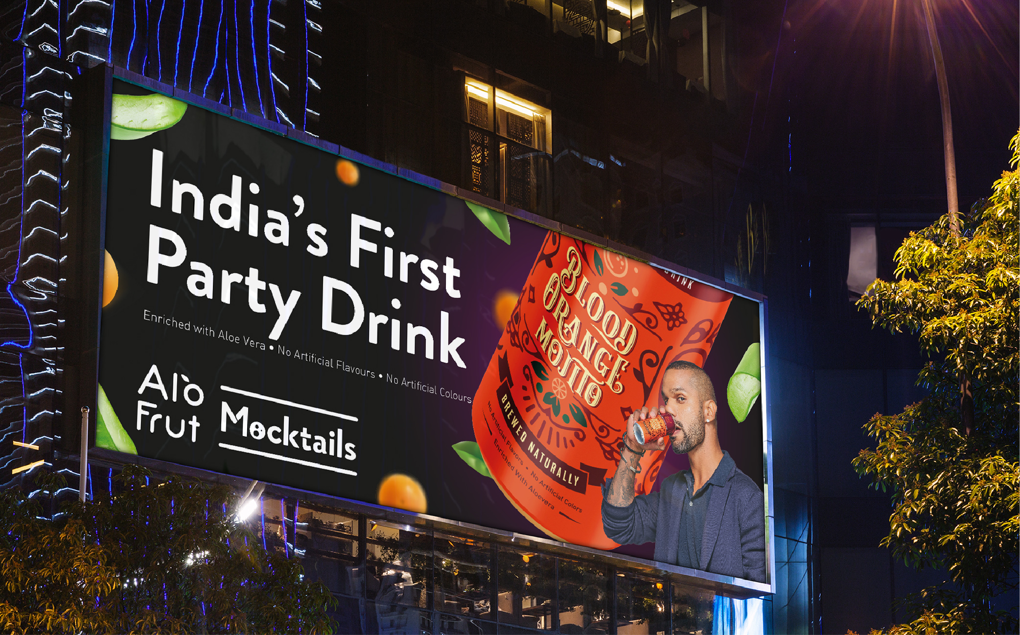
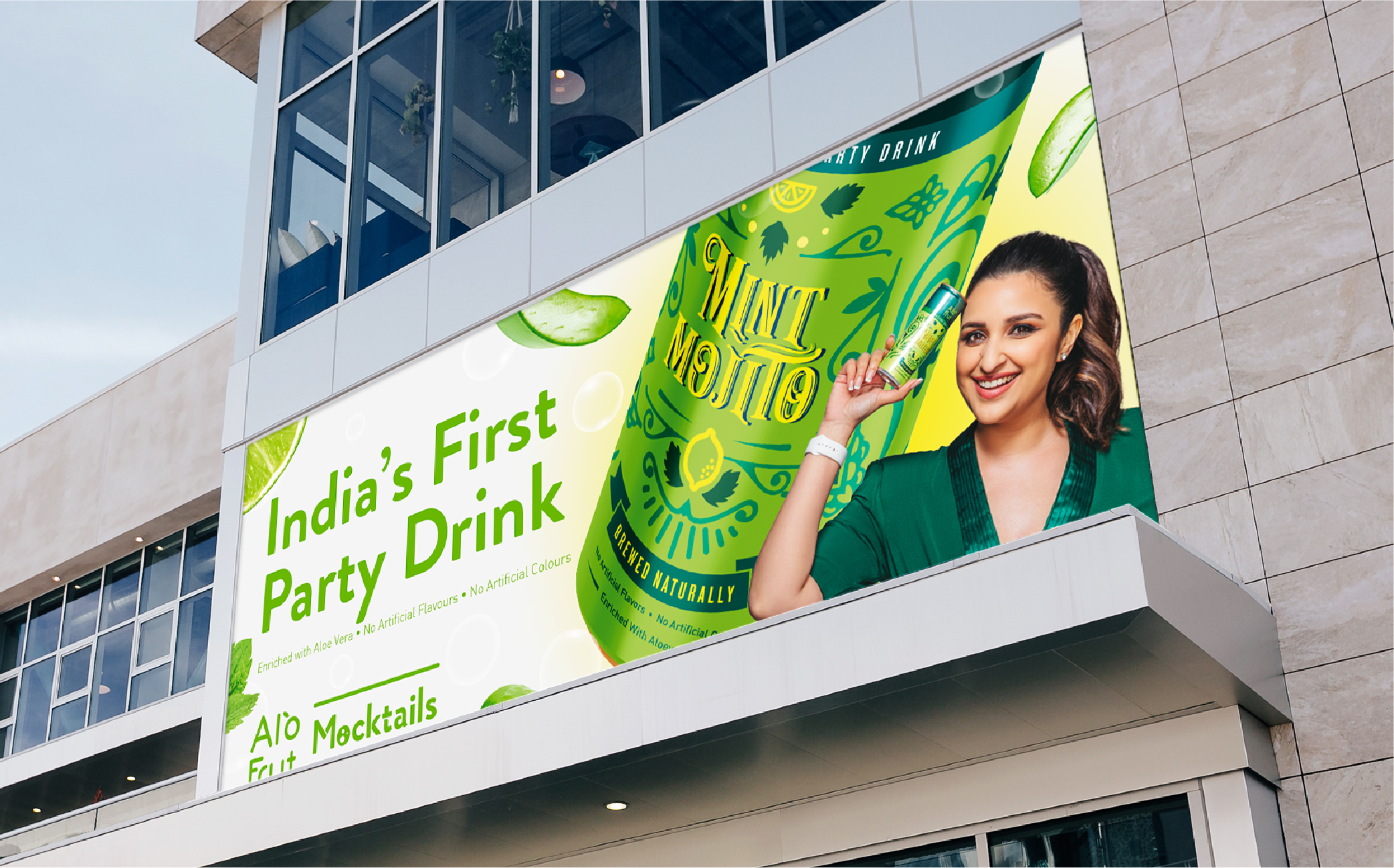
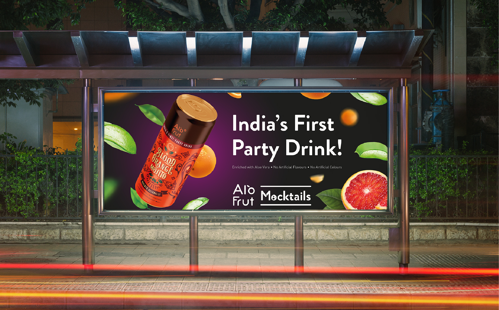
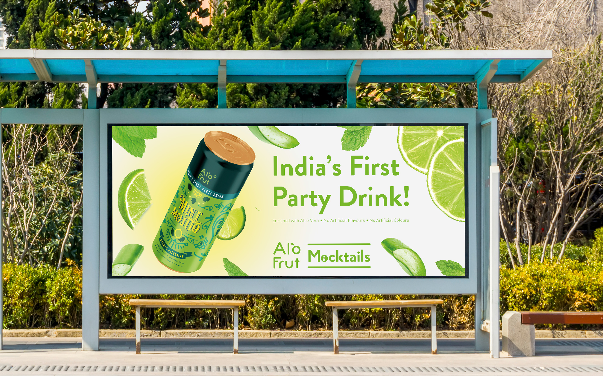
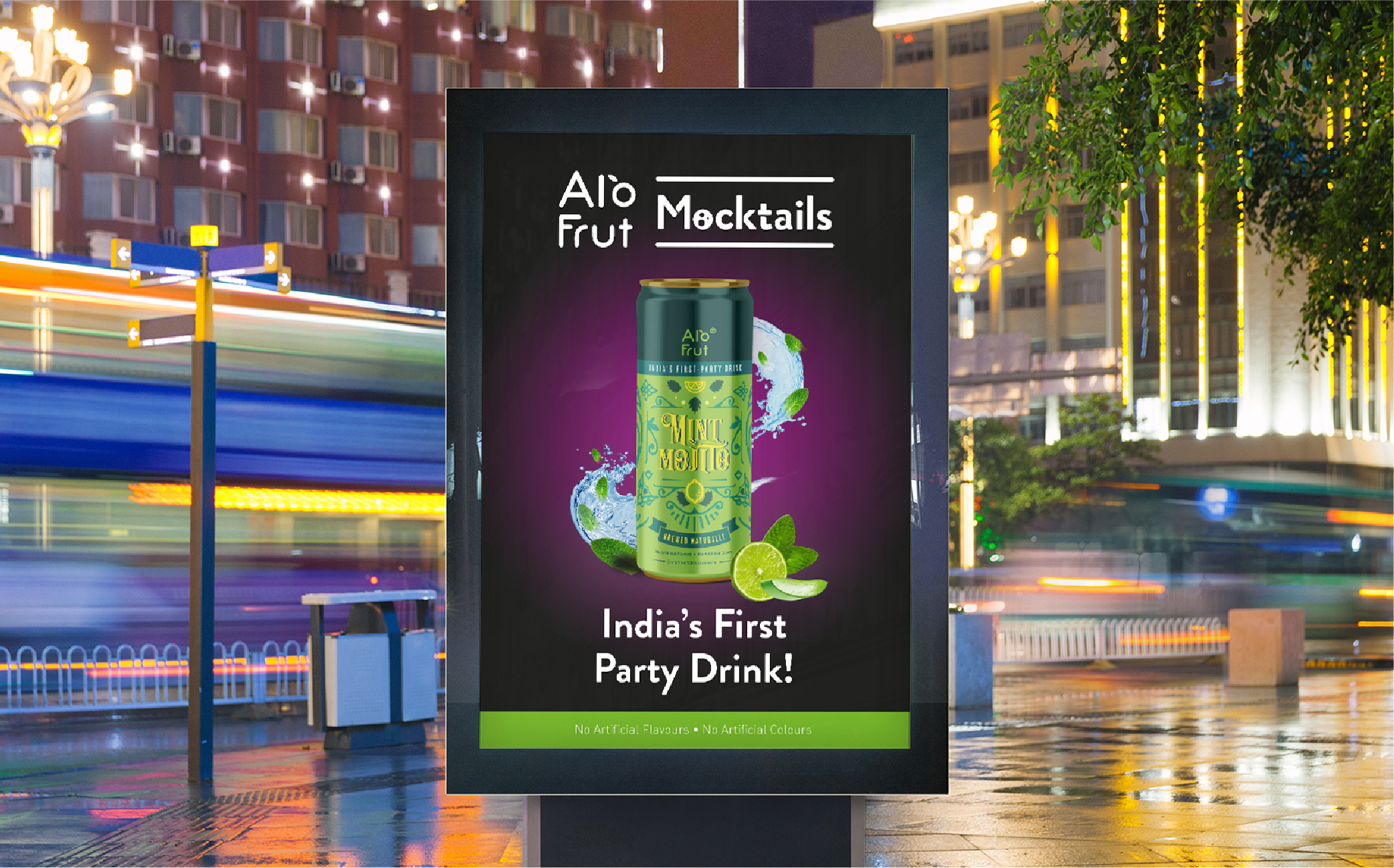
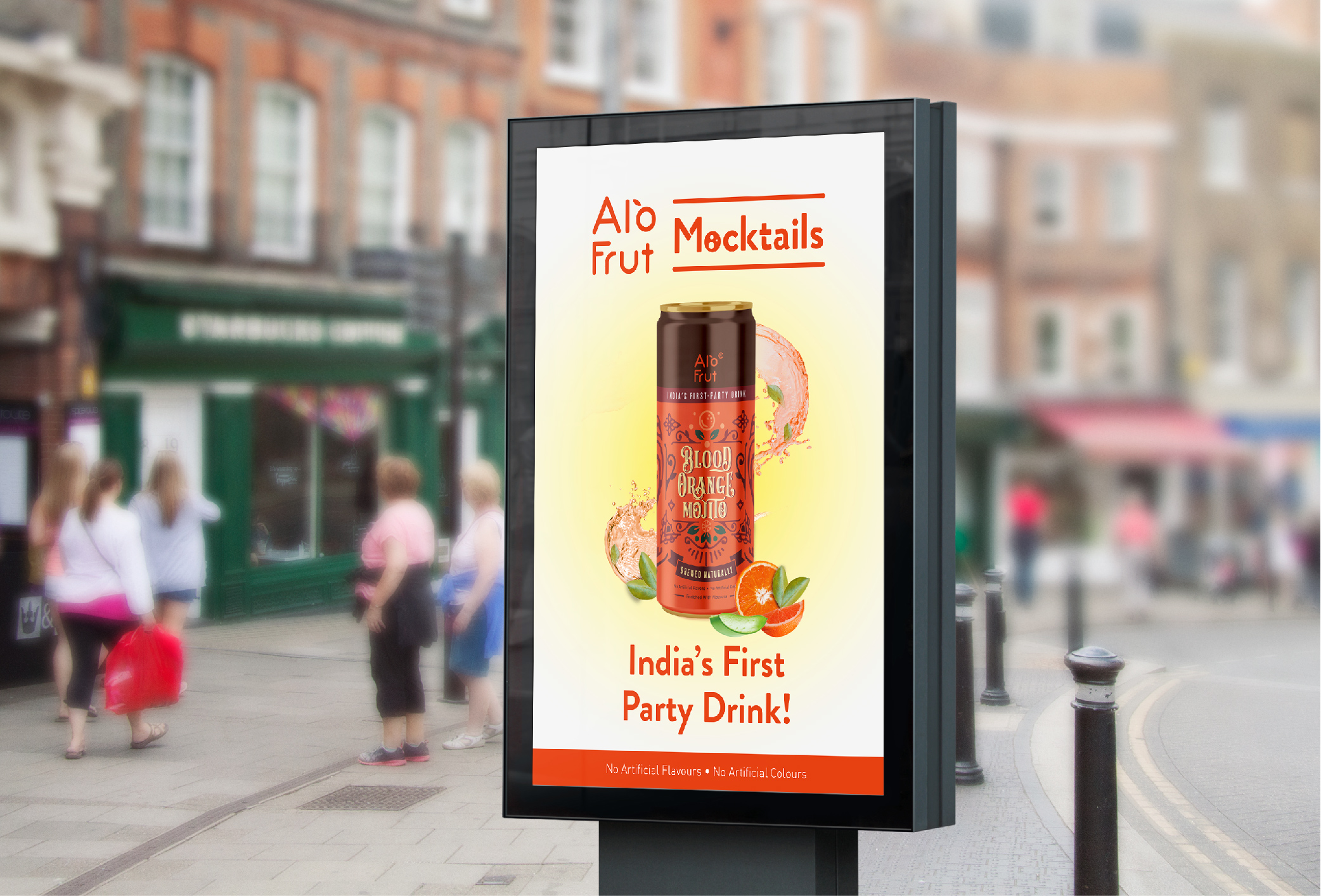
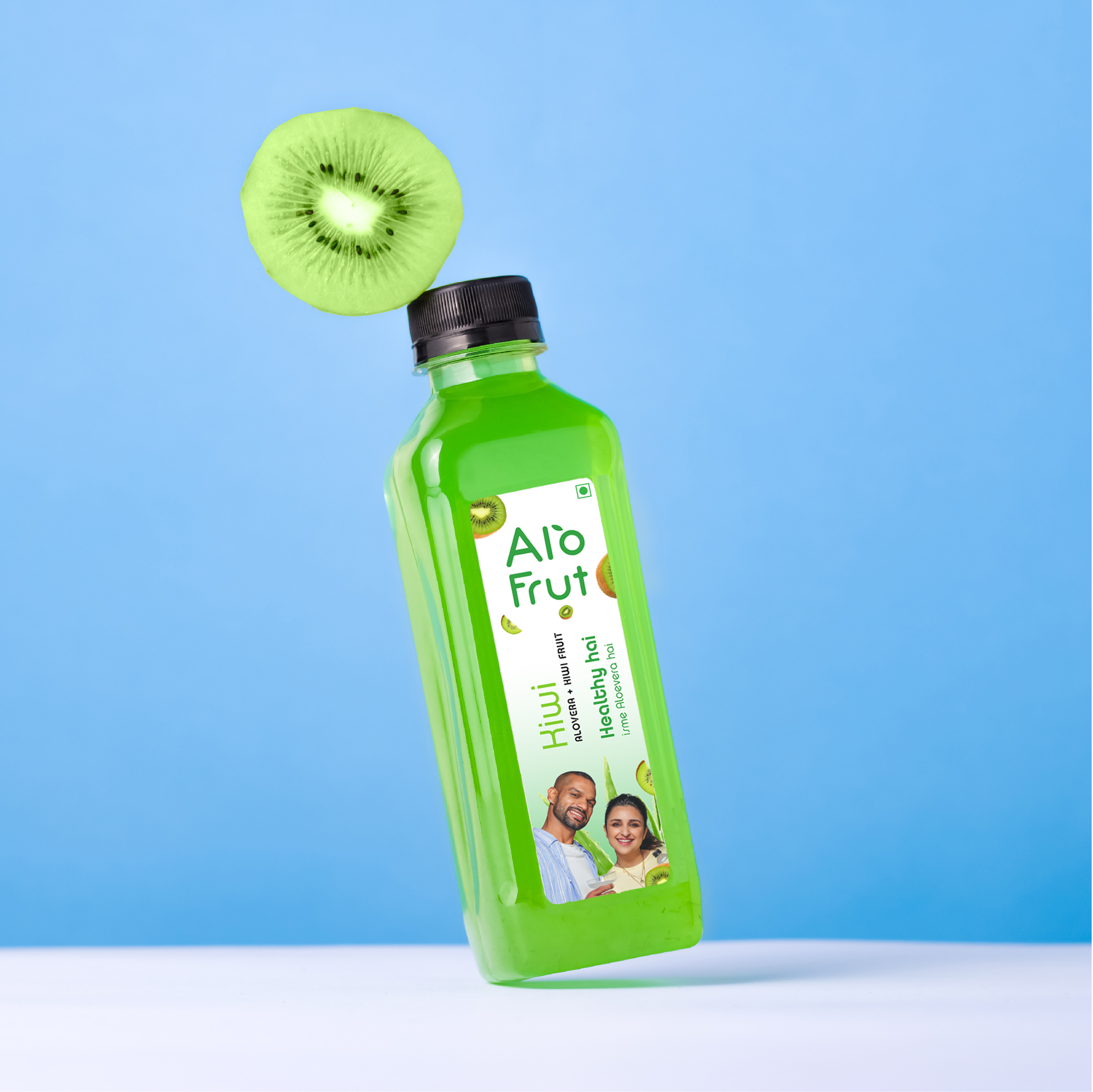
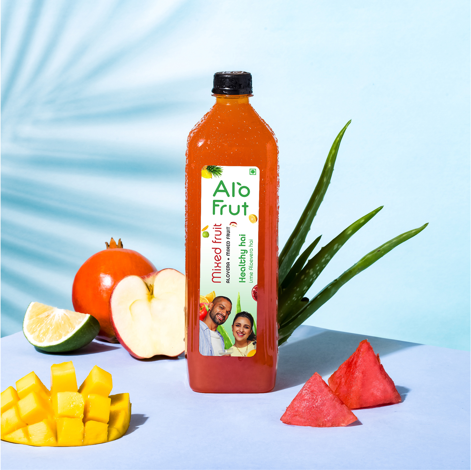
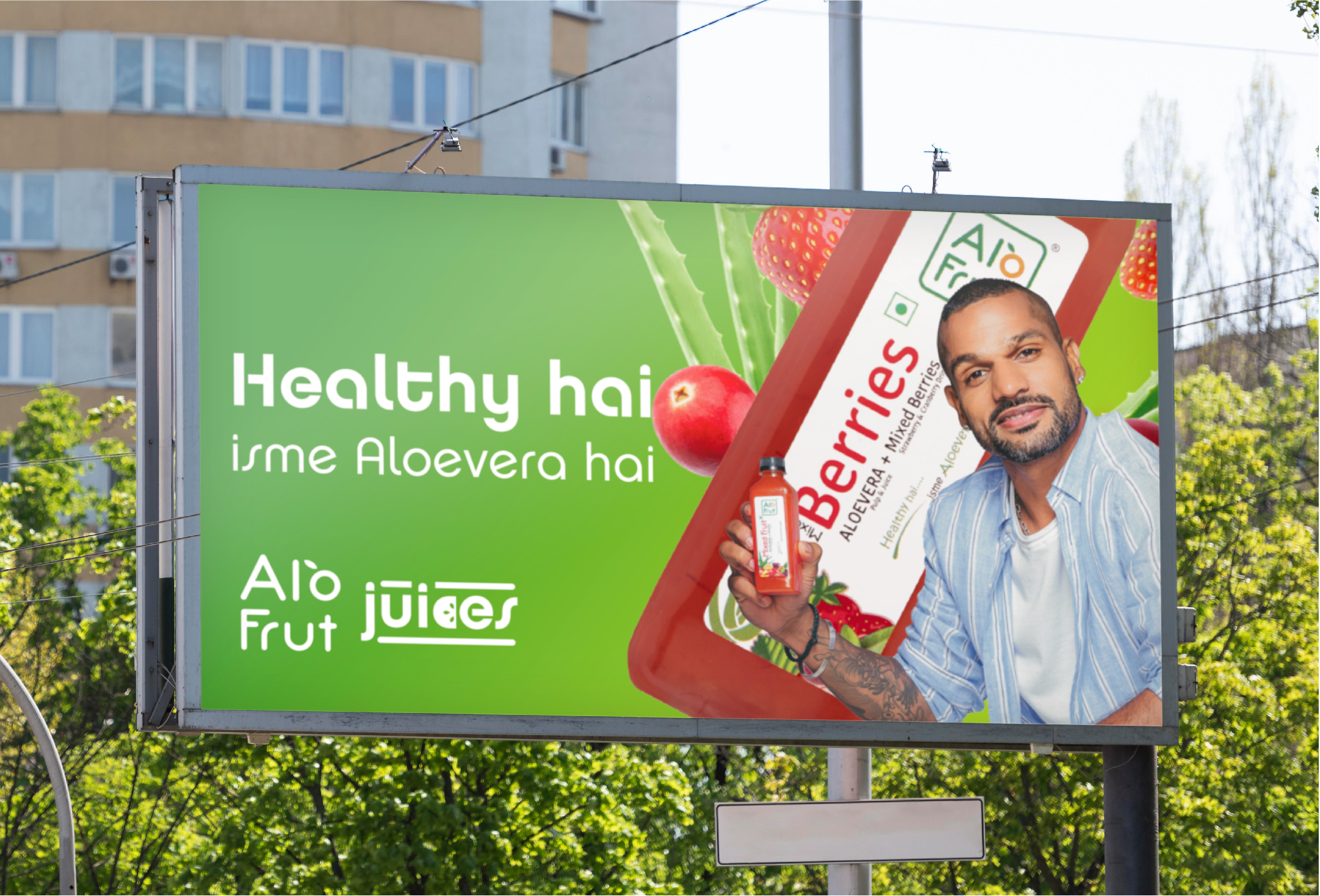
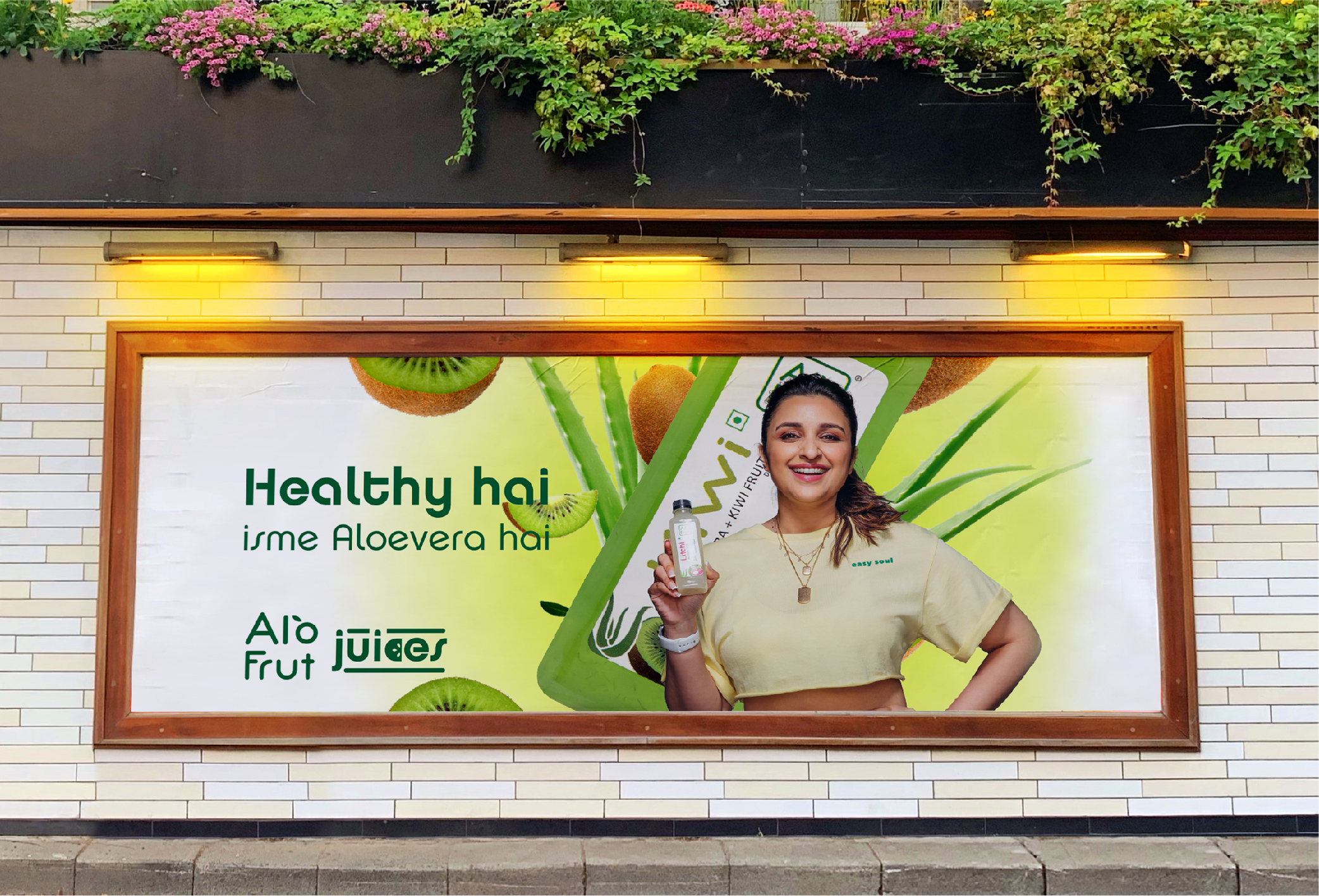
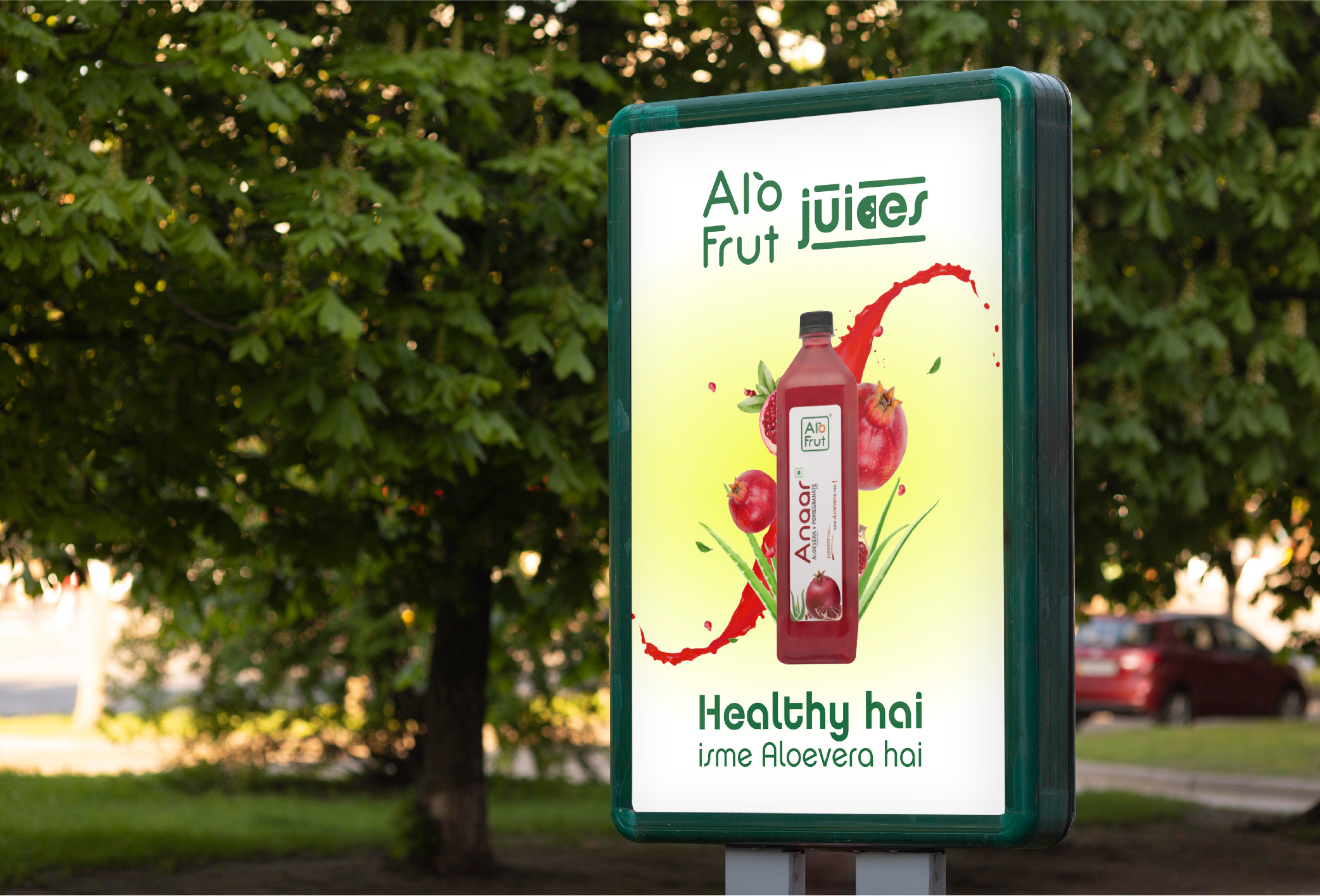
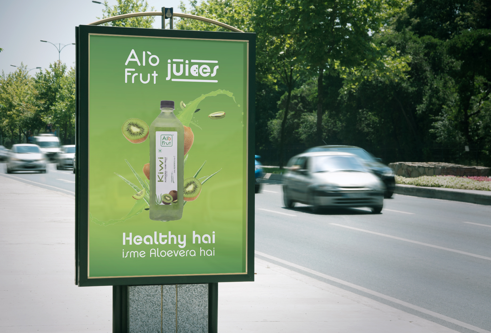
Alo Frut is a well-known Indian brand that makes a variety of FMCG products. The brand defines itself with the usage of aloe vera in its products, which is their USP. They approached us for the packaging design of a new product line called Alo Frut Mocktails, a 0% alcohol beverage with four different exciting flavors. At first, the packaging design of the can was created in isolation. But as the project grew, we were offered to redesign the brand language for communication as well. As we worked upon the visual language of the can, we started figuring out the elements that will help us create a varied, exciting and an adaptable brand language. The design language for Alo Frut Mocktails was created keeping in mind the natural fruits and freshness aspect of the brand. We created a logotype for the product verticals as well. The challenge was to communicate and focus upon the versatility of the drink, which could be had as a refreshment during the day, or also as a beverage for social gatherings like parties at night. As a solution, we came up with an idea of the usage of a 2 colour system which represents the daytime and nighttime consumption of the drink. This language translated into their online as well as offline communication to promote the drinks.
Since the creation of the visual language for Mocktails perfectly fits their brand, they approached us to do the same for their famous Juices product line. A similar system was created, with the focus on the USP of Aloe Vera in the juices. This system has allowed us to create a seamless transition of the design language from the Mocktails to the Juices brand. While we worked on the project, Alo Frut roped in Shikhar Dhawan and Parineeta Chopra as the brand ambassadors for both the product ranges, for the entire 360-degree media experience which translated into online, offline and brand communication.
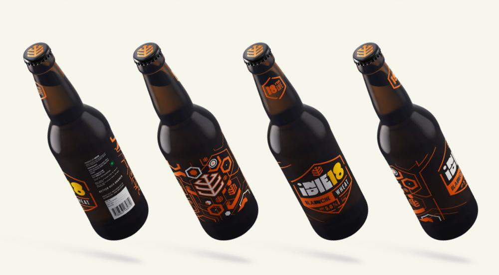
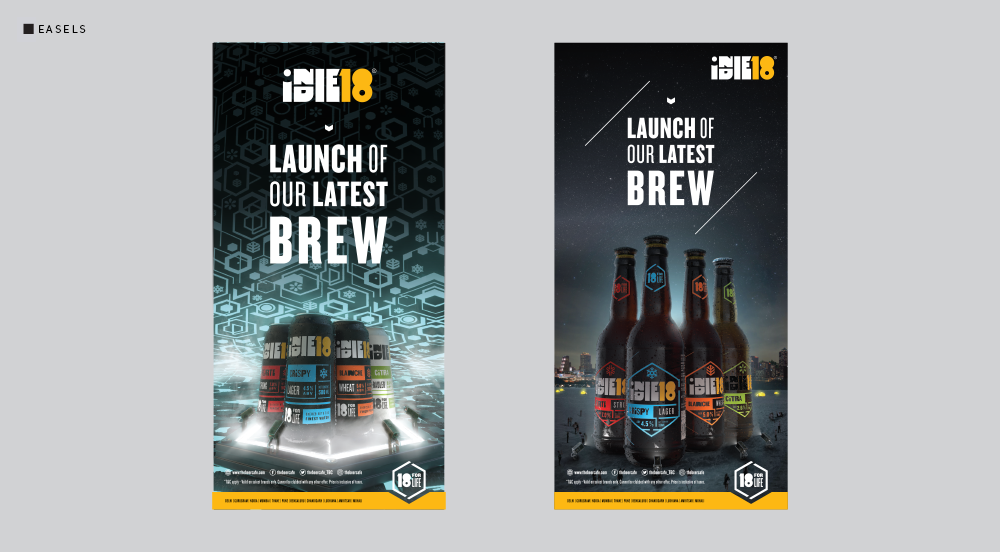
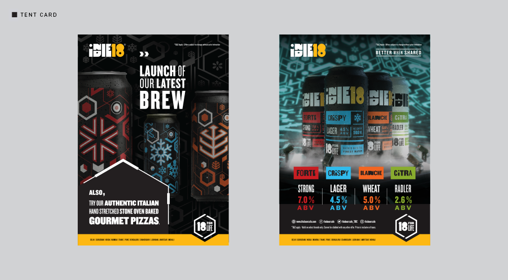
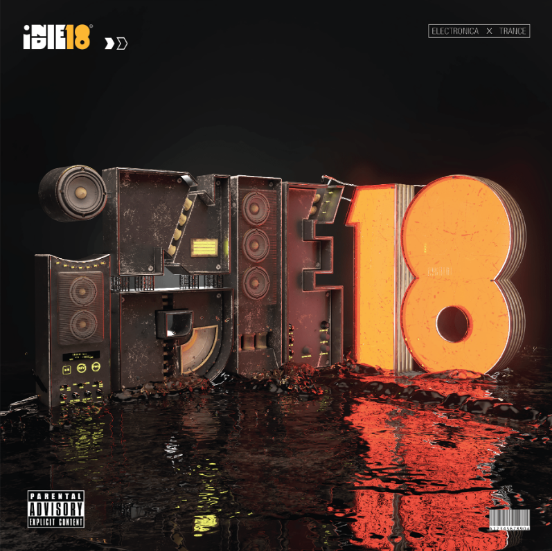
The Indie18 team did their initial market research about the product type, placement, ways of distribution, brand name, and the overall brand arch when Rahul Singh, one of the key promoters of the brand and also the owner of Beer Cafe, approached us to create a holistic branding for Indie18. What was missing was a Brand Story and an overall Brand Philosophy.
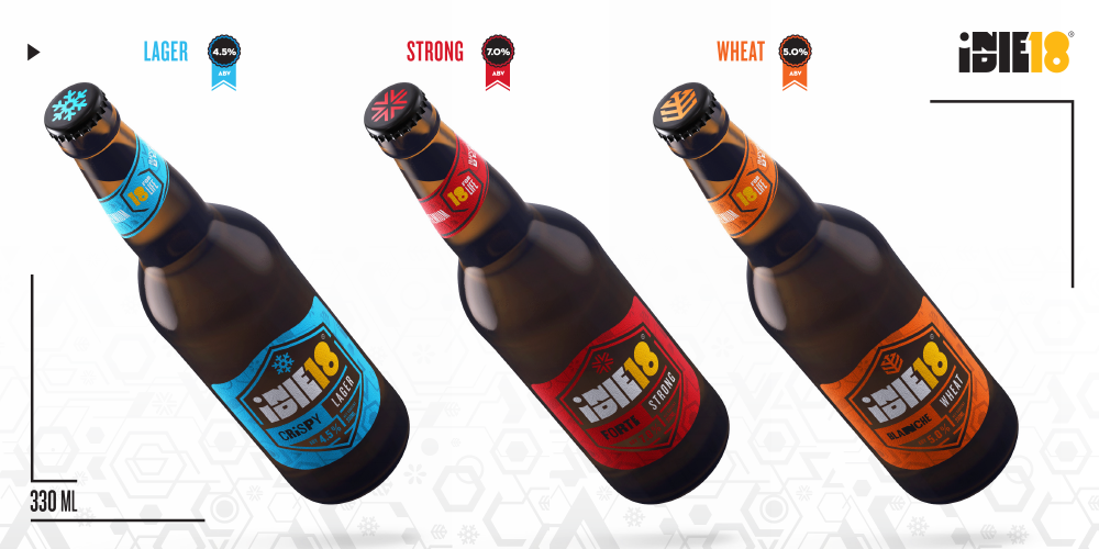
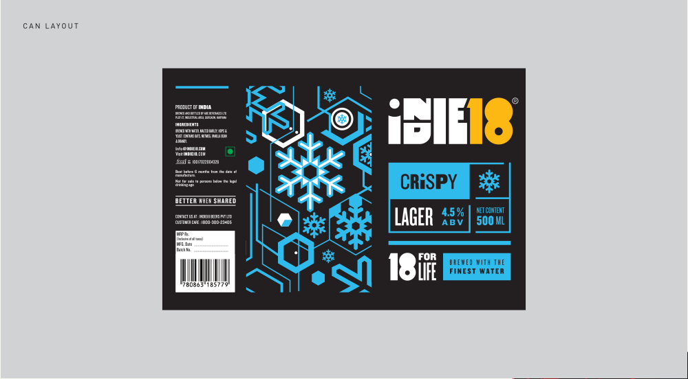
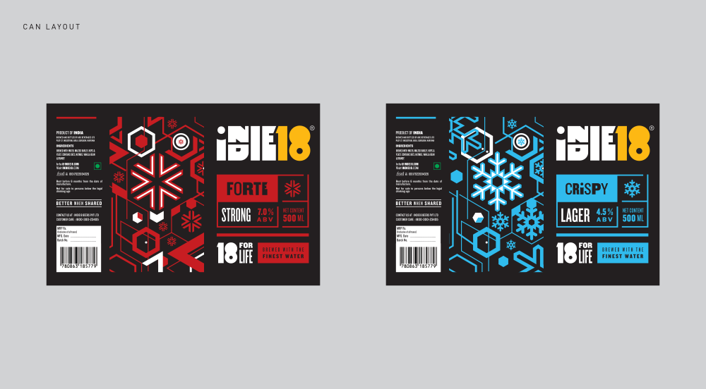
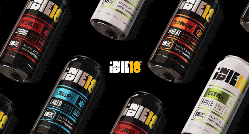
In the current times where the country is densely populated with craft beer. Rahul envisioned an industrial product, with the right ingredients and “consistency”. A proper brand with designer flavors, with the macro understanding of each Flavour’s own Target Group. This vision then helped us create the visuals and vocabulary for the brand, and 360-degree brand identity was created for Indie18. We started with the identity and extended the brand language to how the brand would like to represent itself in Rock shows or any such collaborations. The Client wanted a Modern-Classic approach to the branding, which has a youthful look and yet can appeal to a wide age range audience. The design is minimalist and modern.
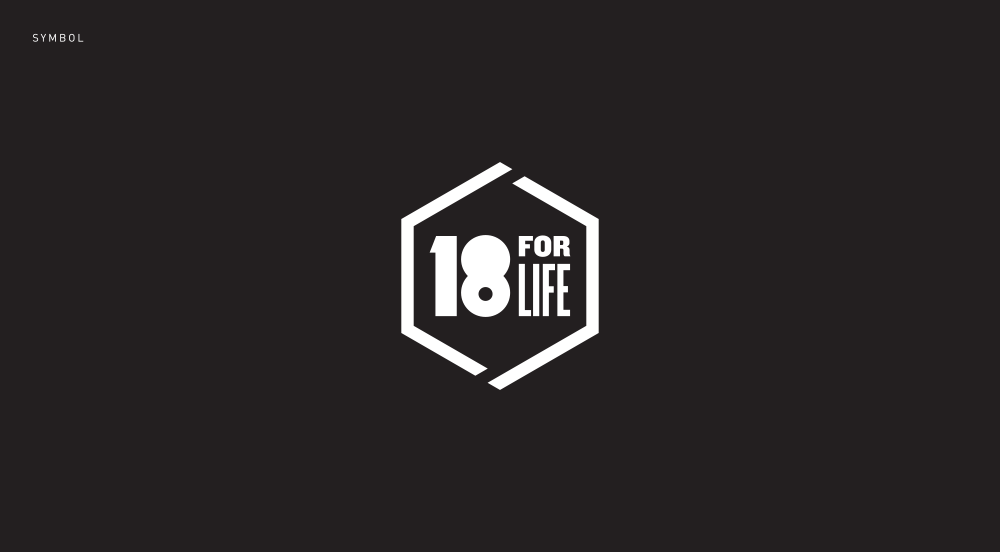
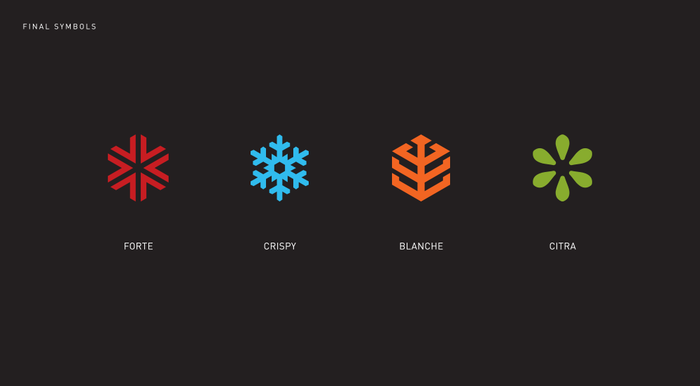
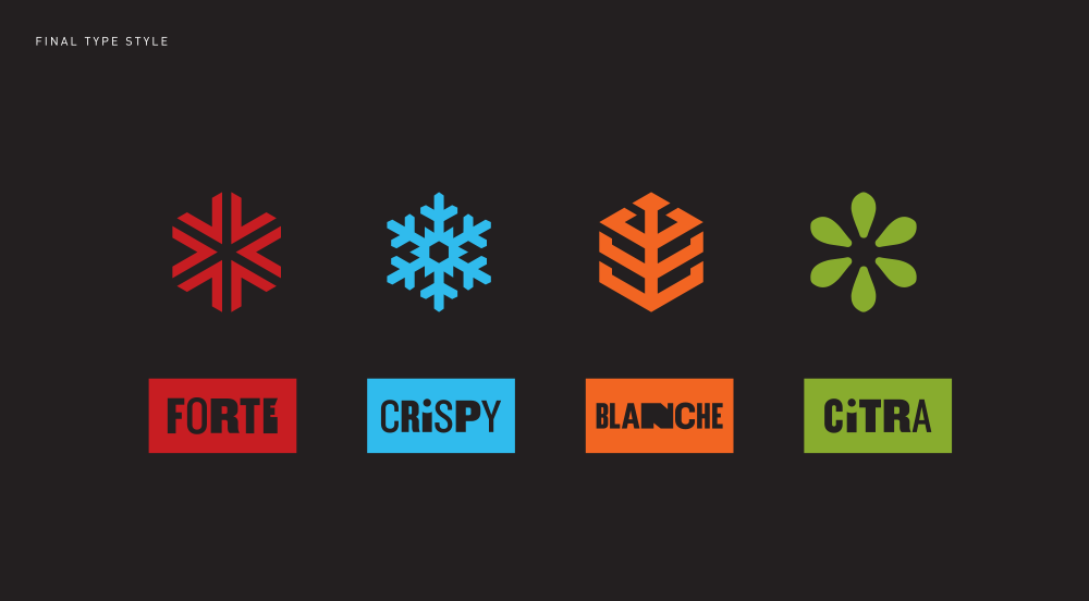
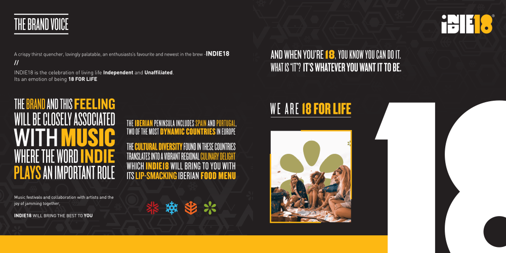
After numerous brainstorming sessions, we finally came with the overall Brand Purpose & Philosophy: Indie18 is a celebration of You- Independent and Unaffiliated. At 18 you make your own indie – to relate, bond, and share. Release your bounds from what was given to you, and Redefine Your Spirit of 18, then and forever. 18 for Life!
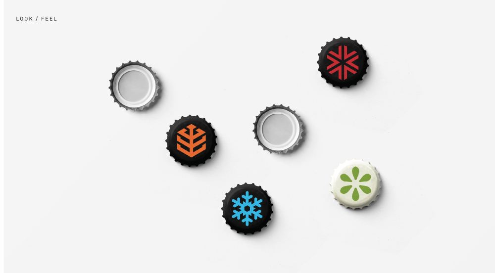
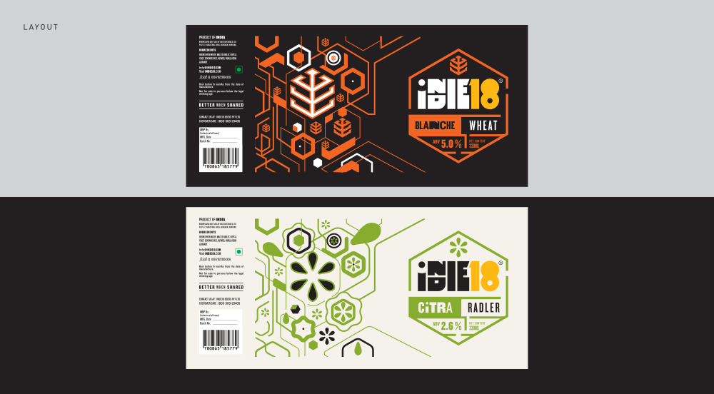
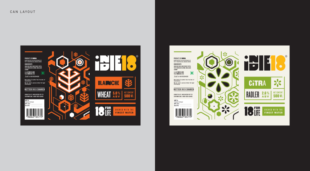
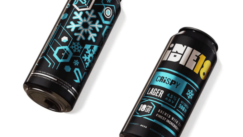
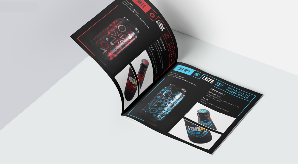
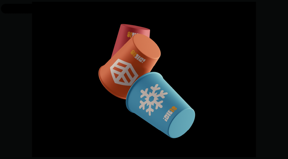
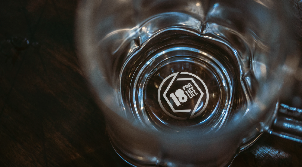
The hexagonal shapes that are a part of the language, represent the ‘bond’ or ‘group’ which represents the communal bonding that takes place over a drink. Each type/flavor of the beer is represented by hexagonal icons, with hexagonal elements that are inspired by nature. The design for the label is created to best suit the limits of the dimension that has been provided by the factories. The branding is also present on the cap, which is biodegradable. We went through the process of the beer till it is served, which also made us think of the design of the Tap structure, and how the tap/draft will be served. We added a special ink, embossed brand tagline, “18 for life”(a unit was developed for the same) to the base of the beer mug. It’s a way to prick the specially made, industrial consistent smooth quality beer to emit bubbles while you consume it.
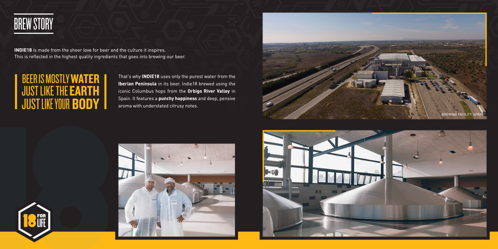
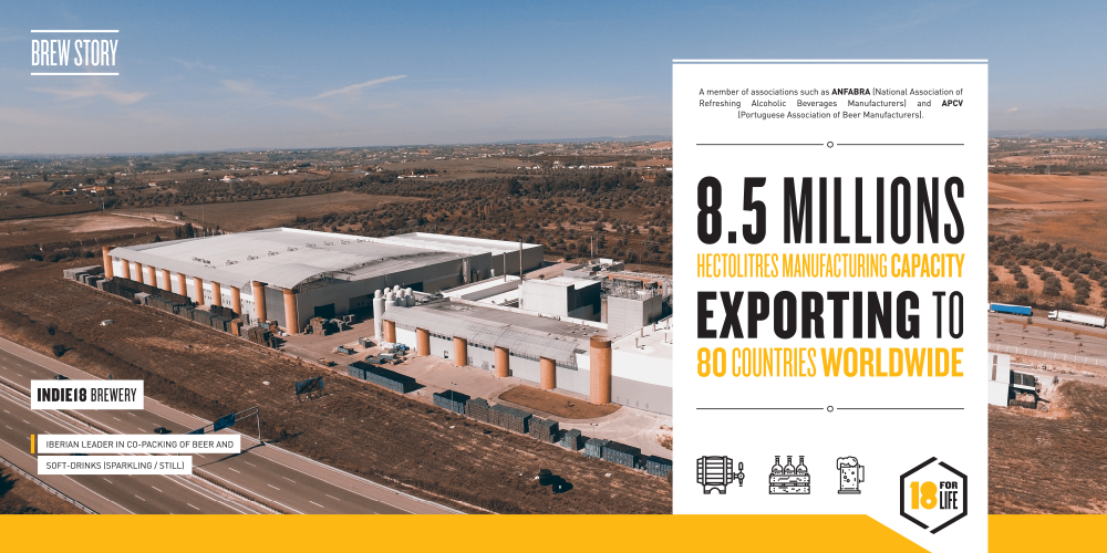
Indie18 is brewed using the iconic Columbus hops from Orbigo River Valley in Spain. It features a punchy hoppiness and deep, pensive aroma with undertoned citrusy notes. Indie18’s brewery is a member of associations such as ANFABRA (National Association of Refreshing Alcoholic Beverages Manufacturers) and APCV (Portuguese Association of Beer Manufacturers). Indie18 uses the purest water from the Iberian Peninsula.
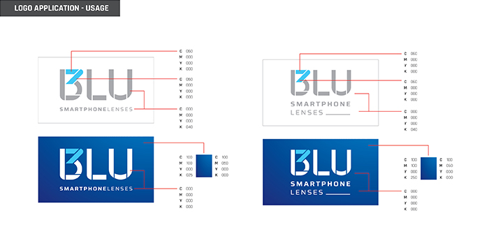
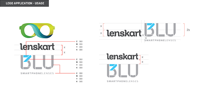
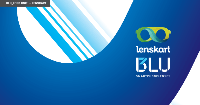
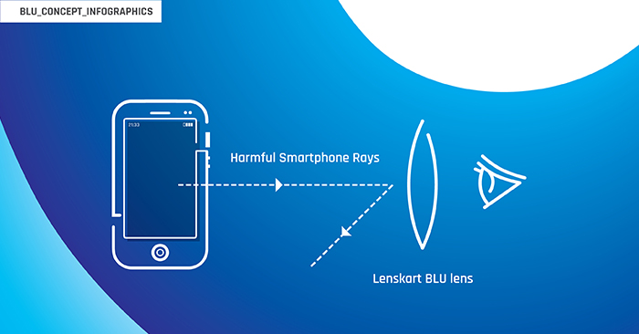
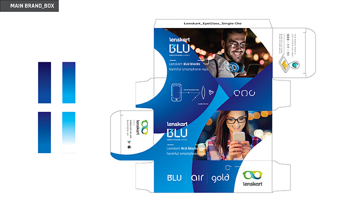
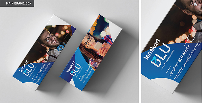
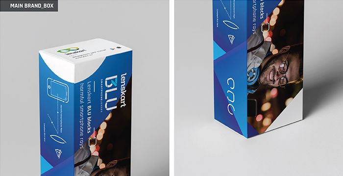
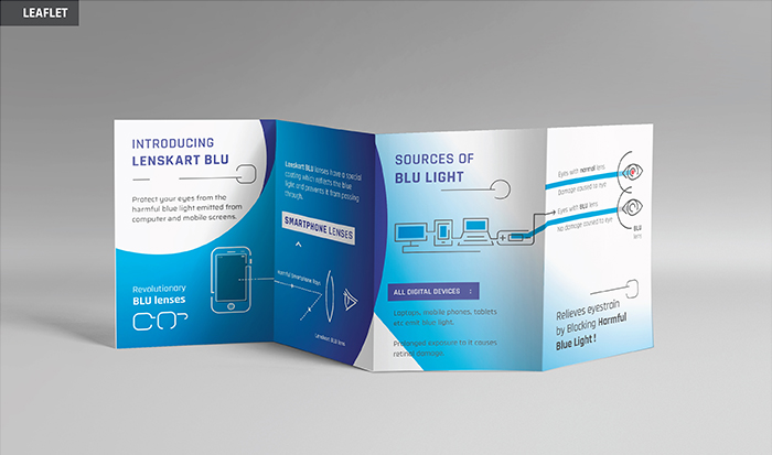
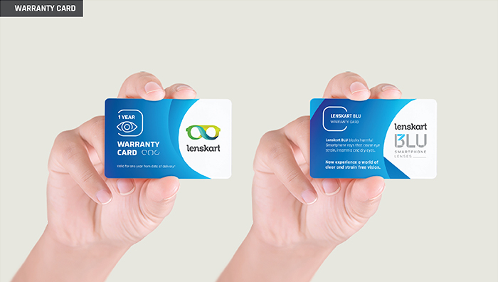
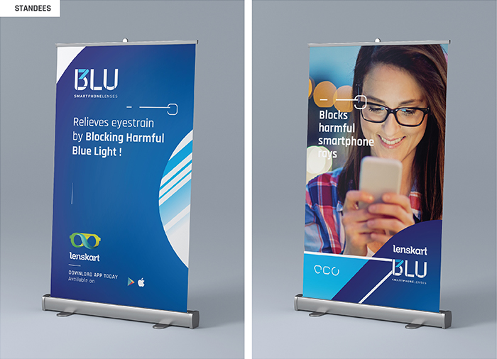
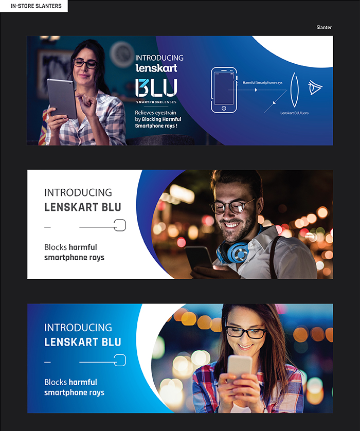
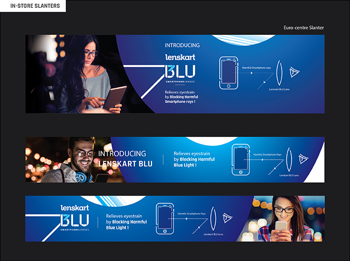
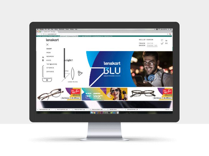
Lenskart Blu is a sub-brand under Lenskart, that promotes the use of lenses that reflect harmful blue rays from smartphones and other electronic devices, protecting the eyes from strain, insomnia, and dry eyes. The brand offers “screentime lenses” that protect the eyes of any active screen user of laptops, monitors, or smartphones. We came up with the by-line “smartphone lenses” for the sub-brand to target a larger contingent of the audience. Being the futuristic brand that they are, we made sure that the Lenskart Blu brand language is clean, simple, and to-the-point. Using tints and shades of the colour blue, and through various interesting and yet easy-to-understand layouts, we built a brand that appeals to today’s digitally active lifestyle and becomes a quick, easy decision for a majority of the market.
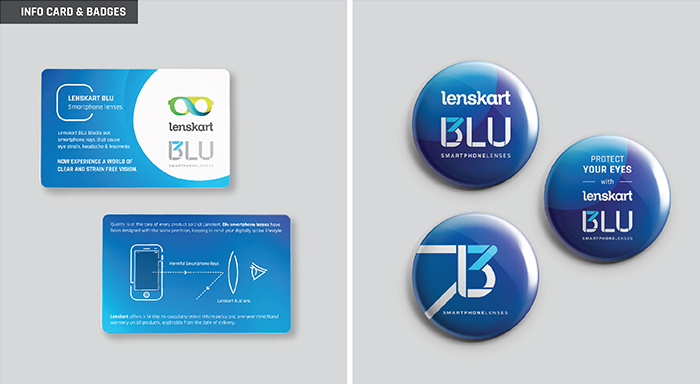
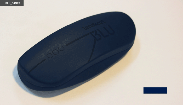
Since it is a sub-brand, we ensured that a lot of the collaterals that we did for Blu could be easily traced back to the Lenskart brand we built, to maintain familiarity and trust. Beginning with the boxes and cases, their various touchpoints, to in-store collaterals, we added the Lenskart Blu brand language to familiar layouts; and managed to create a unique space for the brand while still not entirely removing the connection to its parent- brand.
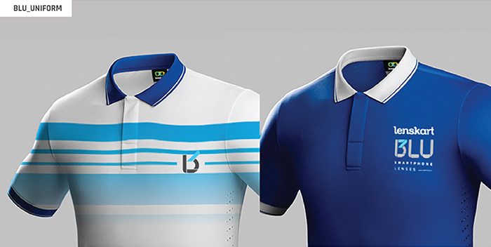
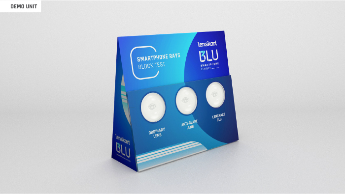
For the stores, it is important to have a visual appeal for the sub-brand, we have designed teeshirts and badges for the sales team who are entrusted with the sale of blu and also helped create a demo unit for customers to get a better understanding of the purpose behind the lenses. The Blu Demo Unit is a roughly 1×1 foot structure, which is sleek to look at, and works from any side (keeping in mind the space constraint in any store). The Unit allows the customer to see the difference between various lenses, and how the Blu lenses are efficient in saving your pupil from the rays coming out of your devices. This product conceptualizing took a considerable amount of time, and has since become one of the best sales tools for the brand across all their stores. We took it one step further than just making blind promises, by literally showing the customer the product in action. Since the unit is interactive, a store visitor can actually do the test themselves and watch the difference in the lenses.
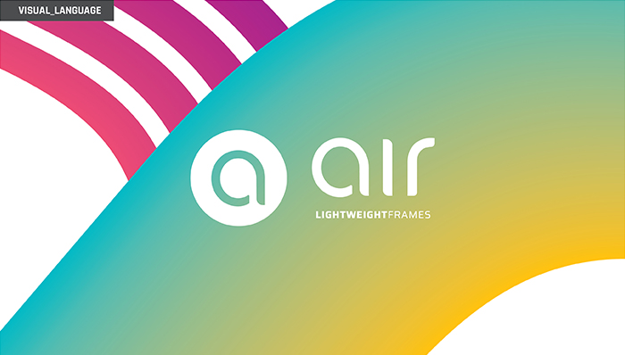
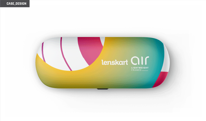
AIR is another such sub-brand under Lenskart and has a very prominent clientele. AIR is not about the lenses; it focusses on the frames – with a USP of being extremely lightweight. Made for regular users, who are active, young, and on the move; AIR offers light, flexible frames which minimize the possibility of physical damage. We coined the byline “lightweight frames” to make it further stand out to the brand’s busy clientele, making it a quick, easy decision. Since it’s launch, it has been successfully working as a concept; and we have now started exploring tributaries of this sub-brand; like Air Flex, Air Fit, etc.
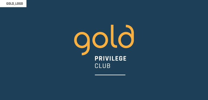
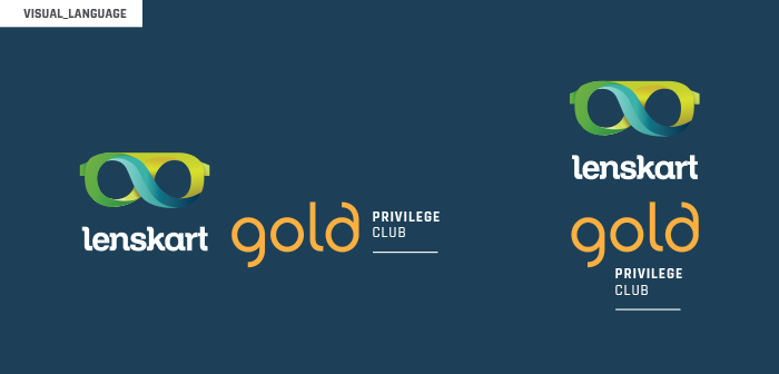
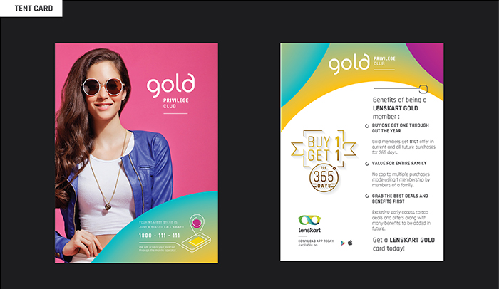
Gold is more of a membership club than a sub-brand – providing members with a variety of deals and offers. There are various other verticals of the main Lenskart brand that we are now trying to work out as part of a cohesive system. We are also working on simplifying the Lenskart web experience, which happens to be one of the most important components of the brand’s outreach.
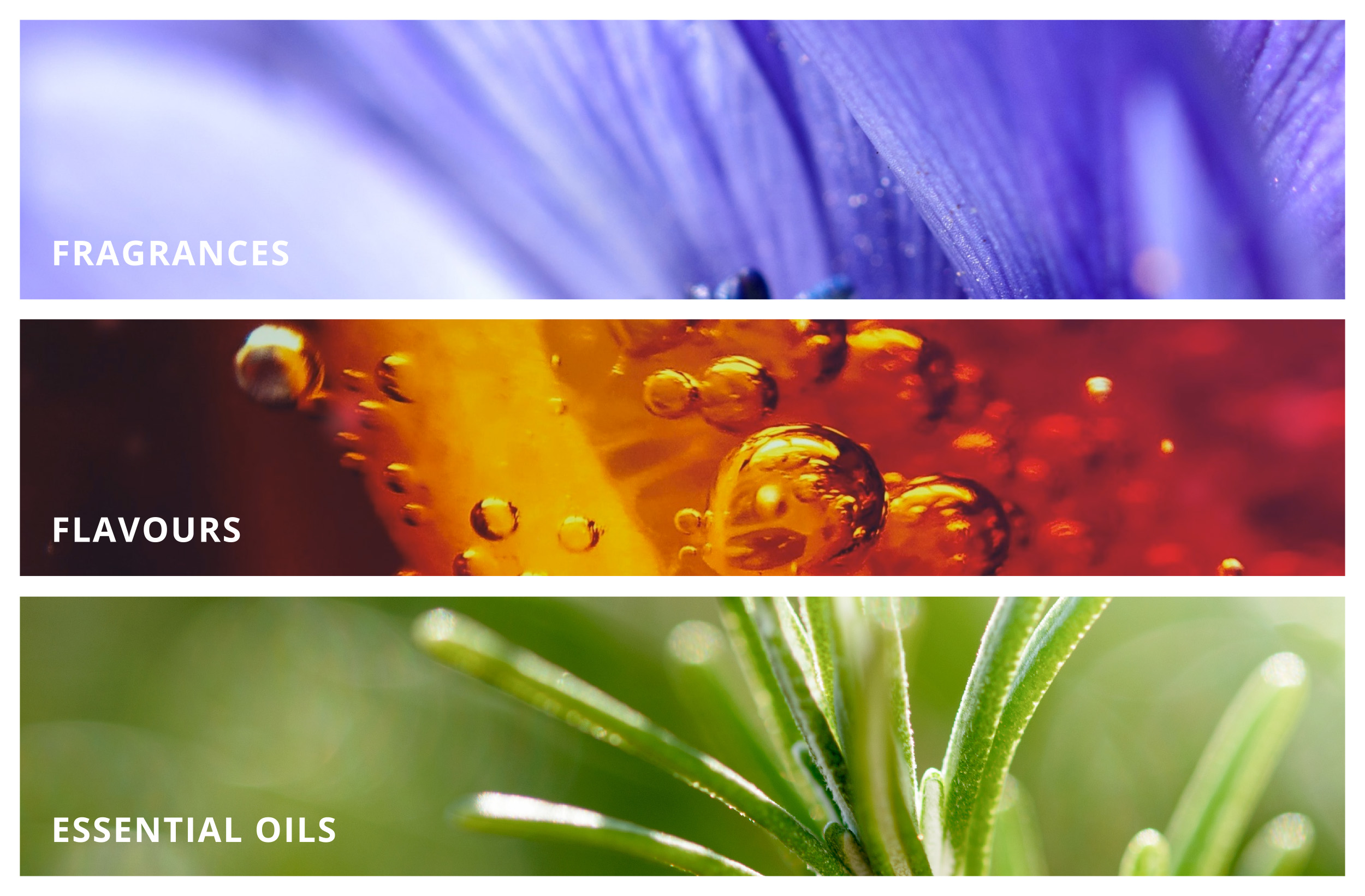
Ultra Internation Limited is one of the pioneers of the business of Flavours and Fragrances in India. It is one of the oldest brands across the globe to establish its success story, known across the fragrance and flavor world, where every chapter is marked by innovation. No wonder, that their innovative approach to meet customers and expectations has won them national as well as international business accolades.
It is nearly a 100 years old brand and it was a prestigious project for us to handle. Especially since we were changing the indeed & brand language of a brand well established.
Understanding the sentiments and alignment to their earlier ideas and the logotype, we came up with something that the decision-makers at UI really liked, then we went on to expand the visual language across all communication.
other than working with the graphical elements, colors, fonts for communication, we also stretched ourselves to draw a few illustrations expressing the love for the work they do for all the three major categories of Fragrances, flavors, and essential oils.s The illustrations were made using the ingredients of each section and to fit into the logo form, replacing the leaf with the artwork.
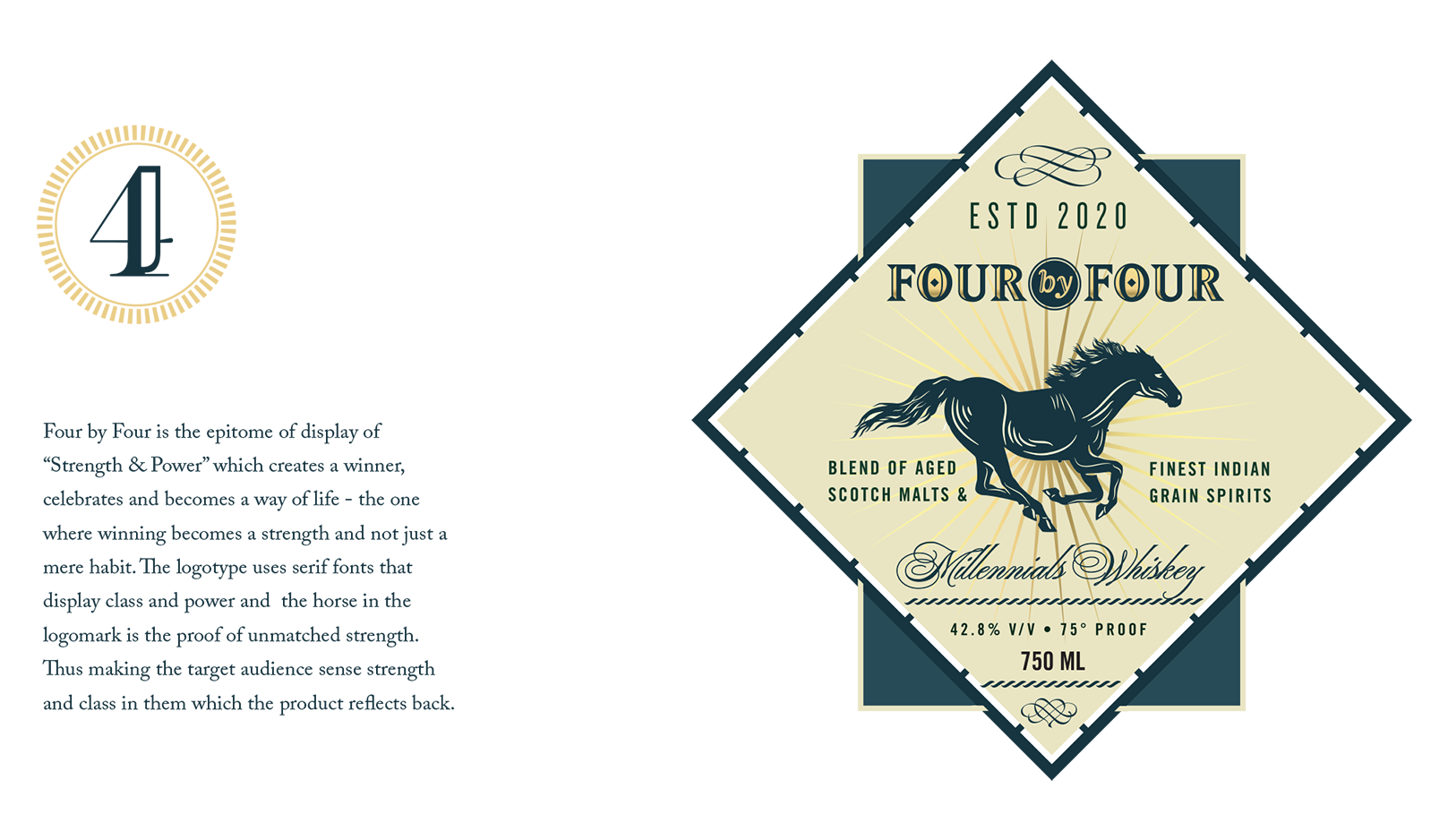
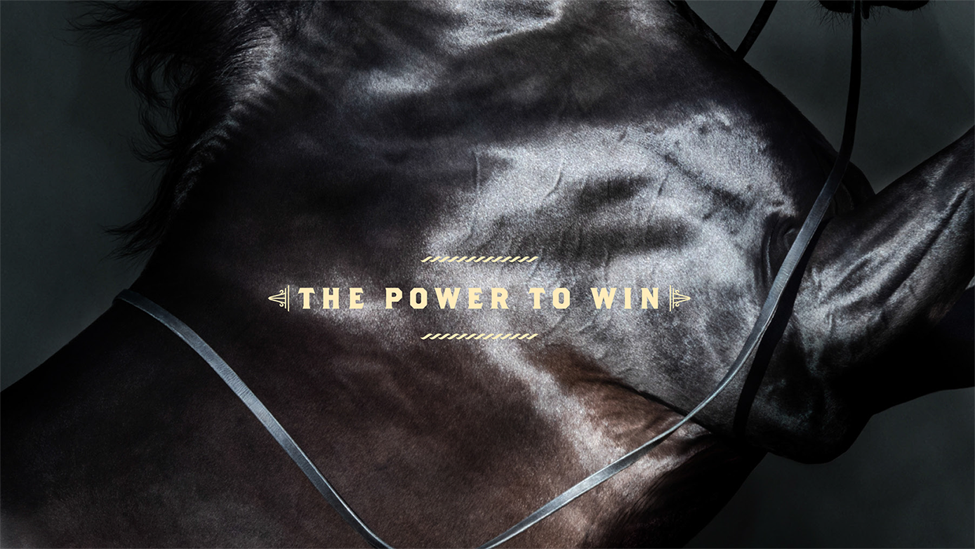
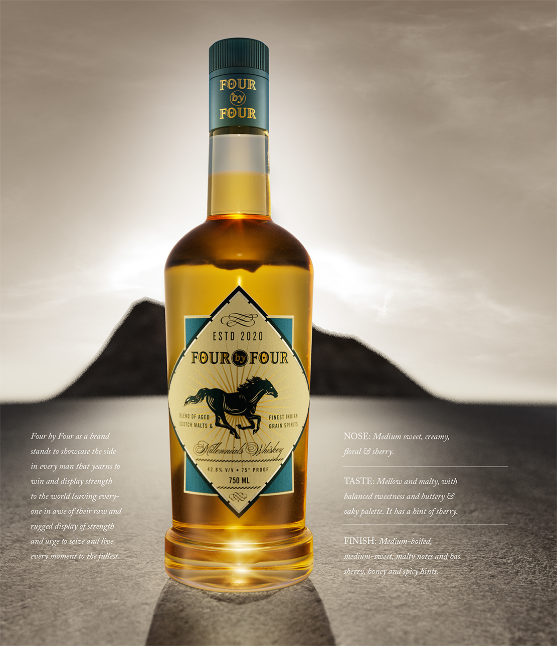
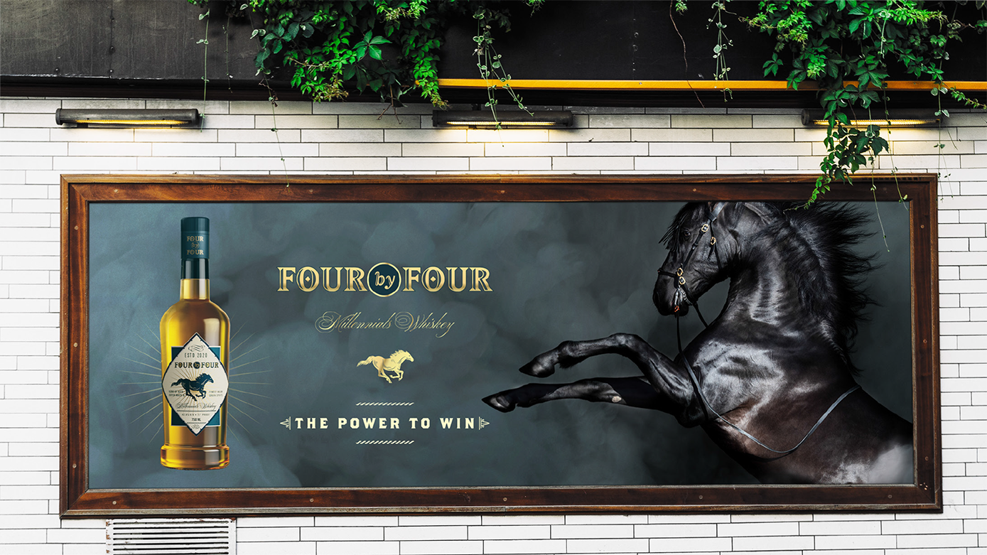
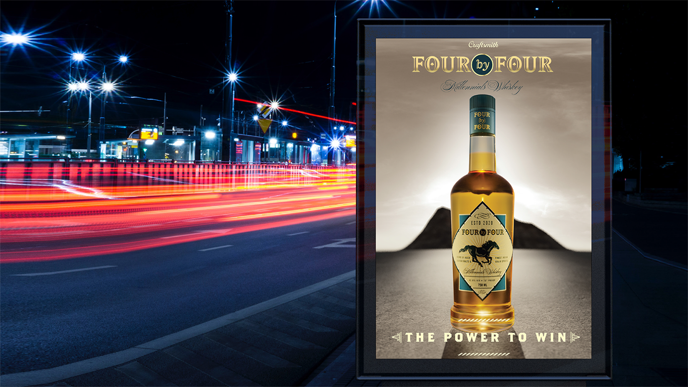
FOUR BY FOUR is the story of the establishment of a blended scotch in India which was to be positioned as the epitome of power, strength, and balance. We worked on incorporating the sensorial aspects of the scotch blend to create the persona of the brand. The terms such as Mellow, Malty, Balanced Sweetness, and Oaky Palate gave us the direction in which the brand and product were to be approached from. We developed FOUR BY FOUR along with the makers at Craftsmith, who took all possible steps both fundamentally and communicative about how the product and the brand will be marketed.
At the inception of the brand, our main focus was to display the qualities of strength and power both verbally and visually. The idea was to use terms and imagery which could be related both directly and indirectly to the concepts. ‘Four by Four’ was the chosen name that drew direct meaning from the four-wheel drives which are used to conquer rugged terrains. Thus the name gave a meaning that pointed towards the direction in which the brand was moving and the use of a horse as imagery completed the ideation process which was again a display of balance, strength, and grace.
The choice of colors was towards the darker tones and pastel shades to establish the mildness and malty flavor that the product gave and the usage of the rotated square on the packaging was to depict the balance that the product tried to emanate. To bring the product to life, the task of creating digital images of the bottle and the labels to give the overall look and feel that was conceived for the product, @rohitbhong and team were roped in to generate the 3D visualization of the product as both they shared the vision of creating FOUR BY FOUR in a way in which it was visualized. For the production details, we worked very closely with the production team with changes in the values of foiling, embossing to get the perfect mix out there on the label as well as on the mono cartons
Lenskart is an e-commerce eyewearcompany founded by Peyush Bansal in 2010, with the headquarters in New Delhi, India. They are the country’s leading online shopping portal for eyewear – with products ranging from a large selection of eyeglasses and sunglasses, to contact lenses, cases, etc. Despite starting off as a solely online business, Lenskart has more recently grown extremely quickly in retail, expanding from 450 stores in 2017, to 600 in 2018. The brand itself lacked a visual vocabulary to support all these new points of communication.They approached us in late 2017, to come up with a strong brand language to support their existing logo – and so we began our most large-scale rebrand to date.
Lenskart came into a market in which eyewear was considered only to be a medical solution. Gradually, over a period of time, they changed the face of their product in the market, making their own customer base of people who suddenly started to see eyewear as a fashion accessory. They were essentially the pioneers that brought the concept of e-commerce eyeware companies to India, thereby gathering a loyal base of recurring customers – a list that keeps growing every day. Today they are one of the most successful brand stories in the country, bringing in A-list celebrities like Katrina Kaif as Brand Ambassadors, and launching new product ranges and offers almost every day.
We began our work by building the brand language – taking the three most commonly identifiable frame shapes – a square, a circle, and a triangle – and editing them, to make them slightly more abstract forms. These three shapes would then go on to be the base structure for the language, being utilized to make patterns, blown up as elements with text, and in the packaging as the shapes themselves. Taking this forward, we made abstract forms to represent each of the 8 different kinds of frame categories on offer, as an icon-based system for identification and labeling.
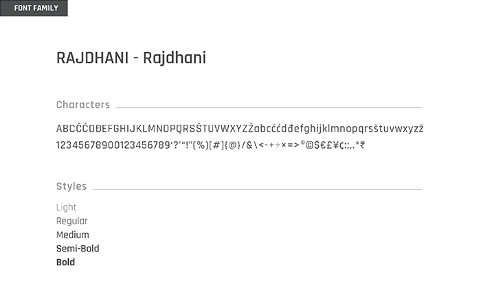
The font family we chose for Lenskart is Rajdhani. This beautiful sans-serif font has modularized letterforms and supports both Devanagari and Latin writing systems. The squared and condensed appearance may be interpreted as technical or even futuristic, and our brand language uses the font in its many weights interspersed with the shapes, creating very interesting units of text.
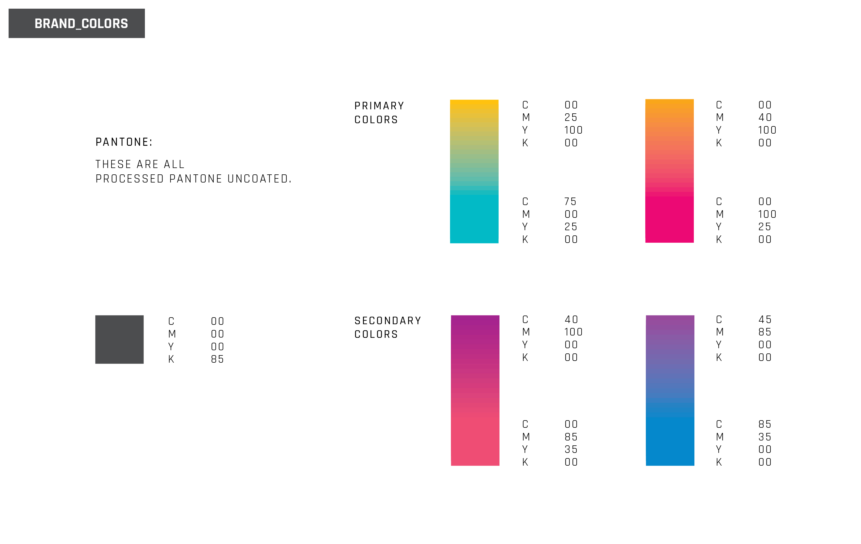
The brand did not have much of an existing brand language to adapt from, so it was upto us to decide on a suitable colour palette. Keeping in mind that the vision and aim of the company is futuristic, and that the brand story is heavily technology-based (the products are assembled by robots to remove the possibility of human error), we decided to go with a bright palette, appearing together in pairs, in gradient form. We felt that this was the closest our language could come to match the existing LensKart logo, and that the bold colours would really position the brand where they want to be – a leader in their field, and therefor trustworthy and certified; while managing to keep their ‘cool’ and youthful image alive, to appeal to newer generations of customers. The impact of seeing multiple gradients, with various combinations of the brand’s colours, is aimed at emphasizing that the brand offers a multitude of choices, whether in style, shape, weight, or lens quality.
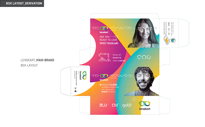
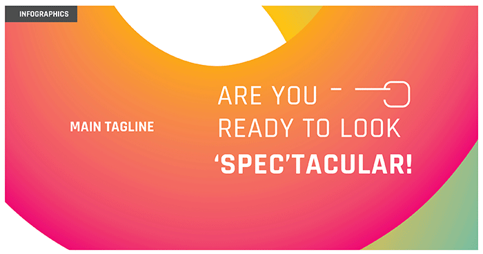
One of the brand’s primary tag lines launched with the re-brand, is “Are you ready to look ‘spec;tacular?” – a pun that was conceived during a fun discussion about the brand, and was eventually appropriated by the company, and used widely in their packaging, as well as advertising. We feel that the line is bold and honest, while maintaining a modern touch to it with the added pun.
To implement our brand language, we began with the cases, boxes, and a few other elements that add to the customer’s experience. The cases were carefully selected and designed to go with the brand’s image, and to make sure LensKart spectacles and their cases will always be distinguishable. The cases are minimally designed, using the three main shapes from our brand language, and with a witty one-liner inside, to keep with the brand’s overall image. Next was the boxes that these cases will be enclosed in. We created vibrant yet clean looking layouts, which are pleasing to the eye while managing to convey a decent amount of information. The colour palette we had previously chosen for the brand was taken forward in these boxes, establishing them further to the customer.
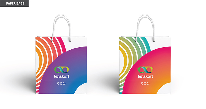
After the initial phase of packaging, we got into slightly smaller touchpoints – a foldout leaflet, and a small cloth to be packaged inside the box with every order; as well as a paper carry bag with the new brand language.
After finishing off with the basic packaging collaterals, we moved on to the in-store work – which was quite a large operation, as this would mean effectively presenting our new language to Lenskart’s humungous customer base for the first time. We worked on in-store-slanters, various posters, standees, shelf-talkers, and finally, the uniforms worn by Lenskart store-employees. The brand language helps to immediately make a space look more lively, and now conveys the intended ‘fun yet practical’ image for Lenskart.
We made a series of web-banners for the brand, which will appear on the Lenskart website. We are also going to be re-vamping the Lenskart website.
After completing the Lesnkart re-brand, we moved on to thier sub-brands; both existing, as well as new ones that have since launched. Beginning with Lesnkart Blu, we created new identities for Lenskart Gold and Air, amongst others. You can see the sub-brands we have worked on here.
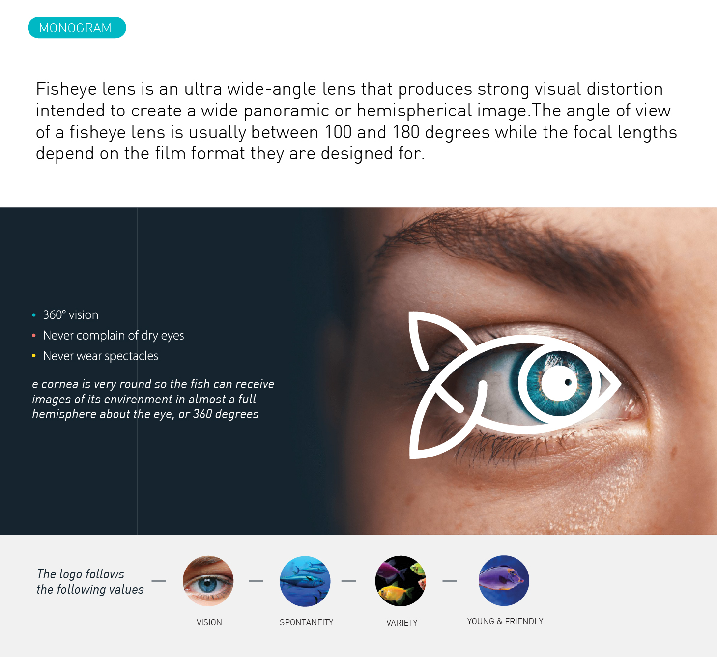
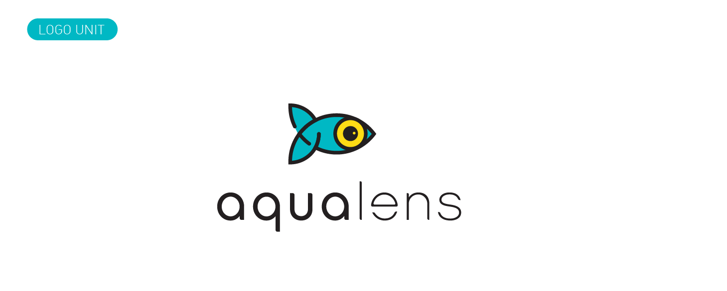
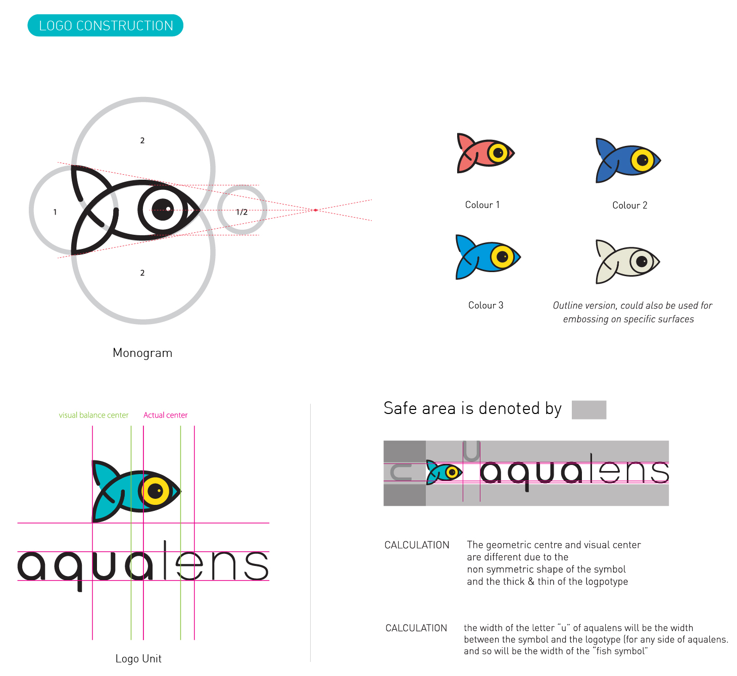
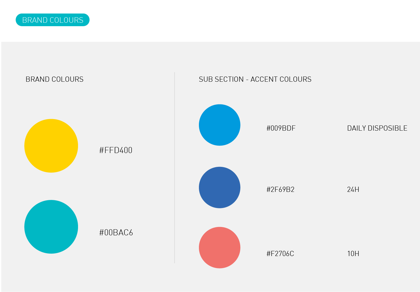
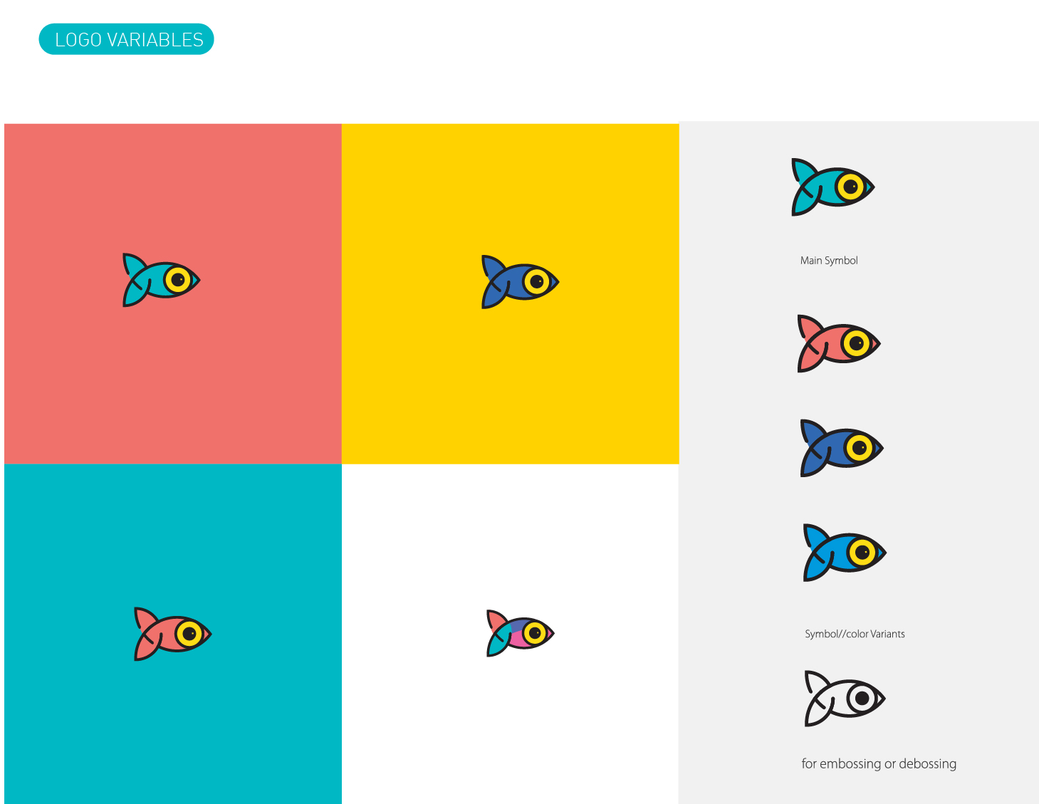
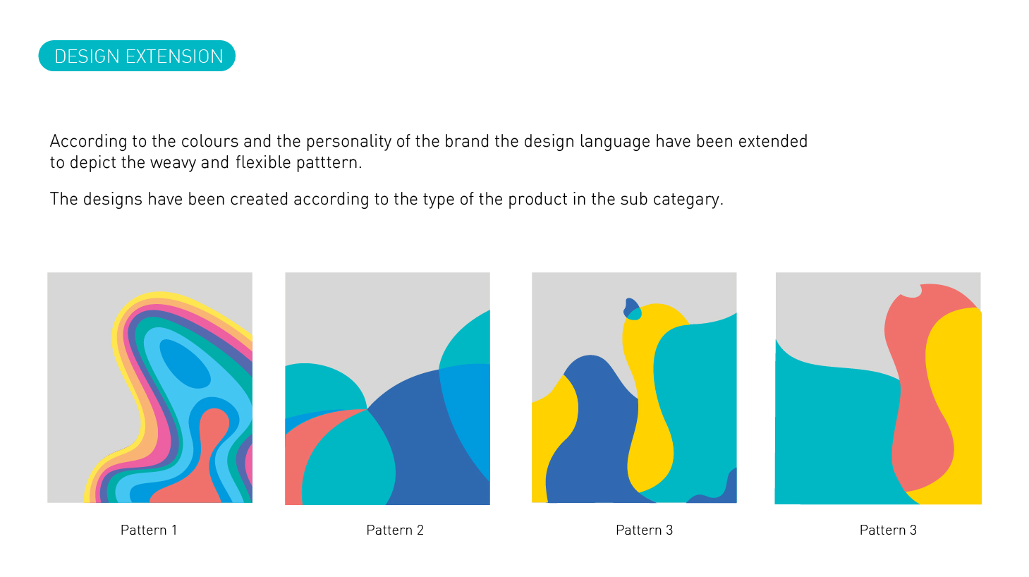
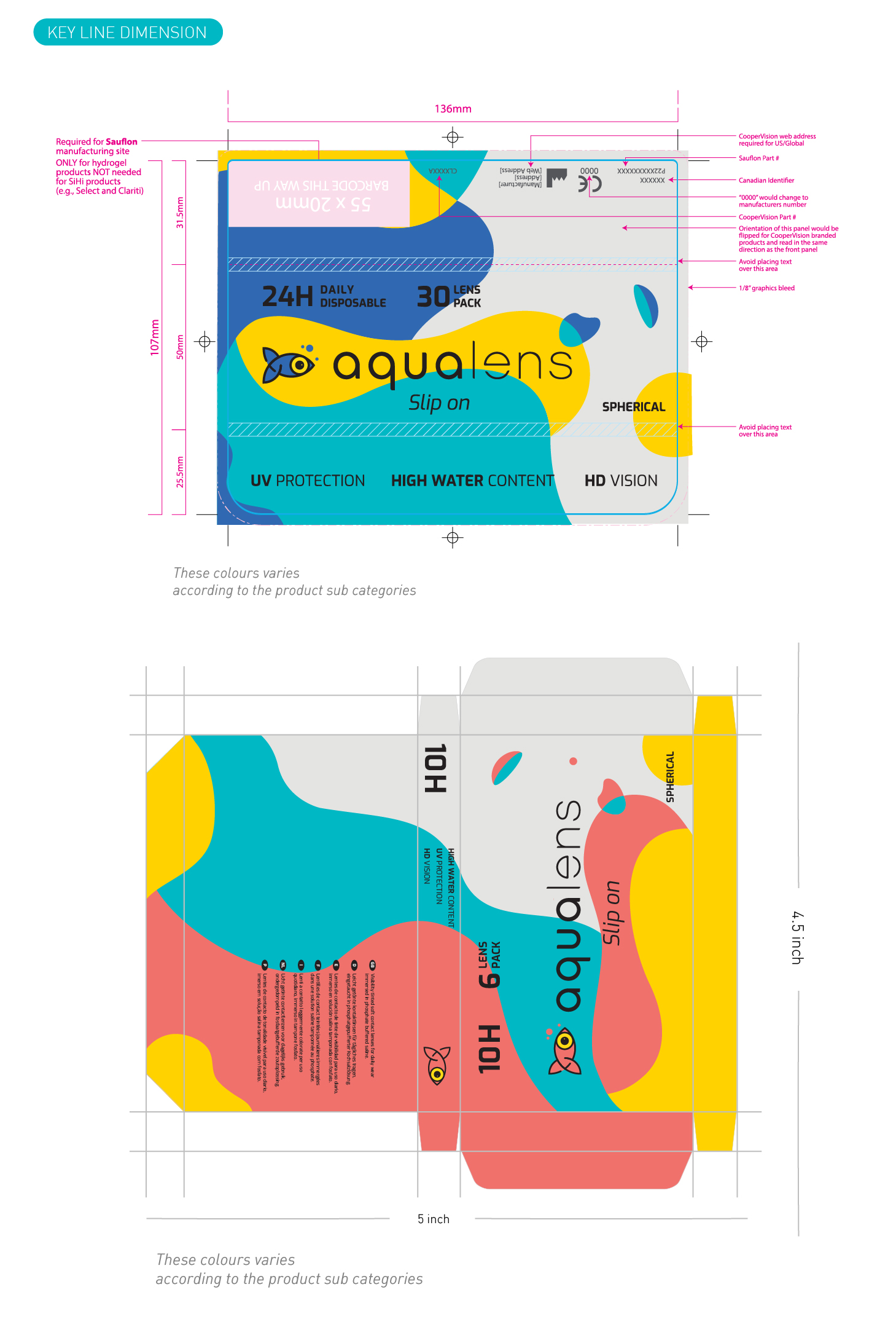
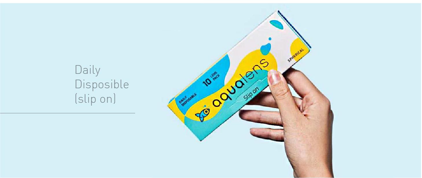
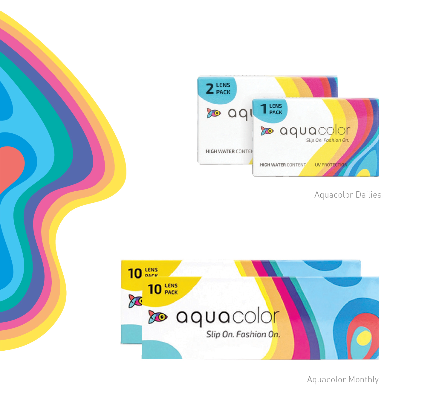
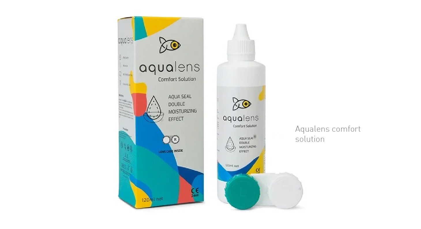
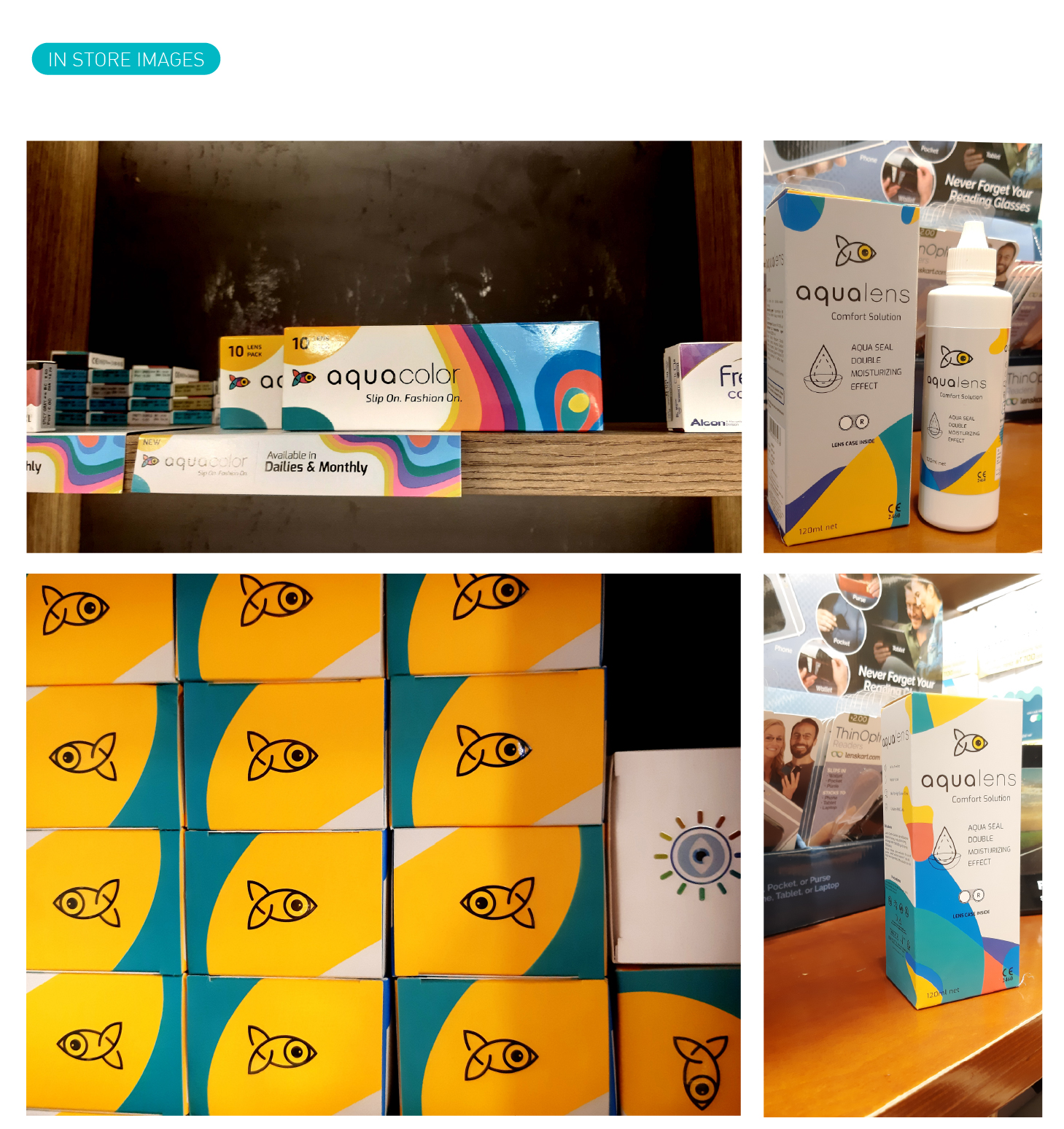
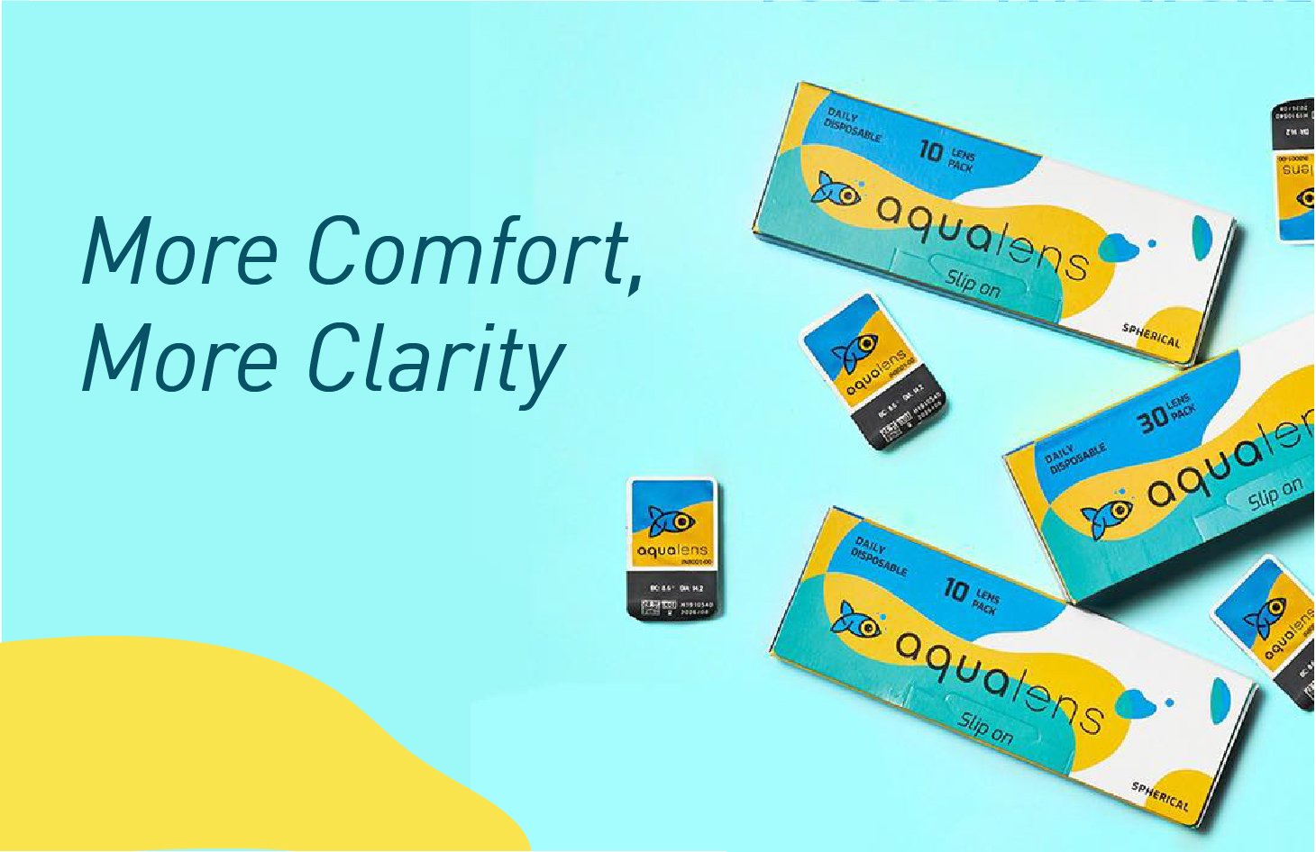
As the name suggests Aqualens is a contact lens brand, introduced by the market giant Lenskart. Aqualens contact lenses are specially developed using the latest technologies to keep our vision intact without letting our eyes feel burnt for it. Aqualens brings us monthly disposable lenses to give regular care to our eyes. The brand has been designed keeping these core USPs in mind to not only distinguish every product from each other but also maintaining its consistency. Aqualens being a relevant brand, understand the user’s day to day life, schedule and working ours to constantly evolving its products and also giving rise to variants that are just the best solution to a particular set of people. With such a massive product range it covers almost all kinds of the working class of people who needs lenses today.
We started with the branding and following the story of its evolution, The symbol “fish” which is the brand career across all product li=nes, the logotype is also designed with a keep eye to detail. Making even the logotype symbolic to the brand. The fluid feel of the visual language goes well with the target group and also gives enough dynamic feel to the branding to create sub brands and a long-range of SKUs.
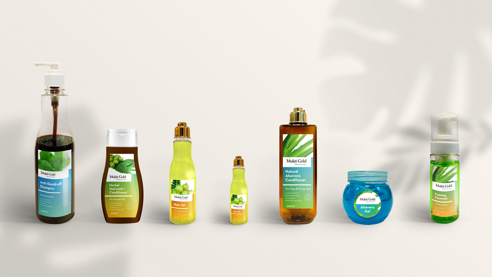
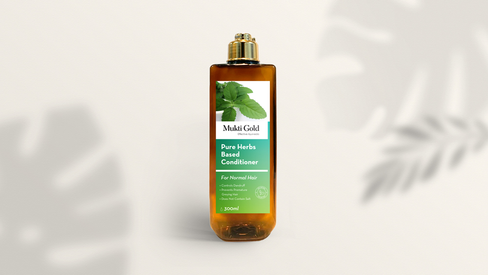
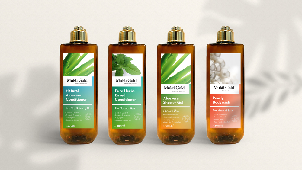
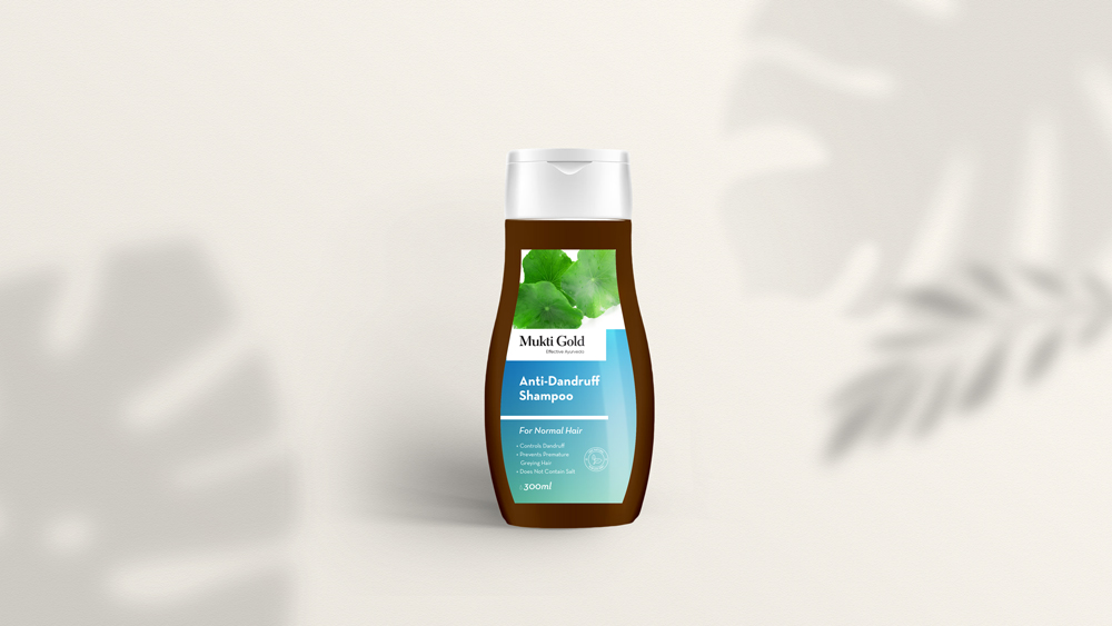
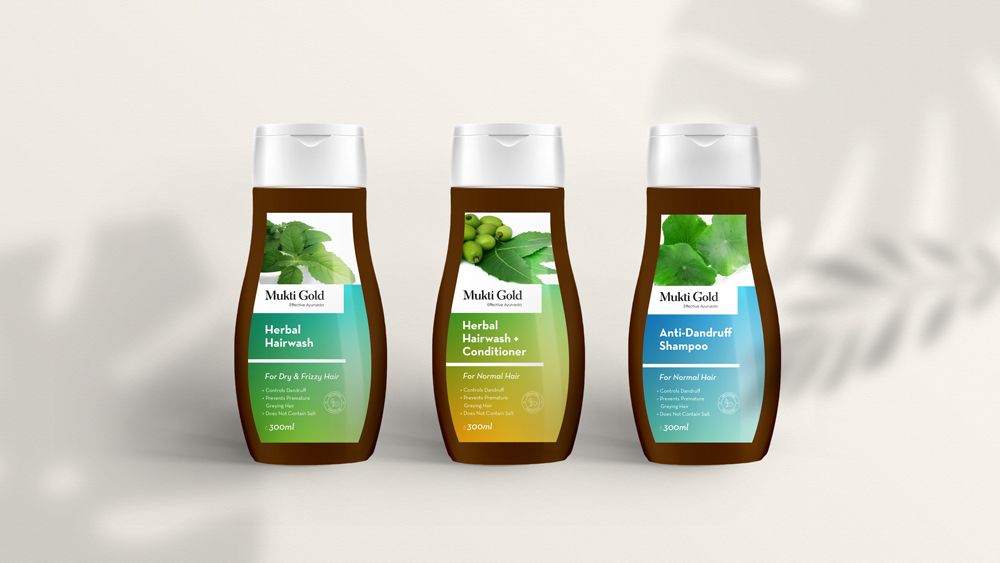
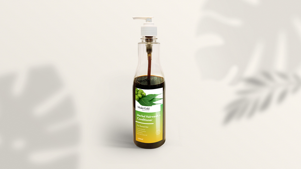
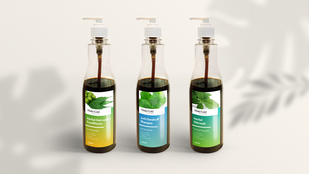
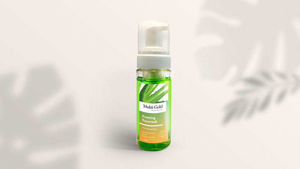
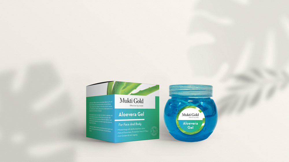
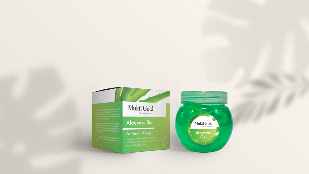
MuktiGold is an Ayurvedic cosmetic brand with a variety of products for Face, Body, and Hair Care. A trusted sub-brand of Axiom Ayurveda, we were approached to re-brand MuktiGold, to transform it from its traditional look to a modern approach, and to create a packaging design system for the entire product line of shampoos, conditioners, face and body washes, aloe vera gels etc. The challenge was to create a system design that is modern and at the same time, shows the ayurvedic ingredients present in the products. To understand the other products in the same sector, we did a market survey and a comparative analysis across the market sections to understand the visual attraction of different products on the shelves in the stores at a minimum of 3 mt distance. Based on the study, a system was designed and the overall visual elements were decided. Gradients were used as the main element of the system design, with different colors representing different ingredients. The ayurvedic ingredients are also directly represented through images on the label design, which makes it easily recognisable. The gradient provides a clean and contemporary feel, with the structure being able to be scaled or transformed into any size, with the space for images to be interchanged on the top portion of the label. This makes it easy to add new products to the existing system as well.


 ‘
‘