ISEE Assessment – UNESCO MGIEP

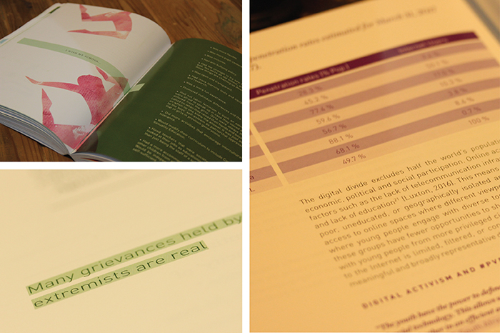
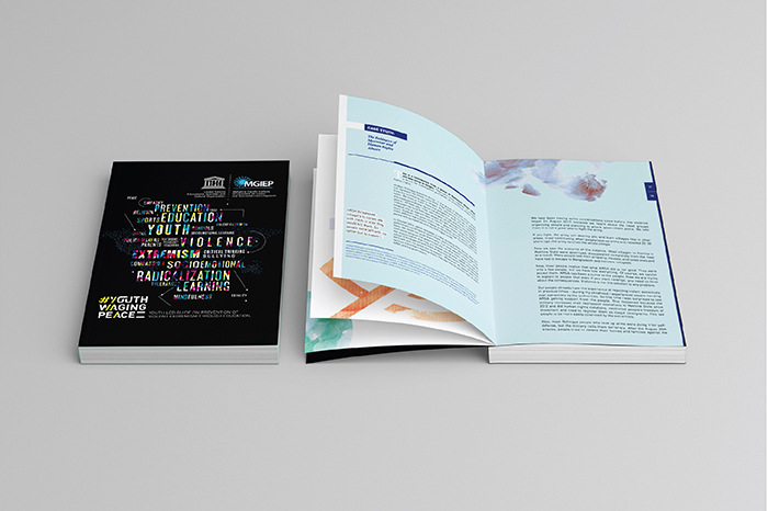
The International Science and Evidence-based Education (ISEE) Assessment is an initiative of the UNESCO Mahatma Gandhi Institute of Education for Peace and Sustainable Development (MGIEP), conceived as its contribution to the Futures of Education process launched by UNESCO Paris in September 2019. In order to contribute to re-envisioning the future of education with a science and evidence-based report, UNESCO MGIEP embarked on an ambitious project of the first-ever large-scale assessment of the knowledge on education.”Reimagining Education The International Science and Evidence-based Education (ISEE) Assessment”

A couple of years back, we were approached by the UNESCO MGIEP team to do the logo/ identity for ISEE, which was done and in use. Last year we were approached to share the whole thought process of “Reimagining Education The International Science and Evidence-based Education (ISEE) Assessment ” and how the documentation of this huge thesis can be put across to its audience.
After much discussion and thorough understanding, we devised two key things which were apportioned and used in the process of designing this publication. A. to divide the whole research and evidence into 4 subgroups. and B. They need to have more than just the textural description, each one of them must have a visual depiction, an abstract scene of a process, a story that reflects the same energy, freedom of thought and also the

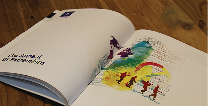
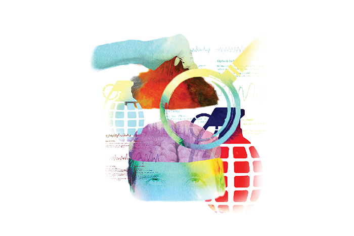
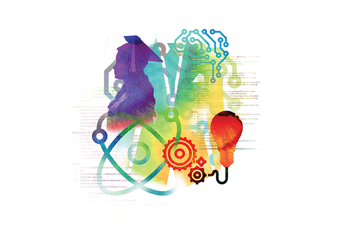
For, A. The Division of the full publication into four was a major step. The four divisions then stand as 1. Education & Human Flourishing, 2. Education & Context, 3. Education & the Learning Experience and 4. Education – Data and Evidence. They were colour-coded and also have a visual narration of the idea in an abstract way, which brings us to part B. which was to illustrate the 4 stages into 4 very complete structures in themselves, but just like the whole concept of ISEE, we kept the visual narration not too cliche and took a more meditative and mind journey kind of narration.

The four parts of the story as described below:
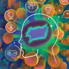
Artwork 01: Exploring the possibilities, from your ecosystem.
The Being is excited and happily surprised to receive so much positive energy and learn from its surroundings. All it concentrates on is to receive it. And slowly all of it starts making sense// forming shape. Still lucid, but now a form, A form that is ever-evolving and the being is discovering new nuances every moment in it.

Artwork 02: The Need to take it to a Better space, to throw light to more people, to share.
The being, take it this newly achieved knowledge to places, in the process the being evolves itself and while it is growing the form grows further as well. The being realises, Sharing is always two ways, when you give, you get something in return if you are open and accepting.

Artwork 03: The idea to make it a process, After all, process is what matters, It needs to be part of a “structure”
The being reaches the pool of knowledge and looks for the Meta Lotus. Lotus represents art, design, mathematics, structural genius and methodology
Thousands of luminations leave the lotus, after being enlightened with some or other kind of knowledge. The Being gentle slides the evolving ball of knowledge into the meta lotus.
The Lotus and the ball of knowledge becomes a seamless force to the awakening of knowledge.

Artwork 04: The idea of “when you give// you also receive”, the universe is watching. comes into play.
The being transforms into a MetaBeing. All wisdom, all acceptance. A new beginning a new source of knowledge.

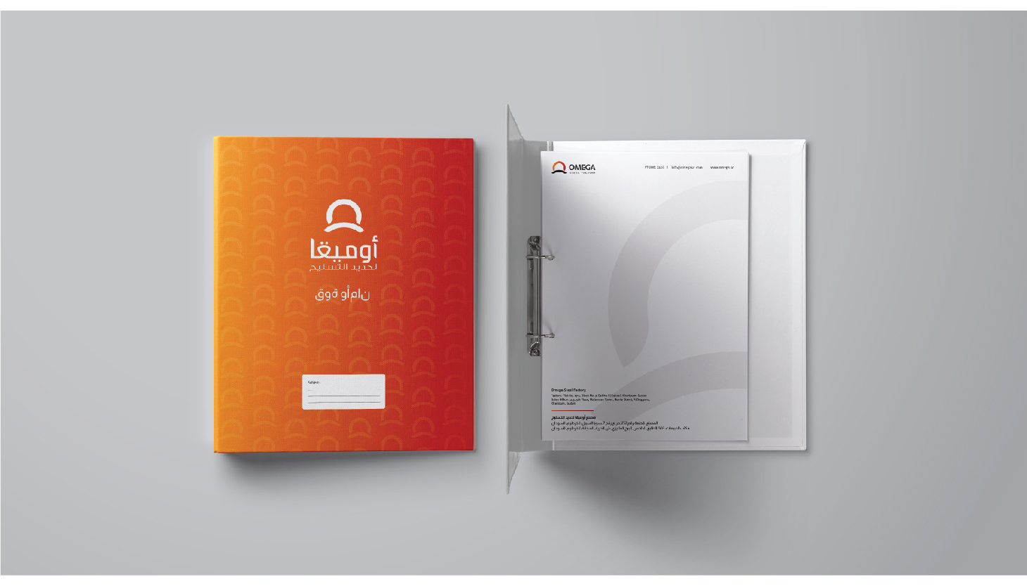
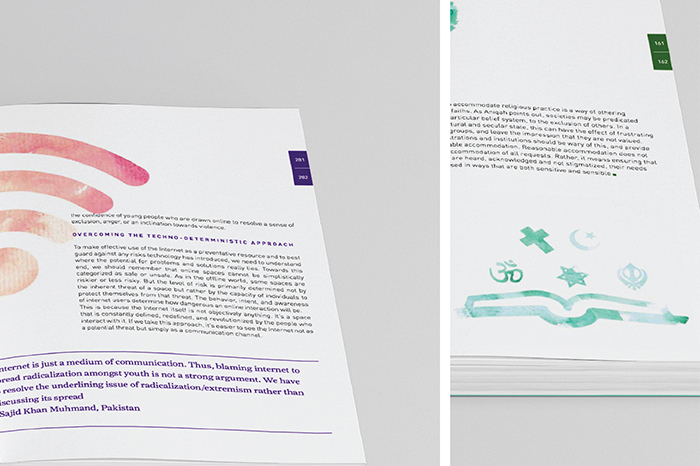
The rest of the publication and layout design was taken care of with various visual tools of publication design that help us create a great system design for the layouts to adapt to change and also communicate in the best possible way. We also designed a case to keep all four books together, along with the summery and highlights. We also designed a few promotional collaterals, like standees, leaflets and flyers, for the international launch of the publication.

UN

The UN headquarters in India approached us to design the Annual Report for 2020. ‘UN with India – Annual Report 2020’ focuses on the effects of the COVID-19 pandemic in India, and how the UN mobilized its resources and capabilities for the country throughout the year of 2020. The Government of India – United Nations Sustainable Development Framework (UNSDF) is the framework of cooperation, results and strategies that brings together the work of the UN agencies in the country and guides UN India’s cooperation with the Government of India. The UNSDF is guided by India’s development goals of a better quality of life for all citizens, and consists of seven Priority Areas: 1) Poverty & Urbanization, 2) Health, Water and Sanitation, 3) Education, 4) Nutrition and Food Security, 5) Climate Change, Clean Energy and Disaster Resilience, 6) Skilling, Entrepreneurship, and Job Creation, 7) Gender Equality and Youth Development.

The data provided in the Annual Report is divided into these 7 priority areas, each colour-coded according to the respective colour in the Sustainable Development Goals of the UN. We created a system design, where the section colours and the key of icons differentiate one priority area from the other, with the distinguished UN blue as a common colour throughout the publication, along with a bright yellow. The resulting publication design has different colour blocks intermingling with each other in clean yet engaging layouts. The stencil version of the font adds a dash of an experimental feel to the otherwise clean design language.

Three sets of infographic designs were created for the system, to visualise different types of data. Photographs play a prominent role in the entire publication, with clear references given to the different agencies such as UNHCR, UNDP, UNICEF, WHO etc. We intentionally created captions with a large font and noticeable boxes to give importance to the photography, as well as the stories behind them.

UI

Ultra Internation Limited is one of the pioneers of the business of Flavours and Fragrances in India. It is one of the oldest brands across the globe to establish its success story, known across the fragrance and flavor world, where every chapter is marked by innovation. No wonder, that their innovative approach to meet customers and expectations has won them national as well as international business accolades.

It is nearly a 100 years old brand and it was a prestigious project for us to handle. Especially since we were changing the indeed & brand language of a brand well established.
Understanding the sentiments and alignment to their earlier ideas and the logotype, we came up with something that the decision-makers at UI really liked, then we went on to expand the visual language across all communication.
other than working with the graphical elements, colors, fonts for communication, we also stretched ourselves to draw a few illustrations expressing the love for the work they do for all the three major categories of Fragrances, flavors, and essential oils.s The illustrations were made using the ingredients of each section and to fit into the logo form, replacing the leaf with the artwork.

StarSteels

StarSteels initiated its operations with R&D going through the early phases. In 2020 they planned to launch the brand in dubai. Start steels’ core idea is to involve newer technologies in the product as well as in the formation of new kids of the product keeping in mind the various design explorations happens in the sector of construction in Dubai. They came to us with the idea of a branding that must look cohesive to the company’s core principles

We experimented with many forms and constantly reevaluated the concept. We finally got  a form that transcended itself into various forms of a singular visual vocabulary.

The logotype was done with the same idea of  keeping the modern approach in mind and also the fact that the brand is going to experiment with technology.

The various forms of the visual vocabulary can be seen across it’s collaterals. We are working on the marketing aspect of the brand where we will talk much more in detail about each of its products and how the market is going to gain from the strength of this brand.

starsteels-02

starsteels-03

starsteels-04

starsteels-05

starsteels-07

starsteels-08

starsteels-09

starsteels-10

starsteels-11

starsteels-12

starsteels-13

Omega Steels

Omega Steel is one of the leading manufacturers of Steel Bars in Sudan. Built on the values of reliability and quality, Omega Steel has become one of the most trusted suppliers to the construction industry in Sudan. With a production capacity of over 350 MT per day, Omega Steel can provide consistent and dependable supply for your projects.

Run by an international team of professionals with a cumulative experience of more than 300 years in the metals manufacturing industry, and backed by Italian steelmaking technology, Omega Steel manufactures quality steel that is compliant not only with Sudanese standards, but also with British and Indian standards. Given our management’s rich experience in specialised steelmaking in India and in other parts of Africa, we bring world-class levels of service and quality to Sudan. We are one of Sudan’s few integrated manufacturers – with full control over the steelmaking process – right from scrap up to finished products. Our melt-shop allows us to monitor chemistry and quality from the beginning up to the end.”

Omega steel-01

Our Perspective:
” To do a rebranding, that too for a company, which is running successfully for a decade. We started brainstorming from the core value of the brand that says ” strength & safety”. We started with the research on the icon, and the logotype. and after a rigorous work of 3 – 4 weeks we came to the final form. The ask was to give a new form, yet retaining the old face value and also live up to the mark of being a known brand”

Omega steel-02

Omega steel-03

Omega steel-04

Omega steel-05

Omega steel-06

Omega steel-08

Omega steel-09

Omega steel-10

Omega steel-11

Omega steel-12

Omega steel-13

ADAA Coffee Table Book for Samsung

The ADAA coffee table book for Samsung is a design inspiration book made for the benefit of the in-house design team at Samsung. The book features the style-evolution of India; in a timeline format – beginning from the Indus Valley Civilisation, all the way to the present 21st century. India is a country with a diverse range of styles, due to different influences from all around the globe through the centuries. The purpose of this book is to make the reader aware of the untapped reservoir of design inspiration in India.

The timeline is divided into three parts; the history of India, India post-independence and the growth of India after the 1991 economic liberalization. These parts are further divided into eras, with information and images to do with the architecture, art & craft, fashion, food, utensil, entertainment, appliances & gadgets, transport & automobiles of each era.

Since the book has a vast amount of information and images, we designed a system for the 3 parts of the timeline. Each section is also icon-coded or colour-coded for easy consumption of content. The book was very well received by the team at Samsung.

1

2

3

4

5

6

7

8

9

10

11

12

14

13

15

16

17

18

19

20

UNESCO MGIEP – Annual Report & Brochure

The UNESCO Mahatma Gandhi Institute of Education for Peace and Sustainable Development (MGIEP) is UNESCO’s category 1 Research Institute that focuses on Sustainable Development Goal (SDG) 4.7 towards education for building peaceful and sustainable societies across the world. We designed their Annual Report for 2017/18; as well as a Brochure, which serves as a quick introduction to the organization and their work.

Annual Report

One of the primary objectives in the brief given to us, was to make sure that the content is distributed and comprehensively aided by visuals – both photographic, as well as illustrated. We also made sure the infographics in the document were represented interestingly, while still maintaining their simplicity.For the visuals in the document, we came up with two distinct styles – one for Section Headers, and one to go along with body copy. For the Sections Headers, we made various collages using basic shapes construed with objects illustrated in a woodcut style; while for the body copy of the document we made compositions using multiple icons related to the text.

Brochure

The MGIEP Brochure posed more of a challenge than the Annual Report – we had to fit a very large amount of information on a single sheet of paper while keeping the reader interested, and without compromising on legibility or balance, of course.After a lot of research into different methods to fold a brochure, we settled in on one, and managed to distribute the vast content of the document on either side – keeping the front side with minimal information and an illustration (as we were told to make one side usable as a poster) – while the back contains most of the body copy, as well as a list of partners.The illustration we made for the brochure had to find a balance between being striking and catching one’s attention, while still conveying an insight into the work done by UNESCO MGIEP.

Both the Annual Report, as well as the Brochure were very well received by our client and has been distributed widely by them.

1

2

3

4

5

6

7(featured also)

1

2

3

5

5

8

9

10

11

12

13

14

15

16

17

18

UNESCO MGIEP – The Blue Dot

The Blue Dot is UNESCO MGIEP’s bi-annual publication, featuring articles showcasing their activities and areas of interest. The magazine’s overarching theme is the relationship between education, peace, sustainable development, and global citizenship.

Keeping the theme in mind, we designed a system for the layout of the magazine for the July 2018 issue. This edition is primarily focused on digital pedagogies to transform learning.

There were six sections in the magazine, each of which has been colour coded and follow a grid structure designed for that section. The entire magazine had a common theme running across, so every section was colour and icon coded with its own unique layout style for the ease of the reader. The system has been created keeping in mind the bigger picture of the magazine, rather than just the content of this particular issue, so that the same system can be used seamlessly in future issues.

The opinion section of the magazine was integrated with illustrations and images, which were a representation of the author’s perspective, giving context to the reader.

all the blue dots together

cover image_website

blue dot_grid

inside blue dot

foreword_1

blue dot_grid

detail of a forward

blue dot_grid

blue dot_grid

empathy opinion

elephant opinion_web

haathi-animation-12-Recovered

blue dot_grid

blue dot_grid

blue dot_grid

blue dot_grid

blue dot_grid

comicstaan

blue dot_grid

blue dot_grid

UNESCO MGIEP – Youth Waging Peace

The UNESCO Mahatma Gandhi Institute of Education for Peace and Sustainable Development (MGIEP) is UNESCO’s category 1 Research Institute that focuses on Sustainable Development Goal (SDG) 4.7 towards education for building peaceful and sustainable societies across the world. We designed a document that they published in December 2017, to be distributed to countries that UNESCO works in, all over the world.

The #YouthWagingPeace guidebook is a document for anyone interested in understanding Violent Extremism and exploring the relationship between Education and Prevention of Violent Extremism (PVE). The guide garnered over 2000 youth submissions/case studies, and finally integrated over 150 case study submissions from young educators and practitioners from 50+ countries. It provides a set of actionable guidelines for PVE to teachers, school administrators, policy makers, family, religious leaders and other informal influencers.

We integrated the content with illustrations; using a style that we developed which is a juxtaposition of icons and water colors; to make the guidebook easier on the eyes, and to keep readers thinking beyond just the text. The body text (though considerable in amount) is comfortably spaced, and therefore not just bodies of text that one tends to skip.

The book was very well received, globally, and even garnered special mentions from various members and advisors to the United Nations, urging for it to be translated to multiple languages so it can be distributed further.

The typographic unit we created for #YouthWagingPeace, has now become a globally used symbol for the movement; and many of the illustrations we created have now been used in promotional capacities to help spread the many important messages the Guidebook carries.


 Print
Print
Print
Print
Print
Print
Print
Print
Print
Print
Print

India Fashion Forum 2017

INDIA FASHION FORUM (IFF) was born alongside the genesis of organised modern retail for fashion in India, out of pure passion for boosting fashion creation and consumption in India. The modus operandi was to catalyse the business to think Fashion Forward, Plan Long-term, and act with Creative Intelligence.

Every year since then, IFF has been the focal point for fashion captains to converge – LEARN, SHARE and EVOLVE – with the single-minded agenda to fast forward growth for the entire value chain – from yarn to retail.

IFF 2017– The 17th Edition, an annual 3-day event organised by IMAGES GROUP to foster the ‘Business of Fashion” with novel business opportunities, ideas, inspiration and industry partnerships. The event has been branded and conceptualised by the studio for the third consecutive year. As with the past 2 years, the event required a dynamic bold identity which had to flow throughout the space and other collaterals. The concept of technology and fashion coming together gave us the opportunity to explore the many tenets fashion and retail. 3d fluid forms in vibrant hues juxtaposed with futuristic croquis took over the visual language this year, and the same was extended into venue graphics and space design for the event.

Our past work with India Fashion Forum can also be found here.

upload-07

upload-10

upload-01

upload-02

upload-03

upload-04

upload-08

upload-05

upload-06

Crystal Lounge | THE GRAND, New Delhi

Crystal Lounge at THE GRAND, New Delhi is the place to see – and – be seen. Guests are delighted by the panoramic views that look out onto lush landscaped garden and beautiful water bodies. Ideal for a business engagement, friendly gatherings or a romantic rendezvous over the perfect cup of tea or coffee. The look we had in mind while designing the identity was for it to be modern and ahead, a unit that complements any fashion or format. The idea was for it to be timeless. We crafted a logotype from scratch to make the unit exclusive and unique. Gold and black used across the print collaterals suggest premium, classy and exclusive.

1

2

3

4

5

Images – Business of Fashion

Images Business of Fashion is a B2B magazine led by research in the Indian casual-wear market, its size, growth, evolution and key trends and opportunities and growth over the years.

The identity and publication design for this magazine extended to promotional collaterals as well for events hosted by the magazine. With a system of icons also created for the analytical and statistical industry insights it provides for its readers. The studio worked on 4 issues of the magazine in 2016 afterwhich the system of design has been carried forward by the publication.

Opening-page

october issue

detail opening

opening-03

detail1

bofupload-08

opening-01

Imperial Greens

Imagine…

You’re lost in the midst of a cornucopia of myriad shades of green. A cacophony of twittering birds breaks the stillness of daily routine. You and your neighbours are separated by a backyard fence that comprises of embracing creepers.An early morning walk allows you to discover a new species of exotic orchids; or spot a gecko scurrying over an overhanging branch. An ecosystem, that doesn’t require you to drive miles out of town for a breath of fresh air. Imperial Greens is a residential township structured at Rudrapur, Uttrakhand.

Deriving inspiration from nature, the form reflects a perfect mix of balance, cosmos and life, all coming together for IMPERIAL GREENS. Emphasising on the typeface used, it has been customised to mould it for both the sturdiness of the houses available along with the lustre that nature has to offer the residents of Imperial Greens. Apart from the earthy concept, this space has more to boast about, be it the modern architecture of the houses or be it the amenities of the complex. Imperial Greens has it all. We helped them make this concept shine through a 40 page brochure and creating a visual language which runs throughout the advertisements and hoardings.

introimage

03

04

05

picture1

4

1

2

08

5

6

picture2

picture4

7

picture7

newspaper ad

aaaa

Outdoorsignage

x1

x2

Lee Cooper

Lee Cooper is well-known global lifestyle company operating worldwide. Started in United Kingdom back in 1908, it made its way to India in 1985. Our task was to redesign the former brand language to promote their new range of shoes, which at the same time reflects the British roots of the brand.

We achieved that by taking on a comprehensive approach and drawing inspiration from geometric forms prevalent in the structural formation of the iconic London bridges. Incorporating elements/shapes like the “rhombus” that are representative of the brand. We formulated abstract patterns based on an isometric grid and followed a distinct color scheme. Tone of voice and copy lines further communicate the unique attributes of the brand.

Lee-Cooper-Front-GIF3

1

x

y

5

6

The design language was taken forward while designing the catalogue for Lee Cooper’s Autumn Winter Collection of 2015.

7.2 copy 2

8.1

8

The design language was also applied across other advertising mediums, during the festive season.

9

10

HOMEMakers

Home Makers is the real estate research and services arm of NNA Consultancy Services Pvt. Ltd. that aims at helping both end users and investors make informed decisions pertaining to their housing / investment requirements. Home Makers Location Reports are an amalgamation of standard real estate and township planning data collected from in house research with a detailed description of the local infrastructure, new developments and current realities of the subject location.

We were asked to redesign the visual language for their periodic reports. For the first half of the financial year 2015-2016. Following a distinct colour scheme and info graphic style treatment we also worked on the cover illustrations for the same.

1

2

4

5

6

7

8