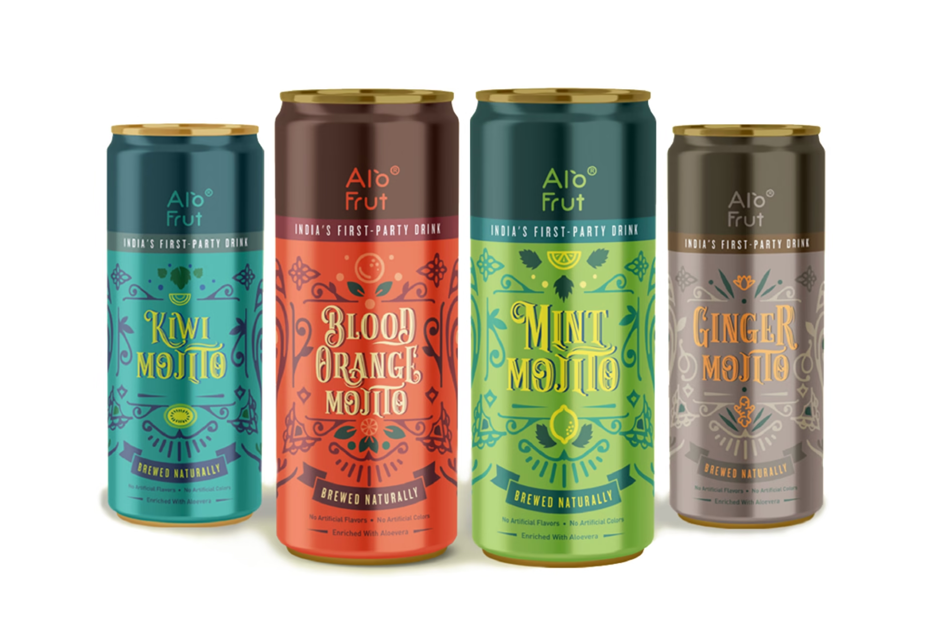
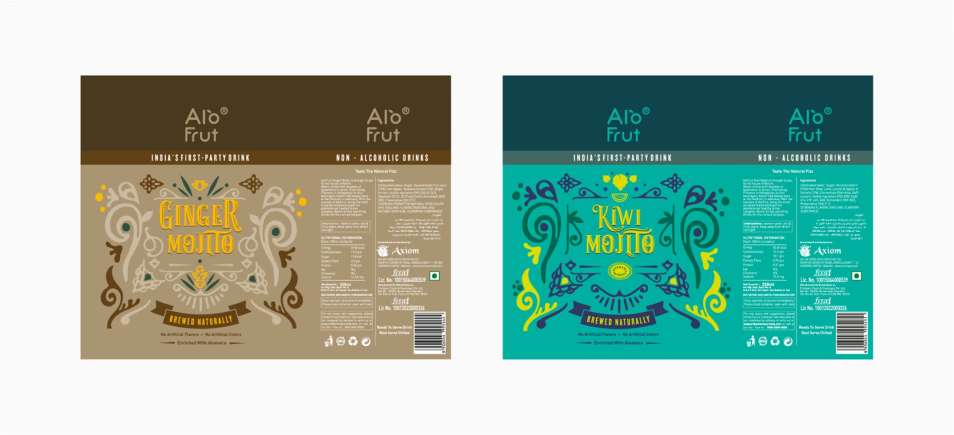
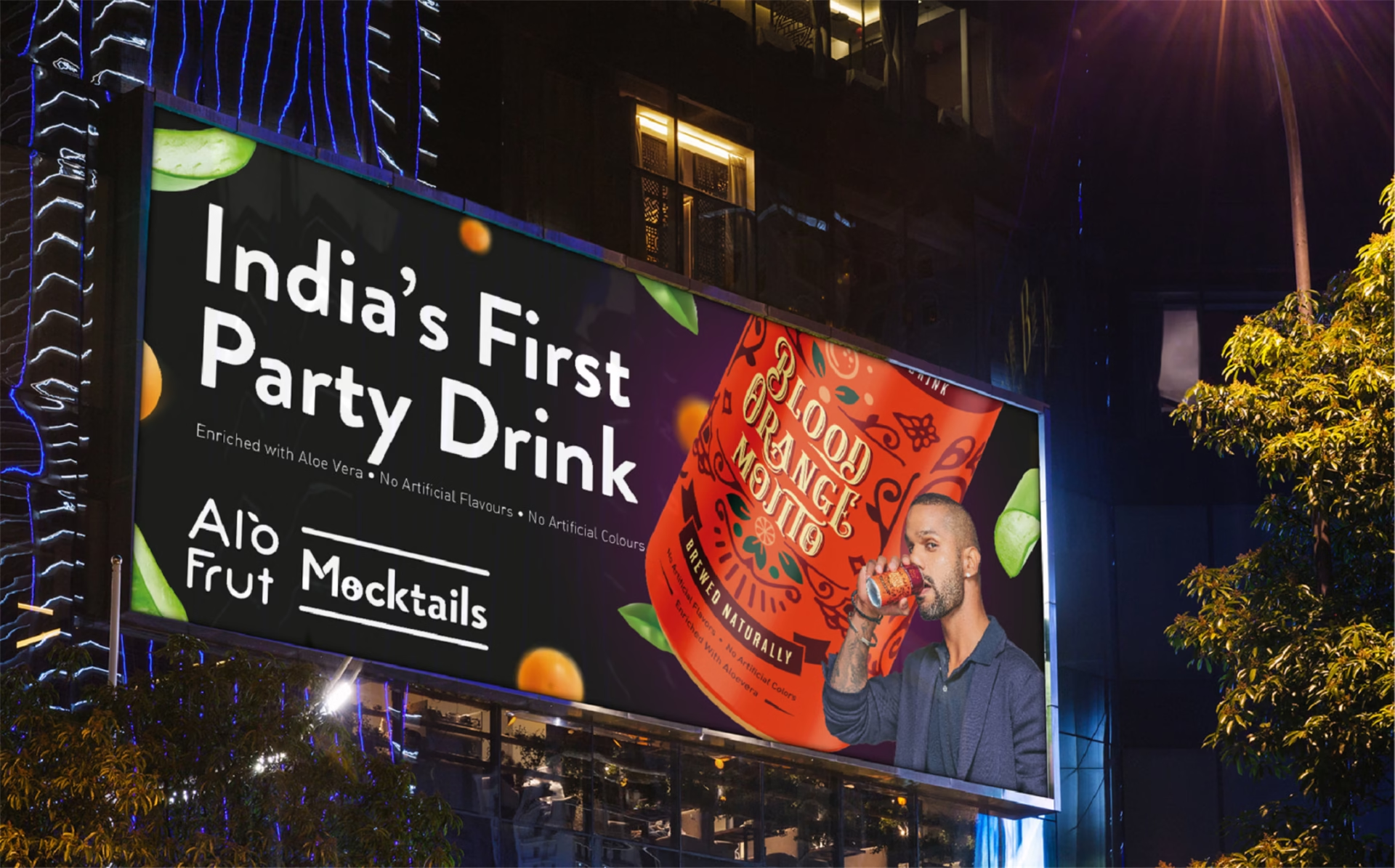
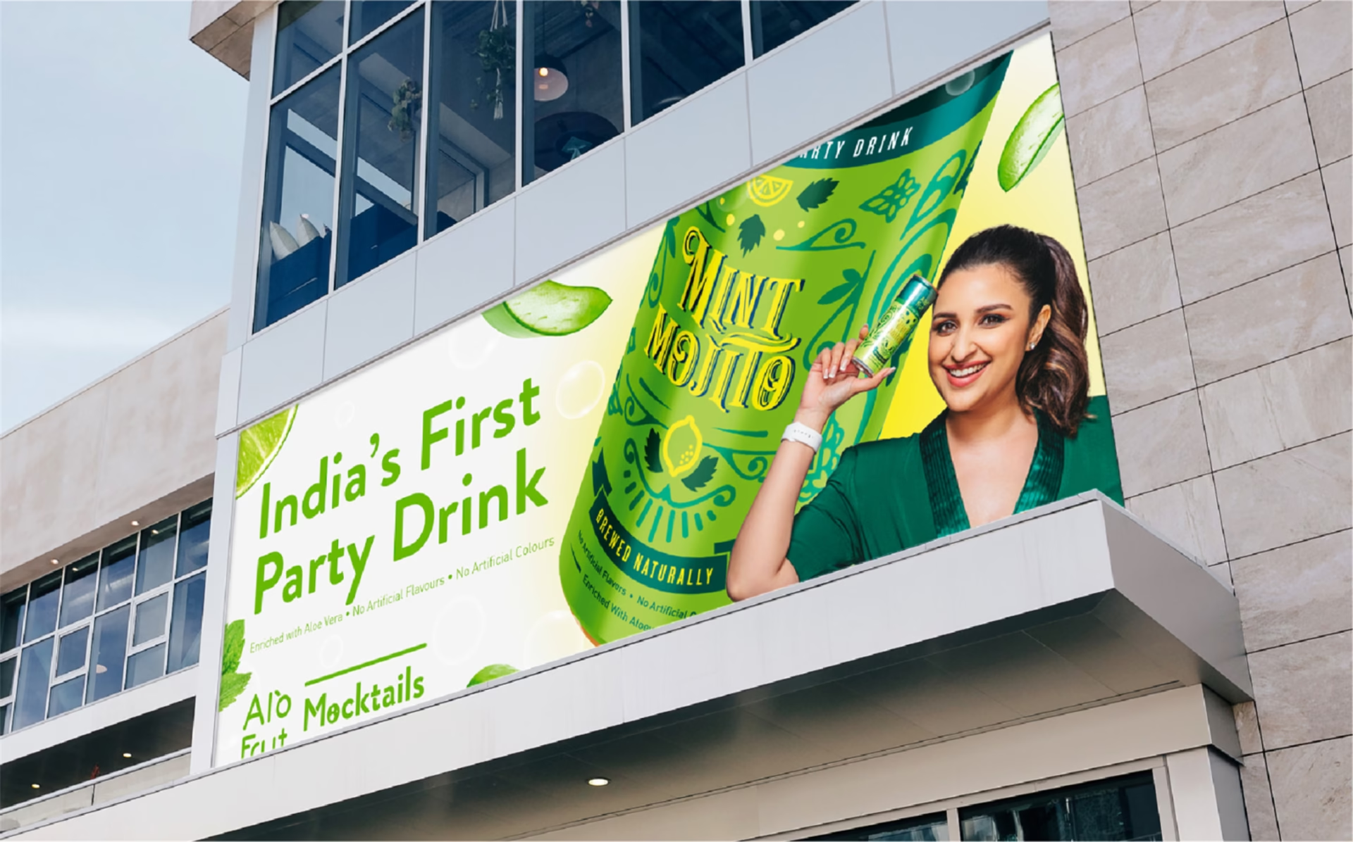
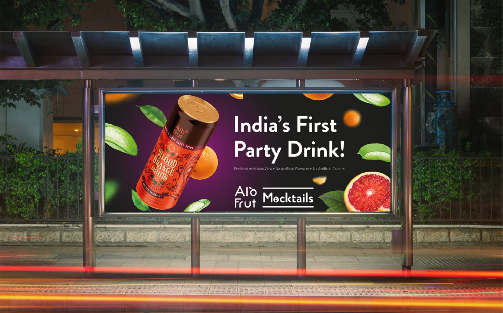
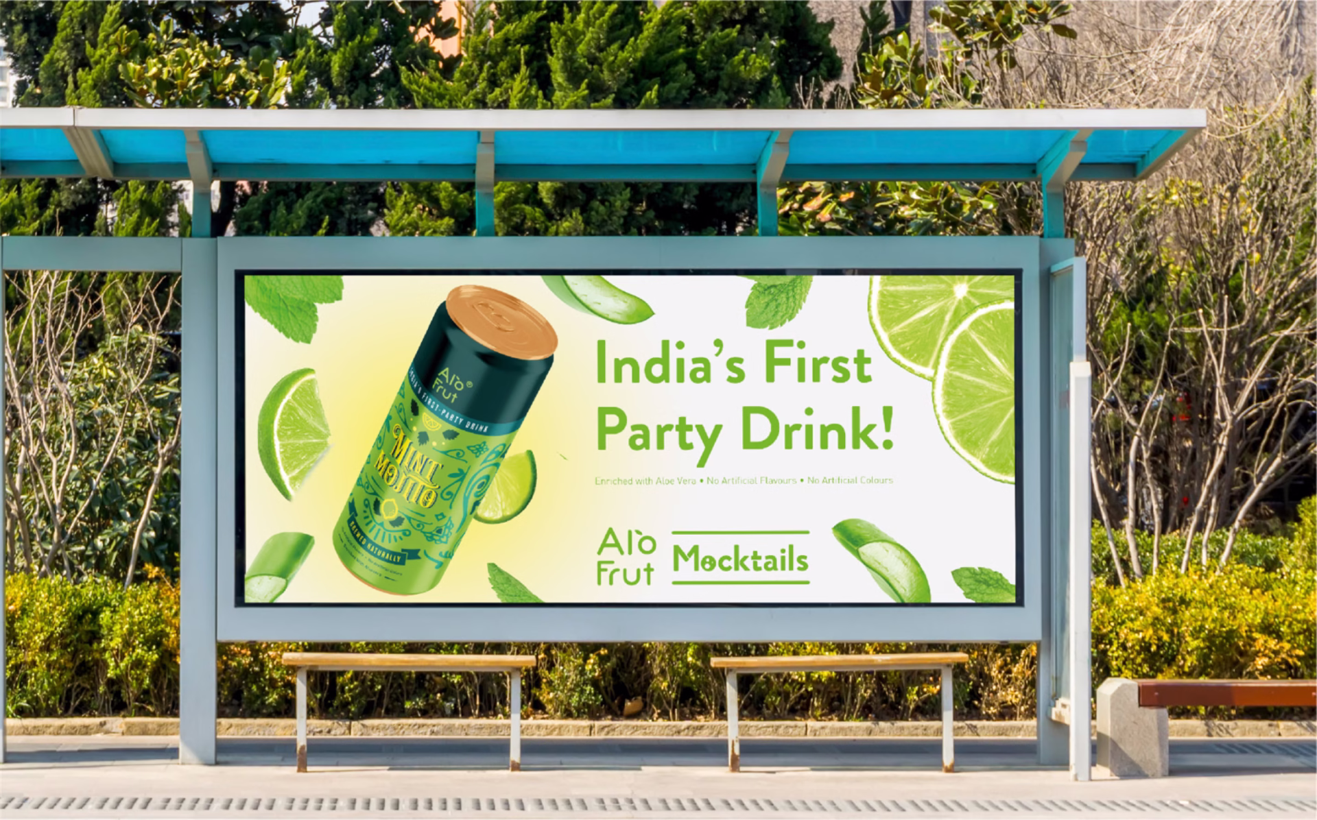
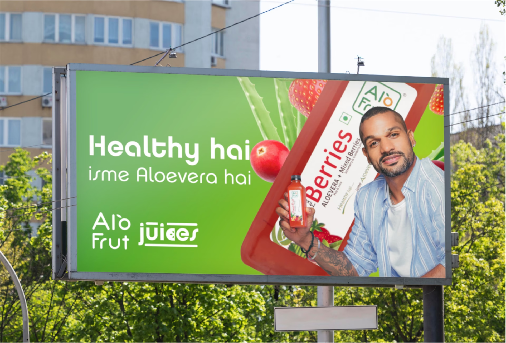
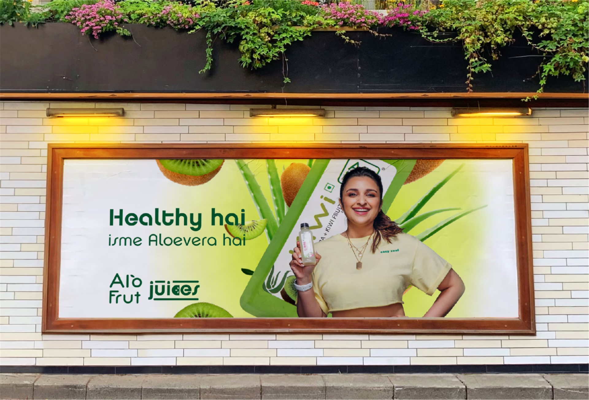
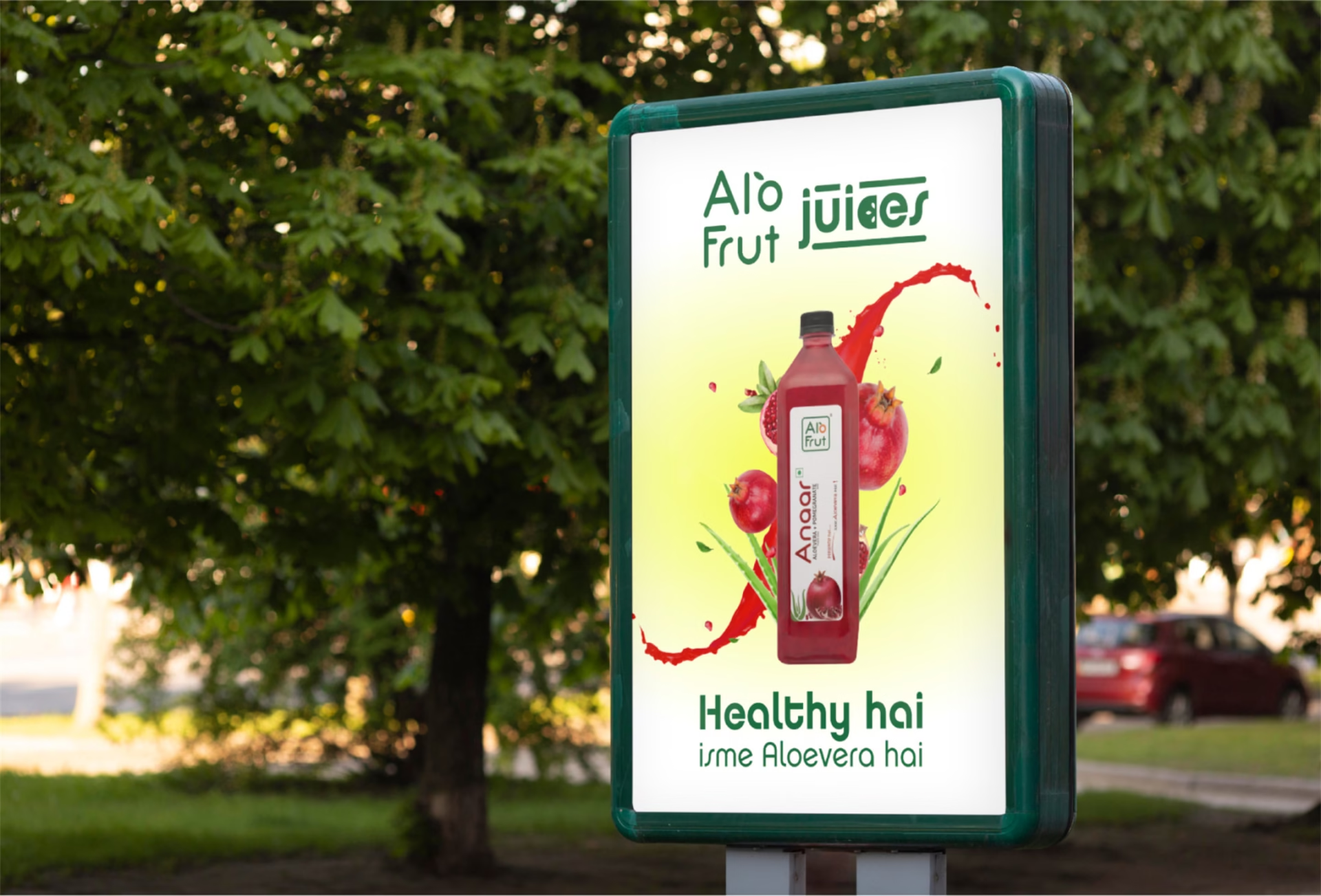
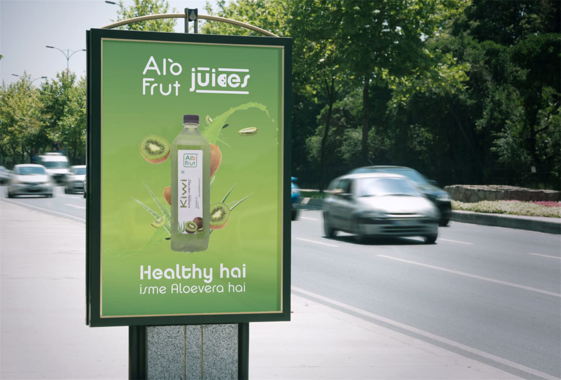
Project Overview
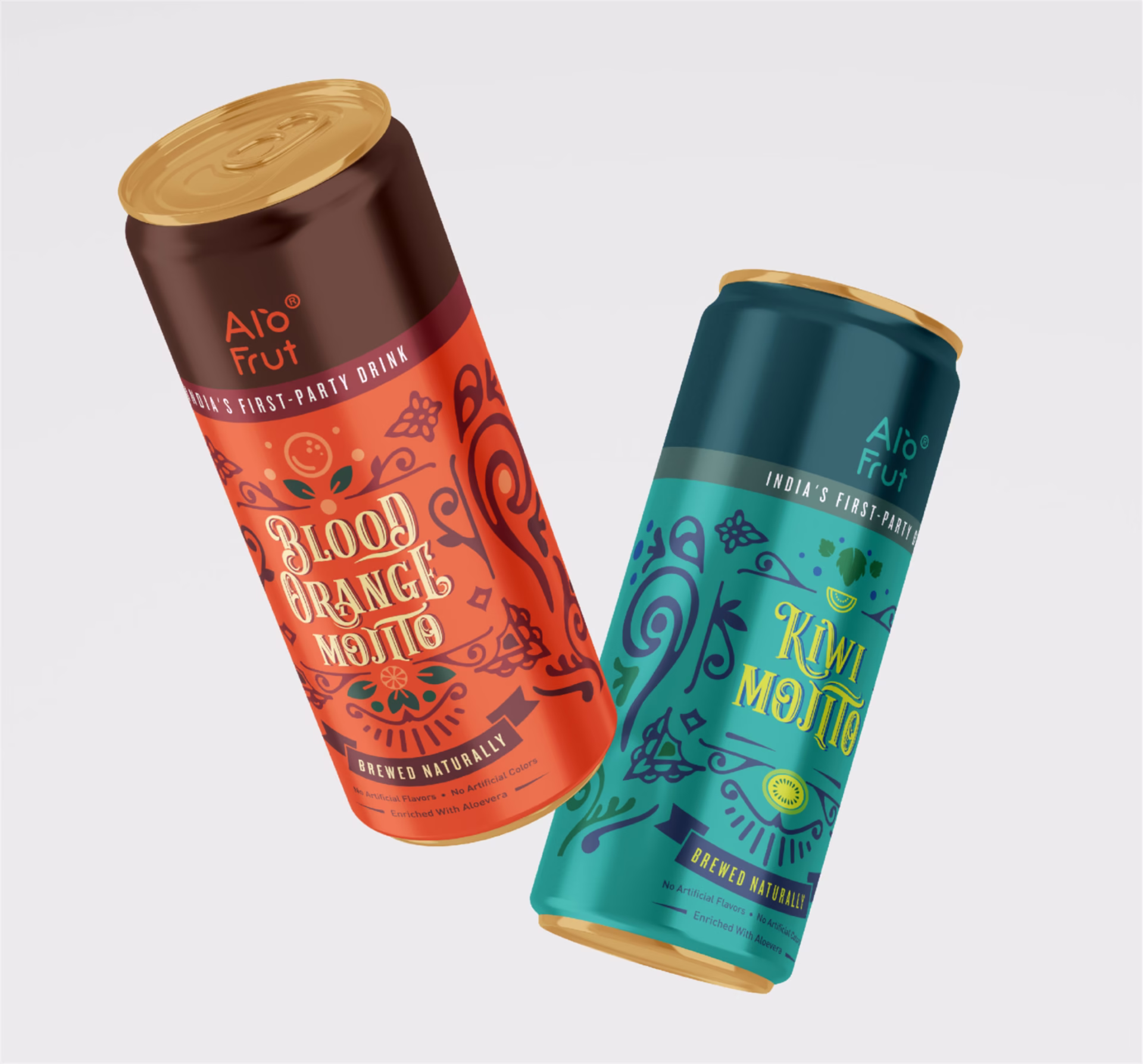
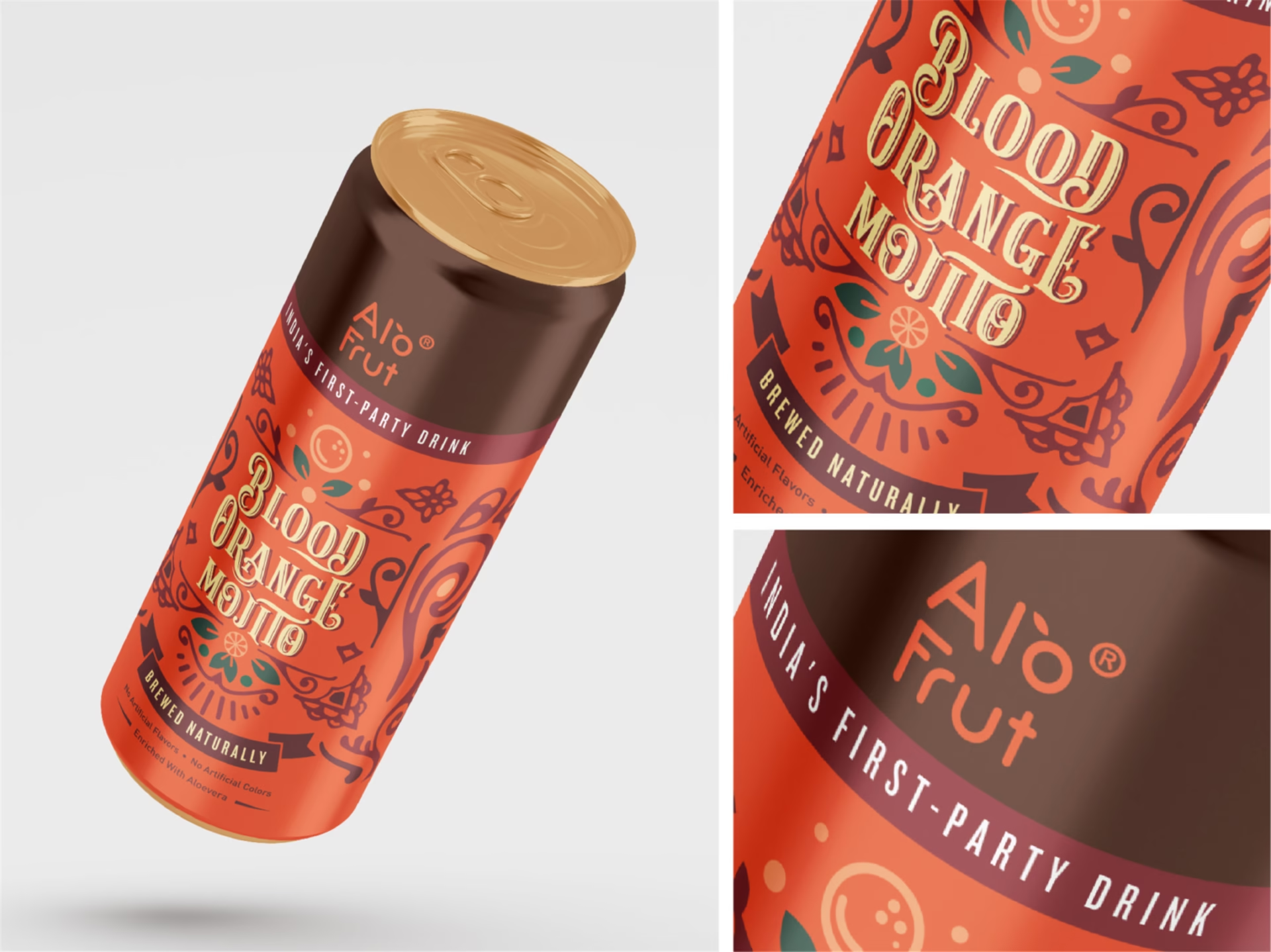
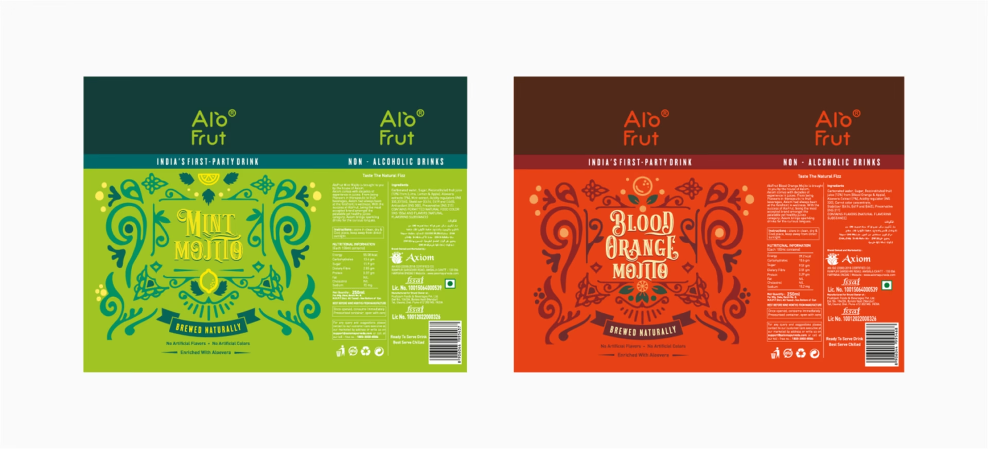
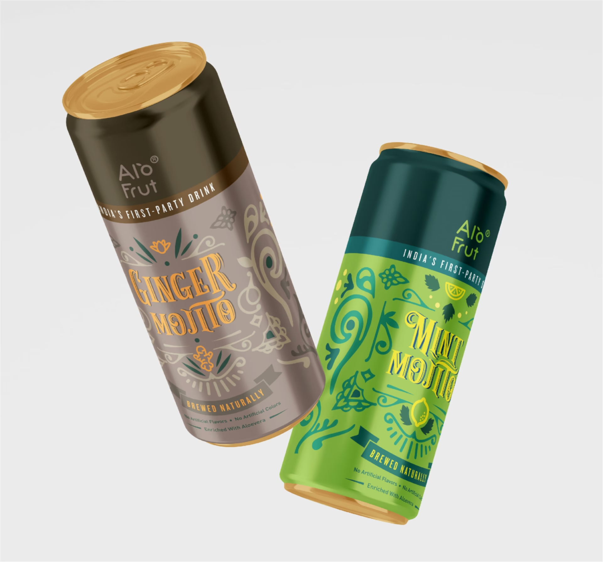
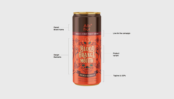
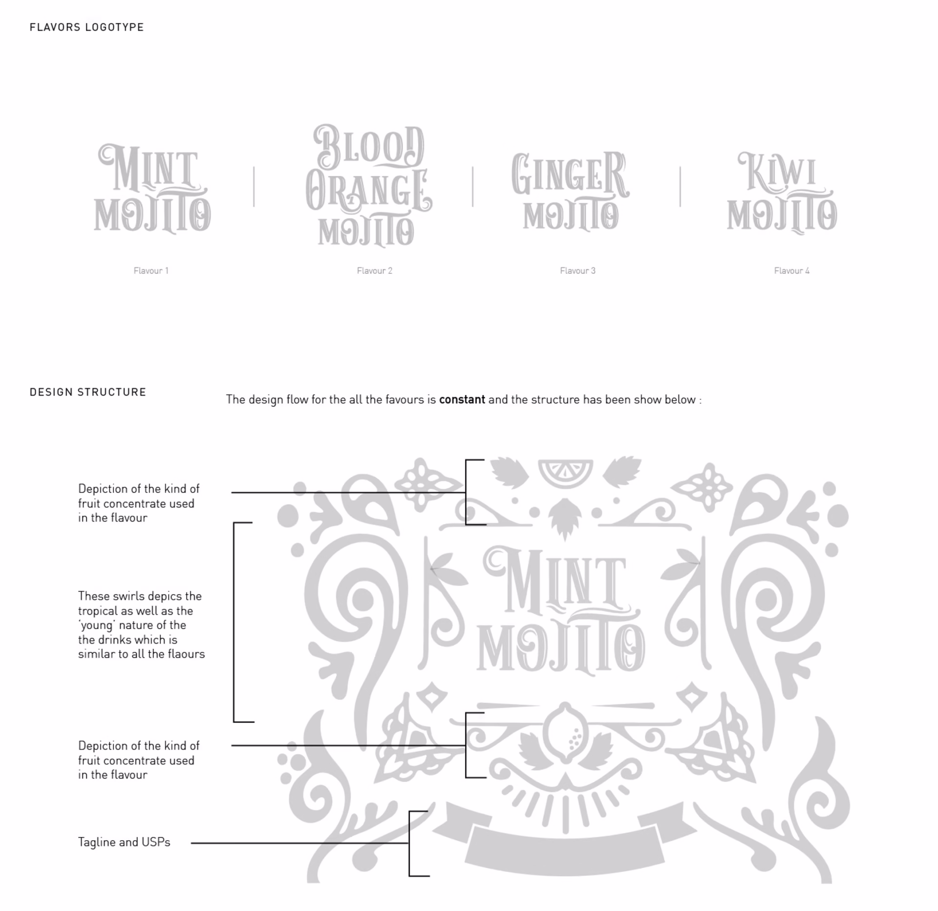
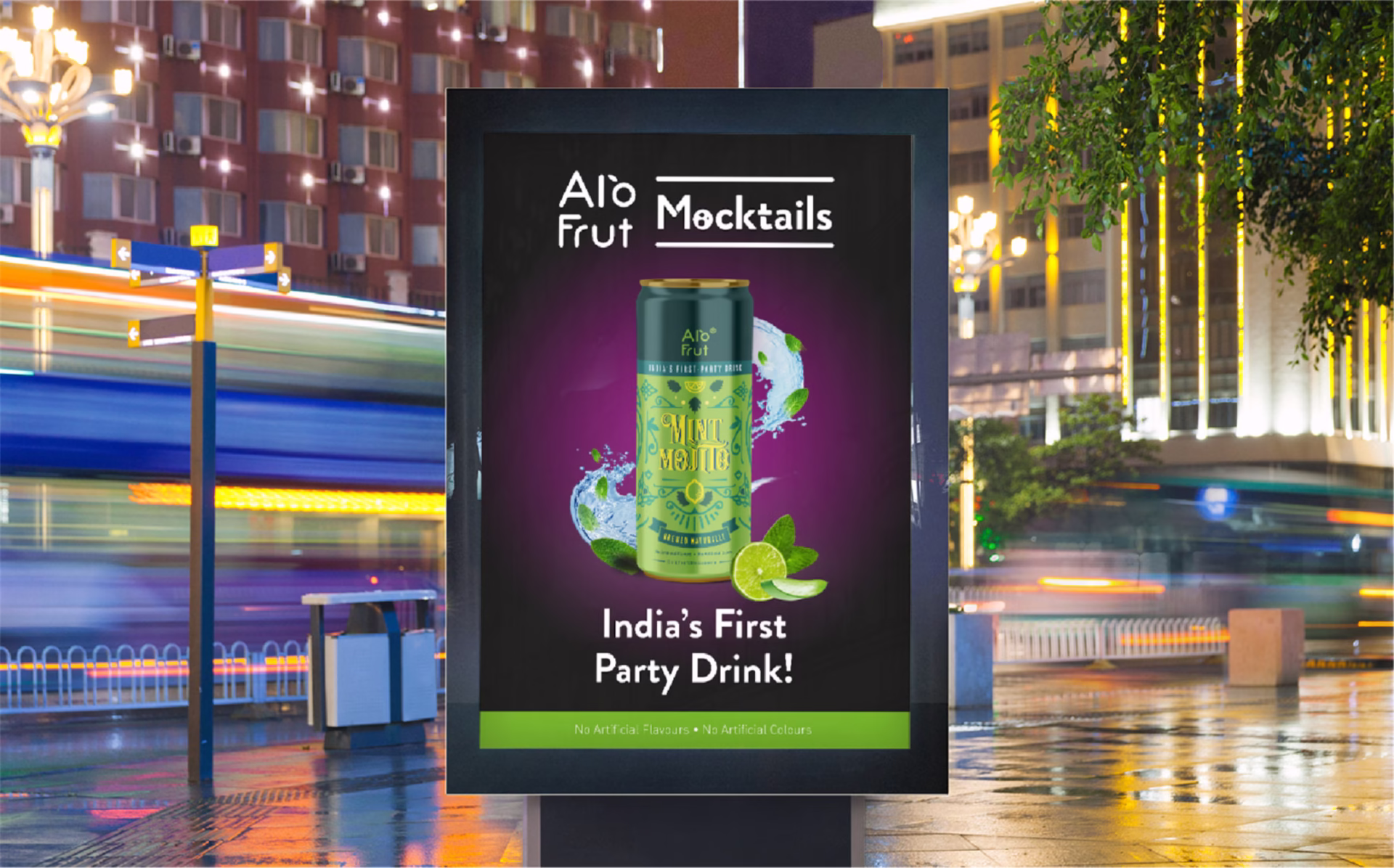
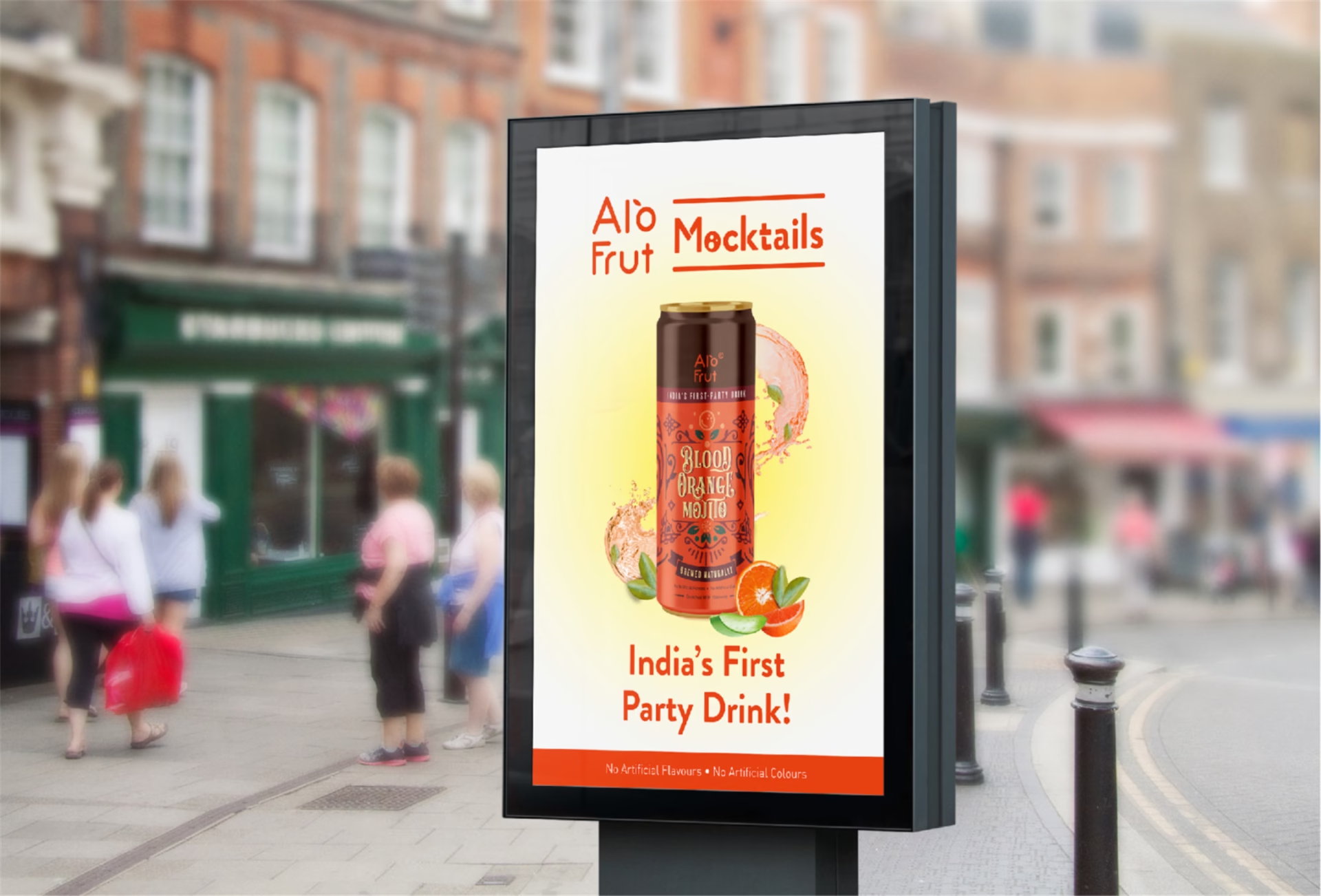
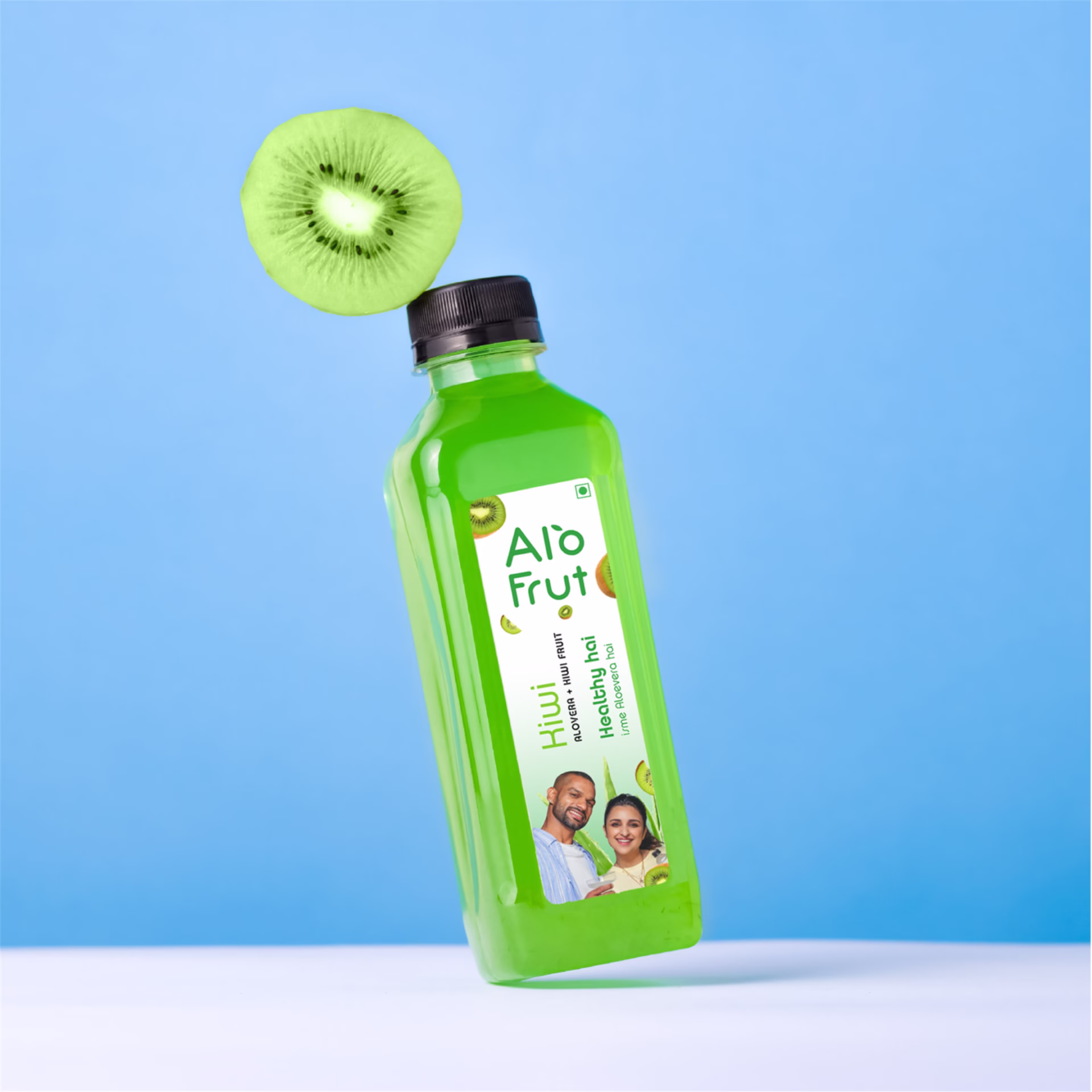
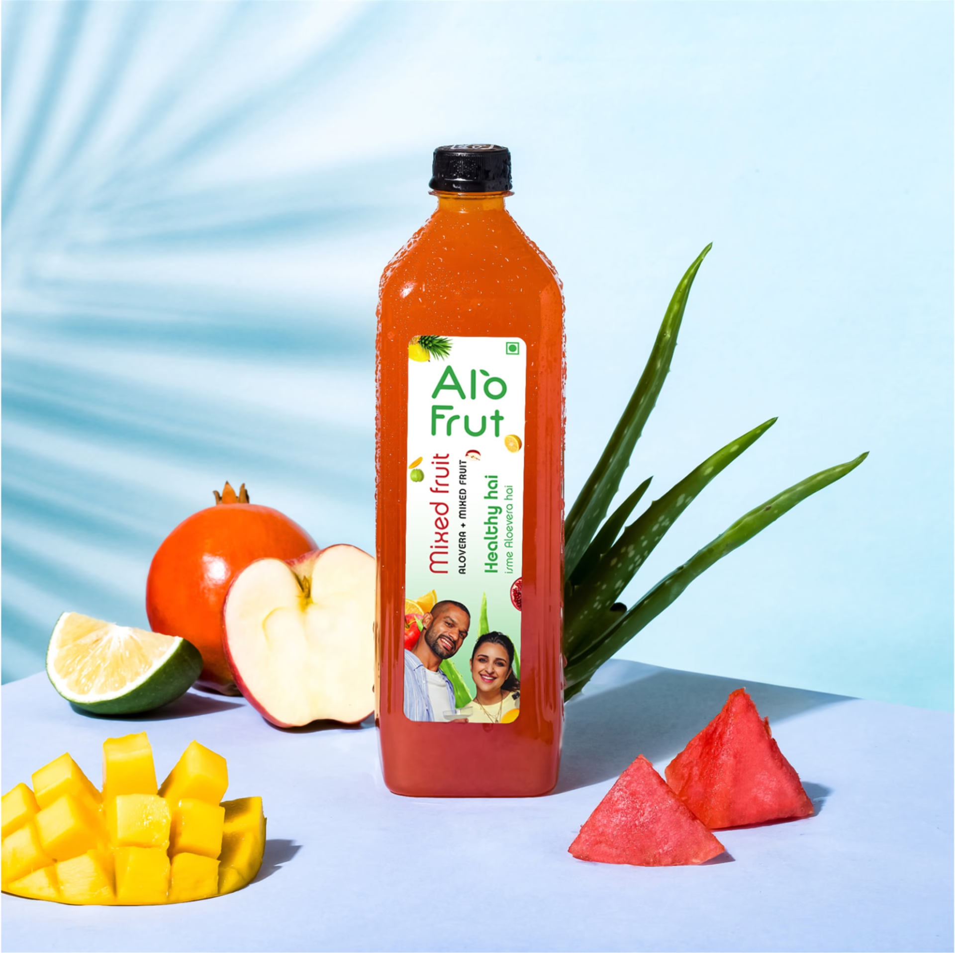
The project involves developing a comprehensive packaging design and brand language for Alo Frut’s latest offering, Alo Frut Mocktails. As a prominent Indian brand recognized for integrating aloe vera into its FMCG products, Alo Frut aims to introduce a refreshing 0% alcohol beverage with four distinct flavors. Initially focused on packaging design, the project expanded to revamp the brand’s communication language, necessitating a cohesive visual identity that captures the beverage’s freshness and versatility across different consumption occasions.
Problem Statement
Charged with launching Alo Frut Mocktails into the market, the team faces the challenge of effectively conveying the beverage’s freshness and adaptability, suitable for both daytime refreshment and nighttime social gatherings. Additionally, they must redefine the brand’s communication language to ensure consistency and resonance across various online and offline platforms.
Our Approach
Our approach began with a deep dive into Alo Frut’s brand essence, followed by conceptualizing a visual language reflecting natural freshness. We seamlessly integrated a 2-color system to signify daytime and nighttime consumption, translating this into striking packaging and brand language redesign. Emphasizing versatility, our promotional strategy highlighted suitability for various consumption occasions, online and offline. Finally, ensuring adaptability, we crafted design elements poised for future extensions while maintaining brand coherence.