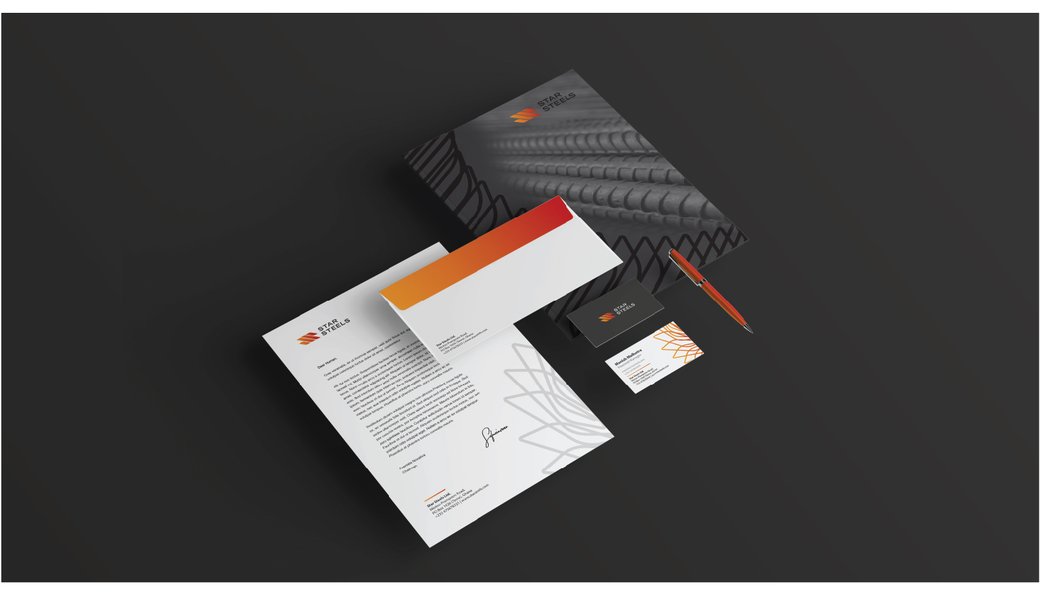
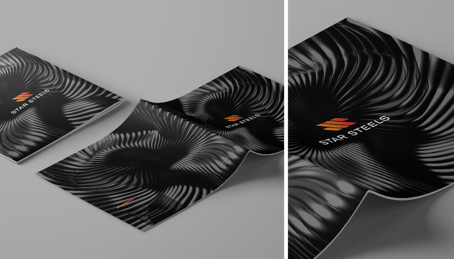
StarSteels initiated its operations with R&D going through the early phases. In 2020 they planned to launch the brand in dubai. Start steels’ core idea is to involve newer technologies in the product as well as in the formation of new kids of the product keeping in mind the various design explorations happens in the sector of construction in Dubai. They came to us with the idea of a branding that must look cohesive to the company’s core principles
We experimented with many forms and constantly reevaluated the concept. We finally got a form that transcended itself into various forms of a singular visual vocabulary.
The logotype was done with the same idea of keeping the modern approach in mind and also the fact that the brand is going to experiment with technology.
The various forms of the visual vocabulary can be seen across it’s collaterals. We are working on the marketing aspect of the brand where we will talk much more in detail about each of its products and how the market is going to gain from the strength of this brand.
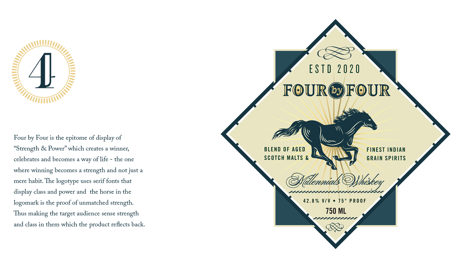
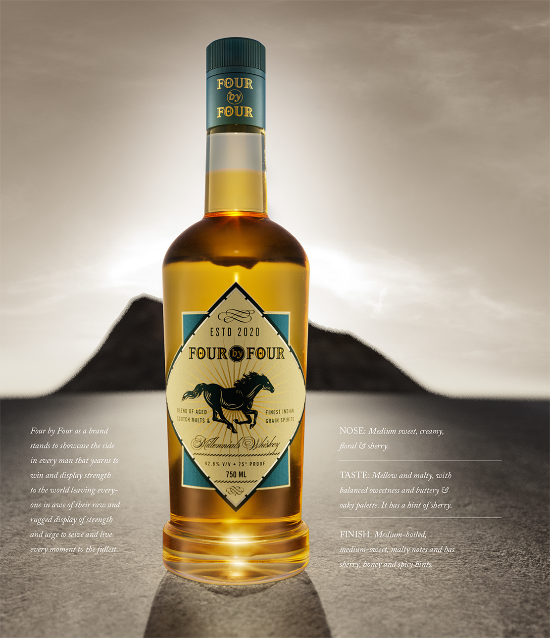
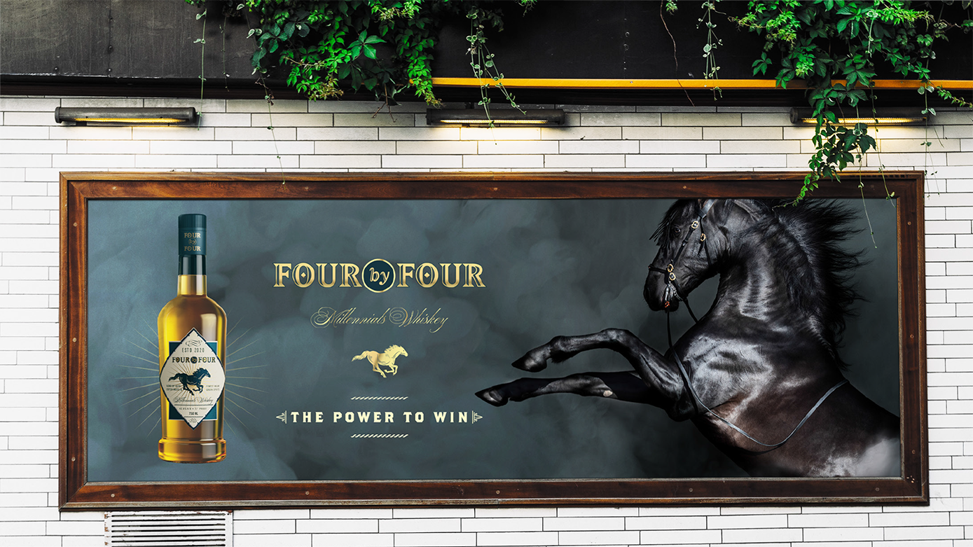
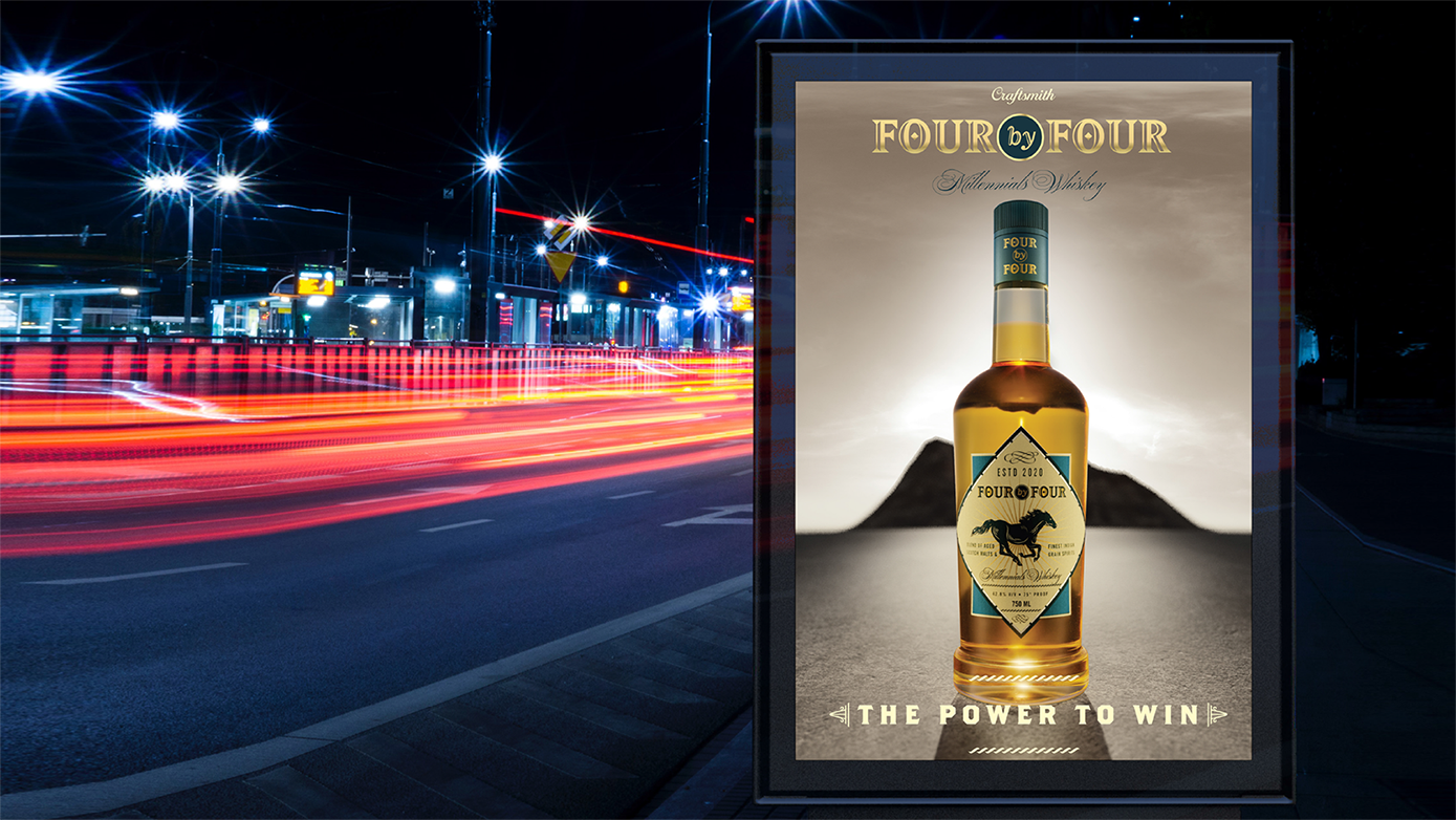
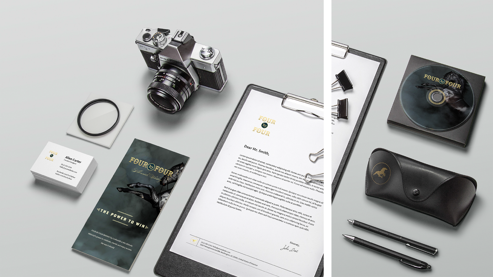
FOUR BY FOUR is the story of the establishment of a blended scotch in India which was to be positioned as the epitome of power, strength, and balance. We worked on incorporating the sensorial aspects of the scotch blend to create the persona of the brand. The terms such as Mellow, Malty, Balanced Sweetness, and Oaky Palate gave us the direction in which the brand and product were to be approached from. We developed FOUR BY FOUR along with the makers at Craftsmith, who took all possible steps both fundamentally and communicative about how the product and the brand will be marketed.
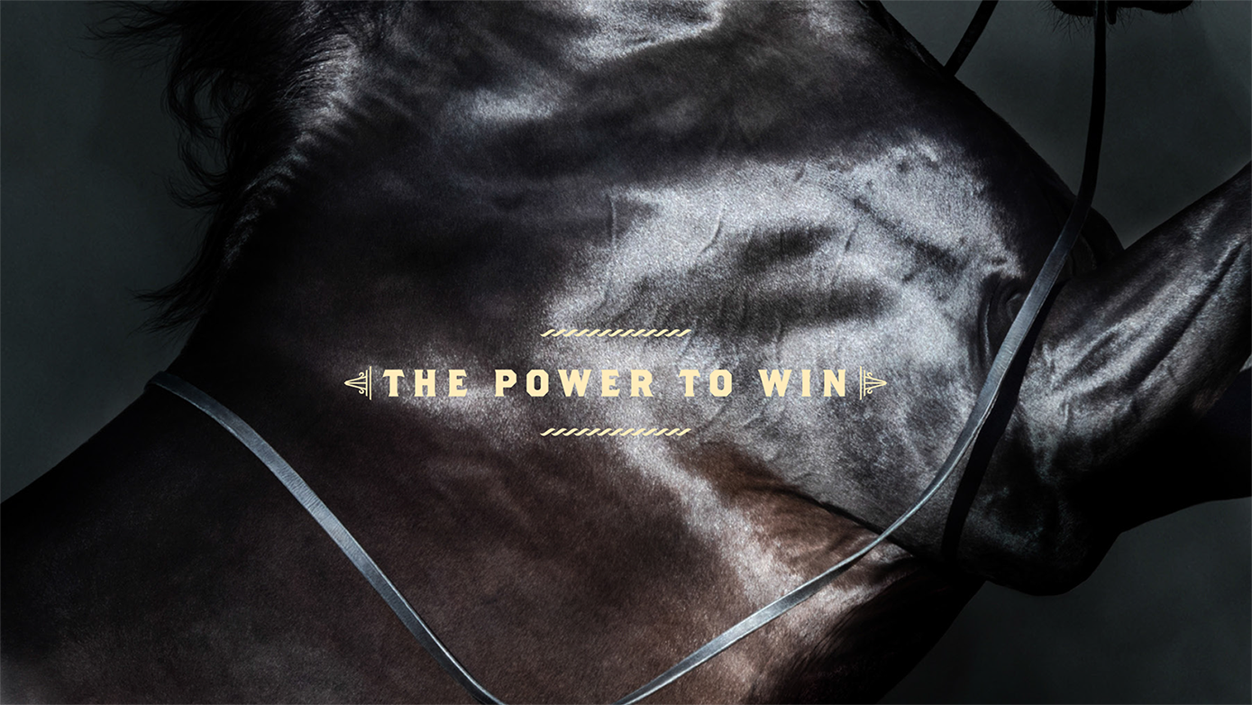
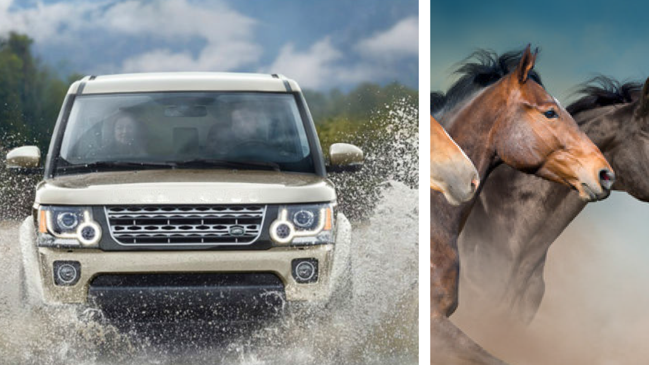
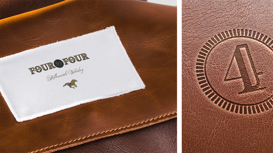
At the inception of the brand, our main focus was to display the qualities of strength and power both verbally and visually. The idea was to use terms and imagery which could be related both directly and indirectly to the concepts. ‘Four by Four’ was the chosen name that drew direct meaning from the four-wheel drives which are used to conquer rugged terrains. Thus the name gave a meaning that pointed towards the direction in which the brand was moving and the use of a horse as imagery completed the ideation process which was again a display of balance, strength, and grace.
The choice of colors was towards the darker tones and pastel shades to establish the mildness and malty flavor that the product gave and the usage of the rotated square on the packaging was to depict the balance that the product tried to emanate. To bring the product to life, the task of creating digital images of the bottle and the labels to give the overall look and feel that was conceived for the product, @rohitbhong and team were roped in to generate the 3D visualization of the product as both they shared the vision of creating FOUR BY FOUR in a way in which it was visualized. For the production details, we worked very closely with the production team with changes in the values of foiling, embossing to get the perfect mix out there on the label as well as on the mono cartons
Lenskart is an e-commerce eyewearcompany founded by Peyush Bansal in 2010, with the headquarters in New Delhi, India. They are the country’s leading online shopping portal for eyewear – with products ranging from a large selection of eyeglasses and sunglasses, to contact lenses, cases, etc. Despite starting off as a solely online business, Lenskart has more recently grown extremely quickly in retail, expanding from 450 stores in 2017, to 600 in 2018. The brand itself lacked a visual vocabulary to support all these new points of communication.They approached us in late 2017, to come up with a strong brand language to support their existing logo – and so we began our most large-scale rebrand to date.
Lenskart came into a market in which eyewear was considered only to be a medical solution. Gradually, over a period of time, they changed the face of their product in the market, making their own customer base of people who suddenly started to see eyewear as a fashion accessory. They were essentially the pioneers that brought the concept of e-commerce eyeware companies to India, thereby gathering a loyal base of recurring customers – a list that keeps growing every day. Today they are one of the most successful brand stories in the country, bringing in A-list celebrities like Katrina Kaif as Brand Ambassadors, and launching new product ranges and offers almost every day.
We began our work by building the brand language – taking the three most commonly identifiable frame shapes – a square, a circle, and a triangle – and editing them, to make them slightly more abstract forms. These three shapes would then go on to be the base structure for the language, being utilized to make patterns, blown up as elements with text, and in the packaging as the shapes themselves. Taking this forward, we made abstract forms to represent each of the 8 different kinds of frame categories on offer, as an icon-based system for identification and labeling.
The font family we chose for Lenskart is Rajdhani. This beautiful sans-serif font has modularized letterforms and supports both Devanagari and Latin writing systems. The squared and condensed appearance may be interpreted as technical or even futuristic, and our brand language uses the font in its many weights interspersed with the shapes, creating very interesting units of text.
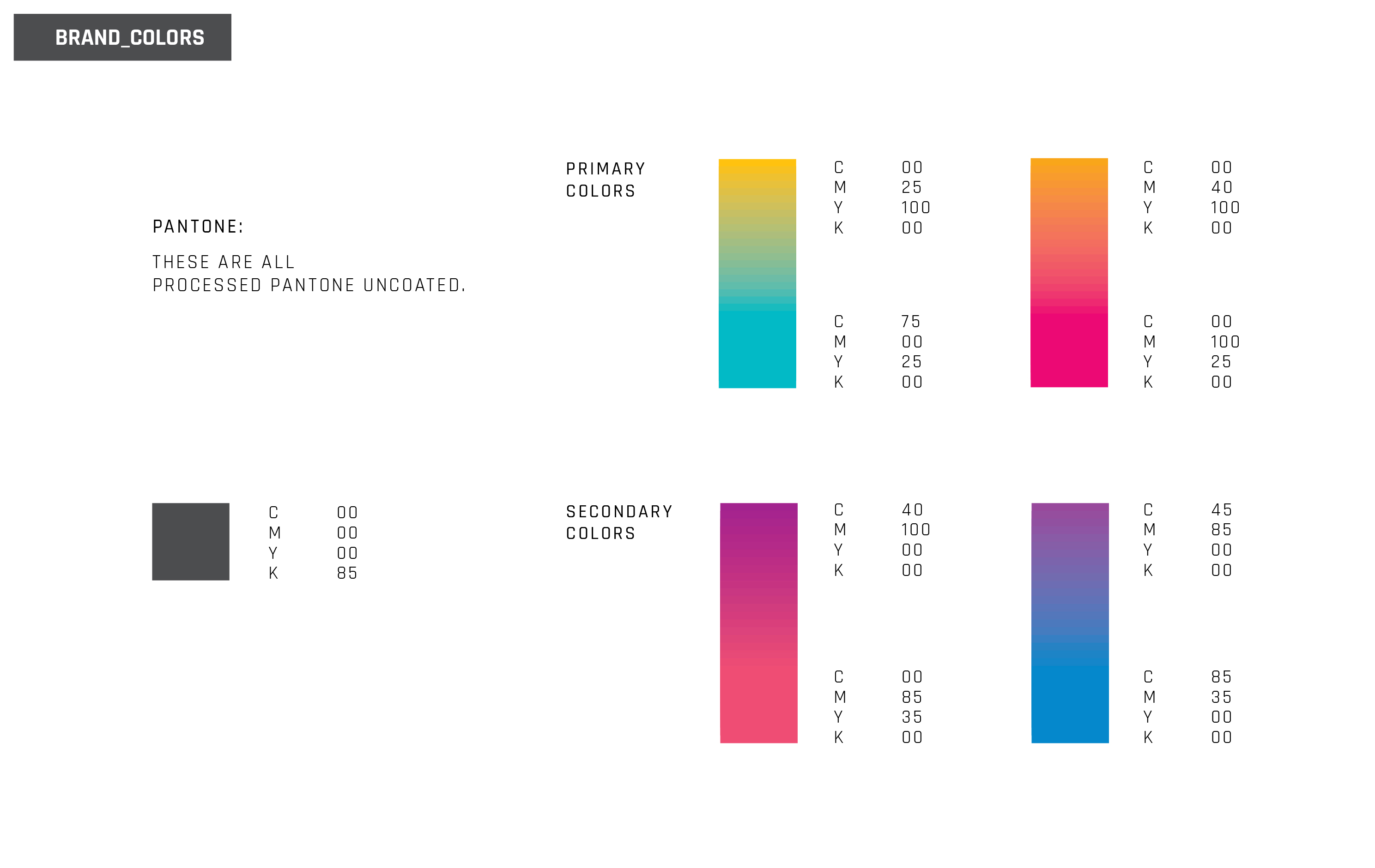
The brand did not have much of an existing brand language to adapt from, so it was upto us to decide on a suitable colour palette. Keeping in mind that the vision and aim of the company is futuristic, and that the brand story is heavily technology-based (the products are assembled by robots to remove the possibility of human error), we decided to go with a bright palette, appearing together in pairs, in gradient form. We felt that this was the closest our language could come to match the existing LensKart logo, and that the bold colours would really position the brand where they want to be – a leader in their field, and therefor trustworthy and certified; while managing to keep their ‘cool’ and youthful image alive, to appeal to newer generations of customers. The impact of seeing multiple gradients, with various combinations of the brand’s colours, is aimed at emphasizing that the brand offers a multitude of choices, whether in style, shape, weight, or lens quality.
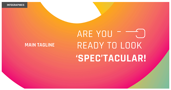
One of the brand’s primary tag lines launched with the re-brand, is “Are you ready to look ‘spec;tacular?” – a pun that was conceived during a fun discussion about the brand, and was eventually appropriated by the company, and used widely in their packaging, as well as advertising. We feel that the line is bold and honest, while maintaining a modern touch to it with the added pun.
To implement our brand language, we began with the cases, boxes, and a few other elements that add to the customer’s experience. The cases were carefully selected and designed to go with the brand’s image, and to make sure LensKart spectacles and their cases will always be distinguishable. The cases are minimally designed, using the three main shapes from our brand language, and with a witty one-liner inside, to keep with the brand’s overall image. Next was the boxes that these cases will be enclosed in. We created vibrant yet clean looking layouts, which are pleasing to the eye while managing to convey a decent amount of information. The colour palette we had previously chosen for the brand was taken forward in these boxes, establishing them further to the customer.
After the initial phase of packaging, we got into slightly smaller touchpoints – a foldout leaflet, and a small cloth to be packaged inside the box with every order; as well as a paper carry bag with the new brand language.
After finishing off with the basic packaging collaterals, we moved on to the in-store work – which was quite a large operation, as this would mean effectively presenting our new language to Lenskart’s humungous customer base for the first time. We worked on in-store-slanters, various posters, standees, shelf-talkers, and finally, the uniforms worn by Lenskart store-employees. The brand language helps to immediately make a space look more lively, and now conveys the intended ‘fun yet practical’ image for Lenskart.
We made a series of web-banners for the brand, which will appear on the Lenskart website. We are also going to be re-vamping the Lenskart website.
After completing the Lesnkart re-brand, we moved on to thier sub-brands; both existing, as well as new ones that have since launched. Beginning with Lesnkart Blu, we created new identities for Lenskart Gold and Air, amongst others. You can see the sub-brands we have worked on here.
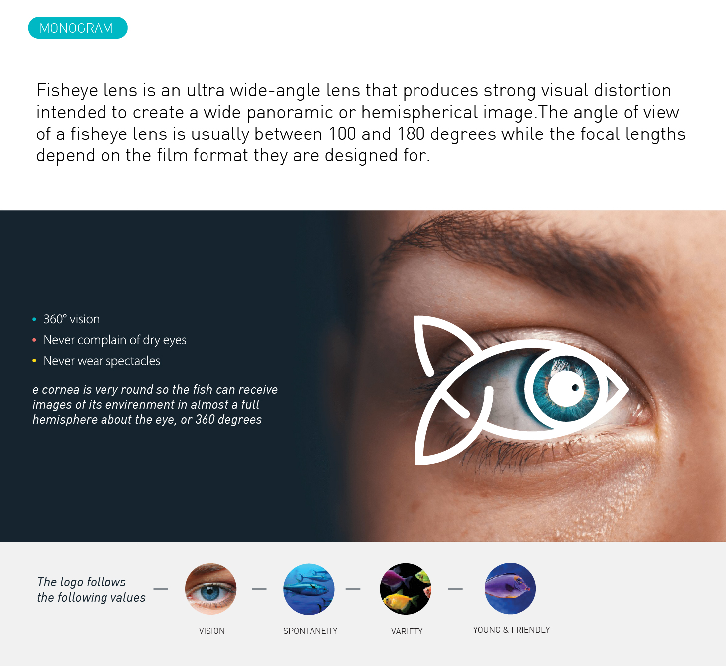
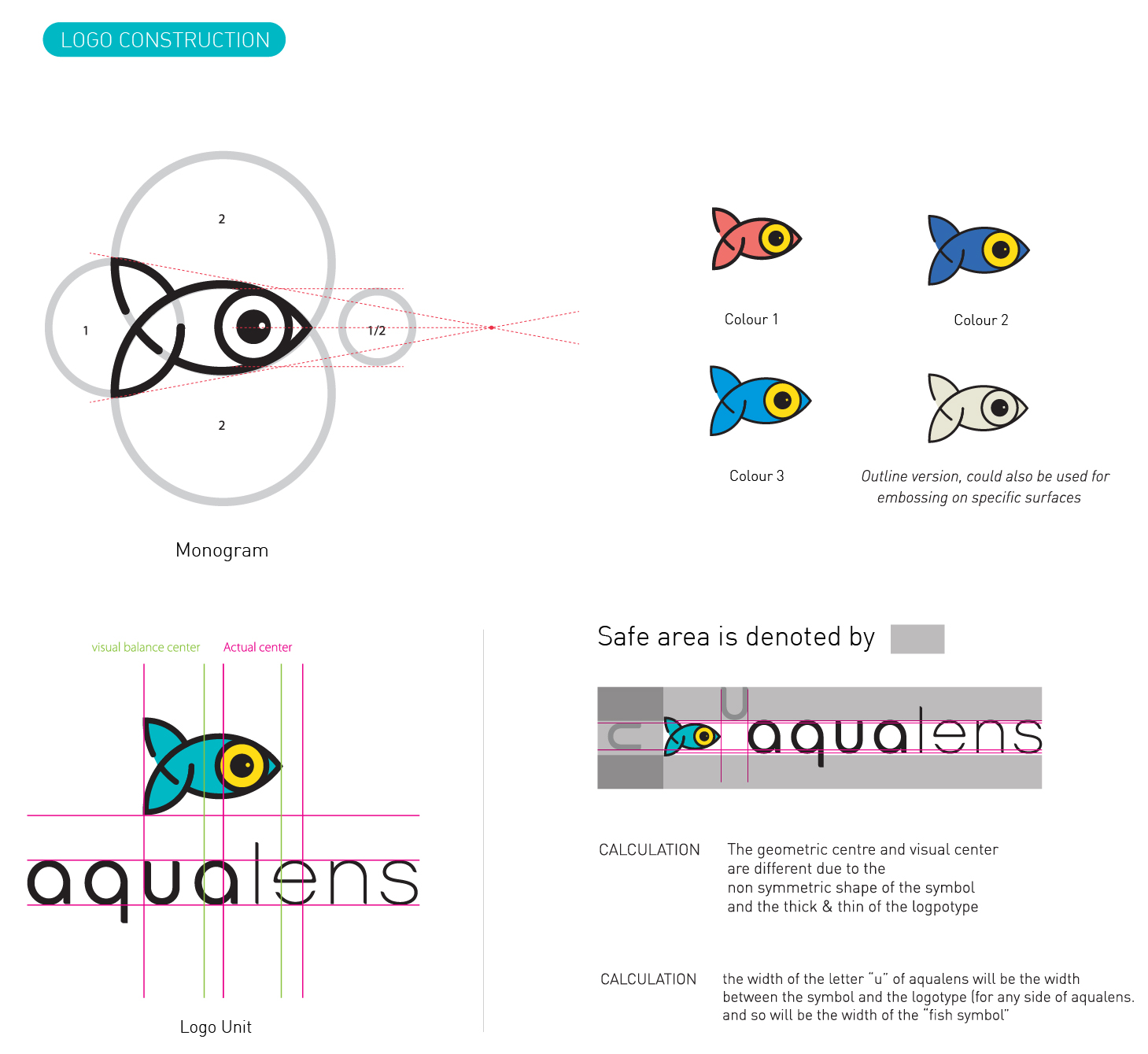
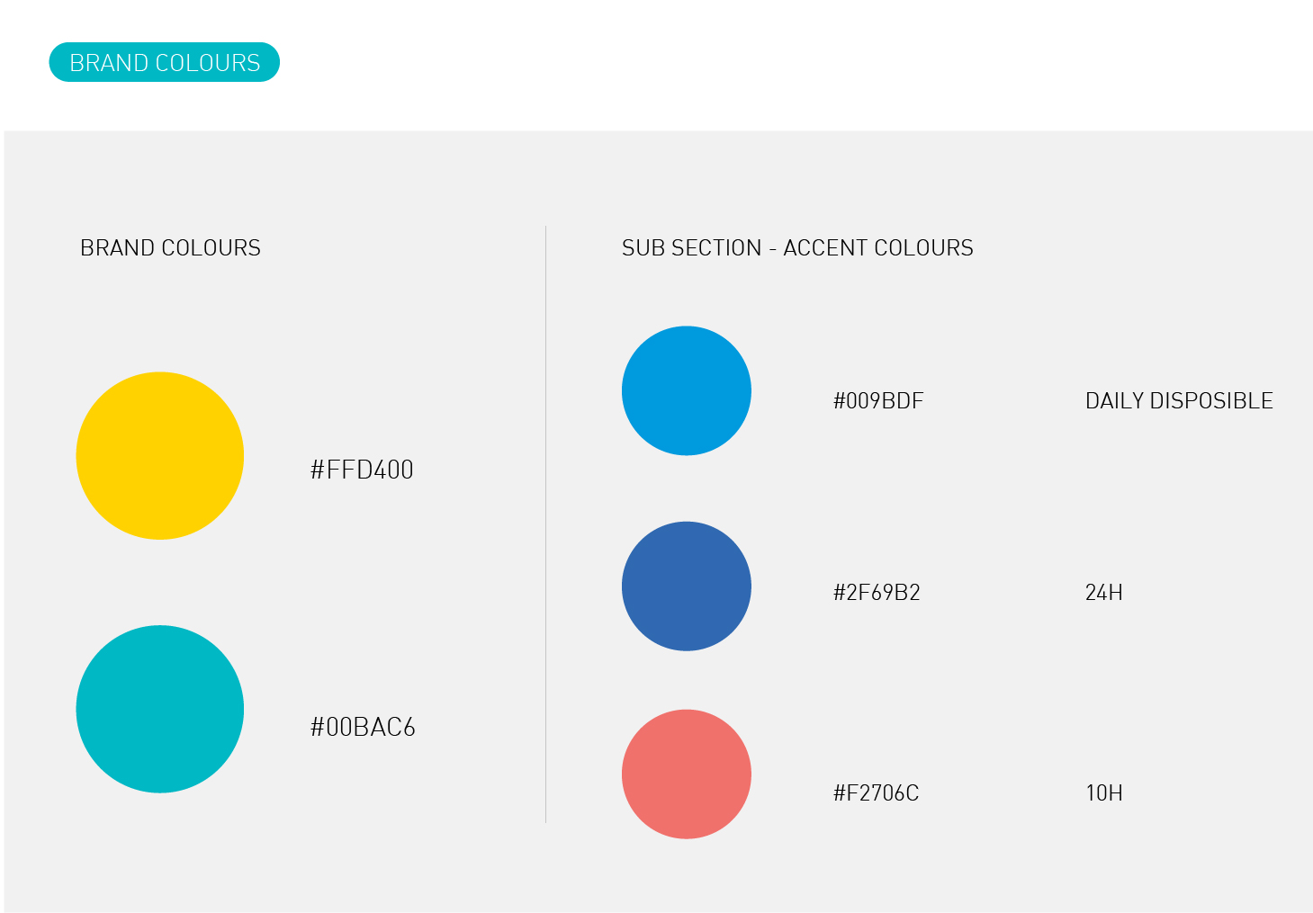
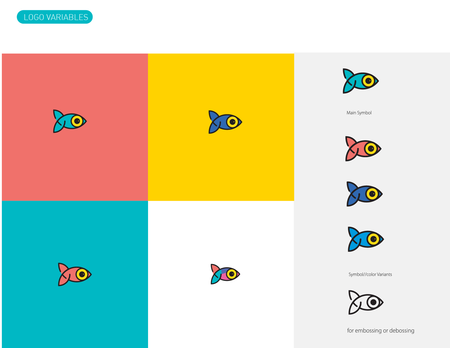
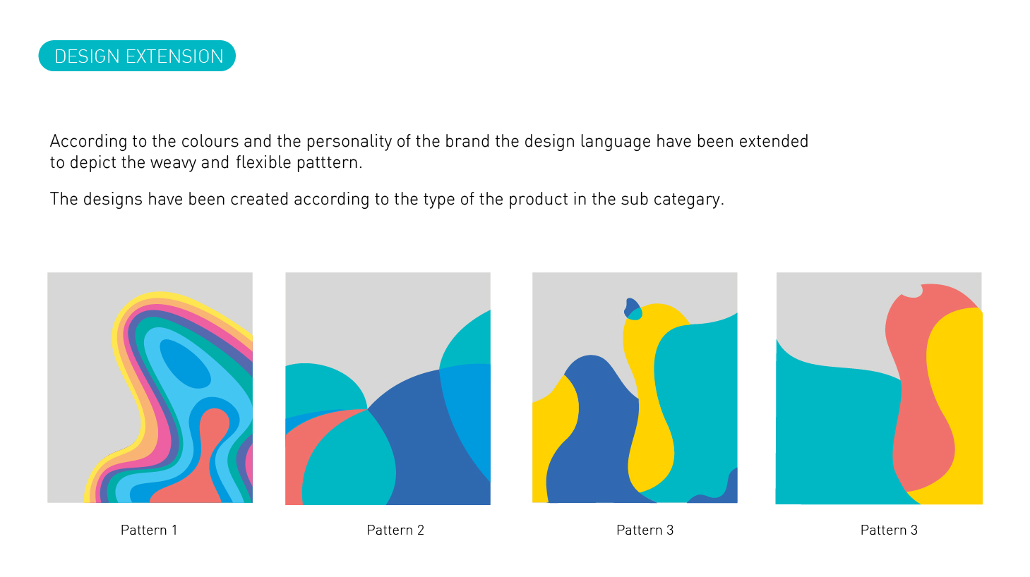
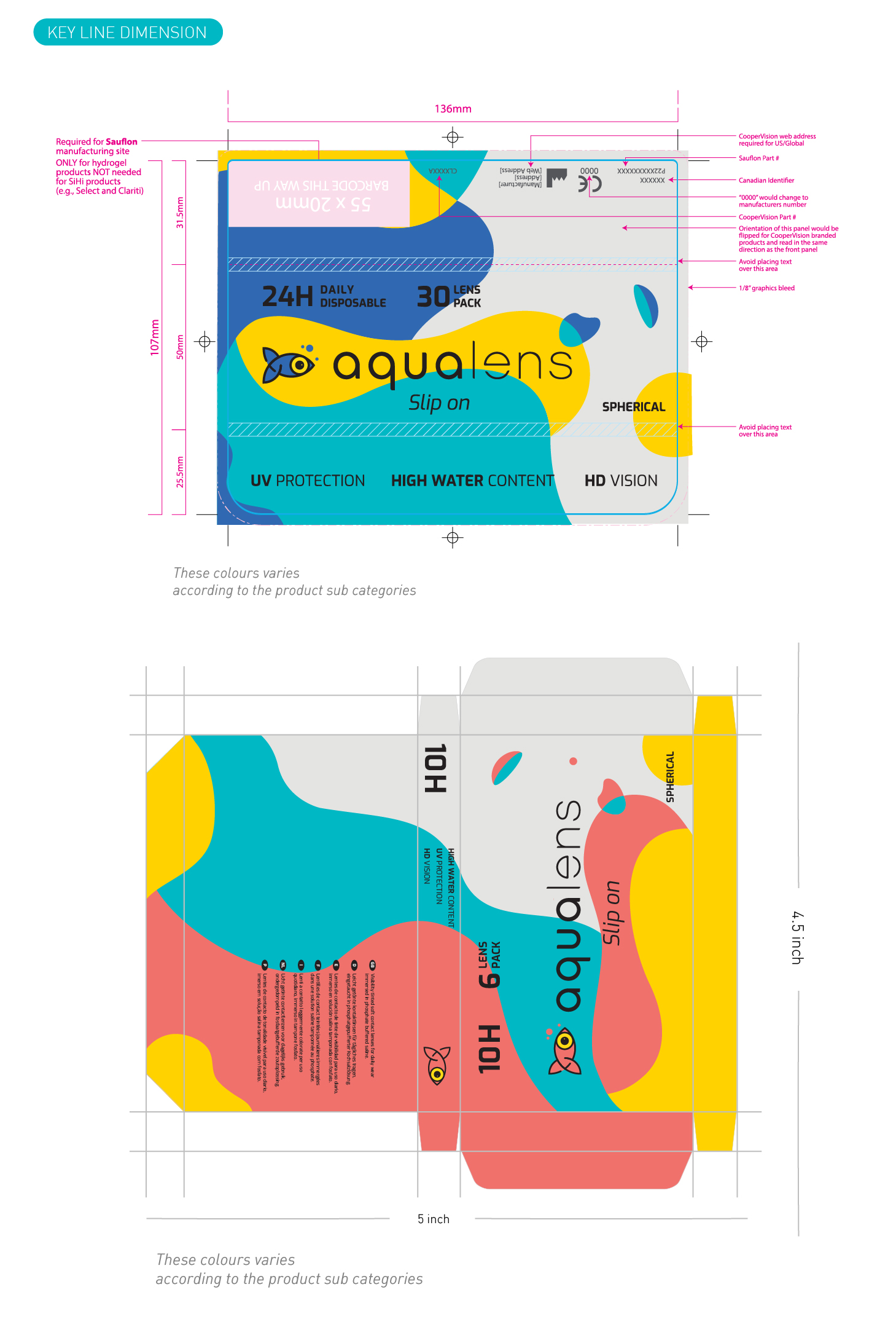
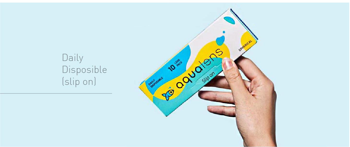
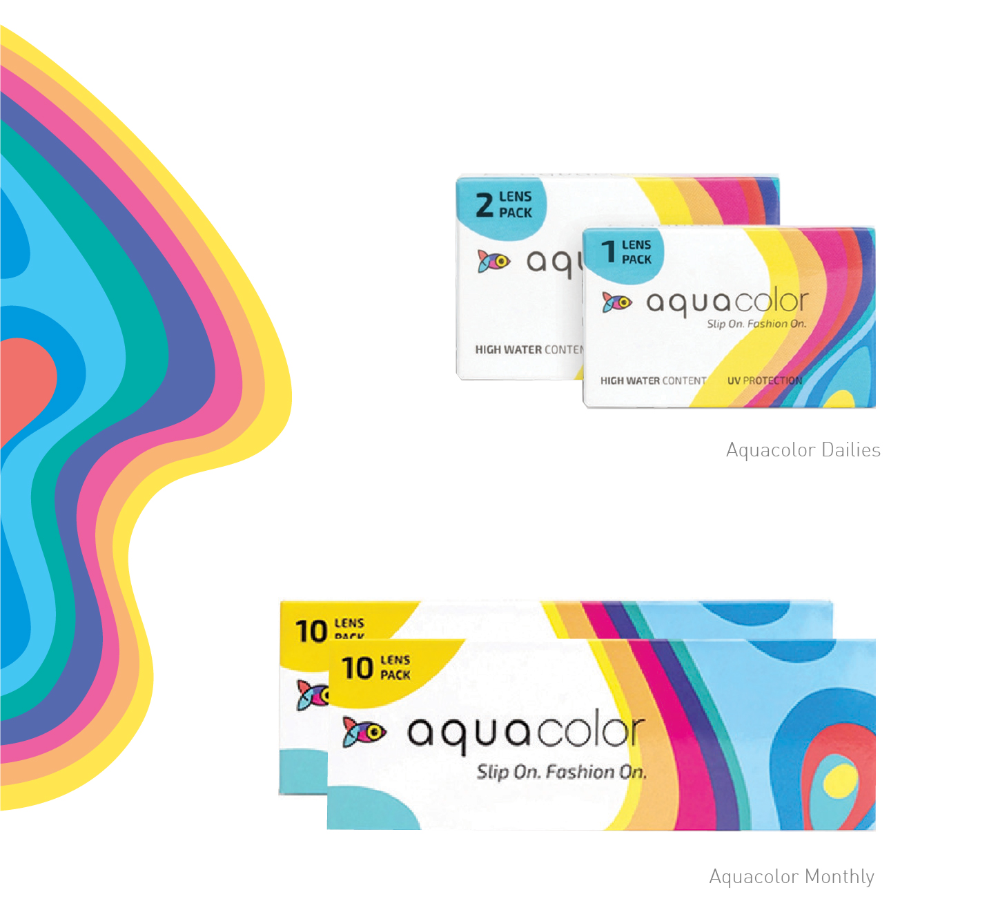
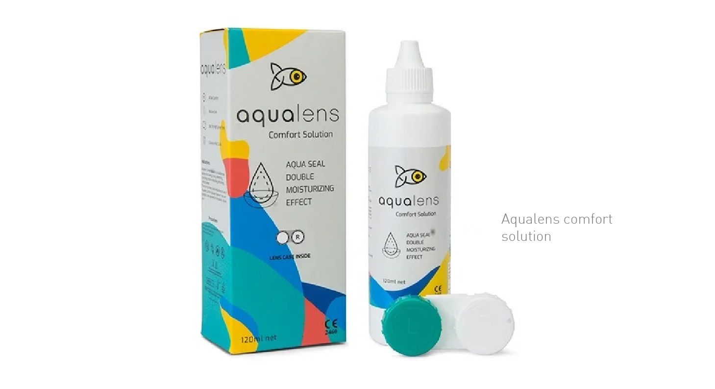
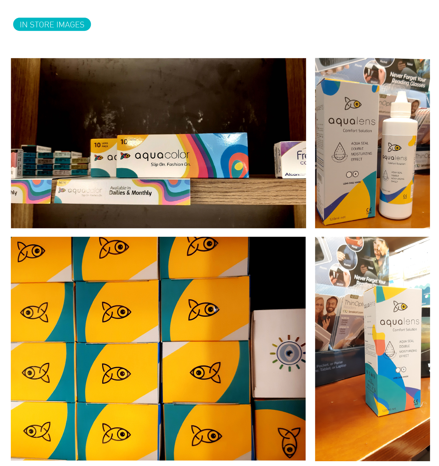
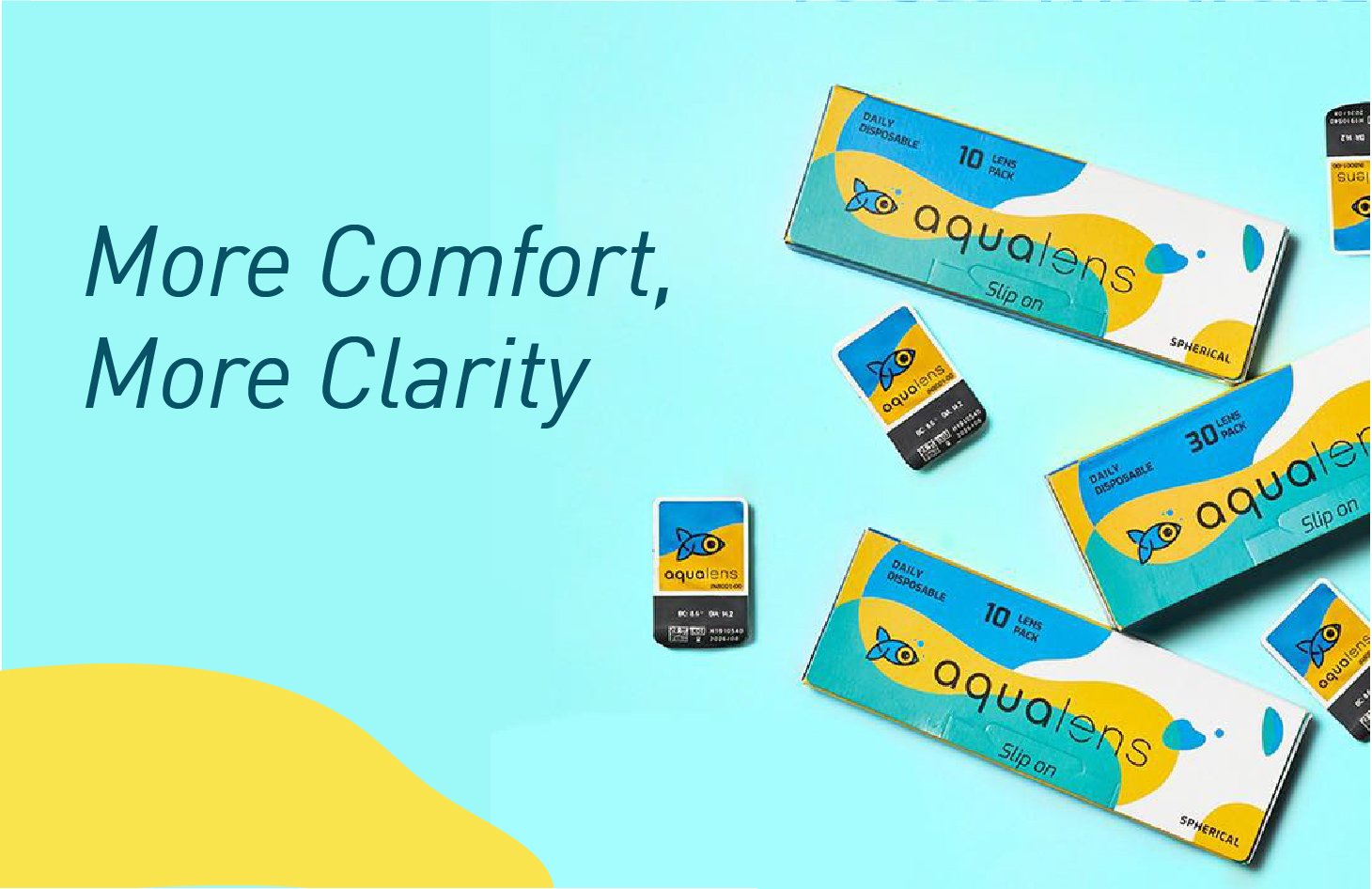
As the name suggests Aqualens is a contact lens brand, introduced by the market giant Lenskart. Aqualens contact lenses are specially developed using the latest technologies to keep our vision intact without letting our eyes feel burnt for it. Aqualens brings us monthly disposable lenses to give regular care to our eyes. The brand has been designed keeping these core USPs in mind to not only distinguish every product from each other but also maintaining its consistency. Aqualens being a relevant brand, understand the user’s day to day life, schedule and working ours to constantly evolving its products and also giving rise to variants that are just the best solution to a particular set of people. With such a massive product range it covers almost all kinds of the working class of people who needs lenses today.
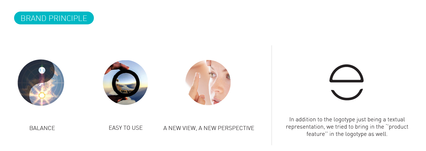
We started with the branding and following the story of its evolution, The symbol “fish” which is the brand career across all product li=nes, the logotype is also designed with a keep eye to detail. Making even the logotype symbolic to the brand. The fluid feel of the visual language goes well with the target group and also gives enough dynamic feel to the branding to create sub brands and a long-range of SKUs.
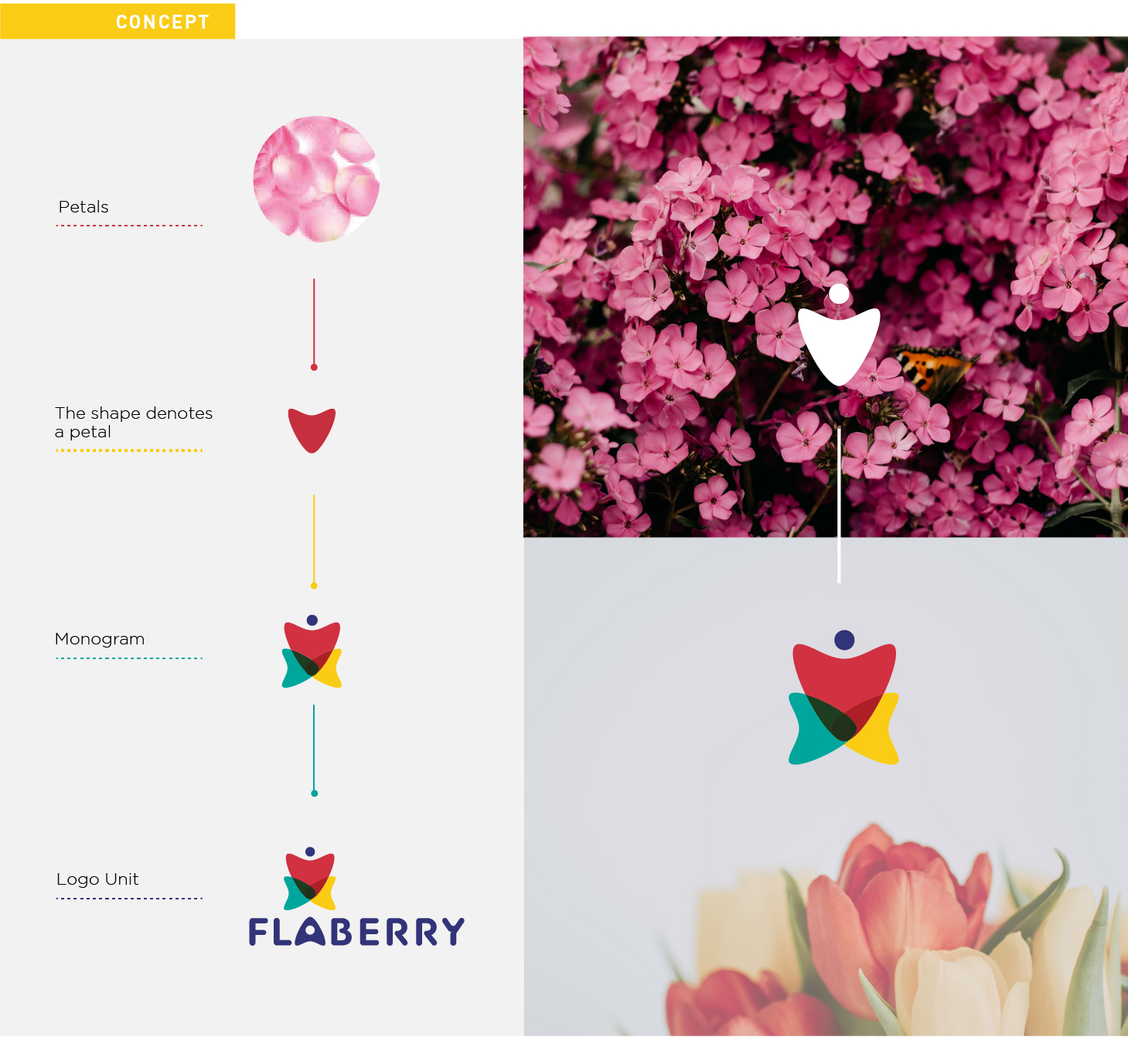
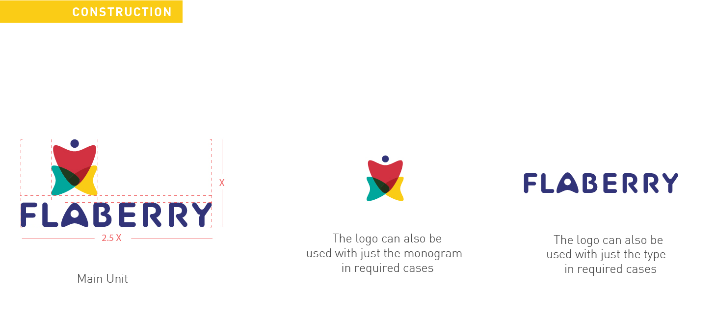
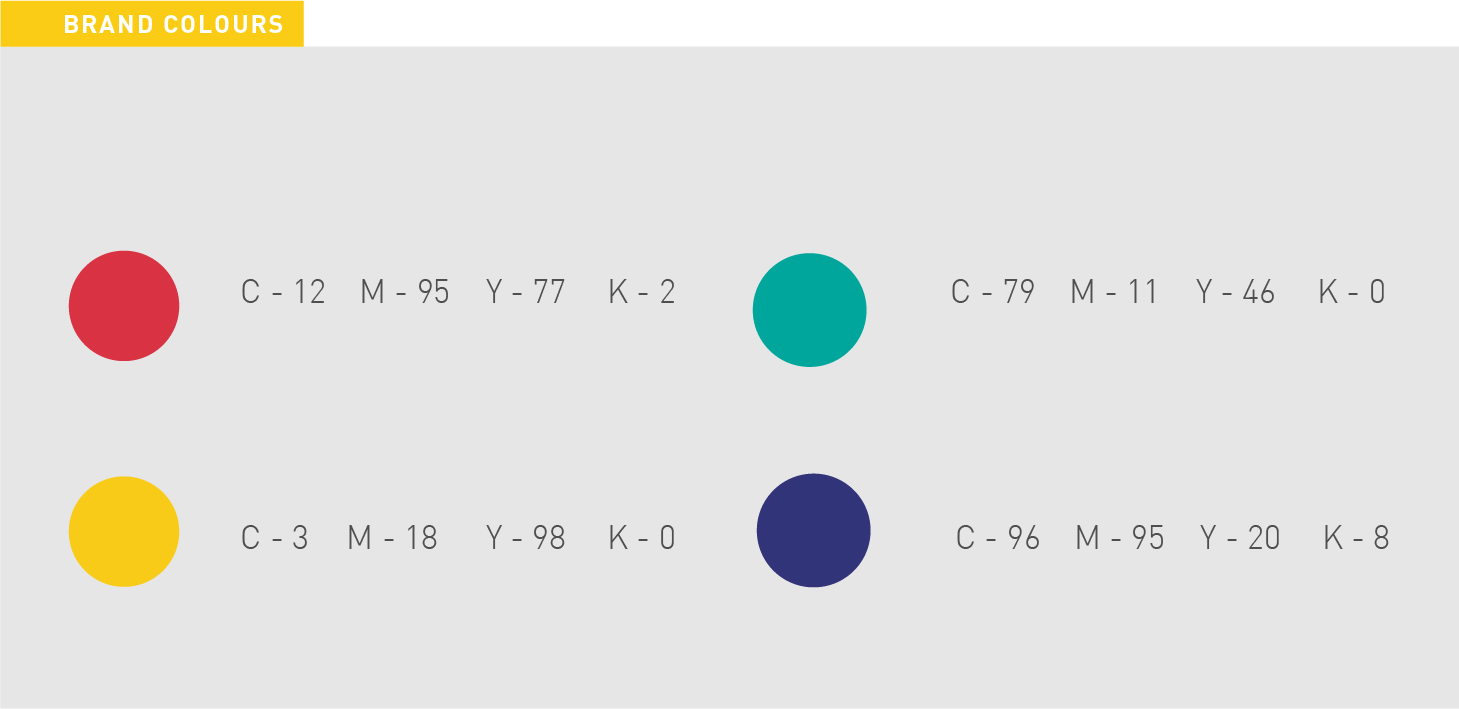
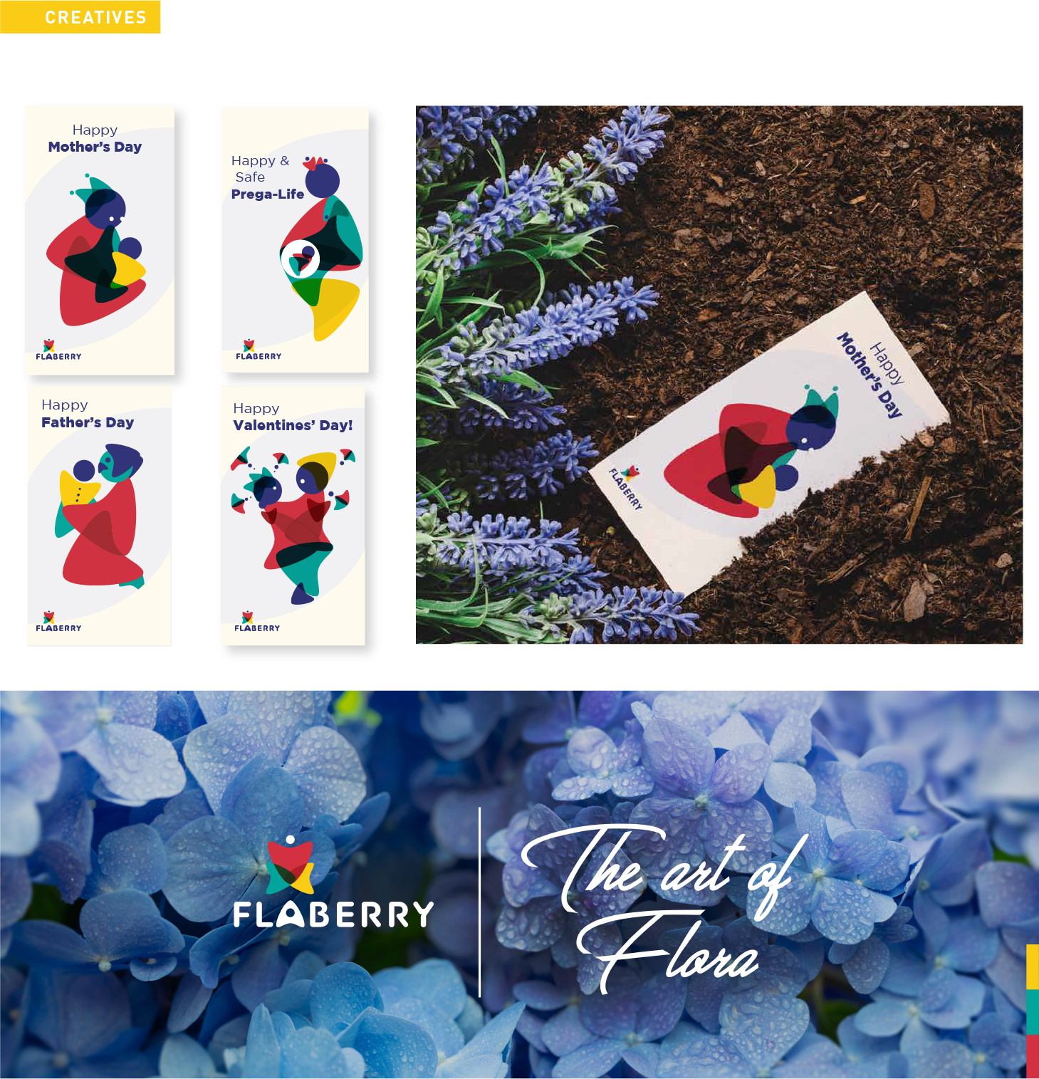
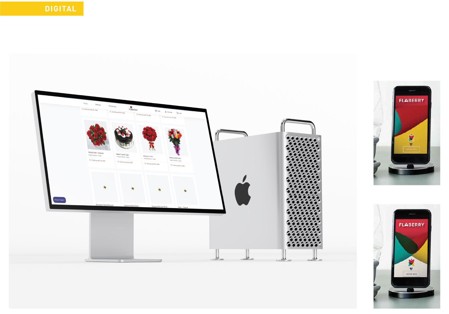
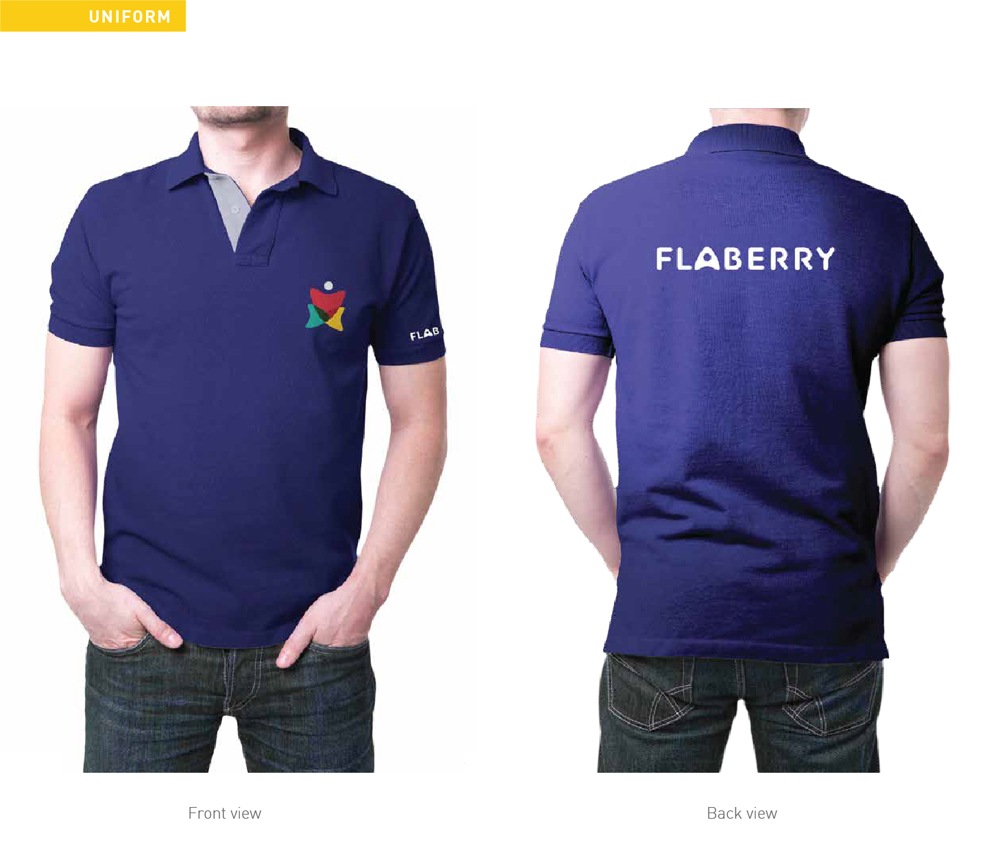
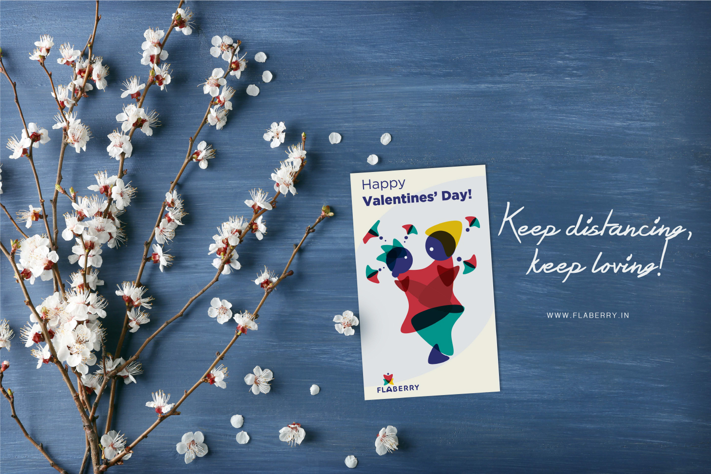
Flaberry is one of the first online flower and boutique delivery company/system in our country. Strategy wise moving head to head with one of the market leaders, Flaberry has ideas that might crack a new horizon for the brand and make it a No. 1 online Flower solution. Flaberry’s strength is its ability to get any kind of flower for its client, be it from India or abroad. and secondly a unique design team. The design team deal with just flower arrangements, and
Like similar online services, it has options to make combos with cards, chocolates, cakes. But The USP of the brand is Flowers and they want to stick to this uniqueness, so not providing more than 10% to any complimentary services. They are one of the leading & trusted Online florists delivering across India.
Since the brand wanted to become a household name for its flower services we have worked out a few very key aspects of the strategy to do so. Apart from doing a branding that would look modern, easy, fun, and adaptable design language. The idea is to be easy and communicative but be straight and relevant in the approach. Our idea of Karts added a few dimension to the business and we also plan to take things ahead to pierce through all possible target group
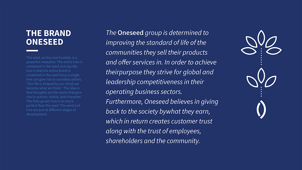
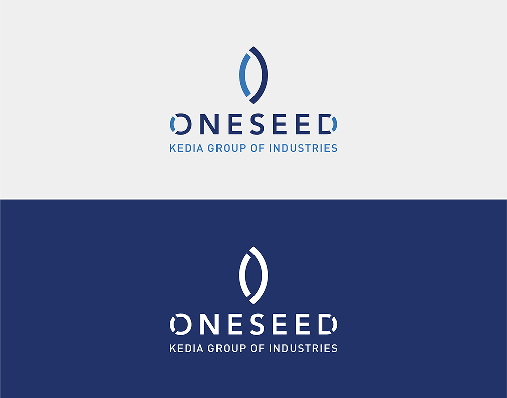
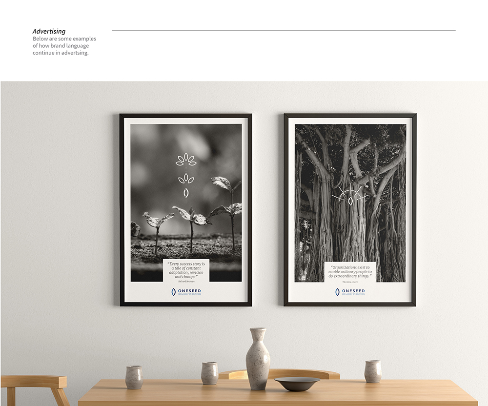
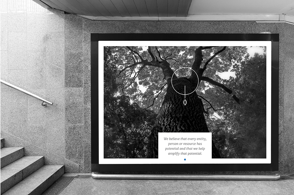
The seed, so tiny and humble, is a powerful metaphor. The entire tree is contained in the seed, but equally true is that the entire forest is contained in the seed since a single tree can give rise to countless others. “Our life is shaped by our mind; we become what we think.” The idea is that thoughts are the seeds that give rise to actions, habits, and character. The fully-grown tree is no more perfect than the seed. The seed and tree are just at different stages of development.
The Oneseed group is determined to improving the standard of life of the communities they sell their products and offer services in. In order to achieve their purpose, they strive for global and leadership competitiveness in their operating business sectors. Furthermore, Oneseed believes in giving back to society by what they earn, which in return creates customer trust along with the trust of employees, shareholders, and the community.
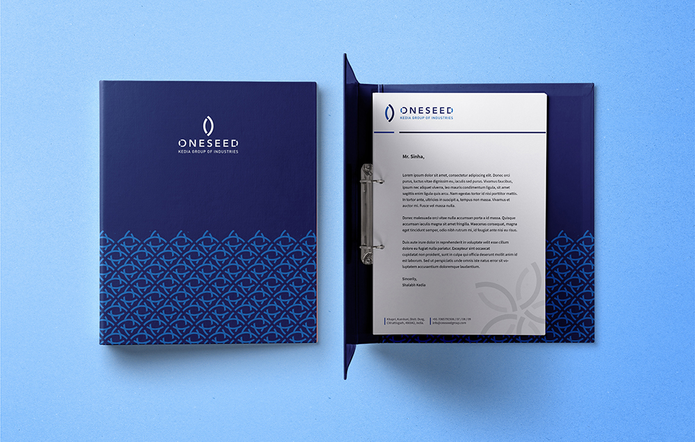
We were approached by the Consulting team YME and briefed about the whole ecosystem of the brand OneSeed. Rebranding is always tougher than branding, as you need to set in a few things that the brand has been communicating and device something that is new and yet not takes away from the charm the older feel has created, over a period of 5 decades.
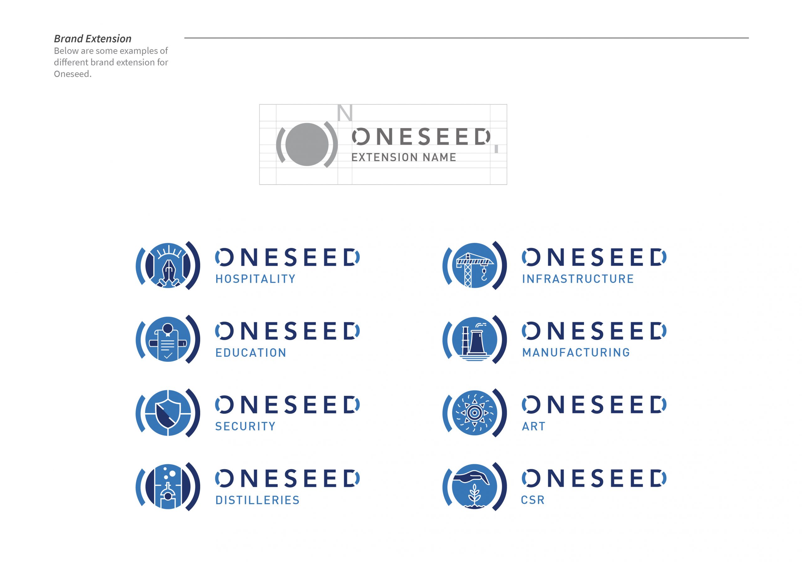
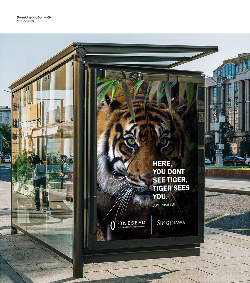
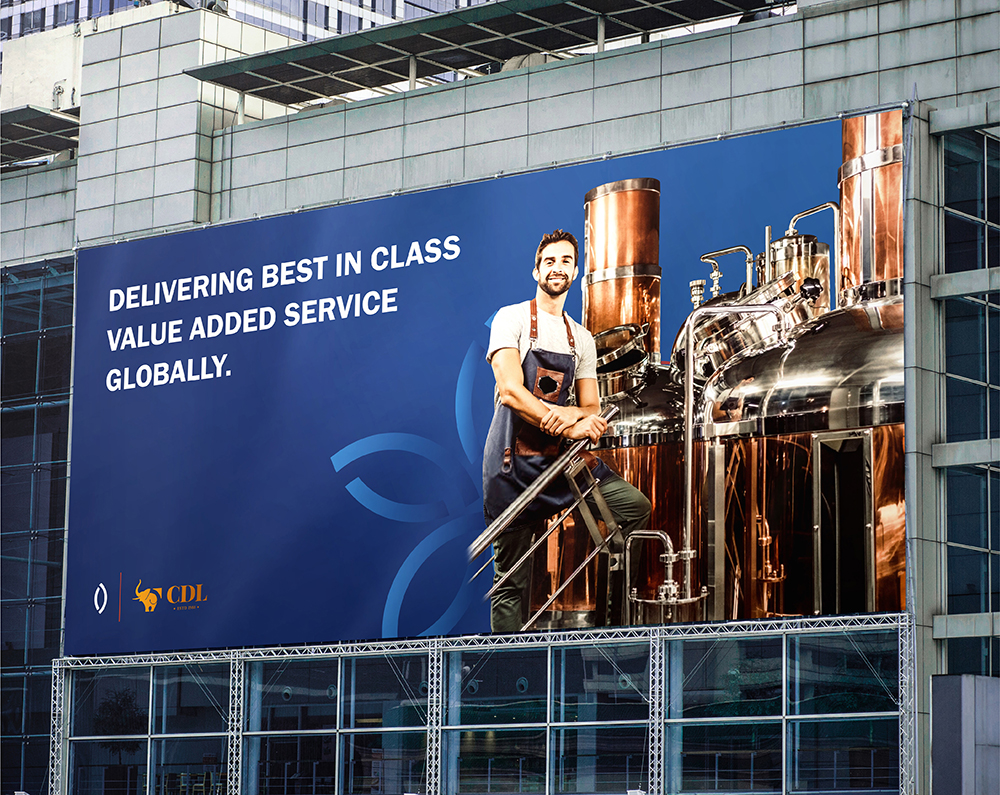
We started with our initial derivation of forms from the whole idea of the group, which says the Jungle is living inside one seed and one seed is the entire jungle. We expanded that thought as we kept defining each part of their communication and establish an overall brand vocabulary for the brand, starting from the logo to outdoor communication to show the adaptative nature of the branding and how it carries the brand language into its individual sectors or sub-brands.
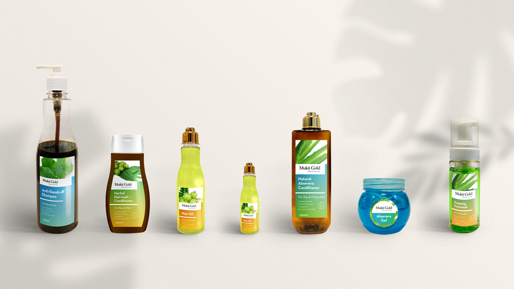
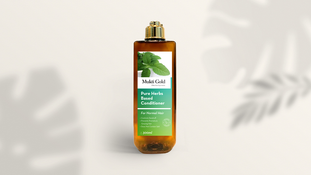
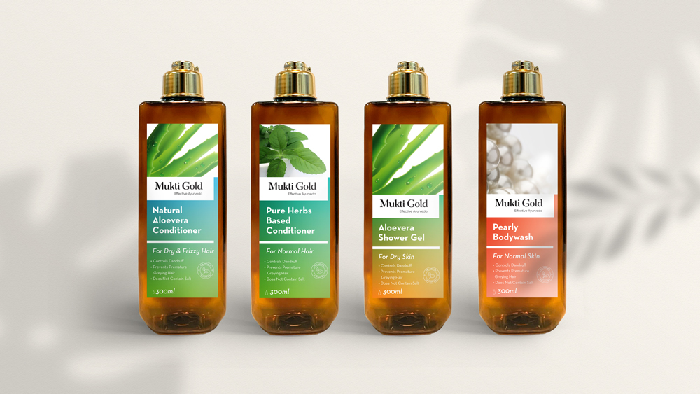
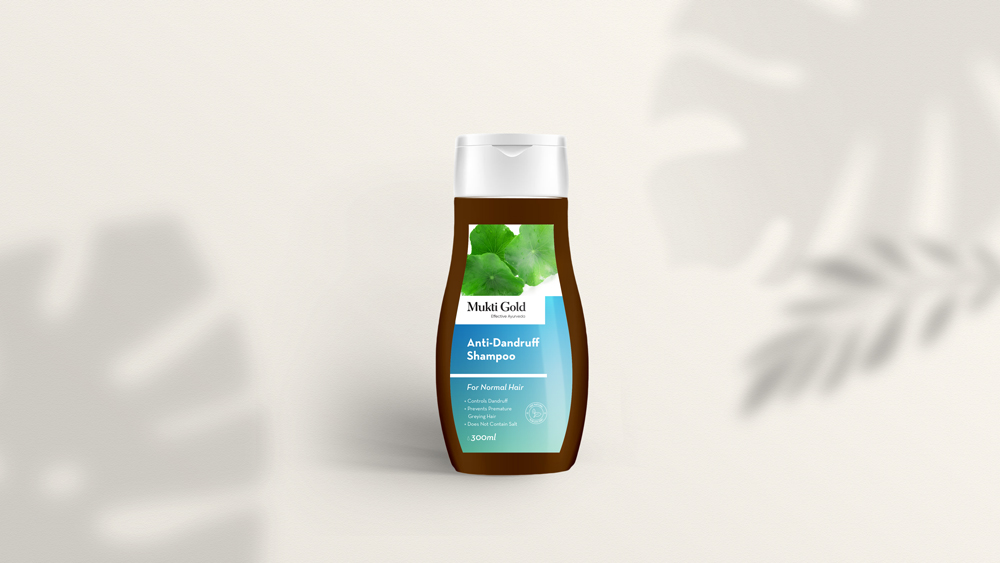
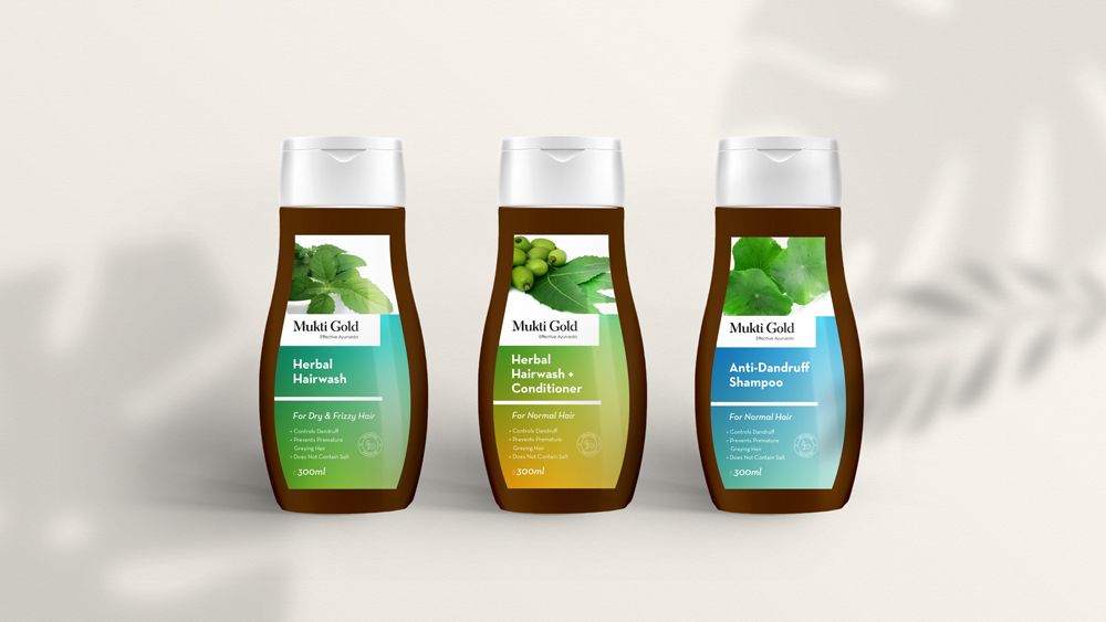
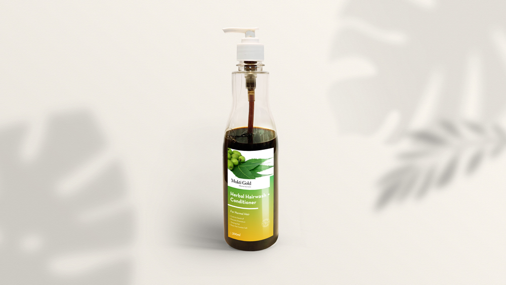
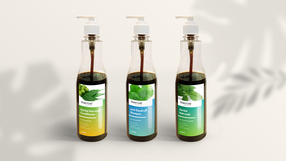
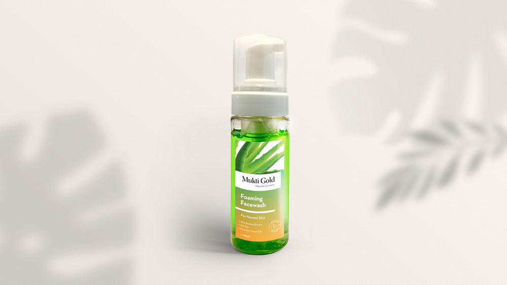
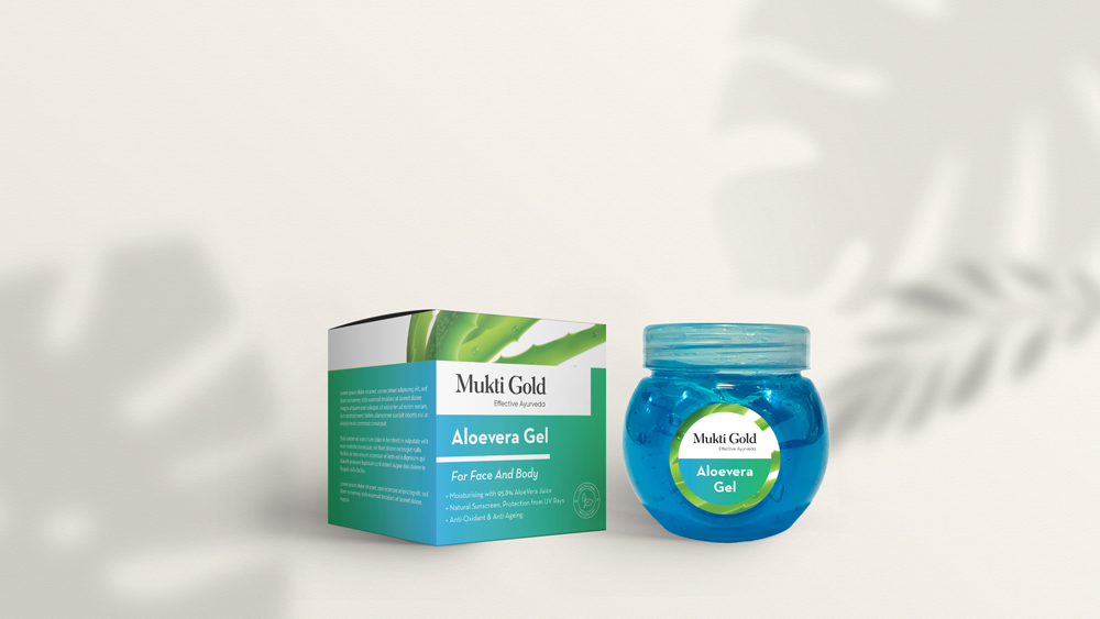
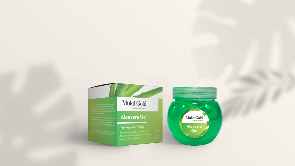
MuktiGold is an Ayurvedic cosmetic brand with a variety of products for Face, Body, and Hair Care. A trusted sub-brand of Axiom Ayurveda, we were approached to re-brand MuktiGold, to transform it from its traditional look to a modern approach, and to create a packaging design system for the entire product line of shampoos, conditioners, face and body washes, aloe vera gels etc. The challenge was to create a system design that is modern and at the same time, shows the ayurvedic ingredients present in the products. To understand the other products in the same sector, we did a market survey and a comparative analysis across the market sections to understand the visual attraction of different products on the shelves in the stores at a minimum of 3 mt distance. Based on the study, a system was designed and the overall visual elements were decided. Gradients were used as the main element of the system design, with different colors representing different ingredients. The ayurvedic ingredients are also directly represented through images on the label design, which makes it easily recognisable. The gradient provides a clean and contemporary feel, with the structure being able to be scaled or transformed into any size, with the space for images to be interchanged on the top portion of the label. This makes it easy to add new products to the existing system as well.
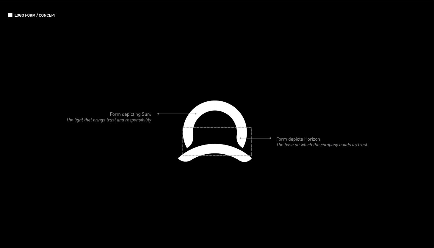
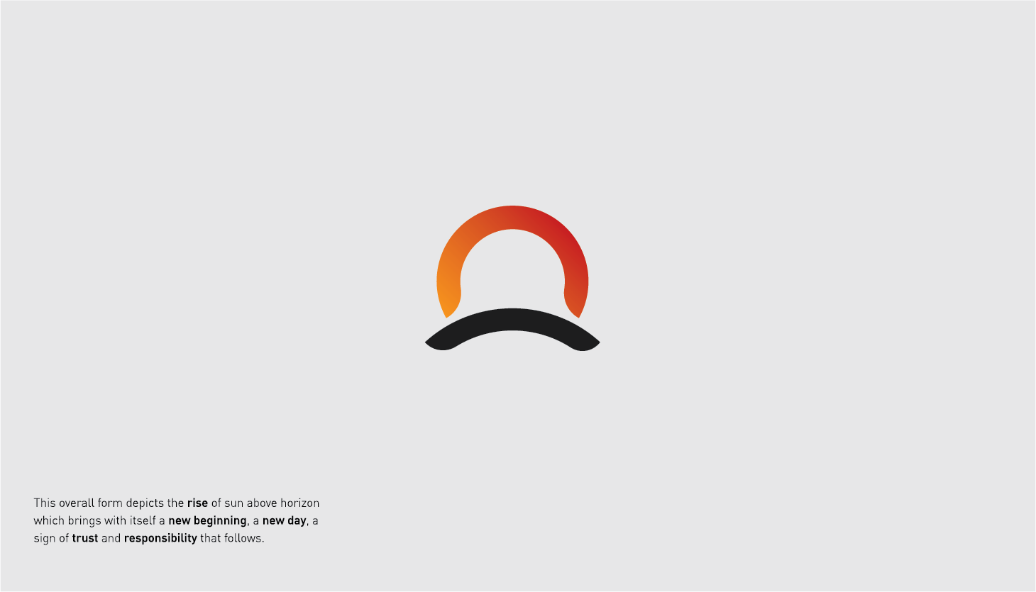
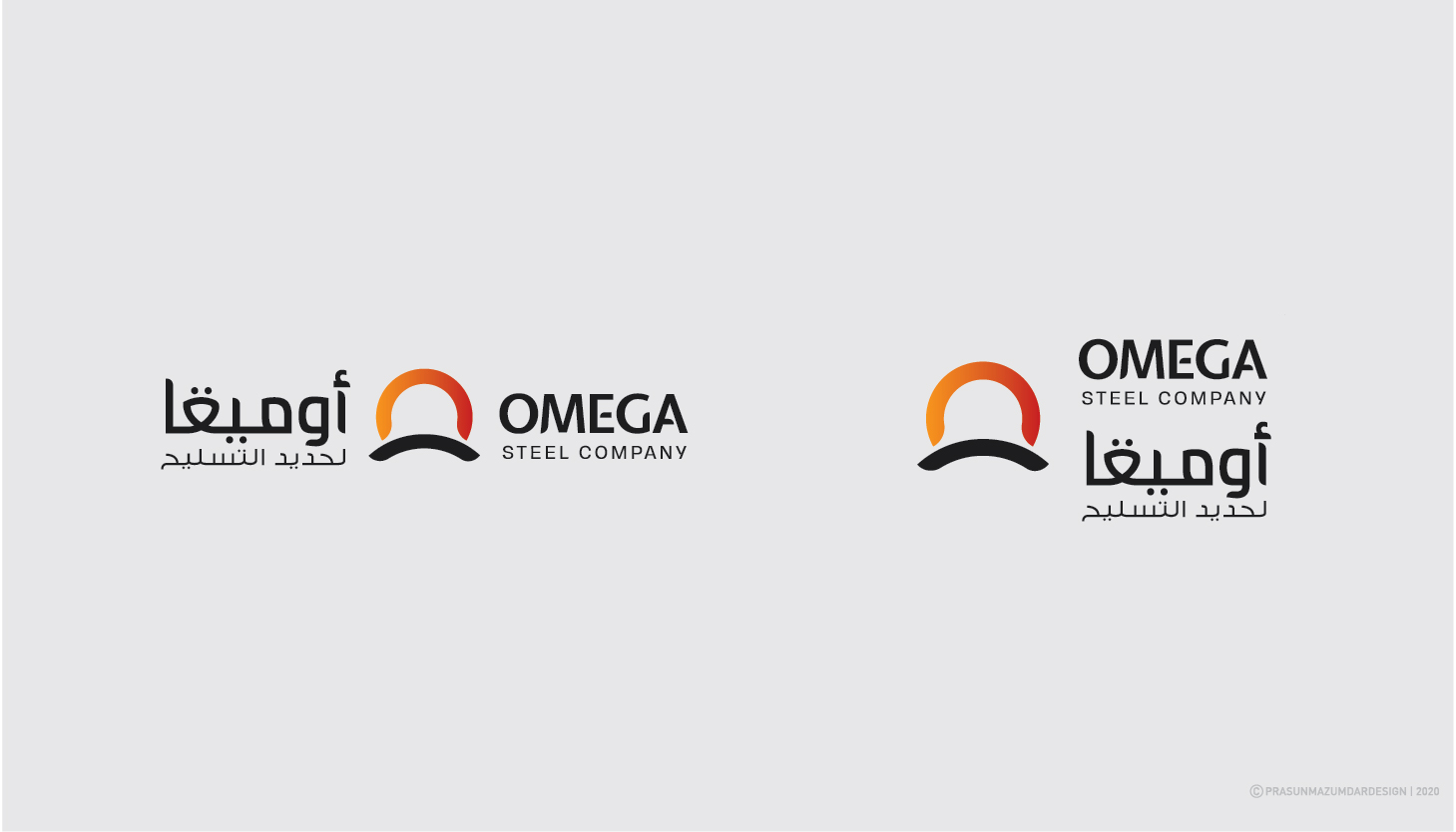
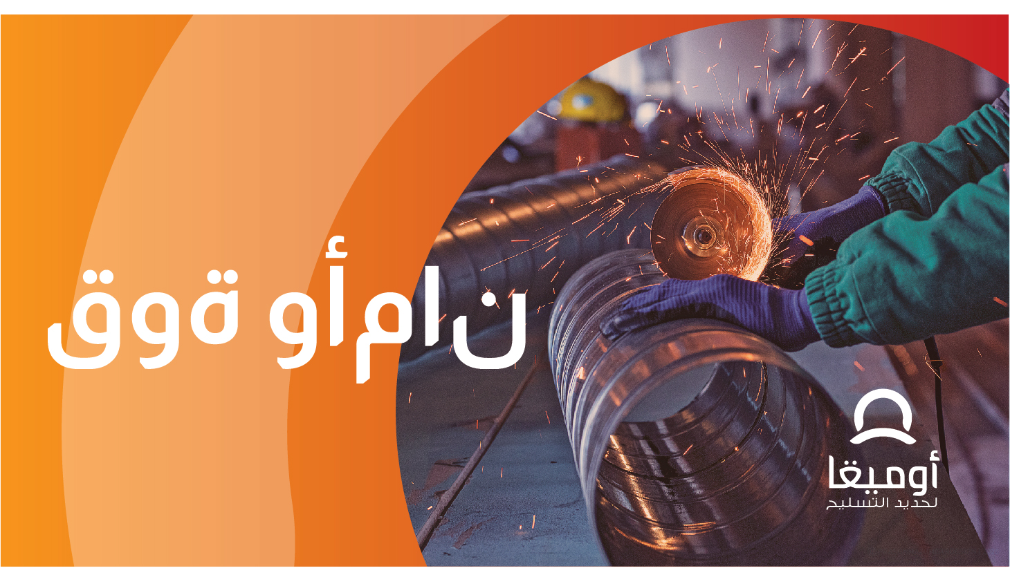
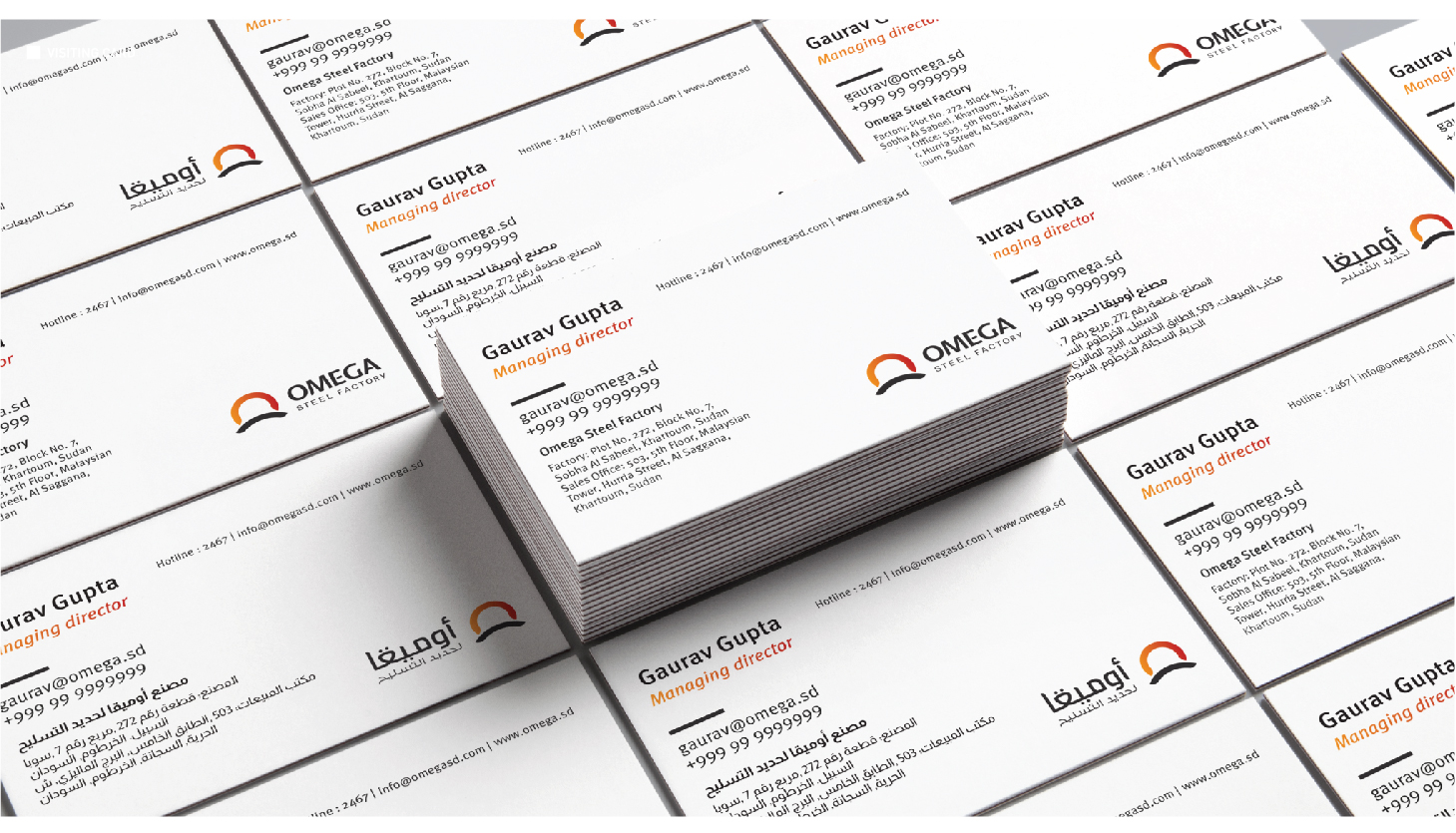
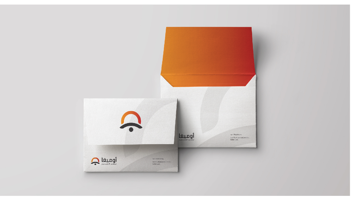
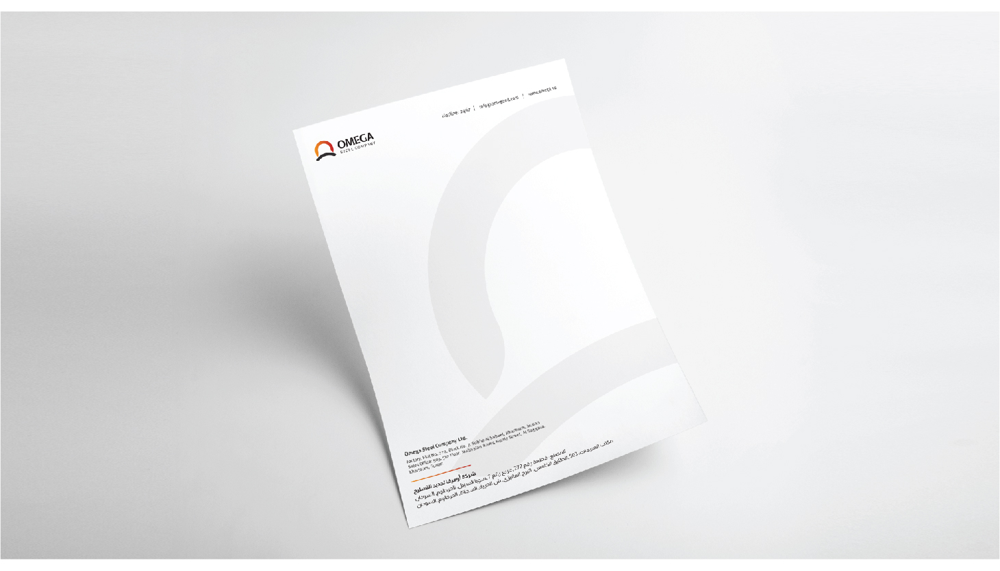
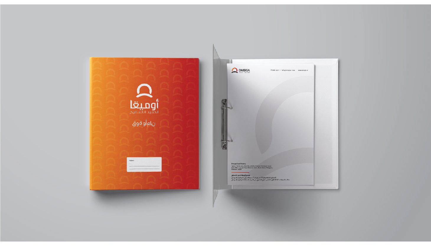
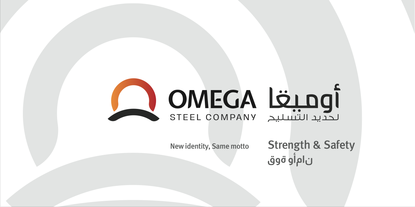
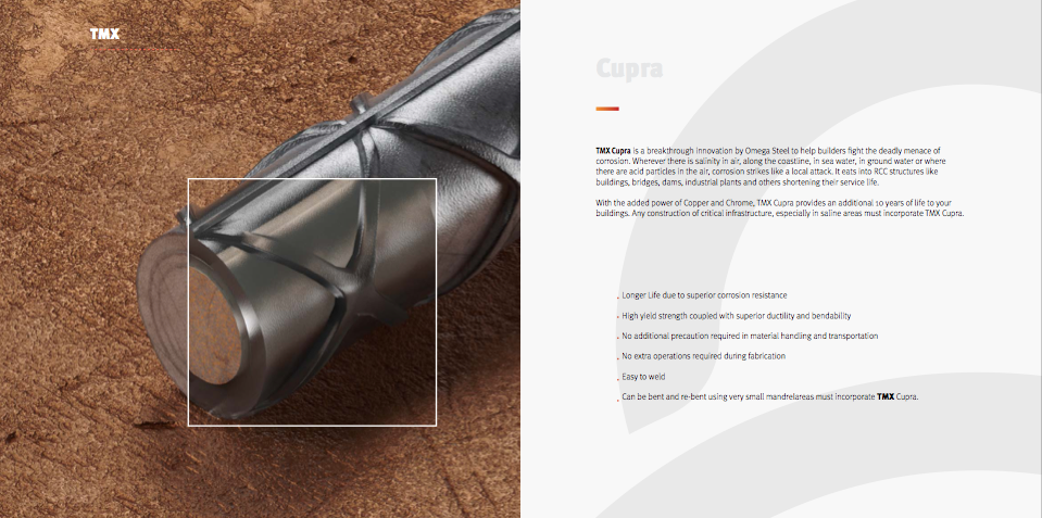
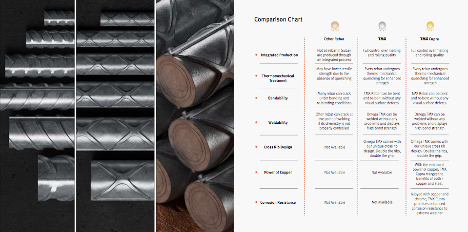
Omega Steel is one of the leading manufacturers of Steel Bars in Sudan. Built on the values of reliability and quality, Omega Steel has become one of the most trusted suppliers to the construction industry in Sudan. With a production capacity of over 350 MT per day, Omega Steel can provide consistent and dependable supply for your projects.
Run by an international team of professionals with a cumulative experience of more than 300 years in the metals manufacturing industry, and backed by Italian steelmaking technology, Omega Steel manufactures quality steel that is compliant not only with Sudanese standards, but also with British and Indian standards. Given our management’s rich experience in specialised steelmaking in India and in other parts of Africa, we bring world-class levels of service and quality to Sudan. We are one of Sudan’s few integrated manufacturers – with full control over the steelmaking process – right from scrap up to finished products. Our melt-shop allows us to monitor chemistry and quality from the beginning up to the end.”
Our Perspective:
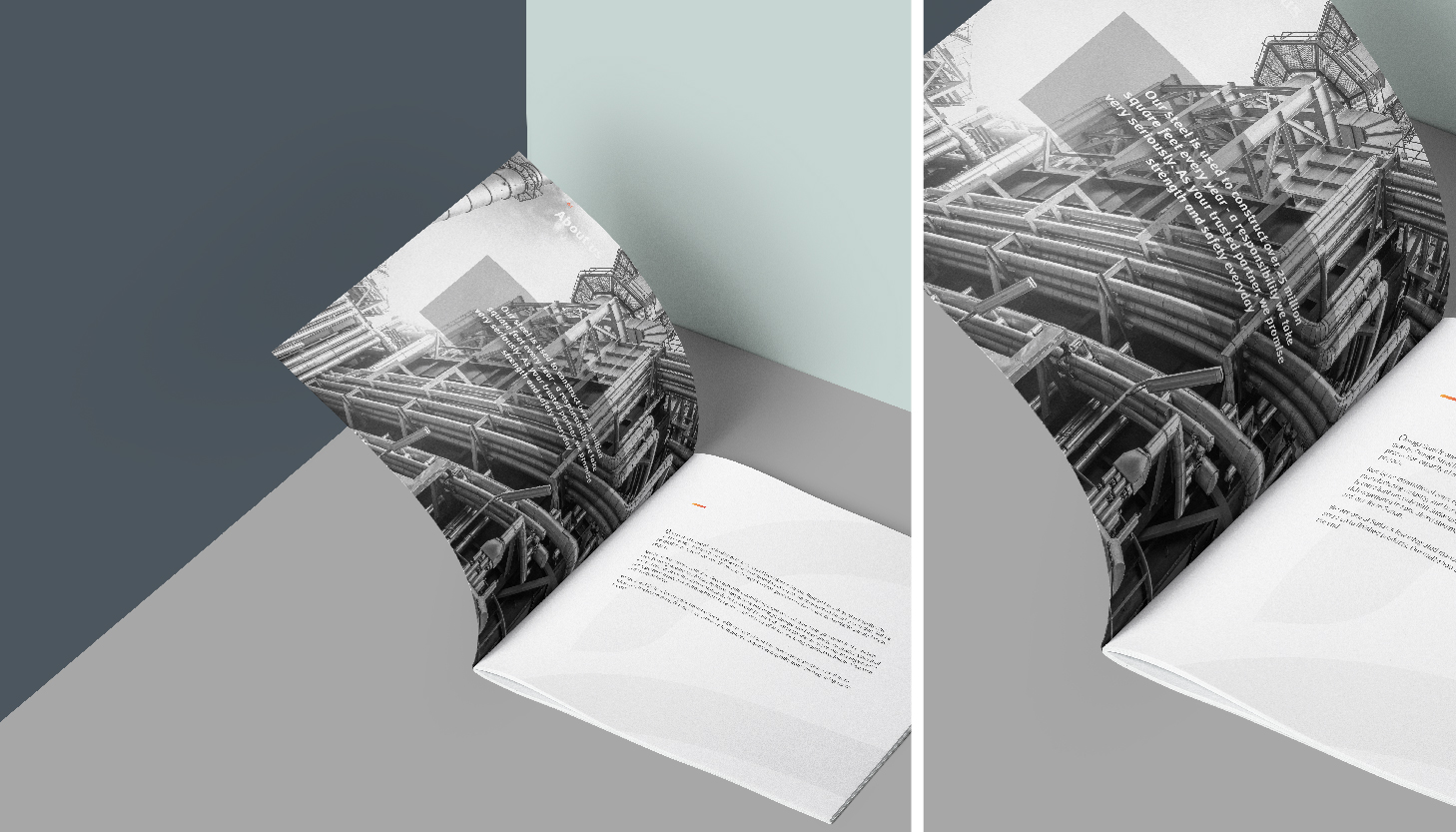
” To do a rebranding, that too for a company, which is running successfully for a decade. We started brainstorming from the core value of the brand that says ” strength & safety”. We started with the research on the icon, and the logotype. and after a rigorous work of 3 – 4 weeks we came to the final form. The ask was to give a new form, yet retaining the old face value and also live up to the mark of being a known brand”
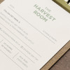
The Harvest Room is a premium vegan home- styled meal delivery service which caters to the authentic vegans in Delhi. The aim is to bring curated plant-based menus to our customer’s tables.
The Illustrations give softness and warmth to brand Language. The illustration along with the soothing and organic color palette has been used dynamically to form the design language. This infused with elegant layout and minimal approach makes the the Brand identity – Easy, Modern, Cozy and Welcoming.
The colors used in Illustration and other elements throughout the brand are also Indicative of naturally occurring process and gives the overall brand a homely feel to it. This further suggest the homegrown ingredients and other natural things associated with the brand. This makes the Brand image – Chic, Warm and Delightful.
The Illustrations are digitally hand drawn on Photoshop. The feel and the image of the brand has been taken into consideration so it’s better suited to fit the overall brand language.
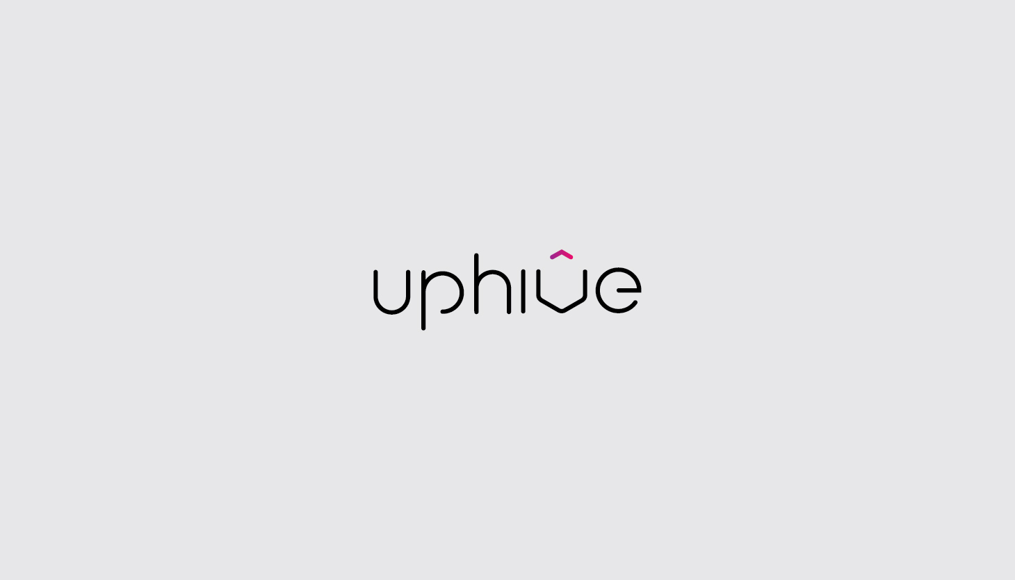
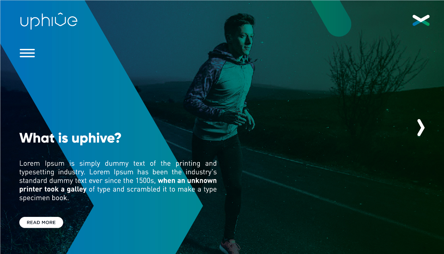
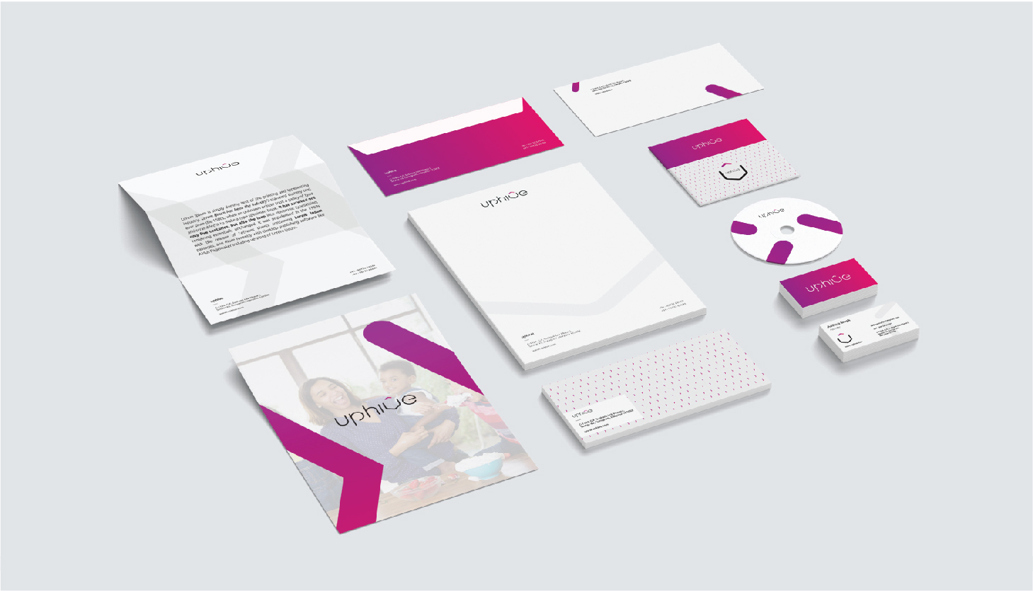
The objective behind this project was to design the branding/ branding language for an online platform/ agency called UPHIVE.The agency had a renewed turnover towards products that associated tagged as lifestyle wellness products.Once the brand had established it’s core area, it has expanded to food, cosmetics, medicines etc.
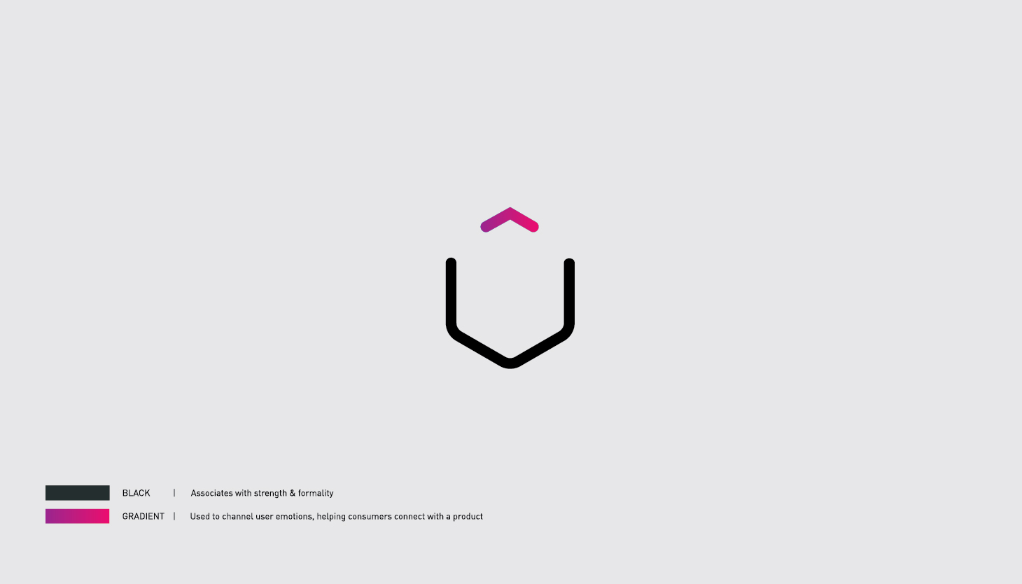
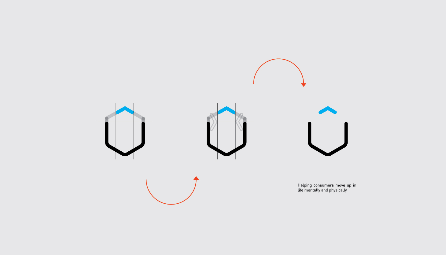
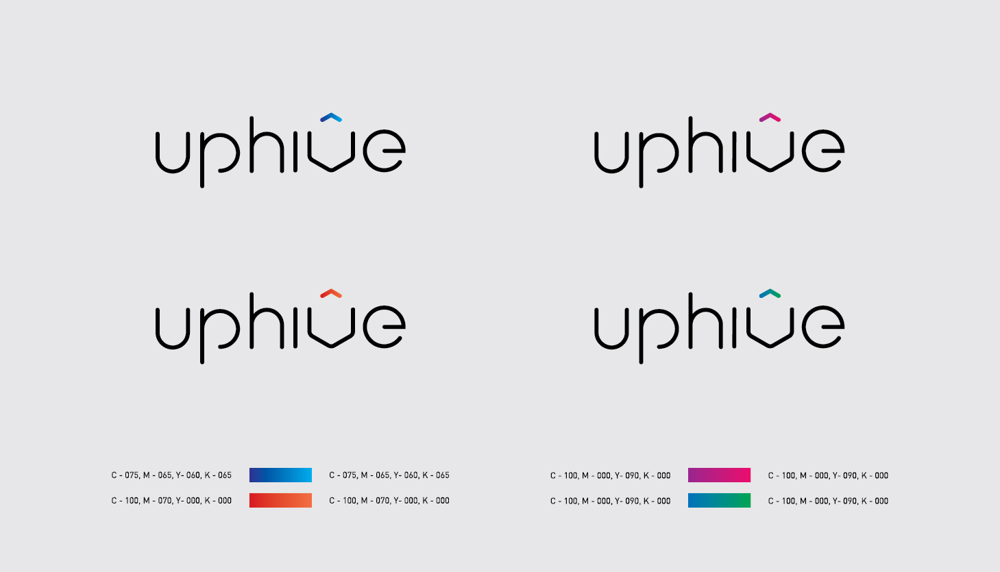
The logo was made in mind keeping up cycling and cohesiveness as major process element for a company of this nature with a touch of minimalism. The usage of colours was to give a idea of freshness and reassurance to the customers. A certain thickness considered while making the logotype for the form it would be an extension go the logotype and since the idea of an hive was primary in nature, we opted for a hexagonal shape ( form and logo as one)
The challenge was to use the shapes to construct the hexagons into a comprised ‘V’ as thr alphabet. 4 to 5 gradient styles for color palettes keeping the digital aspect in mindscope for brand extension, enabling thr brand to operate in the future to align themselves with specific product line
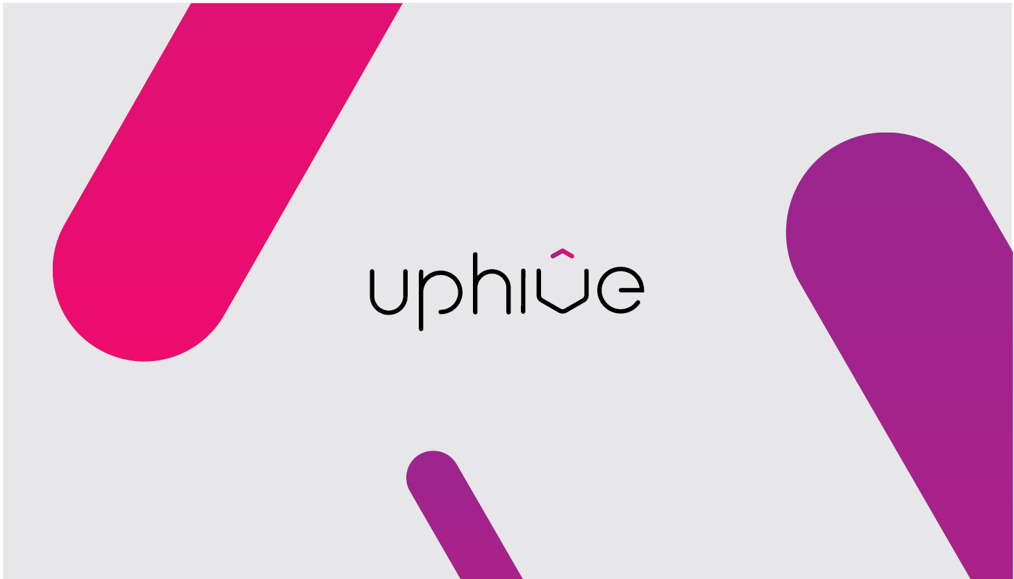
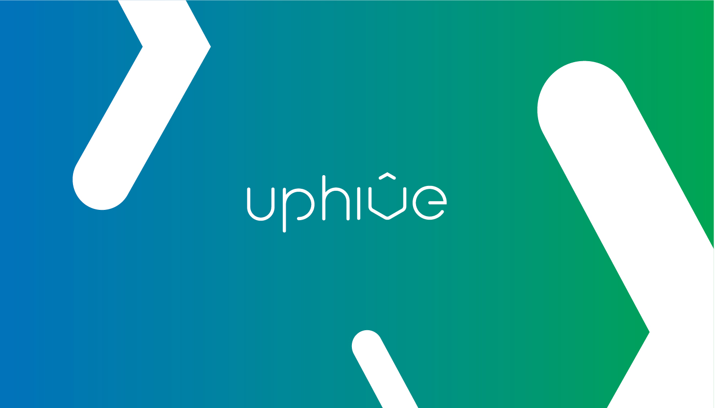
The collaterals below are showcased to exhibit the expansive nature of the brands
Thirsty is a 100% 1st beverage delivery model working in India. The team of highly professional mixologists and taste makers from Indian HORECA industry came together to form the brand. This brand is an amalgamation of all fun loving beverages. The main aim was to create a brand which caters beverages of varied origins differing from the process to the finished product. It’s prime categories are that of- readymade and fresh. Under this two categories of processing, the beverages were subdivide as;
Mock tails, Smoothies, Coolers & Shakes.
The logo was designed keeping the idea of varied beverages as club concept in mind.
To further differentiate the variants on a design note, stickers were created to keep the distinction just not in term of the color palette, but also the texture tactility of the design
The collaterals below are showcased to exhibit the expansive nature of the brands
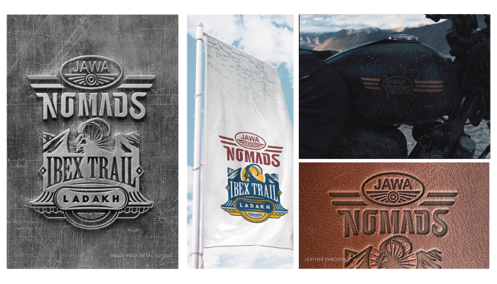
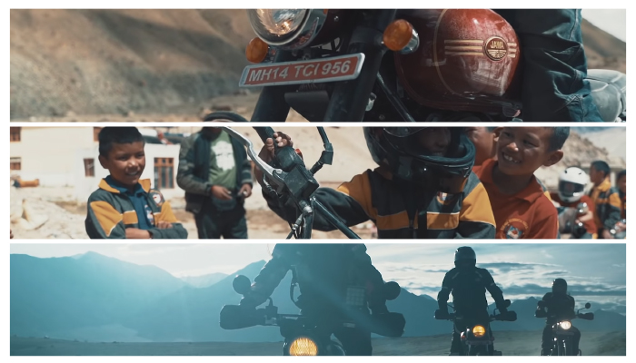
An anchored concept for all JAWA rides focusing on community engagement. The logo is to capture the essence of it being a subculture in itself. This project is focused on a niche target audience.
The logotype for Nomads is carefully hand-drawn. The idea was to make a logotype that romanticized vintage typography and become a visual connecting point between the user and its muse.
The signage or extension with the logo primarily focuses on the region for the specified ride. it emphasizes the topography, beauty and culture of the region.
The signages were further worked upon with explorations of new symbols and styles
Further, collaterals are showcased to present a clear image about the brand extension itself
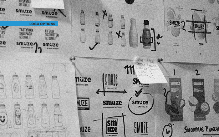
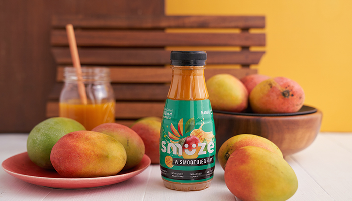
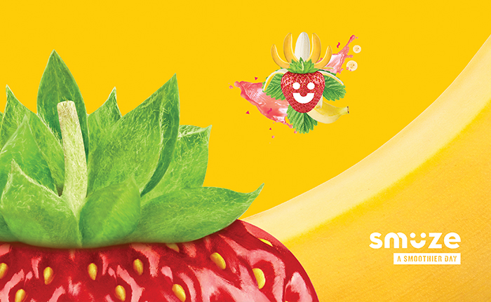
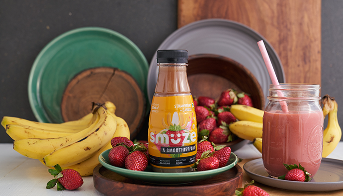
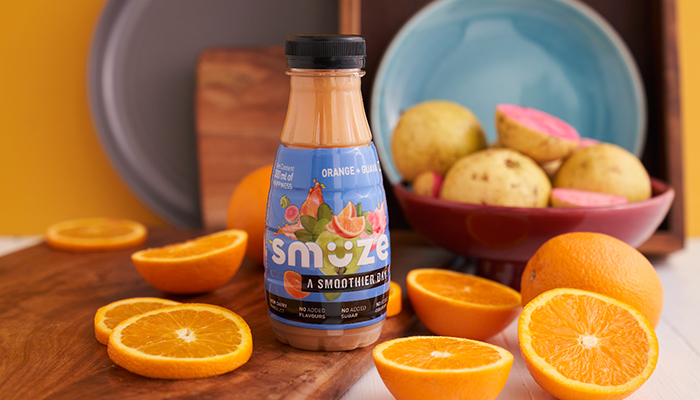
Presenting the first packaged smoothie brand to be retailed in the country, Smuze.
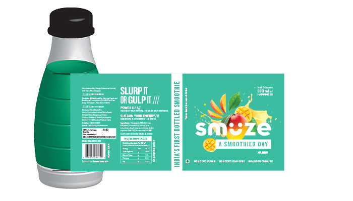
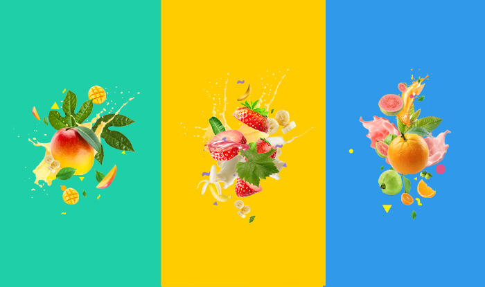
Unlike options currently available in the market, this smoothie is made entirely out of fruit juices, without any milk products and artificial sweeteners. A key property to guide the visual language for the brand.
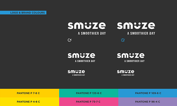
For their release in India, the communication framework had to start from scratch. We brainstormed a unique name which would effectively convey the product’s highlights. The name “Smuze” was coined for a refreshing and filling beverage which one can grab on-the-go in their active lifestyle.
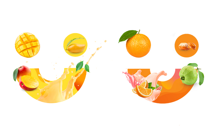
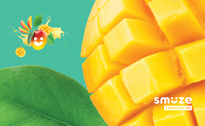
The logotype shapes rounded sans-serif typeface in small captions, the alphabet ‘u’ turns into an affirming smile. Composite copy has been used across the dynamic and playful brand language for print and digital mediums. Together they effectively communicate an overall friendly appeal of the brand. With the variety of flavours offered by the product, our visual language also extended to play around within each of these with different units within a flavour.
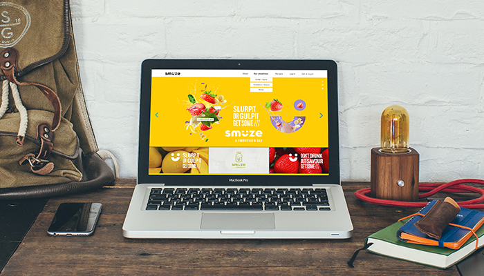
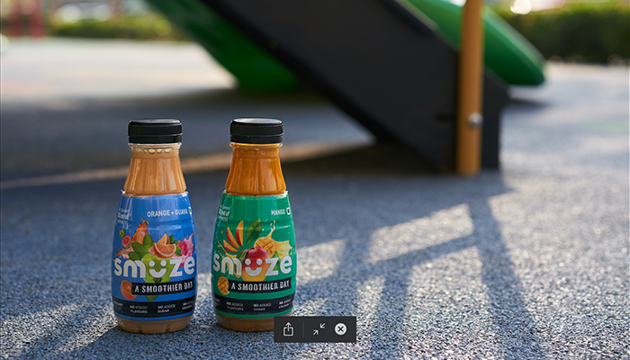
We worked closely with the production team to develop the appearance and shape and size of the bottle The smile symbol from the logo imprinted on the bottle caps adds more nuances to build recognition of the brand in a retail arrangement, while the attractive bottles can be spotted from a farther distance. A website curating engaging content and communication has also been developed for Smuze along with developing a marketing strategy for the product. We have also been strongly involved in art directing the marketing for the brand for its further strategy for communication online and on-ground.
The idea of Little Shelf has its inception from the ‘little shelf’ that families have at their home for kids. Kids, when introduced to books, can develop a love for reading at a very early age. This implies growth in curiosity and that further leads to growth in the collection on that little shelf. To make sure your little one’s collection is delightful, ‘Little Shelf’ was created to show them the bright and colourful world that exists within the pages of a book and lose oneself for a while in a beautiful, imaginary and wonderful place before getting back to reality. There is always a lot to learn from books – words, language, thoughts, experiences. Through the curated box by ‘Little Shelf,’ all these can be shared with future generation in the hope of making the world an extension of a little shelf – a cheerful place that holds wonderful thoughts.
Little Shelf’s brand language is light, fun and playful. Using primary colours, along with some vibrant colour variations, we built a brand that looks playful and also evokes curiosity among the kids. It also appeals to parents as Little Shelf provide quality books that are not easy to find. Since ‘Little Shelf’ doesn’t support the use and throw attitude towards children’s books, the brand language helps to make the collection memorable and make both parents and kids to keep the books forever.
The boxes are divided into the following categories :
0-3years: board, cloth books, toys
3-5years: storybooks to be enjoyed with parents
5+years: Books kids can read on their own
Little shelf is serviceable as a subscription model which offer different options for the customer to choose from. The constant communication and feedback from the consumer help the brand understand the requirement for the child to give them a more personalised experience during the time period of the subscription. The contents of the kit are then curated using the understanding of the possible progression of cognitive skills and emotional understanding of the child.
The box contains things like books, puzzle games, sudoku, action figures, toys and so on.
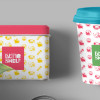
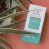
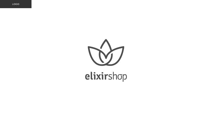
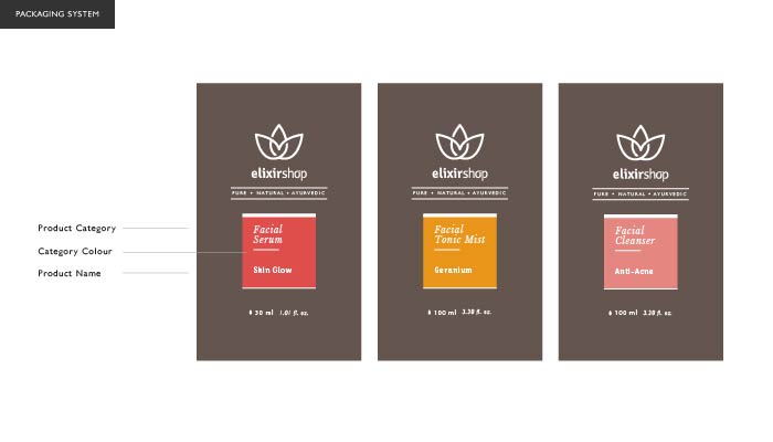
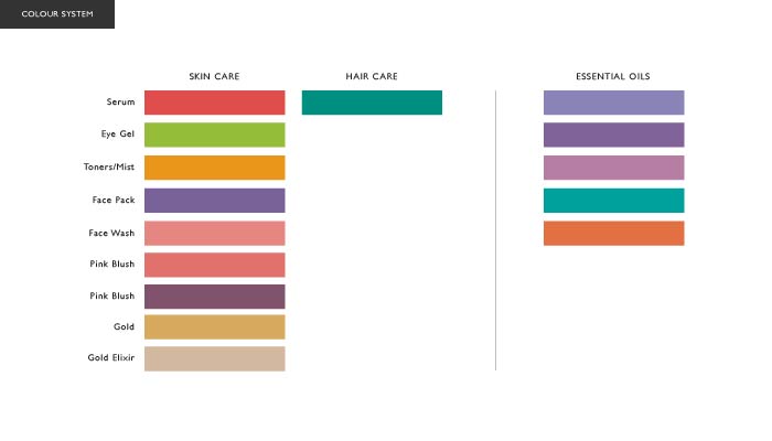
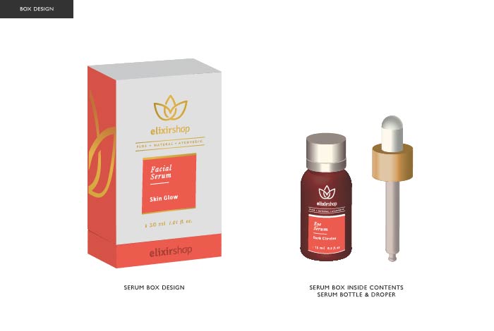
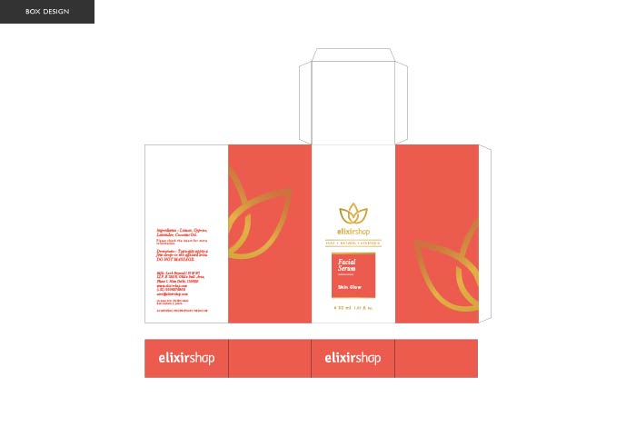
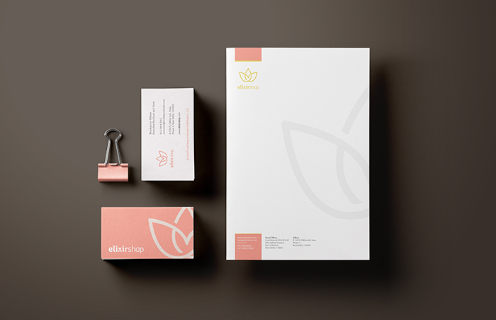
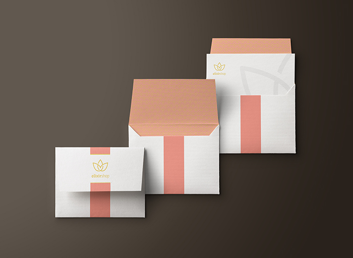
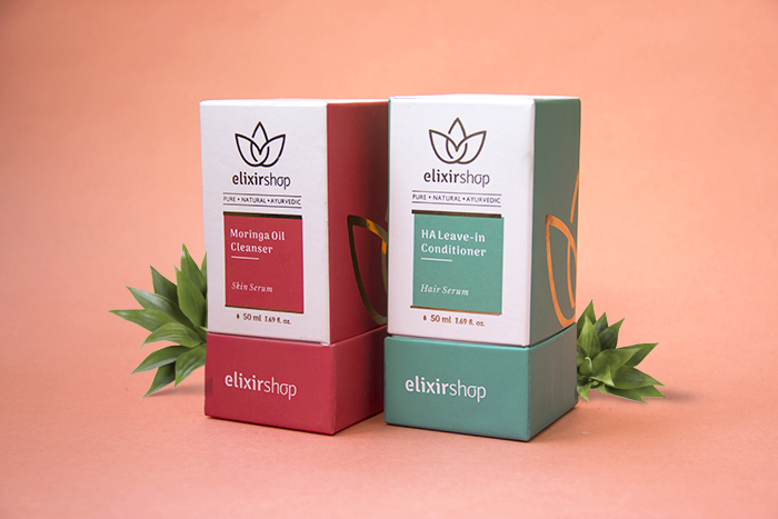
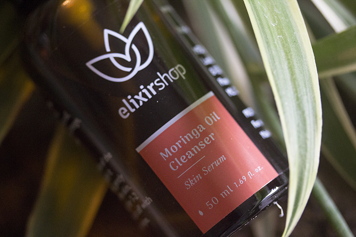
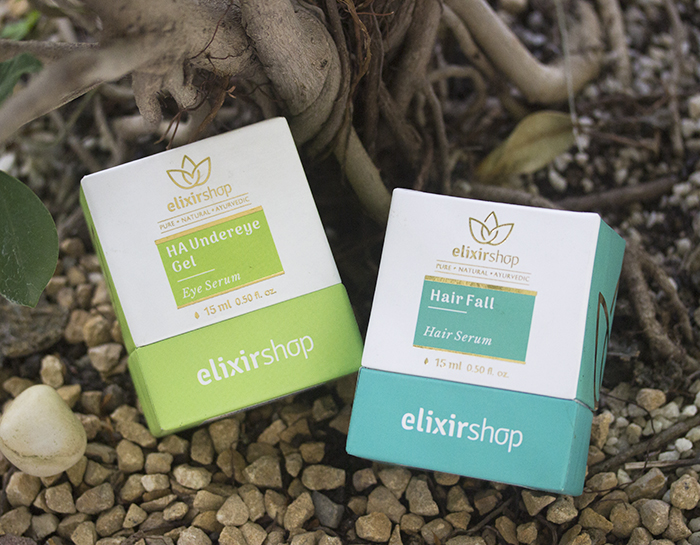
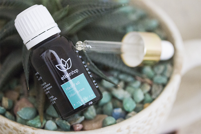
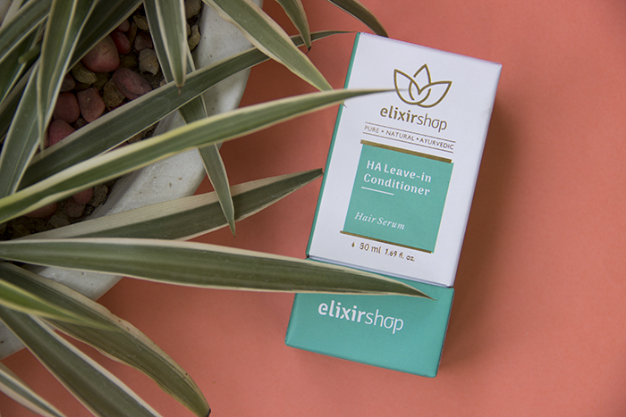
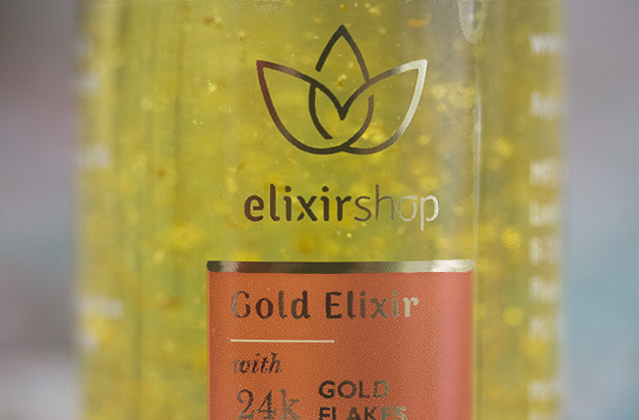
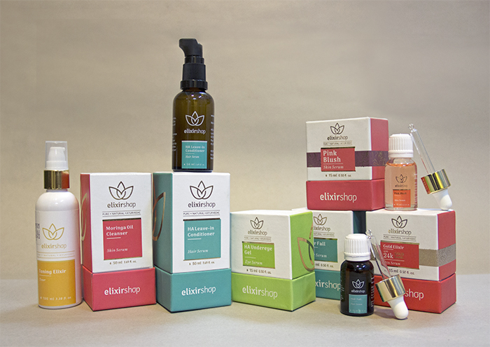
Elixir Shop is a wellness-brand dealing in skin, hair, and body care products – Their products are a 100% natural, have a chemical-free range, and also feature a unique blend of essential oils; making them a brand that focuses on a pure, transparent image that will make clients feel comfortable and at home using their products. We were approached to re-brand their entire product line, creating a unique brand identity system that accurately captures the simplistic, soft feel of the company – and to eventually translate this identity into new packaging design for all of their products – as the packaging is the most visible, and therefore most vital usage of the brand vocabulary that we established.
Lotus was the inspiration for their earlier logo as well. Our challenge was to keep the same concept of a lotus, and create a unique looking logo that will have a modern aesthetics working along with the rest of the design philosophy. The lotus symbol created is one continuous line, with cuts made strategically on places to give a flat yet three dimensional feel, the resultant shape is one single piece which makes it an ideal shape for embossing. We did a hand-drawn logotype with a fair amount of attention to detail, keeping it simple and pure nature of the brand in mind. The entire brand identity system is planned around the strategy of brand placement keeping in mind the target group. We also focused on the future perspective of the marketing goals of each product range and structured the colour system to identify various categories of the products, and a brand identity that holds well all of these categories together, hence providing a very strong visual vocabulary.