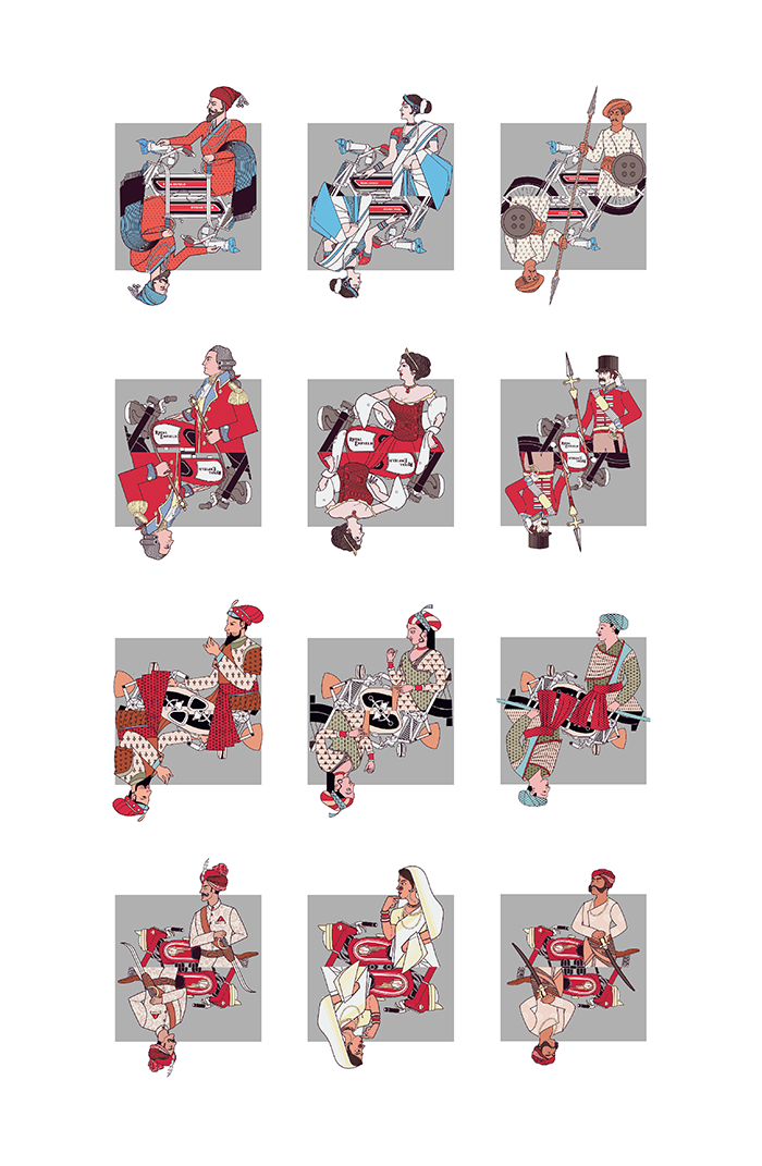
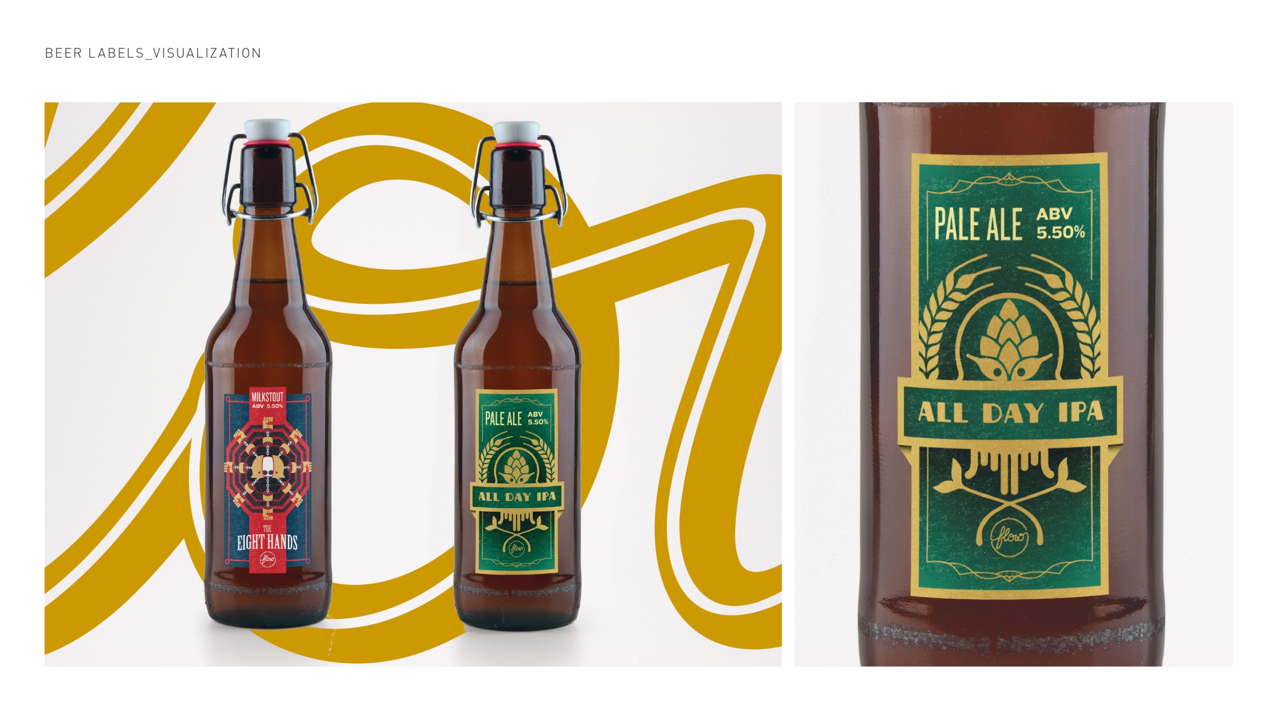
This project with RE and UNESCO, has been done in two layers. Layer 01: Design: Branding and Communication of the project TGHE, which can be viewed here. Layer 2. The Art installation and Art done on 6 Royal Enfield Bike Tanks and 9 Helmets? This humongous amount of Planning & illustrating was done in a record 15 days’ time.
We would like to share a bit of a back story to this exciting journey we had.
As part of its ongoing program in India, UNESCO is focusing on documenting and promoting the country’s vast and diverse Intangible Cultural Heritage (ICH) practices. This is one of the key tenets of developing sustainable, community-based tourism, which has been severely impacted by the COVID-19 pandemic, which is expected to last until 2020. Royal Enfield is working in the Himalayan region to promote sustainable tourism and build resilient communities as part of its CSR-based Social Mission- Responsible Travel. Royal Enfield is deeply committed to collaborating with Himalayan communities in the preservation of culture, knowledge, and traditions that are compatible with just and regenerative living, as well as ensuring that these communities have the vision and knowledge to make decisions that support their resilience in the face of change.
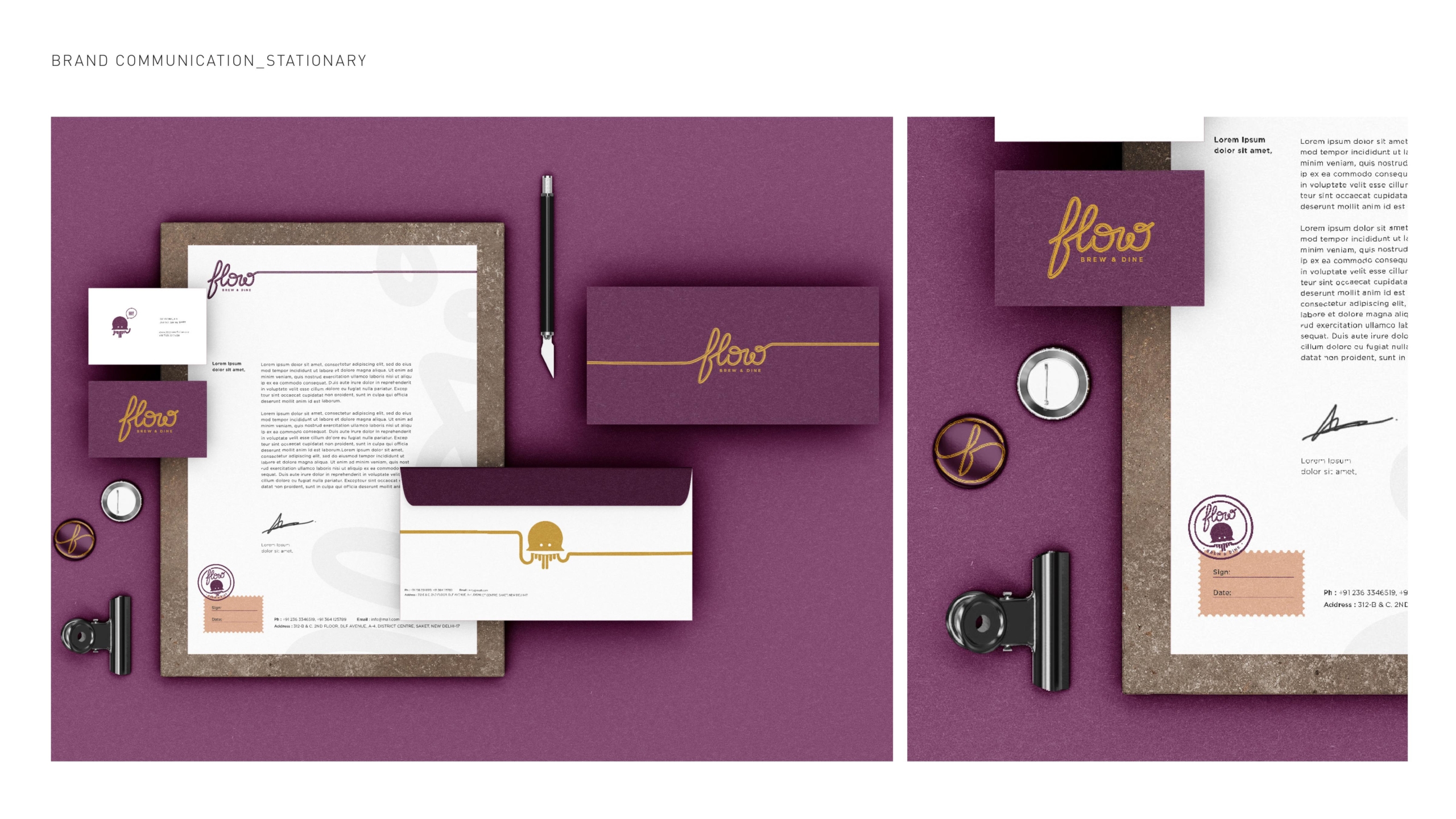
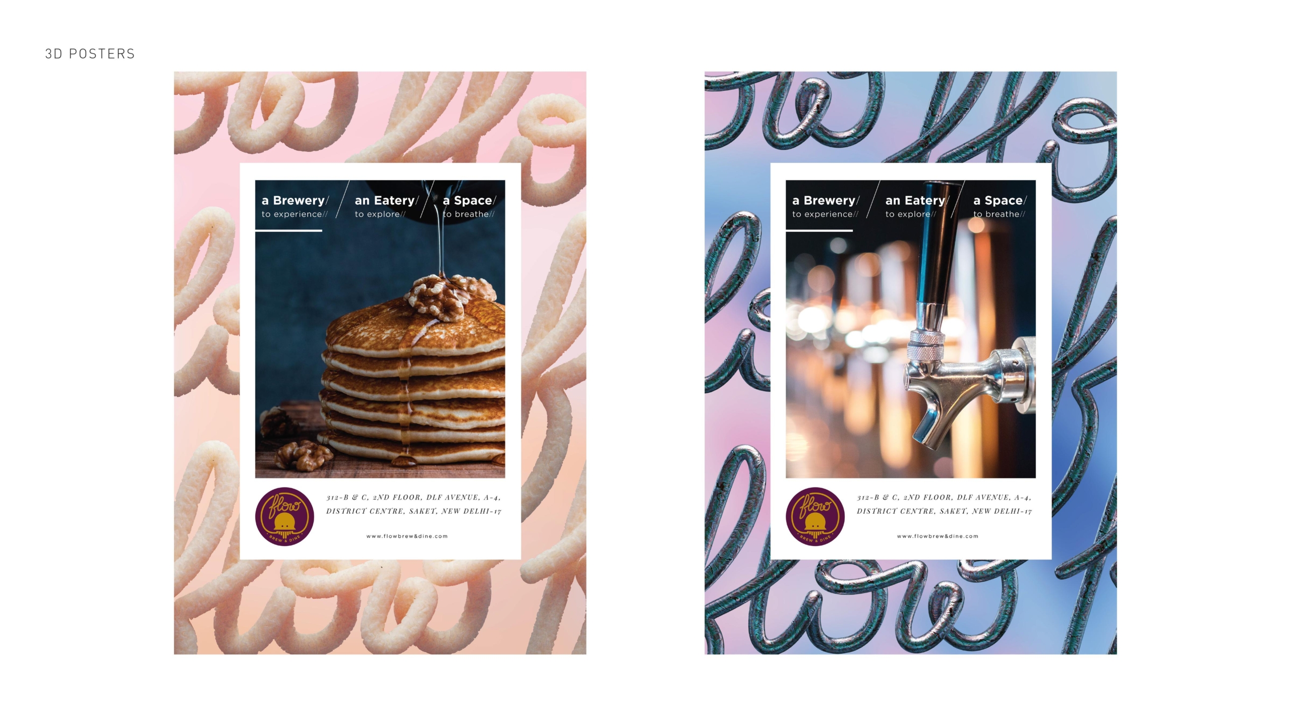
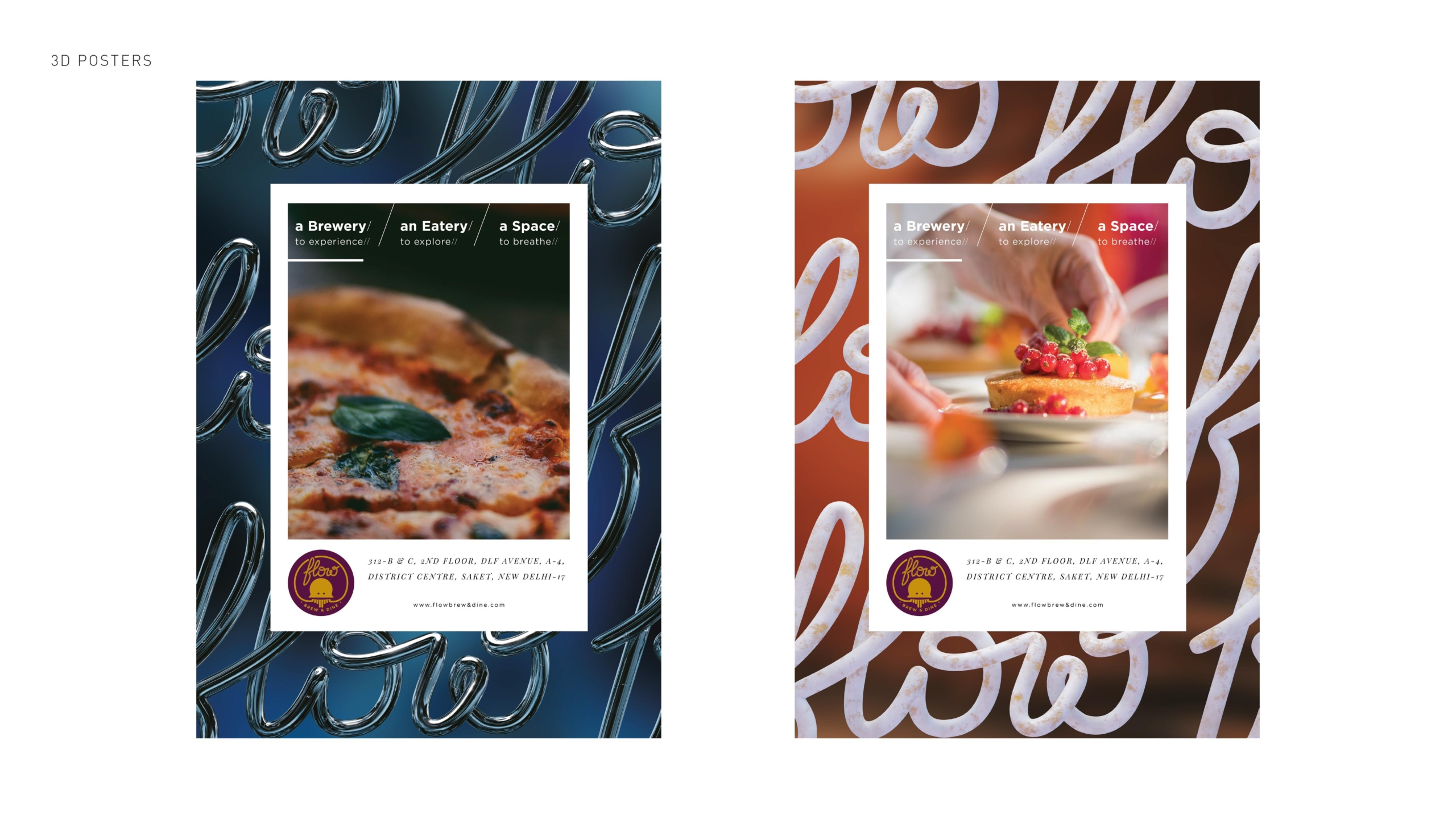
We were approached to do the identity for this very special project. Our research helped us know our country & its diversity better. We looked deeper into the whole project and the fineness of our intangible cultural heritage.
To express it best in the form of the overall installation, which we named “Winds of Change ” the form was inspired by a boomerang, a natural form that flies and also travels back to its source. Each helmet and tanks were illustrated individually with themes coming from the valley that the project is talking about. We covered the whole stretch from the top of Hanley till the deepest jungles of Sikkim. Taking folklore and cultural stories into the context and depicting each design with detailed handwork. A couple of our designs are also inspired by the nature that flourished around those areas, be it the beautiful contour mapping the hills produce to the beautiful starry night sky that very few places on earth really enjoy.


 ‘
‘