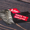
Lee Cooper is well-known global lifestyle company operating worldwide. Started in United Kingdom back in 1908, it made its way to India in 1985. Our task was to redesign the former brand language to promote their new range of shoes, which at the same time reflects the British roots of the brand.
We achieved that by taking on a comprehensive approach and drawing inspiration from geometric forms prevalent in the structural formation of the iconic London bridges. Incorporating elements/shapes like the “rhombus” that are representative of the brand. We formulated abstract patterns based on an isometric grid and followed a distinct color scheme. Tone of voice and copy lines further communicate the unique attributes of the brand.
The design language was taken forward while designing the catalogue for Lee Cooper’s Autumn Winter Collection of 2015.
The design language was also applied across other advertising mediums, during the festive season.
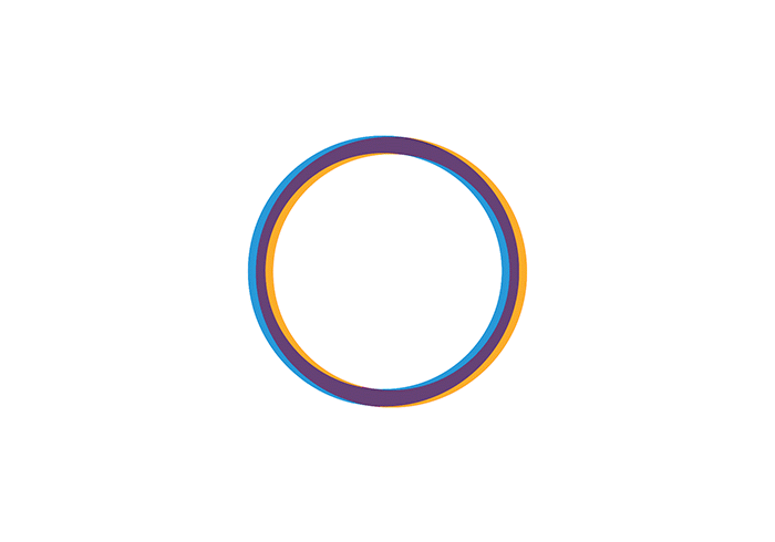
Founded in 2014, New Delhi based Circle of Life Healthcare Private Limited is a technology enabled healthcare startup, which aims to simplify in-patient healthcare delivery solutions in emerging markets, through its mobile application ‘myCOL’.
Taking the founder’s vision into consideration, i.e. to democratize and remove the fear which patients and caretakers feel when approaching a hospital for an in-patient procedure, we derived the identity. A circular loop like formation, that appears almost infinite symbolises an ongoing healthy connection between the customer (the patients) and the service provider (the hospitals).
Apart from working extensively on their mobile application, we designed the website as well www.mycol.in. Which like the app not only helps users to search information regarding hospitals, doctors or procedures. Provides verified and unbiased information of all medical facilities through a map based search. But also, allows users to book an on-site assistant to help them at different stages of hospitalisation.
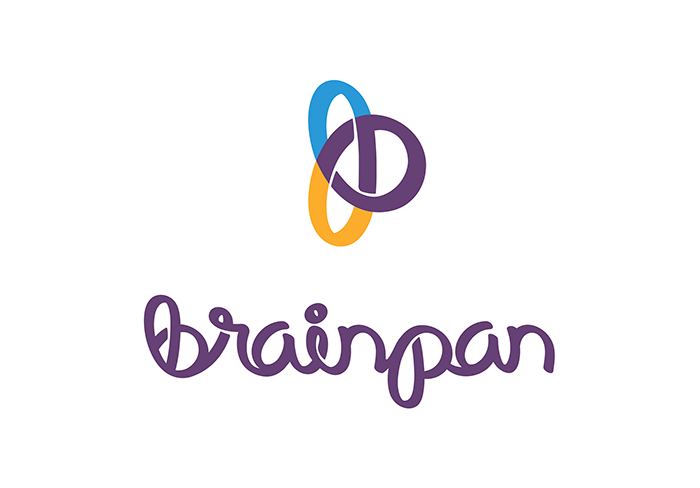
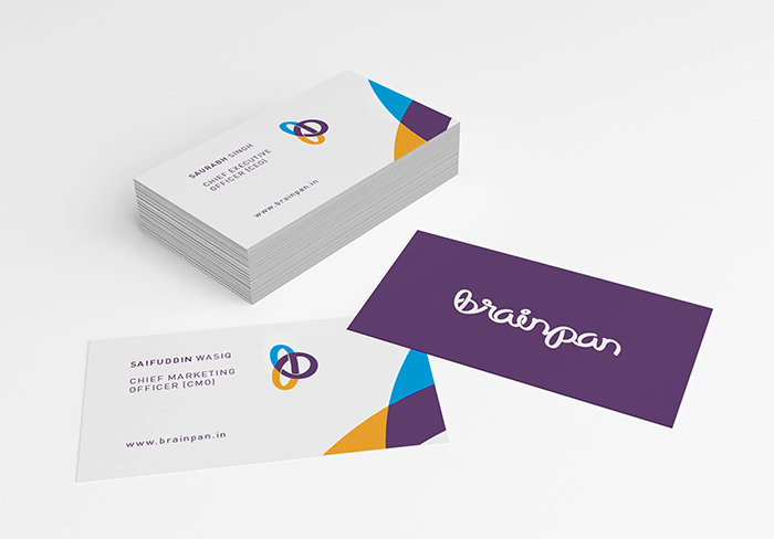
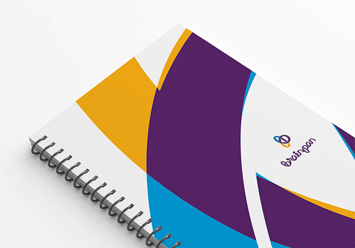
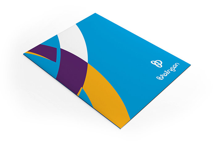
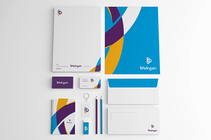
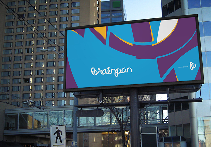
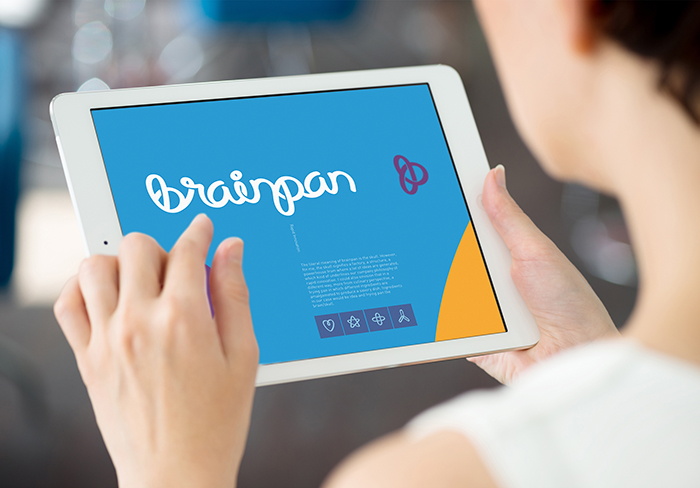
Brainpan Solutions is a new startup that brings together an interdisciplinary team of Computational Scientists, Computer Scientists, Engineers, Mathematicians, and Medical Professionals. Aimed towards bridging the gap between Life Sciences and other research disciplines.
Deriving inspiration from company’s core philosophy i.e. rapid innovation, we created a form that appears to be ever evolving, like an impossible object. We then created a complimentary custom typeface for the logotype that could be used across the different collaterals. Furthermore we also worked on their website.
Bayleaf Wellness brings to you Lyta – Stevia, Sucralose and Original. With these products, it is now possible to lead a healthy lifestyle without compromising on taste or quality.
Lyta – Stevia, Sucralose and Original are being launched in the 1gm tabletop sachet and 100gm home pack. Lyta products have been made using the latest technology and state-of-the-art machinery to deliver a world-class product. Modern day diets, rich in sugar, have led to various health issues like diabetes. Lyta allows you to indulge yourselves without guilt and continue to LIVE A SWEET LIFE.
LYTA – A name derived from the word “LIGHT”. For Lyta, we absorbed the characteristics from the word itself and reflected it through the branding. The packaging design for Lyta was also a part of the project where we kept the visual language and packaging of the product very light and organic. We followed the same communication language to derive the website for lyta.
When it comes to your social life, you must know everything happening “NEAR” you. Nearify unravels all the interesting things happening within a 50 km radius around you on a single platform and also allows you to choose what you like, based on your preferences.
Remember rolling your hands and ogling at something far off and pretending your hands to be binoculars? Fetching movements from the past, Nearify is a fusion of minimal and Idea. The core concept behind the identity was to illustrate – getting everything from around the globe, to YOU, at your location, in your hands.
We made their brand identity and henceforth the other important design deliverables like the design for the website and app.
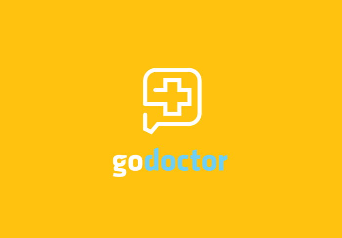
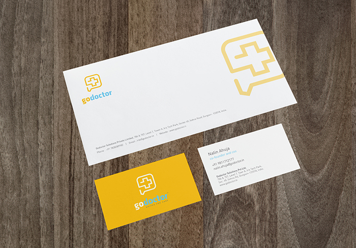
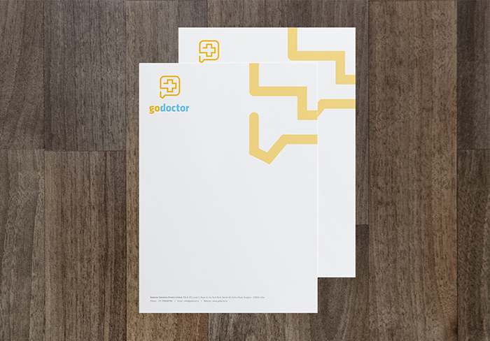
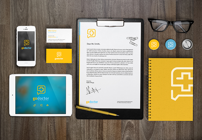
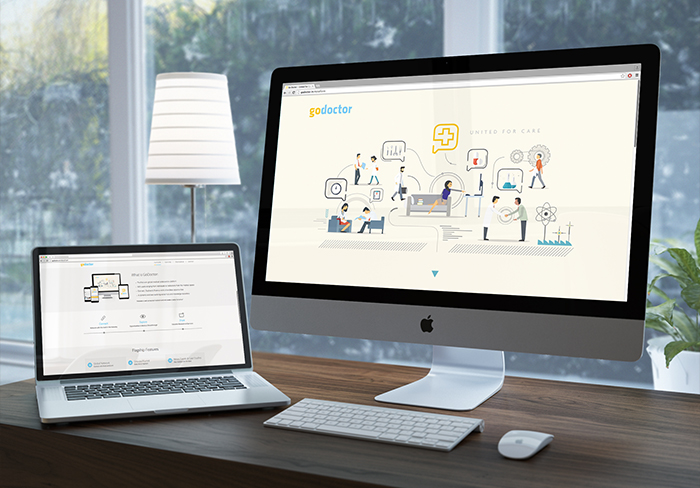
“GO DOCTOR” is an exclusive medical collaboration platform for doctors. A dynamic and ever evolving social hub and knowledge repository.
The key message i.e. continuity and connectivity of thoughts and ideas is exemplified through its bold and straightforward identity design. For the brand language, we used a vibrant color scheme to consolidate the idea of a “new and one of it’s kind” social platform. We also designed templates for the website.
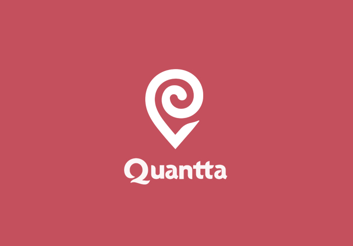
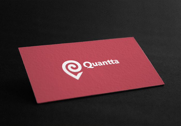
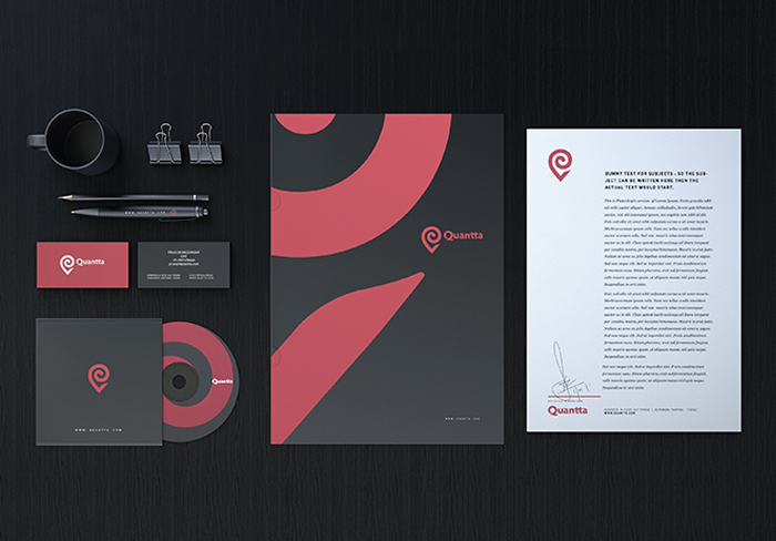
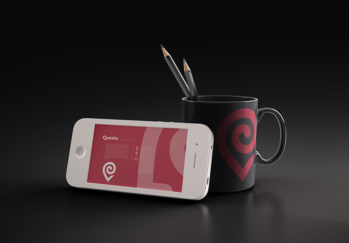
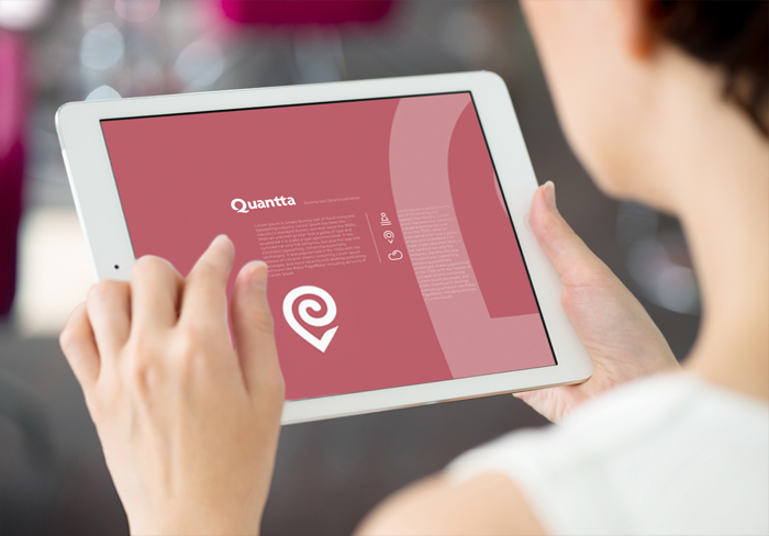
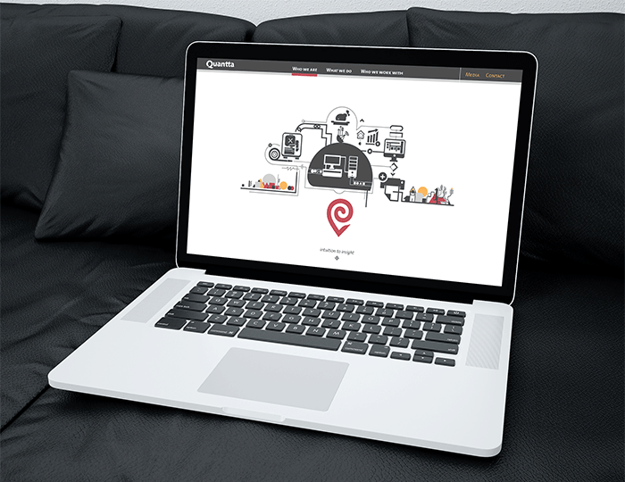
Quantta is a data and business analytics company that uses statistical data and maps to interpret and visualize data into actionable insight.
The identity based on the top view of a shell conch, that also appears to be a pointer communicates a bold figurative language and visualizes the vision that represents Quantta i.e. to transform the retail industry by their location analytics through dedicated efforts. Their solid red color tells the story of a modern company whose here to deliver. Apart from the print collaterals, we also designed templates for their website.
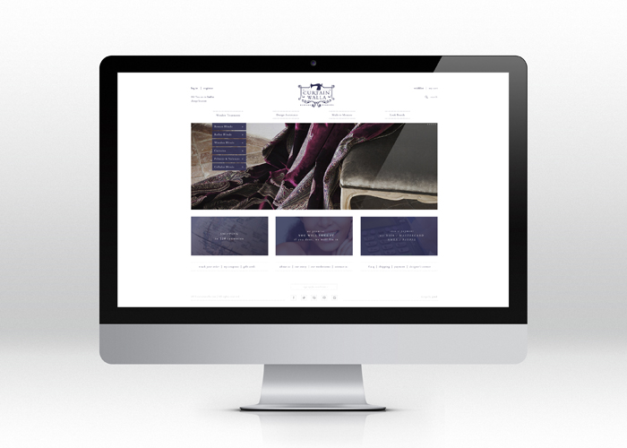
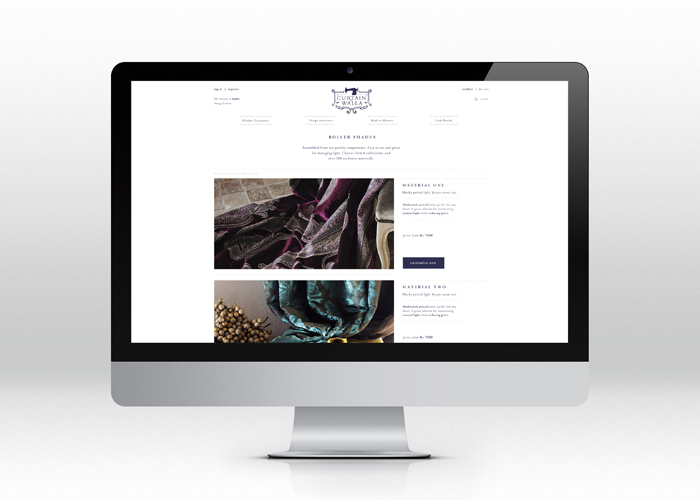
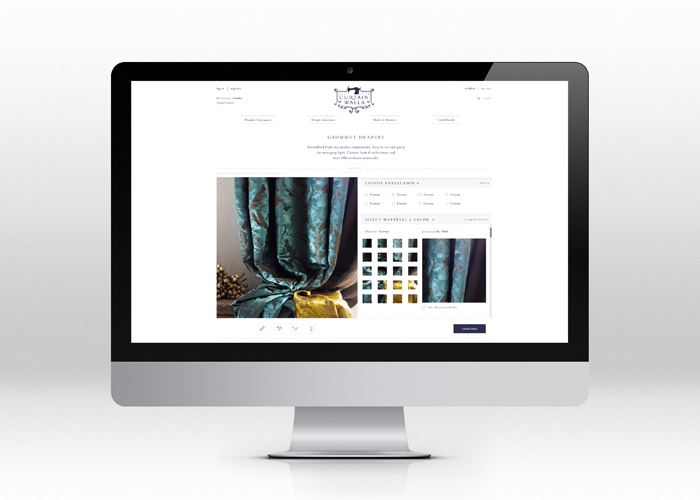
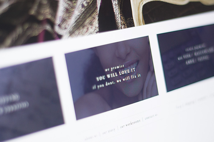
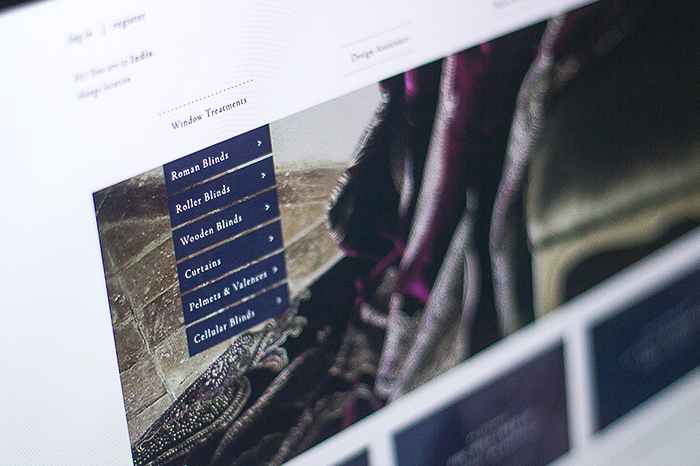
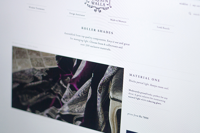
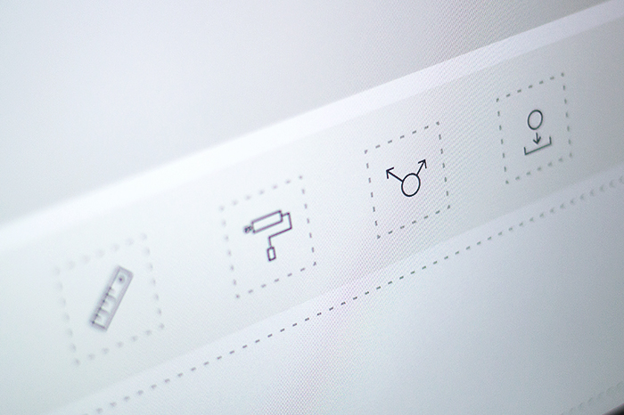
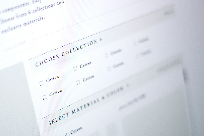
Curtainwalla is a custom window treatments company. With its large range of luxury textile and interior design experts, Curtainwalla wants to change the way people shop for their homes by letting them be in charge. One has to simply measure their windows, chose a textile and curtainwalla insures you get curtains better than you imagined.
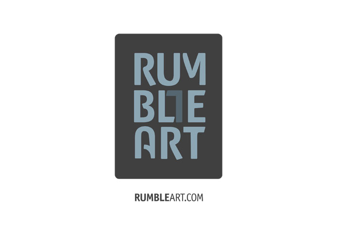
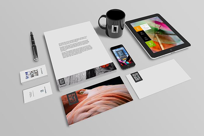
RumbleArt is an interactive portal that seeks to build a universal tribe of artists. They endeavor to promote art to a credible and self-sustainable status. RumbleArt is a community based e-platform for Fine Art Photographers to connect, share and sell their artwork. The aim is to make art a part of the daily behavior. We started with their brand identity system with “frame” as the idea & the concept. The logotype itself has the symbol entrapped as a part of the fixed matrix. We hand tooled the logotype, wanted to give a modern look with arcs, indents & line inclinations showing art as the integral part of the brand. The collaterals are designed keeping in mind the service they provide. The visiting cards have several options with one side showing various images masked through their logotype. The other collaterals have images as well.
We also became a part of their online presence, by giving design directions for the site, working very close with the group of programmers. The website page layouts, icons, touch pad applications, web banner ads are few other deliverables. The website is slowly taking shape, but can be viewed at www.rumbleart.com
Web banner ads, keeping branding as the tool of communication.
Surya Exports was born in the year 1988 and with it a mission dawned; ‘To take India’s rich handicrafts and textile traditions to people the world over.’ House This one of its main brand, other than the “tree of life” deals with mainly home furnishing products. They divide their collection via design style and inspiration and segregate them under four broad categories, namely: classic, nature, abstract and art.
We rebranded House This. We started with conceptualising the various sub divisions and understanding the target group. We did the logo first and subsequently the symbols for the sub divisions. The idea was to get a modern look without losing the Indian feel of the brand. We had a lot of constructive brain storming sessions with the client and finally we came up with something that satisfied our visual as well as functional quest. House This logotype is a redrawn version of font called “sans”, we gave some humanist touch to few of the letters. The symbol seeks inspiration from the idea of material, spiritual and emotional being together that makes a house complete. In the sub brands the ideas are rather direct.
We have designed their website, for better user experience for online shopping. With a great no. of brands selling online we wanted to create a experience in terms of both interaction as well as easy. There are sections where people can even share their ways to doing up their house. The programming is on its way, soon can be experienced.
The branding exercise was done taking into consideration the future aspects and areas of expansion of the brand. House this right now does sell through a lot of collective home furnishing stores, but we have conceptualised and designed the space for their up coming stand-alone stores in 2014. We also designed their quarterly brochure, Diwali leaflet.
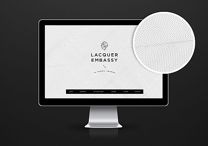
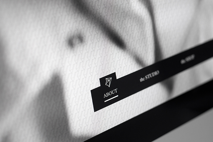
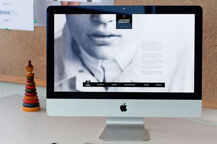
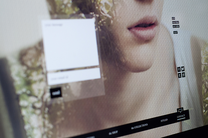
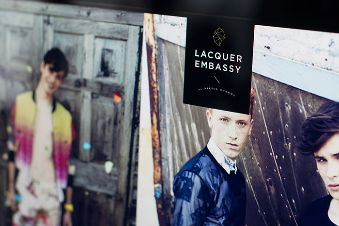
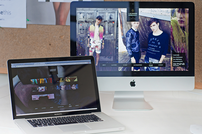
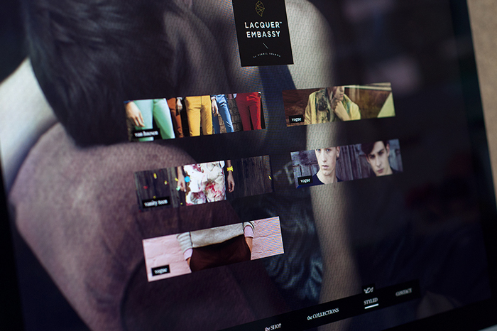
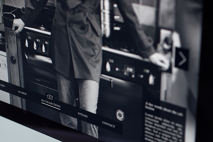
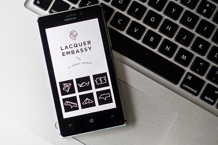
Lacquer Embassy combines classic influences with modern culture, focusing heavily on attention to detail and minimalist silhouettes. The label aims to encompass the fusion of the relaxed elegance of youth and luxury with a definite sense of modern aesthetics. The designs are brought about from an uncomplicated perspective and the inspiring ability to be gentlemanly, yet relaxed and unpretentious. The designs are hybrids that reflect today’s lifestyles without being rooted in any particular time or era.
The website is a pure reflection of the design philosophy of the label, a minimalistic, iconic driven experience which is an extension of the brand identity.
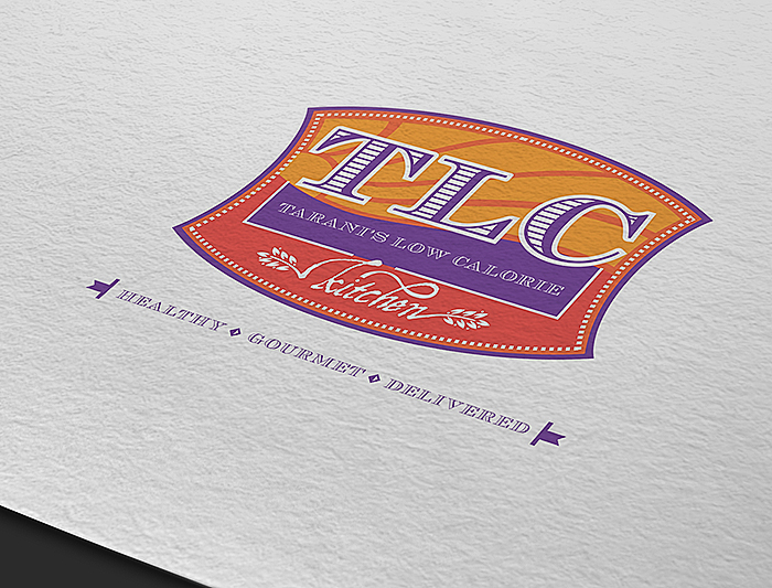
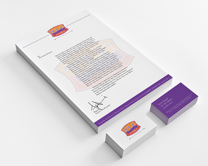
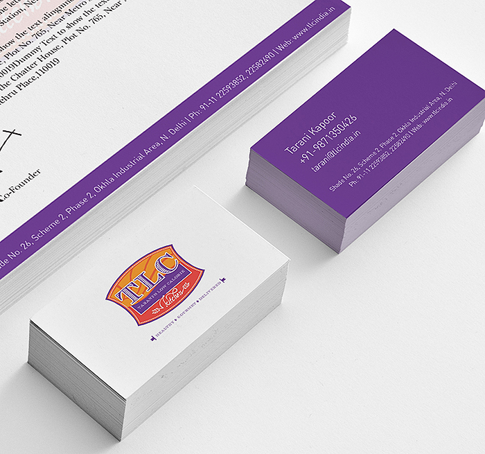
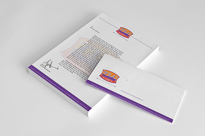
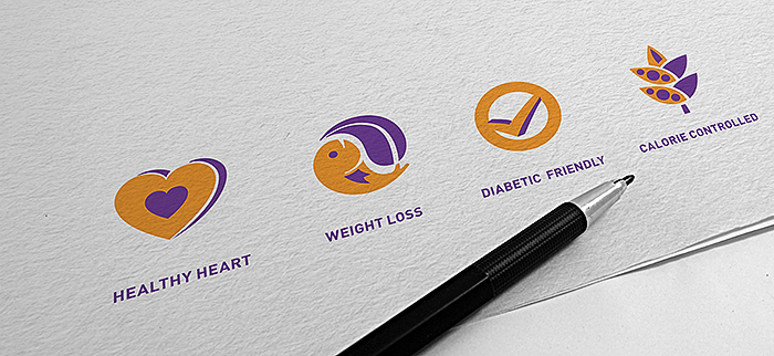
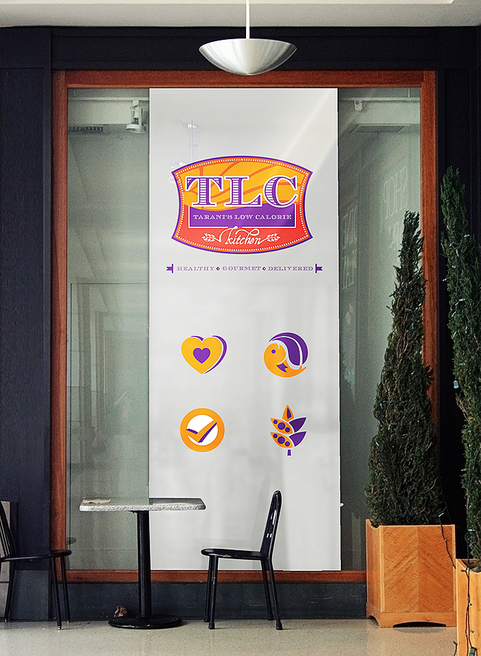
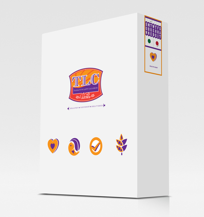
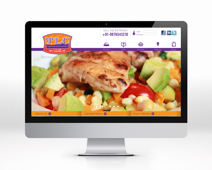
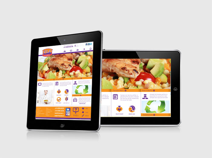
TLC is Tarani’s Low Calorie Kitchen. Its a Delhi based Kitchen offers you a wide variety of health conscious diet also sub divided further into 4 broad categories. We did their logo and the entire brand identity system. That mainly consists of stationery, packaging, facade design, etc. We also did their website and a tab application to browse through the menus and order online.