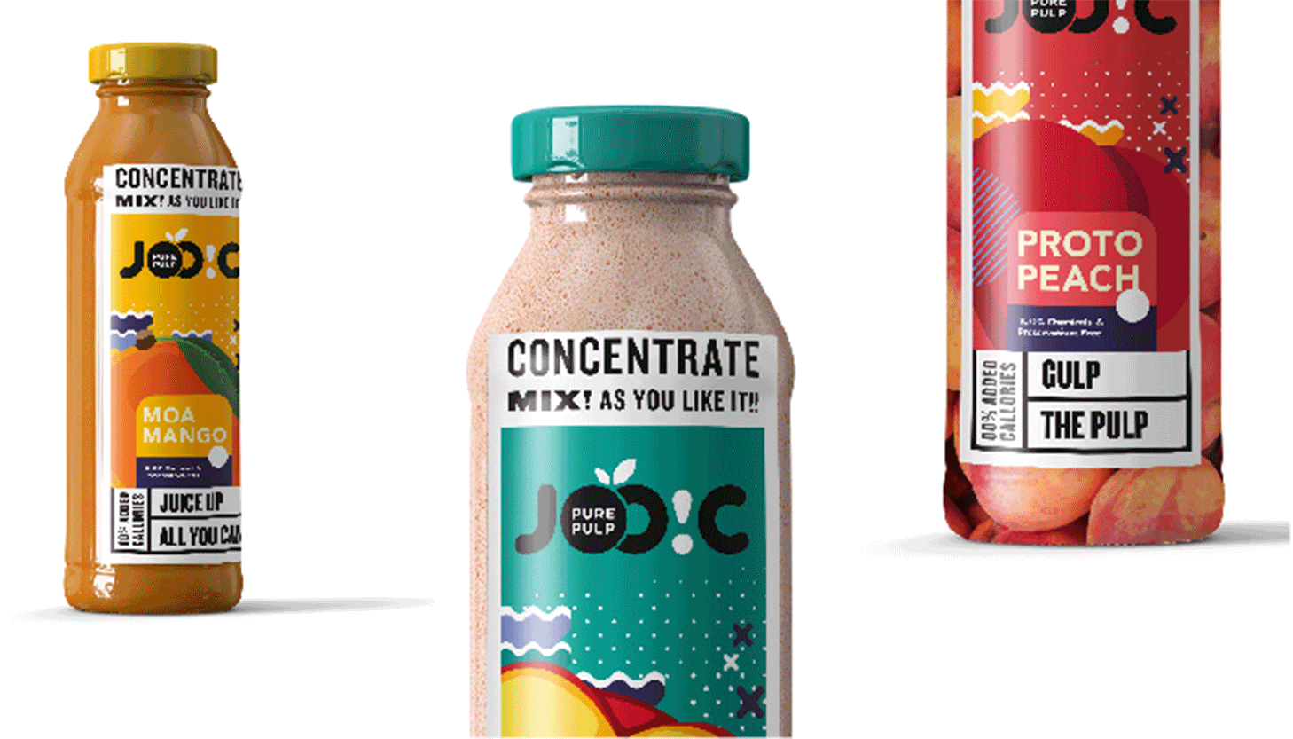
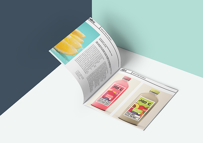
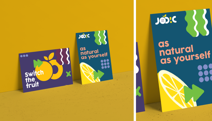
Joo!C stands out among other brands as it gives one of the best beverage solutions, acting as a full range supplier in the bubble of fruit based drinks, ranging from concentrates to juices. A pulpy fruit juice brand, it appears as funky and goofy but doesn’t compromise on authentication and natural aspect and doesn’t struggle to identify as a pure, ready to drink juice brand. Joo!C also has a wide portfolio of different fruits being incorporated naturally. The spectrum ranges from locally known food to some little more exotic category, which combined with the brand identity created by us provides the brand a very varied but consistent, clean, fun and playful look.
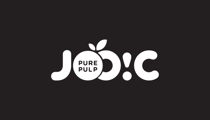
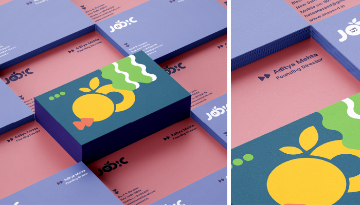
The word Joo!C is very evidently inspired by the name ‘juicy’ which is a very straightforward adjective, more so for a brand selling juice. Very familiar and direct in its pronunciation and very different in our iteration when it’s spelled out, it surely creates a unique space for itself and would resonate with its consumers more easily.
The logo is formed by rounded shapes that evoke joy and playfulness. All these forms are thus treated in a grid to appear of the same strength and so each form can stand out without disrupting the harmony of the logo unit. The two O’s are put very closely to each other to make it look like fruits, accompanied by two small leaves.
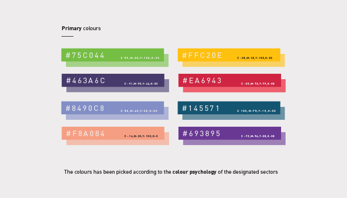
The label for each fruit is naturally inspired by the fruit color and its vibe. The varied colors are not interfered by the consistent brand language and have been used in a way to create an overall harmony throughout the brand language. None of the colors have any value of K so that the black and white label on the logo pops out.
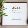
The ADAA coffee table book for Samsung is a design inspiration book made for the benefit of the in-house design team at Samsung. The book features the style-evolution of India; in a timeline format – beginning from the Indus Valley Civilisation, all the way to the present 21st century. India is a country with a diverse range of styles, due to different influences from all around the globe through the centuries. The purpose of this book is to make the reader aware of the untapped reservoir of design inspiration in India.
The timeline is divided into three parts; the history of India, India post-independence and the growth of India after the 1991 economic liberalization. These parts are further divided into eras, with information and images to do with the architecture, art & craft, fashion, food, utensil, entertainment, appliances & gadgets, transport & automobiles of each era.
Since the book has a vast amount of information and images, we designed a system for the 3 parts of the timeline. Each section is also icon-coded or colour-coded for easy consumption of content. The book was very well received by the team at Samsung.
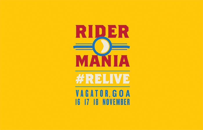
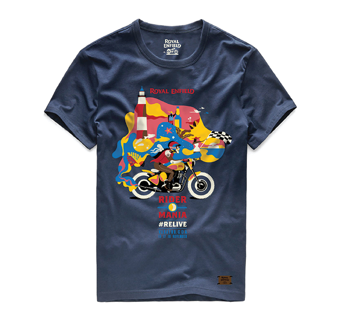
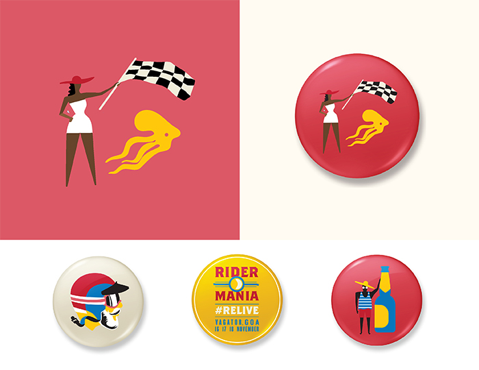
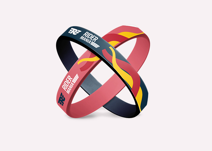
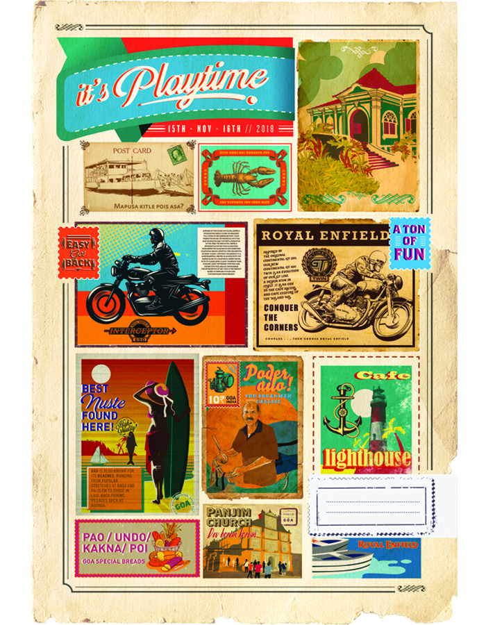
Rider Mania is an event hosted by Brotherhood of Bulleteers Motorcycling Consortium (BOBMC)member clubs in India every year. It is the annual gathering of Indian Royal Enfield motorcycle owners. This year, we designed all the communication collateral, merchandise and even designed the Invites in the form of a Flip-book!
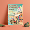
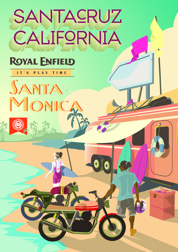
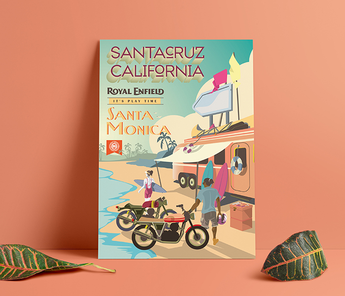
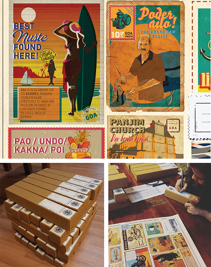
2018 saw the the return of the legendary 1960s Royal Enfield parallel-twins in two brand new variants- The Interceptor INT 650 Twin and Continental GT 650 Twin. We designed the Posters for the respective Launch events in Santa Cruz (California) and Goa (India).
The poster for the Santa Cruz launch highlights its adventurous yet serene beach life.
Launched in October 2012, the Ashdeen label specializes in hand-embroidered saris that are inspired by centuries of Oriental and Persian hand embroidery techniques, craft and craftsmanship. The intricacies of these techniques are rendered flawlessly by a team of 150 craftspersons. Ashdeen creations have been featured in various fashion publications and worn by celebrity actresses and industrialists. They have also been shown at the Lakme Fashion Weeks in Mumbai (spring-summer 2013 and 2014, and winter-festive).
We were tasked with re-doing the Ashdeen brand – beginning with the logo and logo mark, to building a brand language, stationary, and finally packaging.
The brand we created is sleek, minimal, and extremely striking. Using a combination of black, white, and gold, we think the new brand language truly emulates the elegant clothes they represent and would make any of the brand’s esteemed customers want to take further interest in the brand.
We made a set of illustrations using elements which were either taken from or derivatives of various prints and patterns seen in Ashdeen collections.
These illustrations then went on to define the brand, becoming very central to the language across most collaterals.
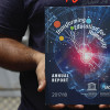
The UNESCO Mahatma Gandhi Institute of Education for Peace and Sustainable Development (MGIEP) is UNESCO’s category 1 Research Institute that focuses on Sustainable Development Goal (SDG) 4.7 towards education for building peaceful and sustainable societies across the world. We designed their Annual Report for 2017/18; as well as a Brochure, which serves as a quick introduction to the organization and their work.
Annual Report
One of the primary objectives in the brief given to us, was to make sure that the content is distributed and comprehensively aided by visuals – both photographic, as well as illustrated. We also made sure the infographics in the document were represented interestingly, while still maintaining their simplicity.For the visuals in the document, we came up with two distinct styles – one for Section Headers, and one to go along with body copy. For the Sections Headers, we made various collages using basic shapes construed with objects illustrated in a woodcut style; while for the body copy of the document we made compositions using multiple icons related to the text.
Brochure
The MGIEP Brochure posed more of a challenge than the Annual Report – we had to fit a very large amount of information on a single sheet of paper while keeping the reader interested, and without compromising on legibility or balance, of course.After a lot of research into different methods to fold a brochure, we settled in on one, and managed to distribute the vast content of the document on either side – keeping the front side with minimal information and an illustration (as we were told to make one side usable as a poster) – while the back contains most of the body copy, as well as a list of partners.The illustration we made for the brochure had to find a balance between being striking and catching one’s attention, while still conveying an insight into the work done by UNESCO MGIEP.
Both the Annual Report, as well as the Brochure were very well received by our client and has been distributed widely by them.
The Blue Dot is UNESCO MGIEP’s bi-annual publication, featuring articles showcasing their activities and areas of interest. The magazine’s overarching theme is the relationship between education, peace, sustainable development, and global citizenship.
Keeping the theme in mind, we designed a system for the layout of the magazine for the July 2018 issue. This edition is primarily focused on digital pedagogies to transform learning.
There were six sections in the magazine, each of which has been colour coded and follow a grid structure designed for that section. The entire magazine had a common theme running across, so every section was colour and icon coded with its own unique layout style for the ease of the reader. The system has been created keeping in mind the bigger picture of the magazine, rather than just the content of this particular issue, so that the same system can be used seamlessly in future issues.
The opinion section of the magazine was integrated with illustrations and images, which were a representation of the author’s perspective, giving context to the reader.
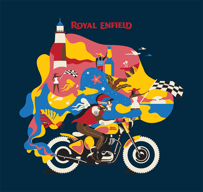
Royal Enfield has been associated with leisure and adventure motorcycling and under the various initiatives, they activate which bring their enthusiasts closer to this aspect. The rides primarily can be segregated into the Marquee rides and events conducted at a national level and subsequently into the regional rides conducted through the regional showrooms as well their dealers.
We were commissioned to do the T-shirts design for the rides happening in different regions of the country as well as abroad. The idea behind each tee shirt graphic is simple, relevance to the ride and must add to the enthusiasm of the riders.
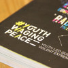
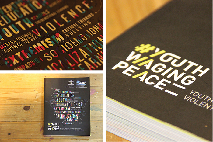
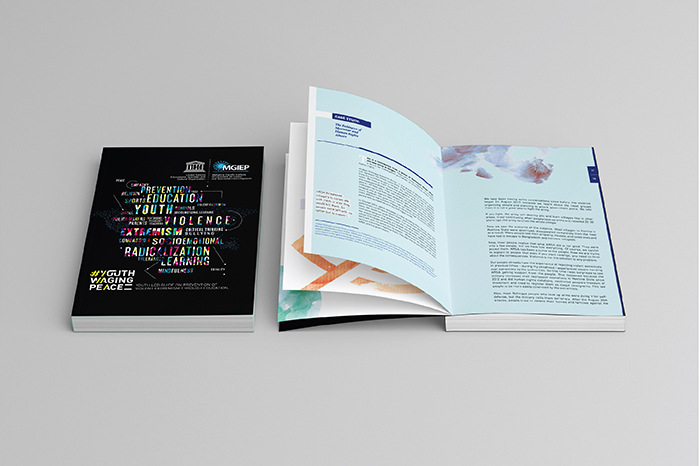
The UNESCO Mahatma Gandhi Institute of Education for Peace and Sustainable Development (MGIEP) is UNESCO’s category 1 Research Institute that focuses on Sustainable Development Goal (SDG) 4.7 towards education for building peaceful and sustainable societies across the world. We designed a document that they published in December 2017, to be distributed to countries that UNESCO works in, all over the world.
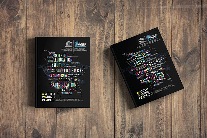
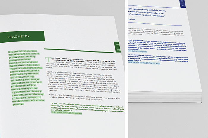
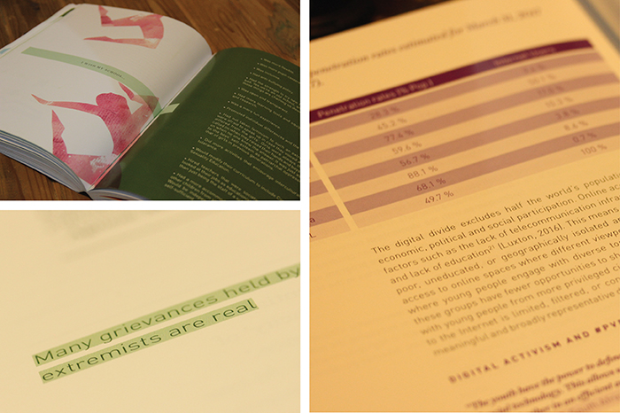
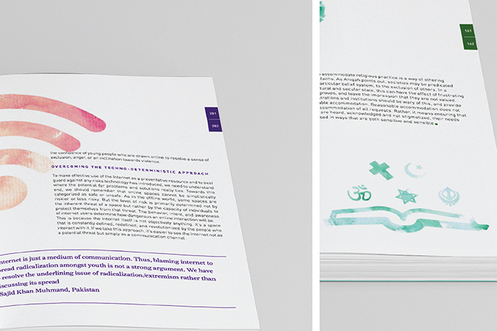
The #YouthWagingPeace guidebook is a document for anyone interested in understanding Violent Extremism and exploring the relationship between Education and Prevention of Violent Extremism (PVE). The guide garnered over 2000 youth submissions/case studies, and finally integrated over 150 case study submissions from young educators and practitioners from 50+ countries. It provides a set of actionable guidelines for PVE to teachers, school administrators, policy makers, family, religious leaders and other informal influencers.
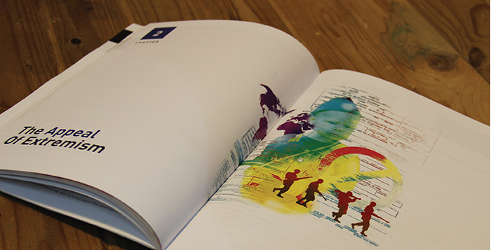
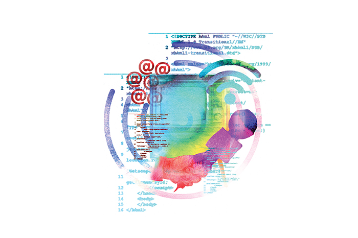
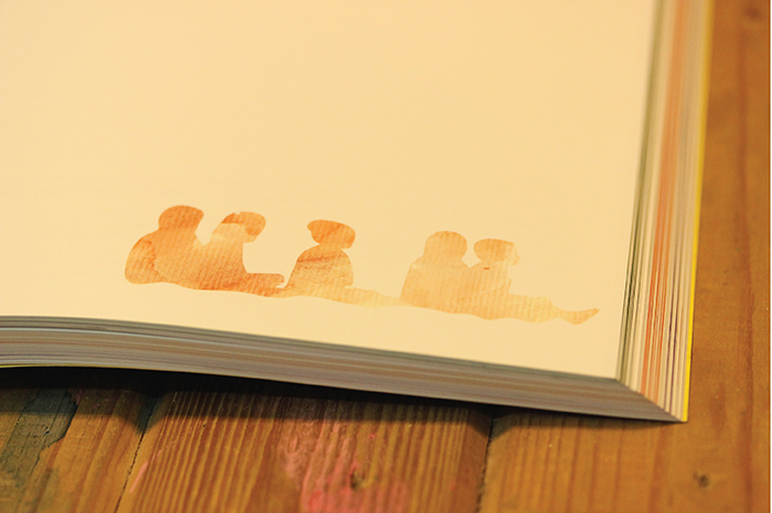
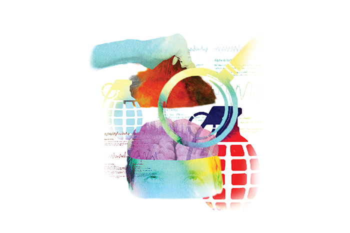
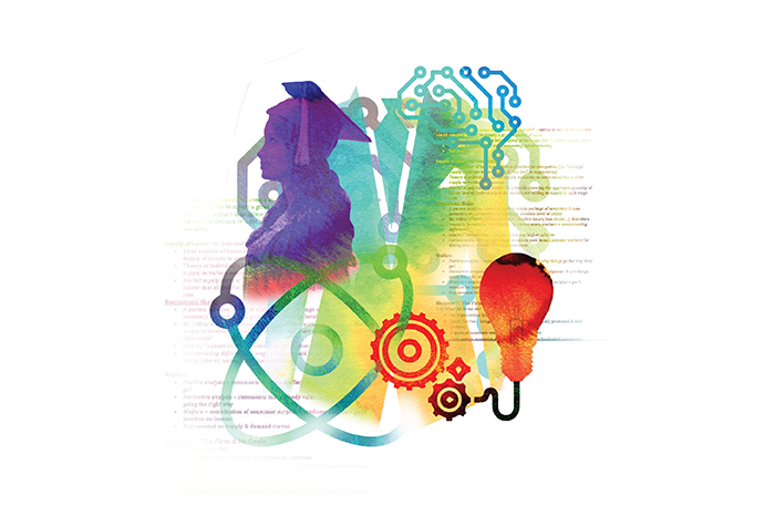
We integrated the content with illustrations; using a style that we developed which is a juxtaposition of icons and water colors; to make the guidebook easier on the eyes, and to keep readers thinking beyond just the text. The body text (though considerable in amount) is comfortably spaced, and therefore not just bodies of text that one tends to skip.
The book was very well received, globally, and even garnered special mentions from various members and advisors to the United Nations, urging for it to be translated to multiple languages so it can be distributed further.
The typographic unit we created for #YouthWagingPeace, has now become a globally used symbol for the movement; and many of the illustrations we created have now been used in promotional capacities to help spread the many important messages the Guidebook carries.
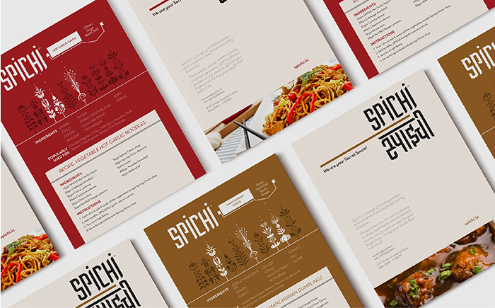
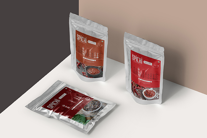
Presenting a pop of flavour, with Spichi. A packaged condiment & concentrates brand, with a variety of sauces to spice up your kitchen.
The communication wireframe had to be mapped out right from the beginning of the project. We were told to brand it like a mass market product, yet polished with clean design sensibility. We began by coming up with a product-specific name that directly suggests the ethos of the product. The name Spichi is short for “Spicy Chinese” – something which we feel has been embodied into the base and condiment dipping sauces. They are developed to bring the real essence of chinese flavors; whether it is to a hearty cooked meal at home or a gourmet dish at a pan Asian restaurant.
Unlike other products currently available in the market these base cooking pastes and condiment sauces provide any Chef assistance in reducing prep time as they are made using only fresh products. Spichi Sauces and Pastes are being used by many marquee clients in the B2B Horeca space Nationwide and are used in a number of Hotels, Banquets, Caterers, QSR’s and fine dine restaurants. Spichi is made by Chefs, for Chefs! We added the tagline, “your secret sauces”, to highlight this fact.
The communication was designed keeping the mass market feel of the product in mind. The logotype is stacked in a grid arrangement to resemble oriental script characters in a contemporary fashion. Accompanied by a Devanagari script version alongside, that would not just make the buyer feel at home, but also place the product in a different pedestal. A product specific brand language has been created – using different herbs/ingredients as elements of the design language. Together the design elements effectively communicate an overall appeal of the brand. With the variety of flavors offered by the product, our visual language extended to play around within each of these – using different units for each flavor, along with a variety of colours to give each of them a unique identity. We worked closely with the production team in order to build the appearance, shape and structure of the sachets. Spichi offers it’s B2B in the market since Dec 2017, with the B2C yet to hit the retail market.
Spice up your meal with this secret ingredient, it packs quite a ‘spichi’ punch!
Founded by two friends with a feisty passion for food. The Embassy Restaurant, located amidst the bustling trade centres on the colonial stretch of Connaught Place; New Delhi has been running for over six decades. A legacy built on matchless recipes along with the changing contemporary preferences in cuisine.
We have taken the rebranding objective ahead with Embassy Catering division as the focal point. The Embassy Catering Service comprises of a team of professionals with unparalleled experience and organisational skills.
While retaining the existing brand colours that have aided its recognition amongst the customers. We felt that the age old word mark for “Embassy” required optical refinement. Once that was achieved, we added two stylised swooshes that satisfyingly guard the word catering set in a serif font for a vigorous brand placement. The same style was utilised to create a series of illustrations; used alongside a set of copy lines and imagery, for online marketing.
Dalum Papers, originally a paper supplier is now a national level stationery brand. Unlike other players in the Indian subcontinent, Dalum products stand out by being made of 100% recycled paper. The identity Dalum Papers has also previously been developed by us. Keeping in mind the identity crafted for this label, a narrative following their philosophy has been developed for their products.
We need our planet as much as the planet needs us. The diversity of life amongst different species is deteriorating. The over-exploitation of resources is destructive to our biotic environments, and we need to ensure that we’re taking radical steps in order to preserve our natural heritage. Taking this thought forward, we designed a series of notebooks for Dalum. The illustrations on the notebooks are composed of a single continuing line, a visual cue taken from idea of regeneration.
The design language was also taken forward while designing the packaging material for the notebooks and other stationary material.