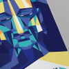
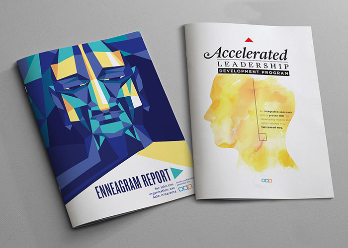
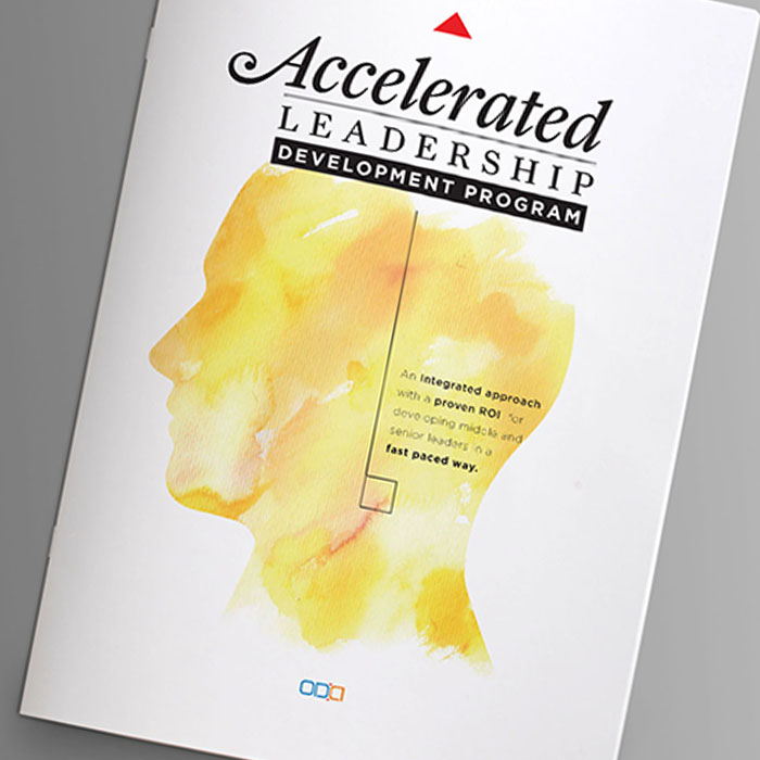
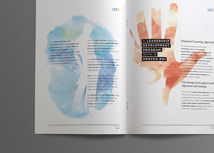
OD Alternatives is a boutique Official development consultancy. They Diagnose, Design and Implement people interventions that create, support and sustain, change and transformation of organizations and communities using behavioural skills knowledge. Their interventions focuses on subjective and objective parts of the organisation using one to oneinteraction methodologies, small group interventions and Large Group Intervention tools.
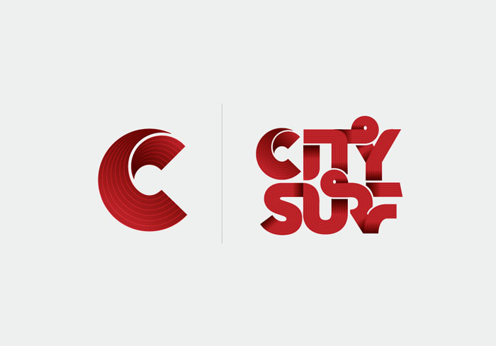
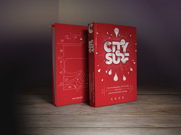
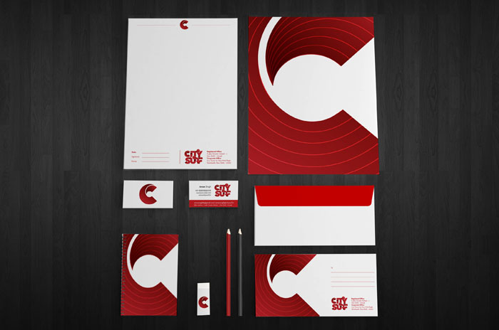
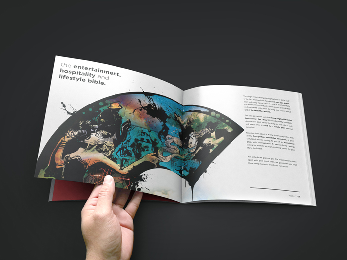
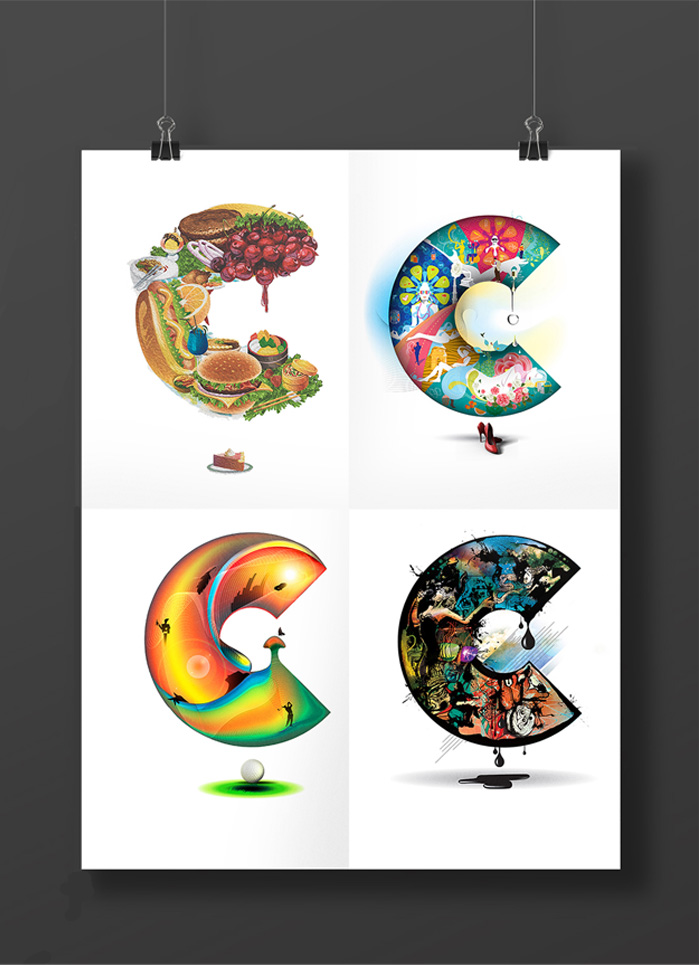
City Surf brings to you the first ever Lifestyle Coupon Book in India !!! With coupons spreading across all categories and an exhilarating variety of destinations,this venture will blow your mind away.
We branded City Surf with letter C as the symbol as well as the representation of all it offers. City Surf provides you offers mainly in four distinct categories, namely: 5 Star or Class apart | Dinning or Cuisine | Entertainment or Chill Out | Lifestyle or Comfort. So we named each category with C and thus created separators in the book for each section, representing each C made of elements it contains in the offers.
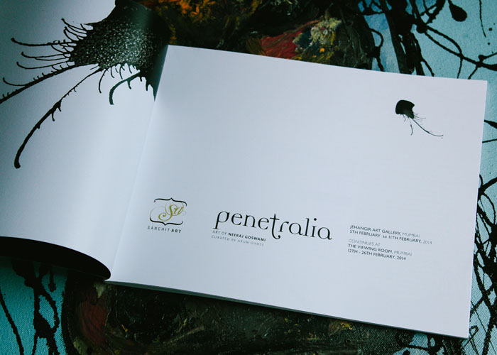
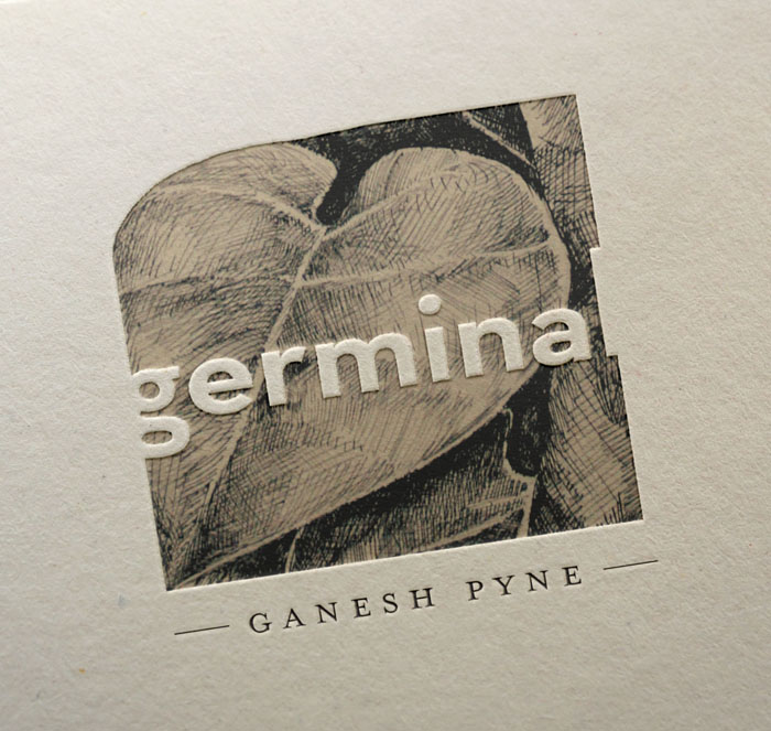
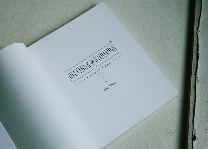
Sanchit Art is an Indian art gallery selling modern and contemporary artworks of various Indian master artists. It also aims to bridge the gap between artists working in India and abroad by establishing a platform to show contemporary European art in India while reciprocating the same with curated shows of contemporary Indian art abroad.
We take care of the visual language of it’s exhibitions and publication work. Depending on the individual theme or the painters involved in a particular exhibition we try our best to satisfy both artistic as well as the communication goals. Sanchit Art Gallery logo is not done by us.
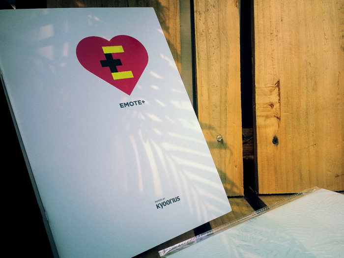
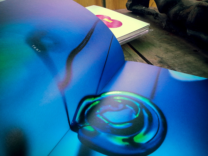
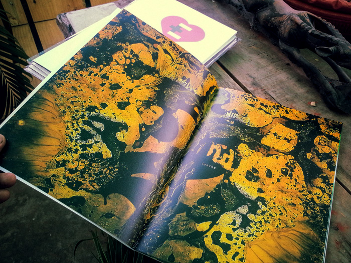
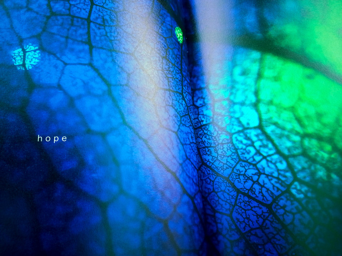
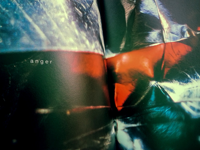
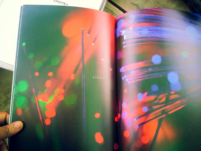
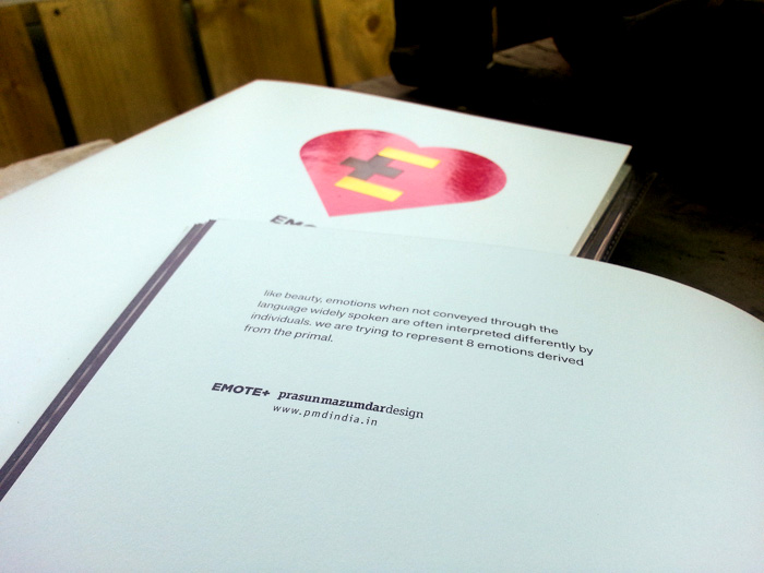
Emote is a not-for-profit organisation initiated by Transasia Fine Papers to build a platform for the design, creative and communication community in India – providing information, inspiration & networking opportunities. Since 15 years Kyoorius is distributing and marketing premium fine papers, Papers by Kyoorius is Transasia’s foray into launching definitive fine paper collections under the Kyoorius brand – bringing to India some of the most innovative and effective fine papers for an ever evolving and always demanding industry. This year they came up with Emote+. Emote is a great combination of look, feel and character of uncoated but and the uncompromising performance of a coated paper.
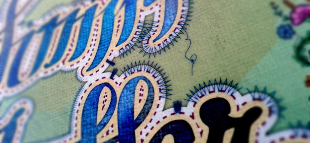
For Emote, we designed their first catalogue. The basic idea behind the design was to show emotions. Like beauty, emotions when not conveyed through the languages widely spoken are often interpreted differently by individuals. We have tried to represent 8 emotions derived from the primal. We did a shoot in-house using macro lenses, we tried to look into the hidden feelings in the textures and colors of objects which we can see around us in our day to day life. Then from a collection of 20 selected shots we used the 8 we wanted to talk about.
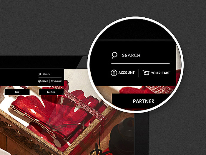
Surya Exports was born in the year 1988 and with it a mission dawned; ‘To take India’s rich handicrafts and textile traditions to people the world over.’ House This one of its main brand, other than the “tree of life” deals with mainly home furnishing products. They divide their collection via design style and inspiration and segregate them under four broad categories, namely: classic, nature, abstract and art.
We rebranded House This. We started with conceptualising the various sub divisions and understanding the target group. We did the logo first and subsequently the symbols for the sub divisions. The idea was to get a modern look without losing the Indian feel of the brand. We had a lot of constructive brain storming sessions with the client and finally we came up with something that satisfied our visual as well as functional quest. House This logotype is a redrawn version of font called “sans”, we gave some humanist touch to few of the letters. The symbol seeks inspiration from the idea of material, spiritual and emotional being together that makes a house complete. In the sub brands the ideas are rather direct.
We have designed their website, for better user experience for online shopping. With a great no. of brands selling online we wanted to create a experience in terms of both interaction as well as easy. There are sections where people can even share their ways to doing up their house. The programming is on its way, soon can be experienced.
The branding exercise was done taking into consideration the future aspects and areas of expansion of the brand. House this right now does sell through a lot of collective home furnishing stores, but we have conceptualised and designed the space for their up coming stand-alone stores in 2014. We also designed their quarterly brochure, Diwali leaflet.
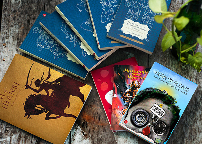
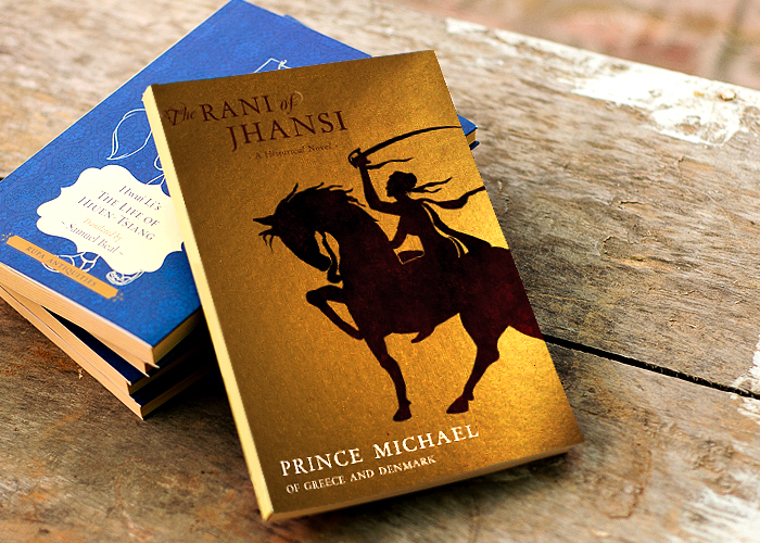
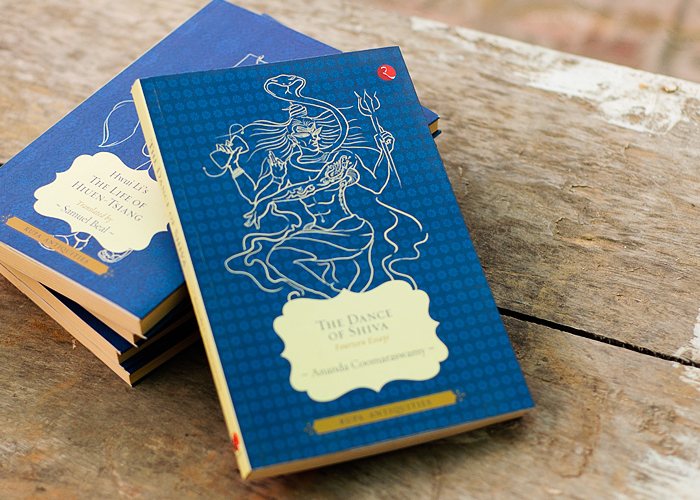
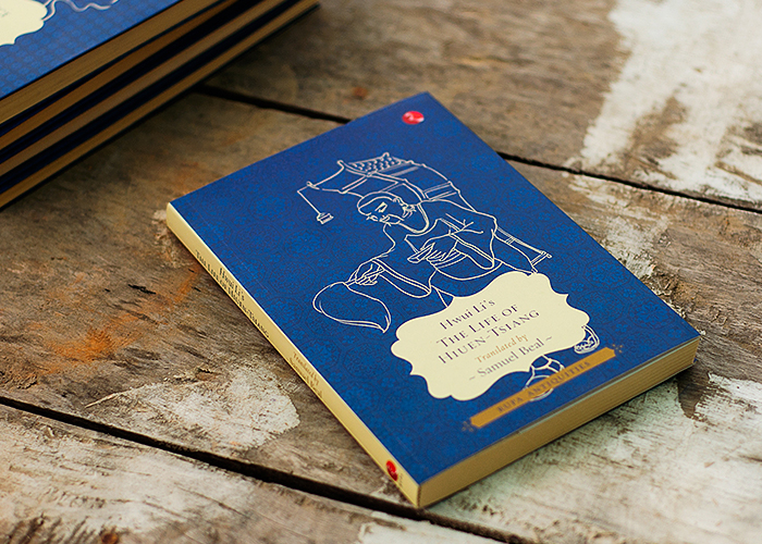
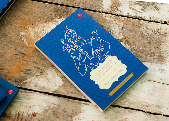
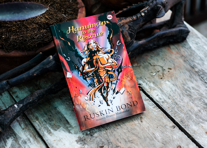
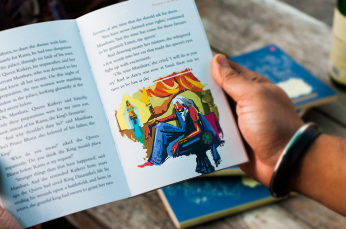
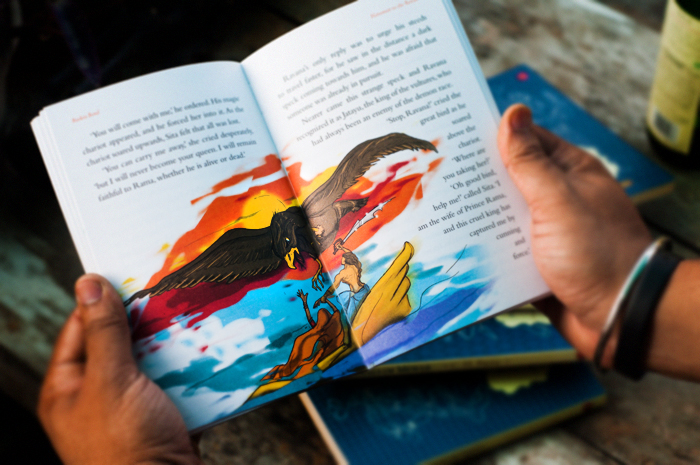
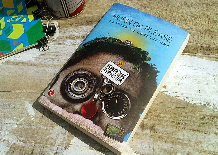
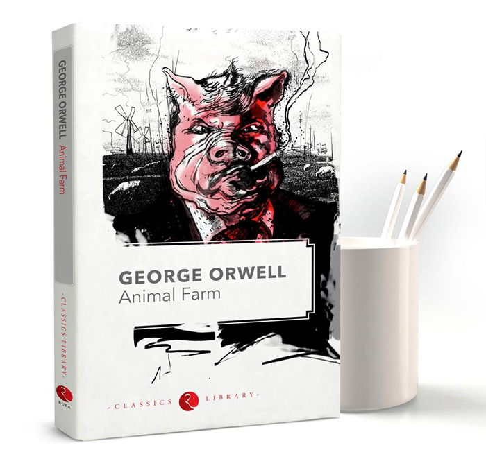
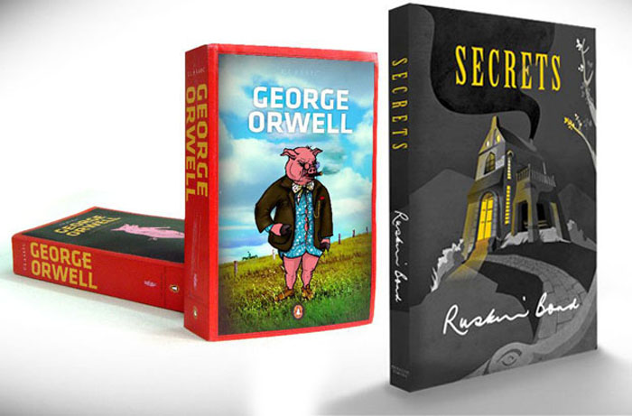
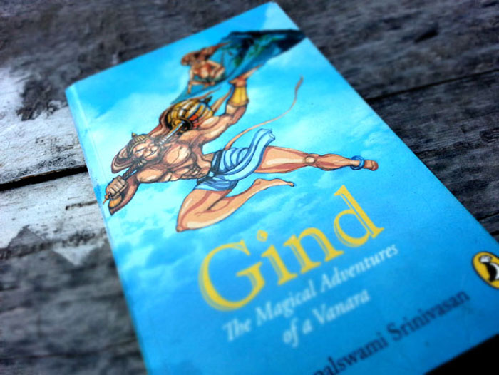
Rupa Publication is one of India’s oldest publication house. We collaborated with them on several projects and in 2013 we are doing a lot more. We did a series in which every book has a story from history of India and around by different authors, we created a line drawing style for them. There are two Ruskin Bond books we are doing this year, Romi and the jungle fire is coming around september. Hanumaan to the Rescue, has already hit the stands, which is about Bond’s take on Ramayana and the importance of Hanumaan and the catalyst character. Rani Jhansi, and Famous HOP “Horn OK Please!” Series of Kartik Iyenger are some other on going projects. We are also working on the new jacket for George Orwell’s Animal Farm. Ruskin Bond’s “Romi& the jungle fire” .
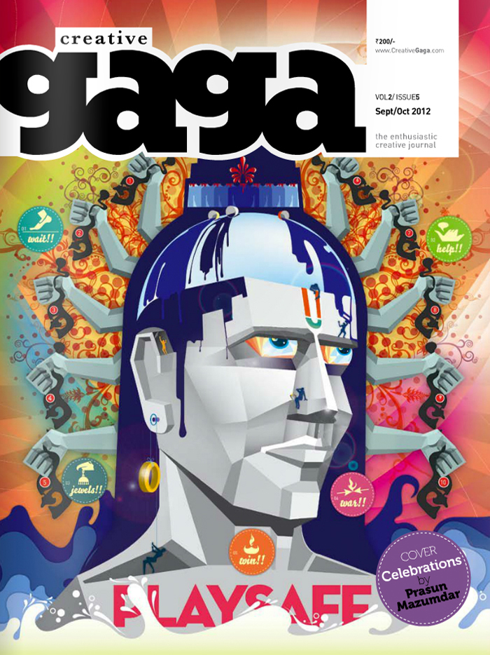
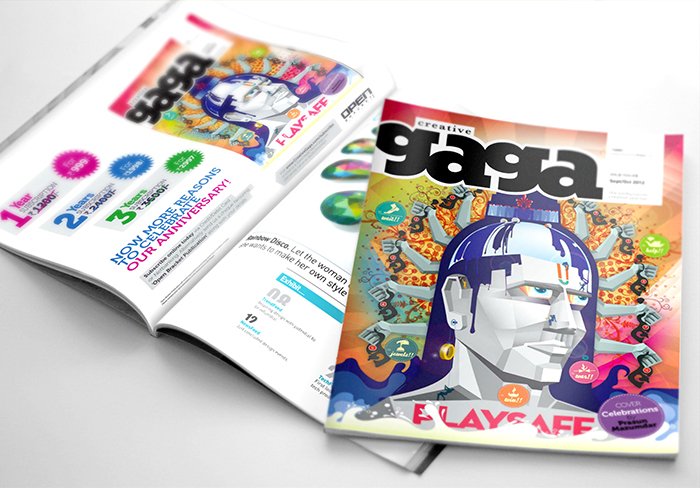
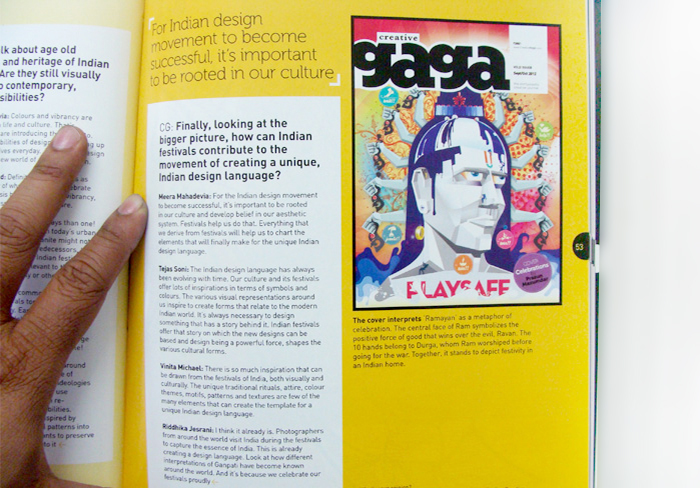
Designing the cover for the magazine “Creative Gaga” . The cover was designed for the special issue for “festival months”. We tried to show our vision on the positive side of the world. Instead of making Ravana and burning that down, we have put in emphasis of creating “Ravana” and getting the essence of his personality of the makers. The idea is why to do anything negative to kill negative, create positive instead. Also this time of the year is when people decorate their houses and also celebrate Dussehra, so that has become the background and the elements of the artwork.
Stellar Children’s Museum is the first of its kind edutainment initiative in India. A pioneering venture of the Stellar Group, the museum is an interactive space for kids to explore new genres of their likeness in the living world. This project was an extremely challenging one, as we had to educate the audience about the concept through effective communication.
We started off with the logo, followed by print collaterals & print ads. Then we got into the physical space of the museum and developed graphics for space along with signage system, info graphics etc.
At Stellar, we did the space design & environmental graphics for both the interior and exterior space. We did the interiors keeping in mind the 7 different galleries each of them with its own visual language and color codes. The environmental graphics for the exteriors were mainly for the branding perspective and few also to talk about the activities in the museum. We also did the directional & space signage system.
The museum also has a café for which we undertook branding, menu design, façade and a few posters. Stellar also provides an option for children to buy stuff from the museum. With that in mind, we developed prints for a range of merchandise right from tee-shirts, pencil boxes to badges, magnets, water bottles etc.
We also designed the museum website www.stellarchildrensmuseum.com. This was very exciting as the website had to be very interactive, playful and fun in order to keep the children engaged. In order to ensure that children enjoyed browsing through we developed options to select themes and maintain personalised calendars & pages. We also did a touch pad application for the visitors to make the experience more cohesive and structured. It gives them the option to first select the gallery they want to visit and then the activity they want to be a part of.
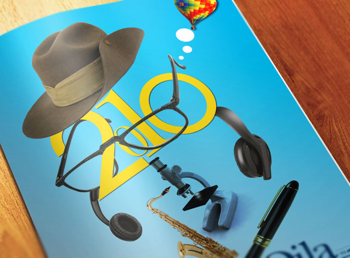
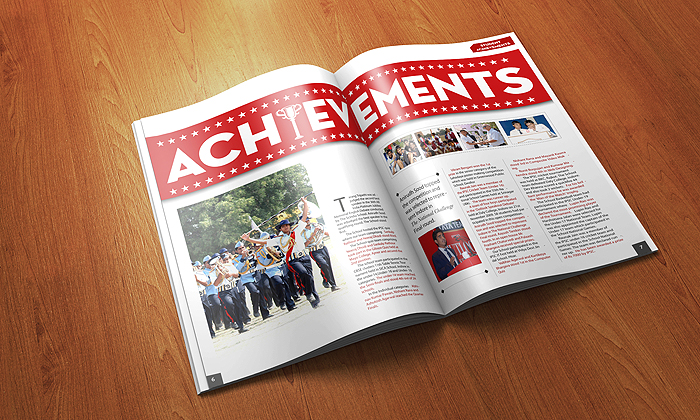
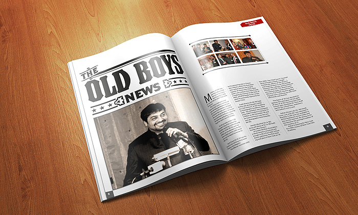
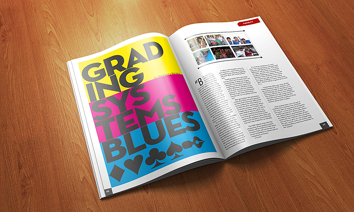
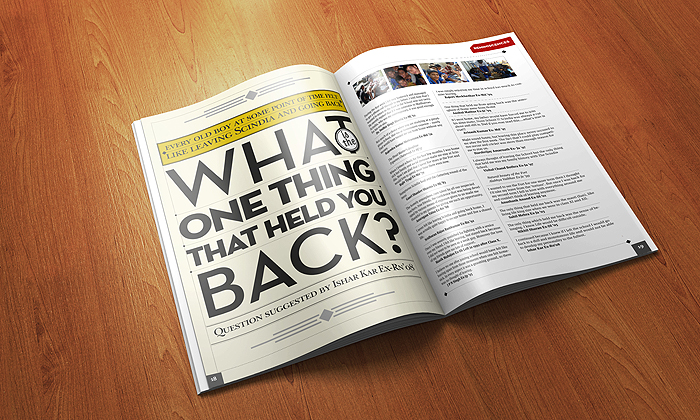
Qila Quotes is a quarterly Magazine of The Scindia School, Gwalior, India. for them we ideated and actualized a fresh design and concept. We designed the Masthead, Cover and Layout of the inside spreads. The idea was to keep the basics of a school magazine & publication design in place and add a bit of design quirk in the elements of the layout.
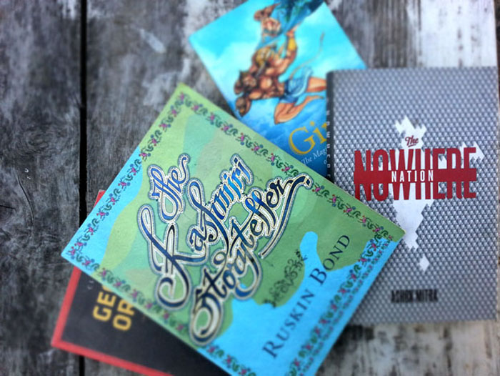
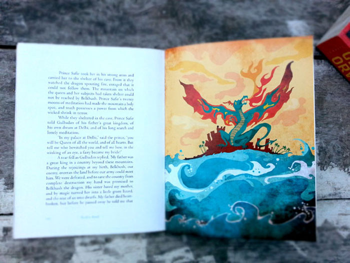
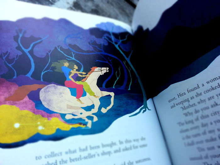
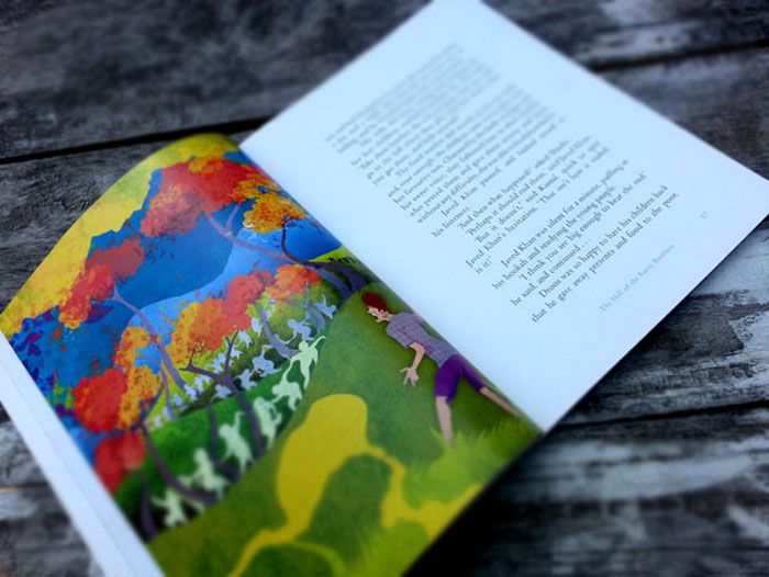
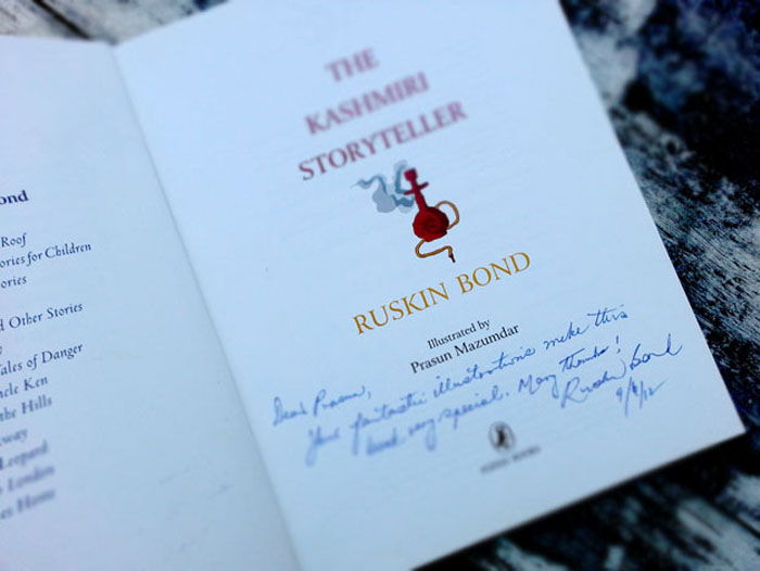
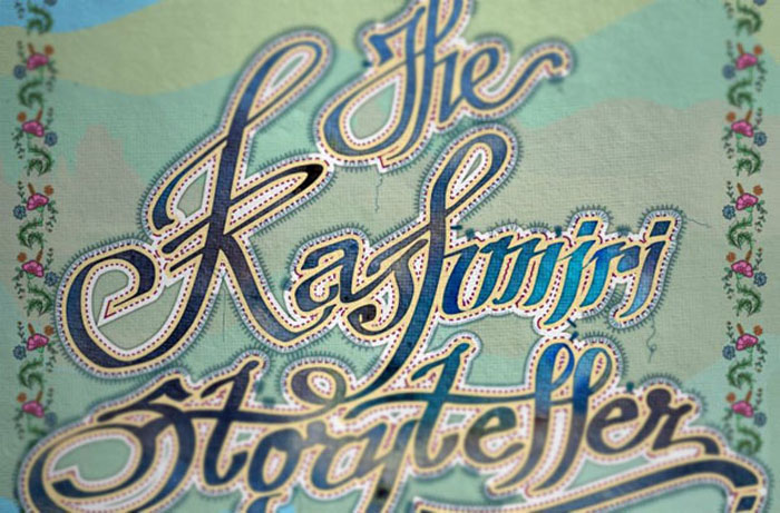
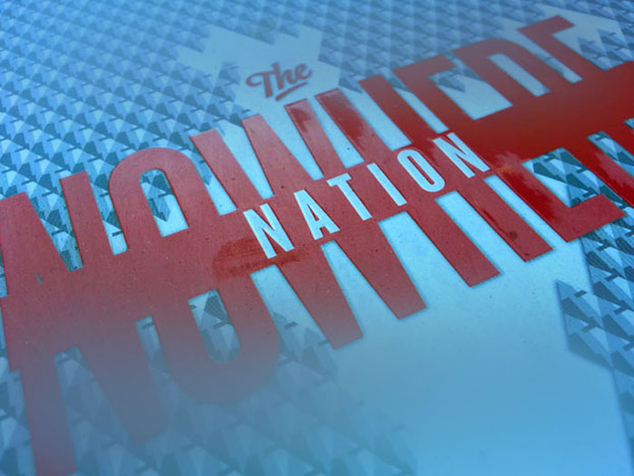
Penguin Books is one of India’s leading publishing houses.We have developed for them are diverse range of book cover designs and illustrations, ranging from children’s classics to political non-fictions. Some exciting projects are “The Kashmiri Storyteller”, a fable by Ruskin Bond. All the inside illustrations were done here, though the text was set by Penguin in-house designer. The Kashmiri Storyteller was also considered for the best illustrated publication design by the Comic Con India. “The Nowhere Nation” by Ashok Mitra, a Collection of Stories by George Orwell & another collection of Ruskin Bond Stories called the “Secrets”.