The Blue Dot is UNESCO MGIEP’s bi-annual publication, featuring articles showcasing their activities and areas of interest. The magazine’s overarching theme is the relationship between education, peace, sustainable development, and global citizenship.
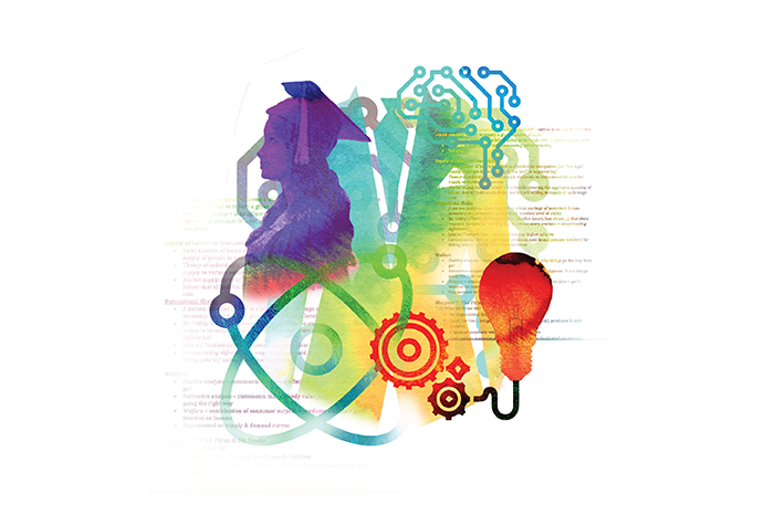
Keeping the theme in mind, we designed a system for the layout of the magazine for the July 2018 issue. This edition is primarily focused on digital pedagogies to transform learning.
There were six sections in the magazine, each of which has been colour coded and follow a grid structure designed for that section. The entire magazine had a common theme running across, so every section was colour and icon coded with its own unique layout style for the ease of the reader. The system has been created keeping in mind the bigger picture of the magazine, rather than just the content of this particular issue, so that the same system can be used seamlessly in future issues.
The opinion section of the magazine was integrated with illustrations and images, which were a representation of the author’s perspective, giving context to the reader.
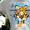
Royal Enfield has been associated with leisure and adventure motorcycling and under the various initiatives, they activate which bring their enthusiasts closer to this aspect. The rides primarily can be segregated into the Marquee rides and events conducted at a national level and subsequently into the regional rides conducted through the regional showrooms as well their dealers.
We were commissioned to do the T-shirts design for the rides happening in different regions of the country as well as abroad. The idea behind each tee shirt graphic is simple, relevance to the ride and must add to the enthusiasm of the riders.
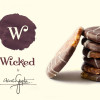
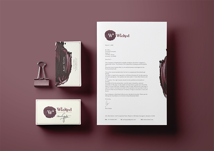
Wicked is a brand for premium high quality nuts, cakes, florentines, and mithai; elegantly crafted and put together by Le Cordon Bleu trained chef Aarti Gupta. We created a brand with high recall value, highlighting the unusual and yet delicious combinations of ingredients, and the uniqueness of Ms. Gupta’s recipes.
From Thai-spiced Nuts, to Besan Fudge, the Wicked brand truly captures the meaning of fusion in an absolutely harmonious manner. The versatility of the brand language allows it to comfortably span across the various categories of products, and a clean minimal approach allows for it to maintain an extremely premium space in the market, while still managing to be approachable to a wide customer base due to the brand’s reasonable pricing.
The products are classified into four categories – Nuts, Florentines, Cakes, and Mithai. Each of these categories then has a list of products under them. We also made basic stationery for the brand, as well as a menu for their products.
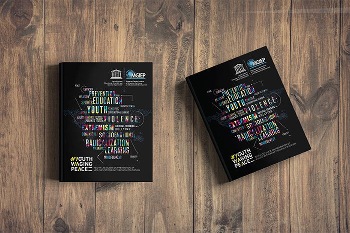
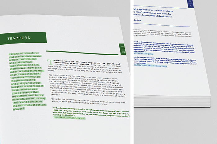
The UNESCO Mahatma Gandhi Institute of Education for Peace and Sustainable Development (MGIEP) is UNESCO’s category 1 Research Institute that focuses on Sustainable Development Goal (SDG) 4.7 towards education for building peaceful and sustainable societies across the world. We designed a document that they published in December 2017, to be distributed to countries that UNESCO works in, all over the world.
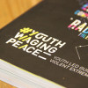
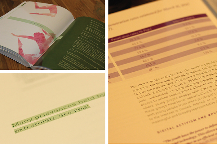
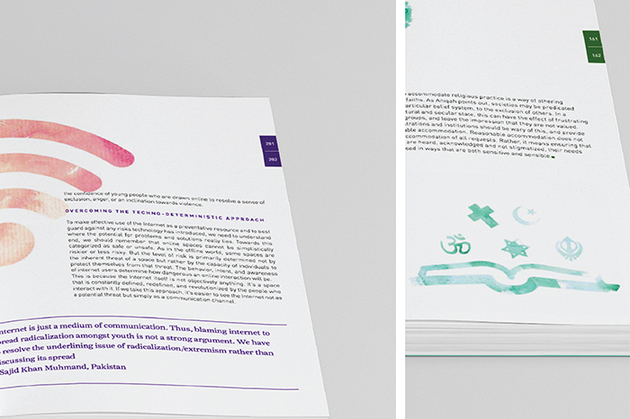
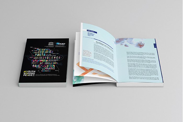
The #YouthWagingPeace guidebook is a document for anyone interested in understanding Violent Extremism and exploring the relationship between Education and Prevention of Violent Extremism (PVE). The guide garnered over 2000 youth submissions/case studies, and finally integrated over 150 case study submissions from young educators and practitioners from 50+ countries. It provides a set of actionable guidelines for PVE to teachers, school administrators, policy makers, family, religious leaders and other informal influencers.
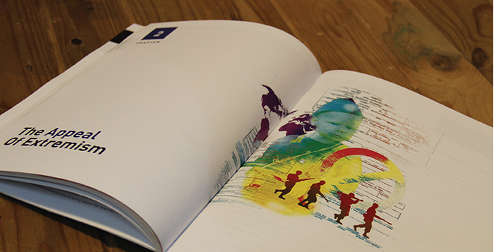
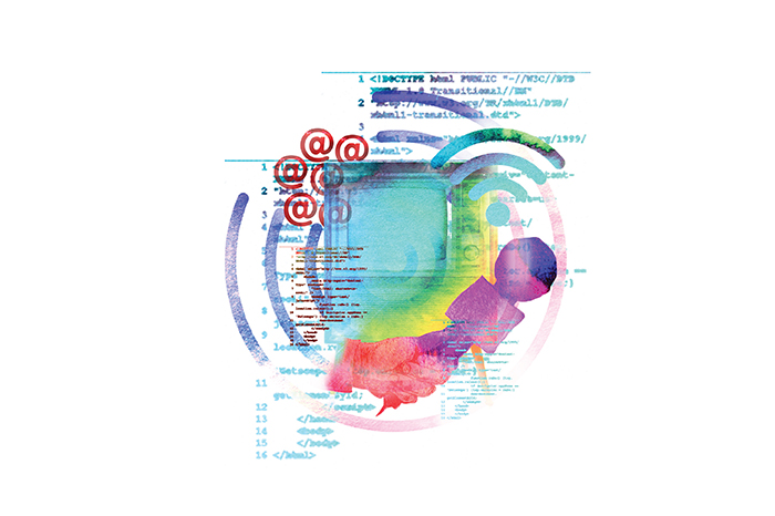
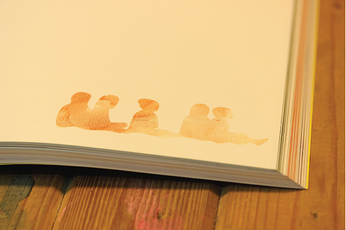
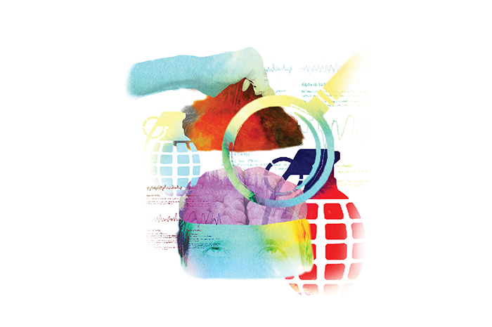
We integrated the content with illustrations; using a style that we developed which is a juxtaposition of icons and water colors; to make the guidebook easier on the eyes, and to keep readers thinking beyond just the text. The body text (though considerable in amount) is comfortably spaced, and therefore not just bodies of text that one tends to skip.
The book was very well received, globally, and even garnered special mentions from various members and advisors to the United Nations, urging for it to be translated to multiple languages so it can be distributed further.
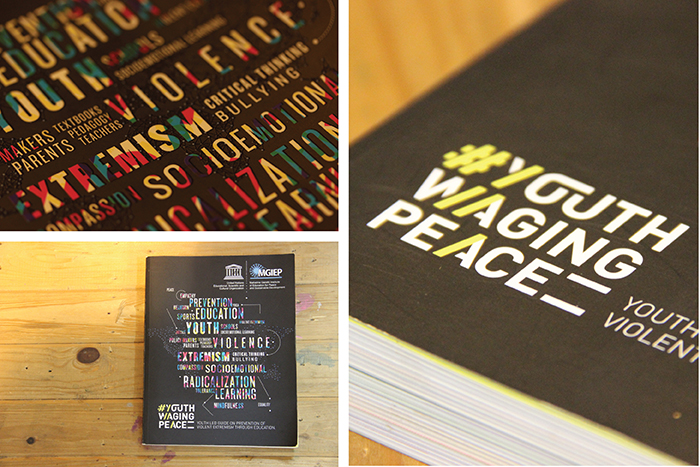
The typographic unit we created for #YouthWagingPeace, has now become a globally used symbol for the movement; and many of the illustrations we created have now been used in promotional capacities to help spread the many important messages the Guidebook carries.
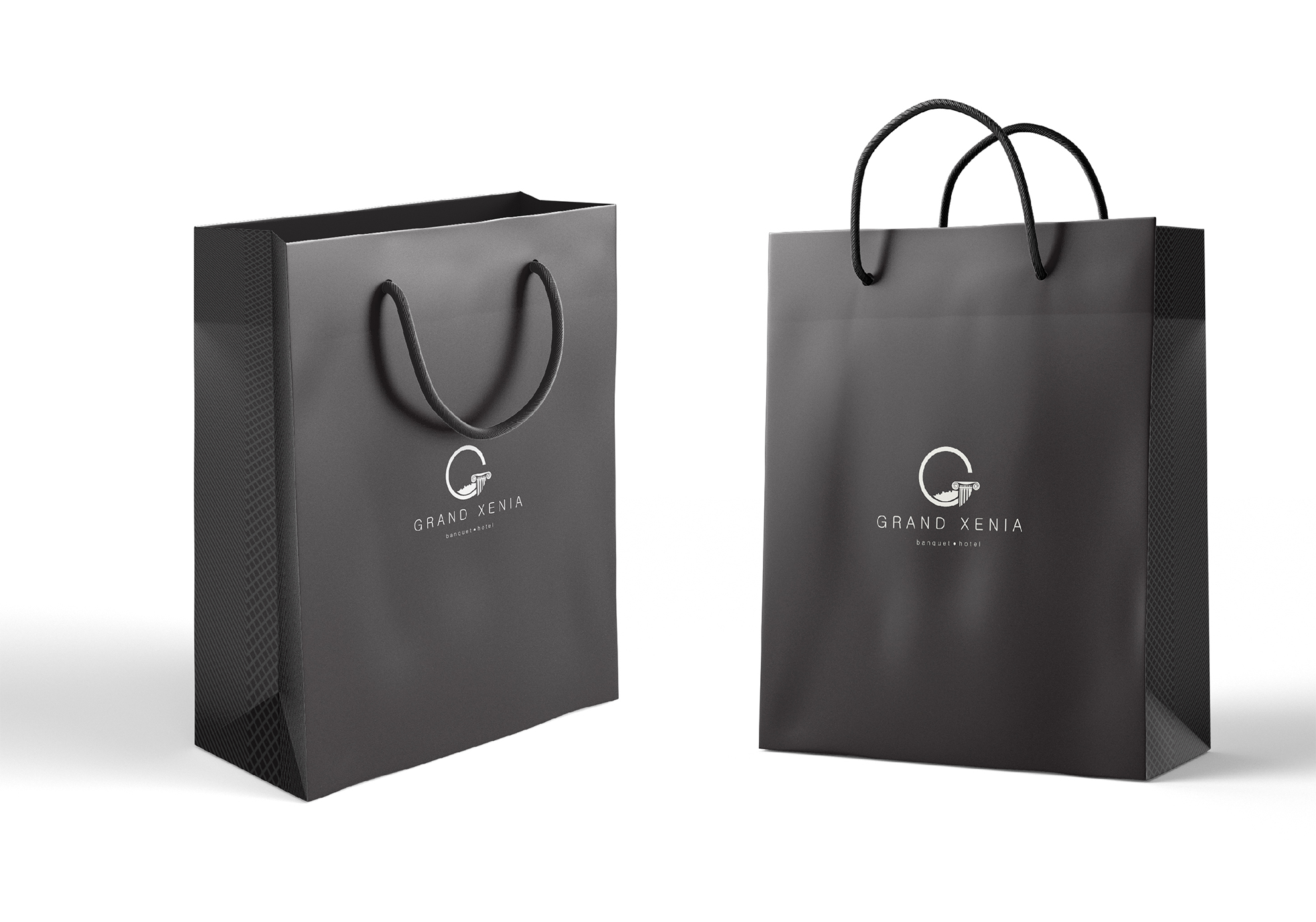
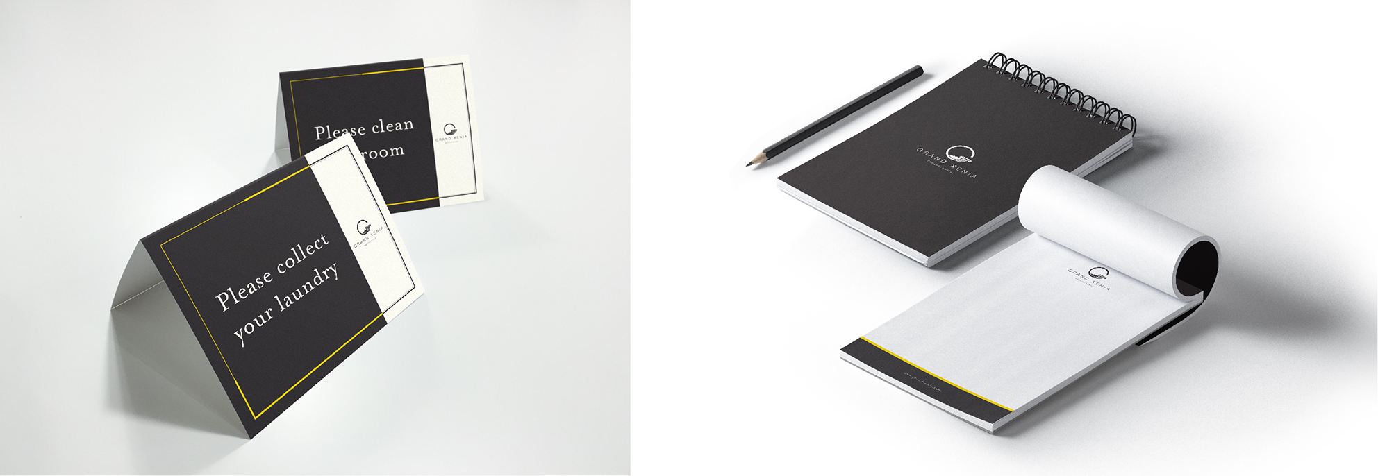
Grand Xenia is a luxury business and banquet hotel, located in Ajmer, Rajasthan, in India.
We were approached by them to create a brand language, as well as all hotel-essential-collaterals, to add to their existing logo.
We created a high-end brand, using black and gold/yellow as the primary colours, to maintain a minimal look across the collaterals, as well as the various other touchpoints that come with the hotel business. Using the ‘G’ from the logo, we created an illustrated icon-based visual style for the hotel, which was then used for signage, as well as various print collaterals appearing around the site. We also created an entire range of packaging for the hotel’s complimentary products and a few other services – from packaging for toiletries, to coasters, bill-books, and various others, we used our brand language to tie them together and elevate the image of the hotel automatically.
We made a promotional ‘brochure’, or a small coffee table book, as one might call it, to highlight the various aspects of the hotel and the facilities that they offer.
Grand Xenia consists of two unique restaurant/bars – Amuse; a resto-bar and Urban Table; a more formal rooftop restaurant. We branded both the restaurants, coming up with overall look and feel, menu cards, signage, and basically anything visual, related to wither of the spaces.
INDIA FASHION FORUM (IFF) was born alongside the genesis of organised modern retail for fashion in India, out of pure passion for boosting fashion creation and consumption in India. The modus operandi was to catalyse the business to think Fashion Forward, Plan Long-term, and act with Creative Intelligence.
Every year since then, IFF has been the focal point for fashion captains to converge – LEARN, SHARE and EVOLVE – with the single-minded agenda to fast forward growth for the entire value chain – from yarn to retail.
IFF 2017– The 17th Edition, an annual 3-day event organised by IMAGES GROUP to foster the ‘Business of Fashion” with novel business opportunities, ideas, inspiration and industry partnerships. The event has been branded and conceptualised by the studio for the third consecutive year. As with the past 2 years, the event required a dynamic bold identity which had to flow throughout the space and other collaterals. The concept of technology and fashion coming together gave us the opportunity to explore the many tenets fashion and retail. 3d fluid forms in vibrant hues juxtaposed with futuristic croquis took over the visual language this year, and the same was extended into venue graphics and space design for the event.
Our past work with India Fashion Forum can also be found here.
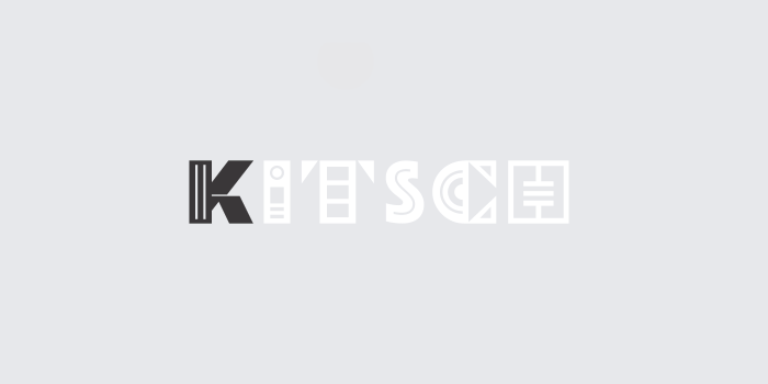
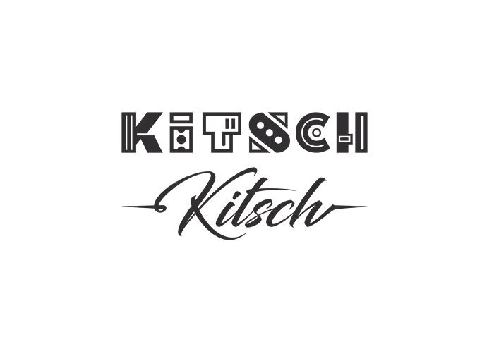
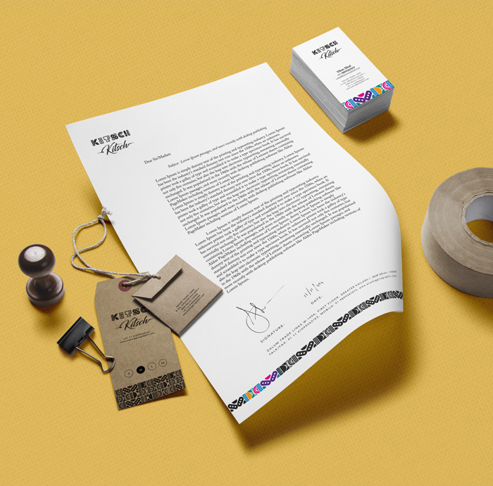
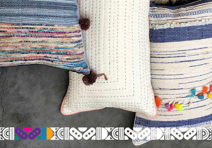
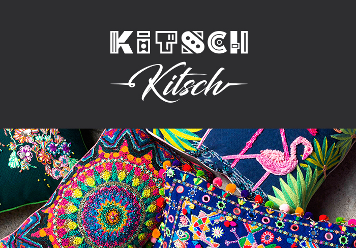
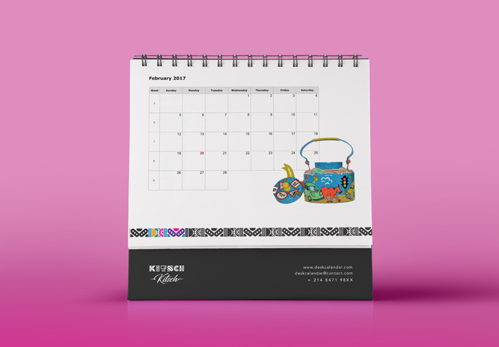
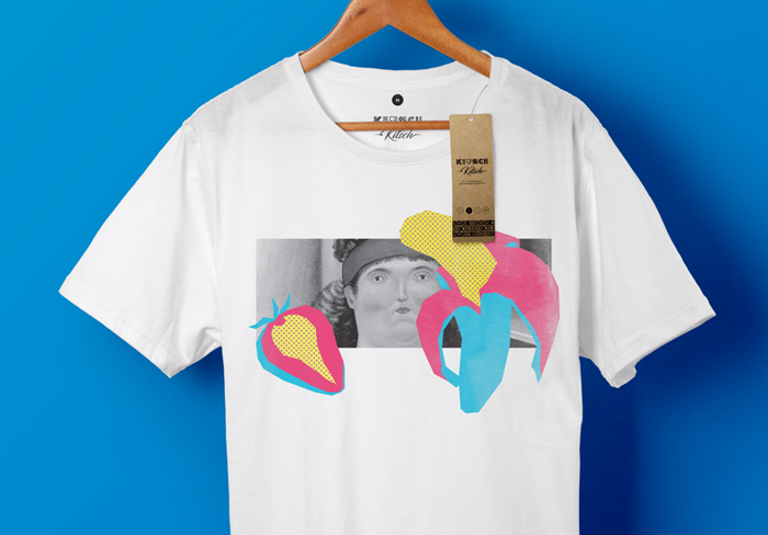
KITSCHKITSCH hosts an array of exotic decorative home products. These Indian kitsch inspired artefacts are hand made to tell stories of beautiful journeys. Started by Santwana and Anand who are visionaries in the field of textiles, their studio pushes for innovation in home interiors in a modern yet trend conscious way. In this direction, we worked to create an identity that’s just as playful and eclectic as the products and the lifestyle the brand name represents.
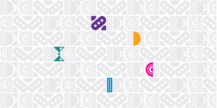
The dynamic logotype is composed of fun interchangeable letterforms combined with brush-lettering to create the name “Kitsch Kitsch”. The logo itself acts as a mixed-bag character with this interplay. The letterforms break away to form graphic elements of the brand language with a play on bright and bold colours. Varied arrangements of these modular elements decorate the brand communication.
Founded by two friends with a feisty passion for food. The Embassy Restaurant, located amidst the bustling trade centres on the colonial stretch of Connaught Place; New Delhi has been running for over six decades. A legacy built on matchless recipes along with the changing contemporary preferences in cuisine.
We have taken the rebranding objective ahead with Embassy Catering division as the focal point. The Embassy Catering Service comprises of a team of professionals with unparalleled experience and organisational skills.
While retaining the existing brand colours that have aided its recognition amongst the customers. We felt that the age old word mark for “Embassy” required optical refinement. Once that was achieved, we added two stylised swooshes that satisfyingly guard the word catering set in a serif font for a vigorous brand placement. The same style was utilised to create a series of illustrations; used alongside a set of copy lines and imagery, for online marketing.
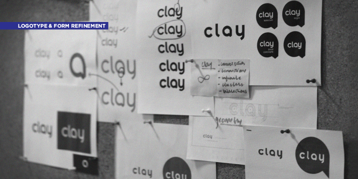
A humble beginning, Clay Telecom started operations with just five people in a cabin in Central Delhi in the year 2000. Almost two decades later, Clay Telecom is now a dynamic global service provider of wireless telecom solutions with Pan-India presence. Catering to both B2B and B2C market segments with worldwide and country-specific voice and data solutions. Twenty lakh (and growing) happy customers across India swear by its services. The reinvention for Clay adopts a spirit that is modern and bold, yet friendly. The new image for the brand captures the company’s approach towards technology, hospitality and innovation in today’s global times.
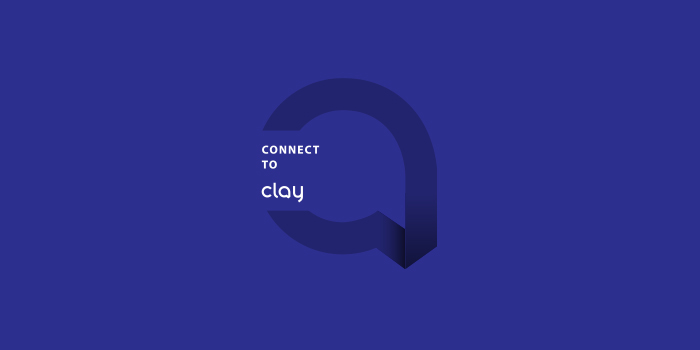
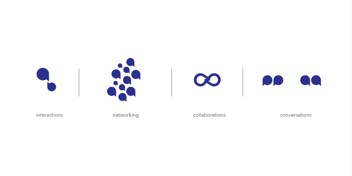
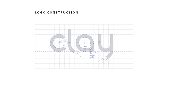
The logo mark “a” stands as the principal identity of the brand, and is also incorporated into the logotype. The letter is shaped like a talk bubble with a visible fold rendered to make the form appear as a continual. The geometric lower-case logotype is affable but professional with close attention to tangential cuts offering a modern sensibility. The language is created based on the essence of space, color, and typography of digital and interactive design. The extended language arising from this logotype is minimal but strong. Elements are restrained to the usage of the brand’s ultramarine blue and balanced grey’s with the logo mark. This approach creates visual homogeneity for the parent brand, thus creating a stronghold in its identity.
.
The new language speaks strongly of Clay’s international approach. It not only confers continuity and connectivity but also speaks of the contemporary and utilitarian aspect of the brand. This reinvention communicates a voice that is progressive and strong in its idea of connecting people and providing global solutions.
Dalum Papers, originally a paper supplier is now a national level stationery brand. Unlike other players in the Indian subcontinent, Dalum products stand out by being made of 100% recycled paper. The identity Dalum Papers has also previously been developed by us. Keeping in mind the identity crafted for this label, a narrative following their philosophy has been developed for their products.
We need our planet as much as the planet needs us. The diversity of life amongst different species is deteriorating. The over-exploitation of resources is destructive to our biotic environments, and we need to ensure that we’re taking radical steps in order to preserve our natural heritage. Taking this thought forward, we designed a series of notebooks for Dalum. The illustrations on the notebooks are composed of a single continuing line, a visual cue taken from idea of regeneration.
The design language was also taken forward while designing the packaging material for the notebooks and other stationary material.
A one-stop destination for travel retail solutions, AVA Merchandising Solutions Ltd. has been a popular retailer in the
sub-continent with a large customer base. With the objective of providing high quality, affordable and convenient shopping possibilities. Our work with Ava entailed redesigning of the existing logo and its diverse applications across mediums, along with the look and feel of the brand. The free form used for the symbol delivers the idea of movement, which carries forward to the complimentary logotype.
To enhance customer engagement and experience, a mobile application “TRAVA” was designed, which is currently in its last development stage.
Outside of the corporate stationery, we also designed templates for their catalogues and other print material which are circulated on board reputed airlines such as Air India and Jet Airways. Concepts were also developed for staff uniform and branding directions of the retail stores spread out across the country.
The Chatter House gastro-pub and bar opened its second branch earlier this year at Khan Market, New Delhi. Set amidst many renowned cafes and designer label boutiques, it’s an extension of its Nehru Place Sibling. We worked closely with the architects to capture keepsakes reminiscent of the Pubs in and around Dublin. Montages featuring old Irish rhythms, posters of old bands and memorable postcards adorn the bar counter and the seemingly underground walls. Lights inspired by wrought-iron torches cast over dusky interiors and unique art pieces, taking one away on an Irish sing-along.
*(Image Credits : Niveditaa Gupta).
Beyond the walls, a great deal of attention was given to the menu. The vast combination of cuisines served up by the kitchen is highlighted via bold iconography and type play.
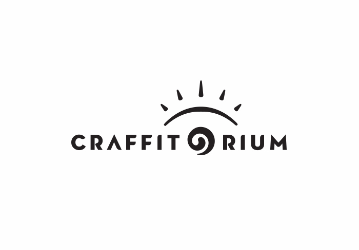
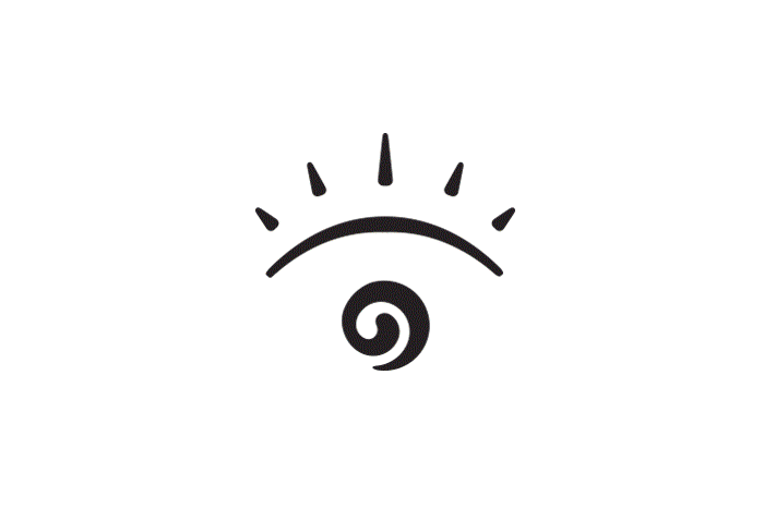
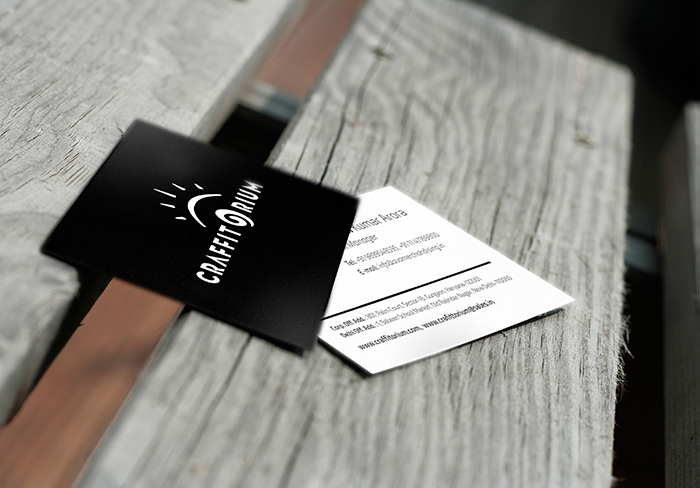
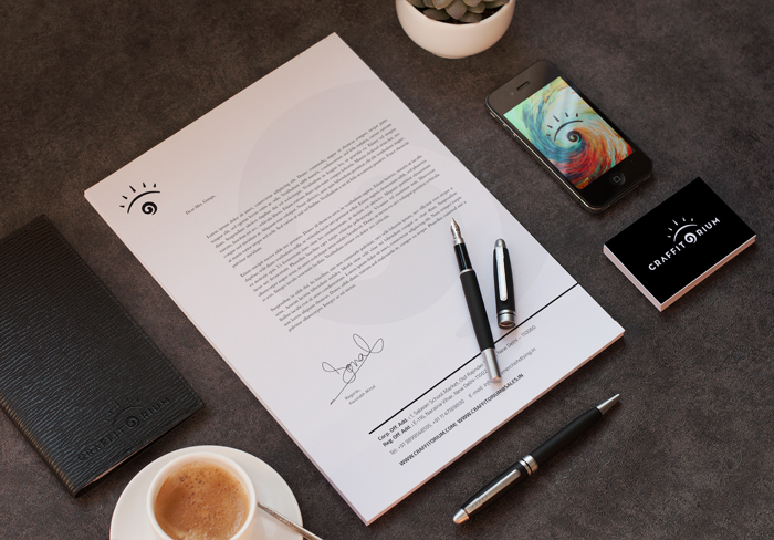
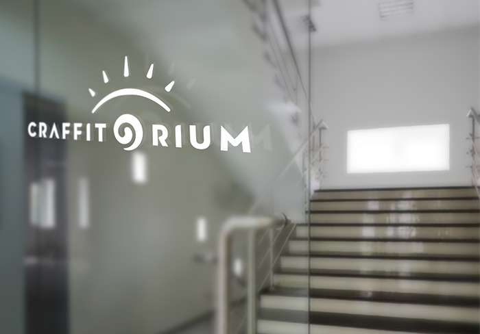
Craffitorium is an E-emporium that sells bespoke art, showcasing a unique range of household goods. The online enterprise is focussed on promoting fading traditions. As an old proverb says, “When you go to buy, use your eyes, not your ears”. The motif here plays on the importance of the most receptive sensory organ, the eye. The eyelid placed artfully above the type combines with a stylised representation of an iris to give Craffitorium a new form. Along with this stylised logotype, the identity communicates a voice that is progressive and dynamic in its cause for celebrating indigenous art.
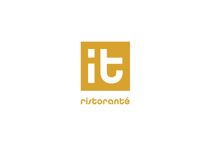
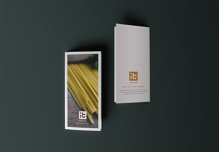
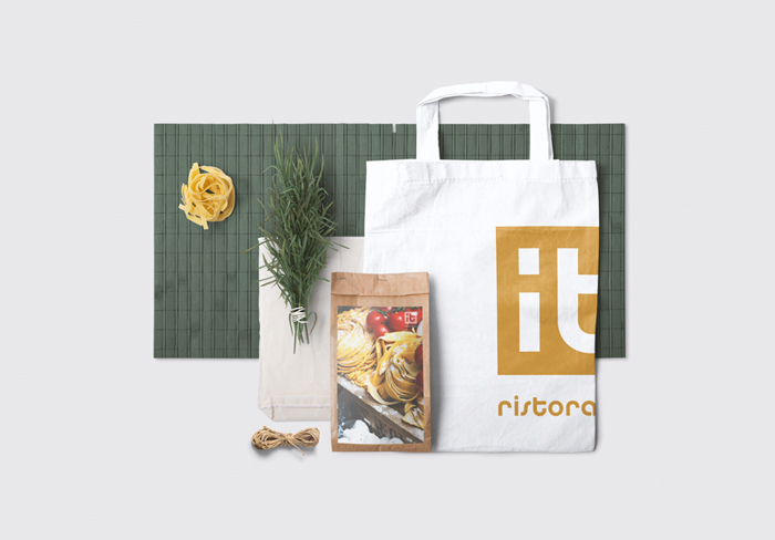
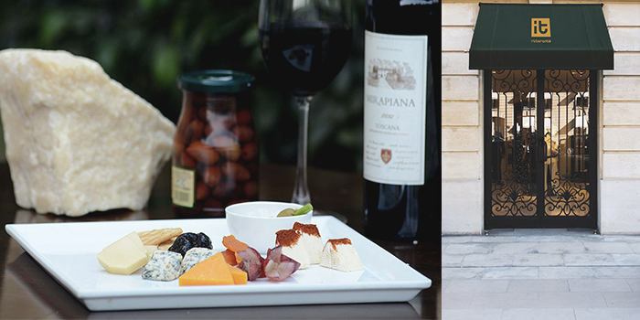
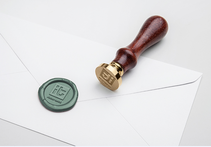
IT is an award-winning Italian restaurant at THE GRAND, New Delhi that offers authentic Tuscan flavours of Italy. The restaurant has a beautiful Italian ambience. The mouthwatering wood-fired thin crust pizzas, live kitchen, alfresco dining and an extensive Italian wine menu makes for a truly unforgettable dining experience. The Identity was designed keeping in mind the vibe of the place. The monogram, a superposition of two letters as graphical elements presents the idea of sophistication as a simple and elegant type. It is straightforward and effective in representing finesse and expertise.
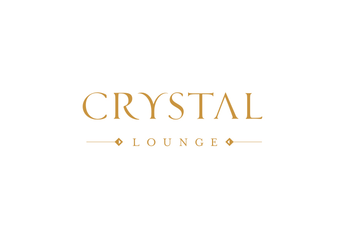
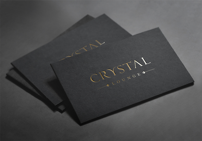
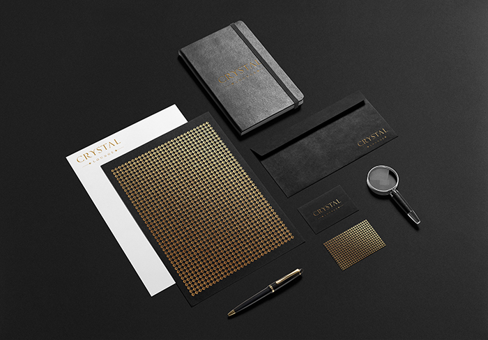
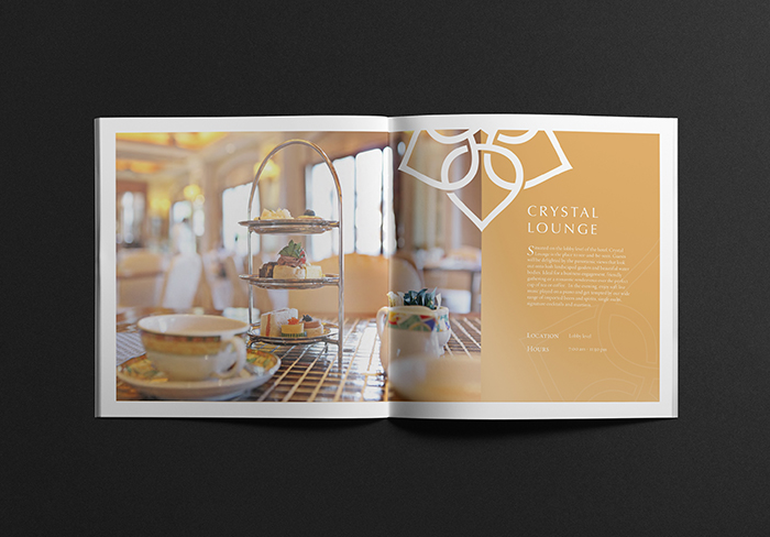
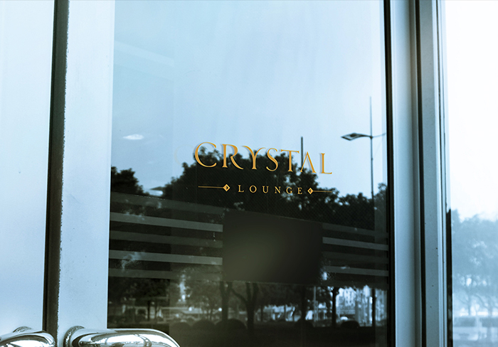
Crystal Lounge at THE GRAND, New Delhi is the place to see – and – be seen. Guests are delighted by the panoramic views that look out onto lush landscaped garden and beautiful water bodies. Ideal for a business engagement, friendly gatherings or a romantic rendezvous over the perfect cup of tea or coffee. The look we had in mind while designing the identity was for it to be modern and ahead, a unit that complements any fashion or format. The idea was for it to be timeless. We crafted a logotype from scratch to make the unit exclusive and unique. Gold and black used across the print collaterals suggest premium, classy and exclusive.