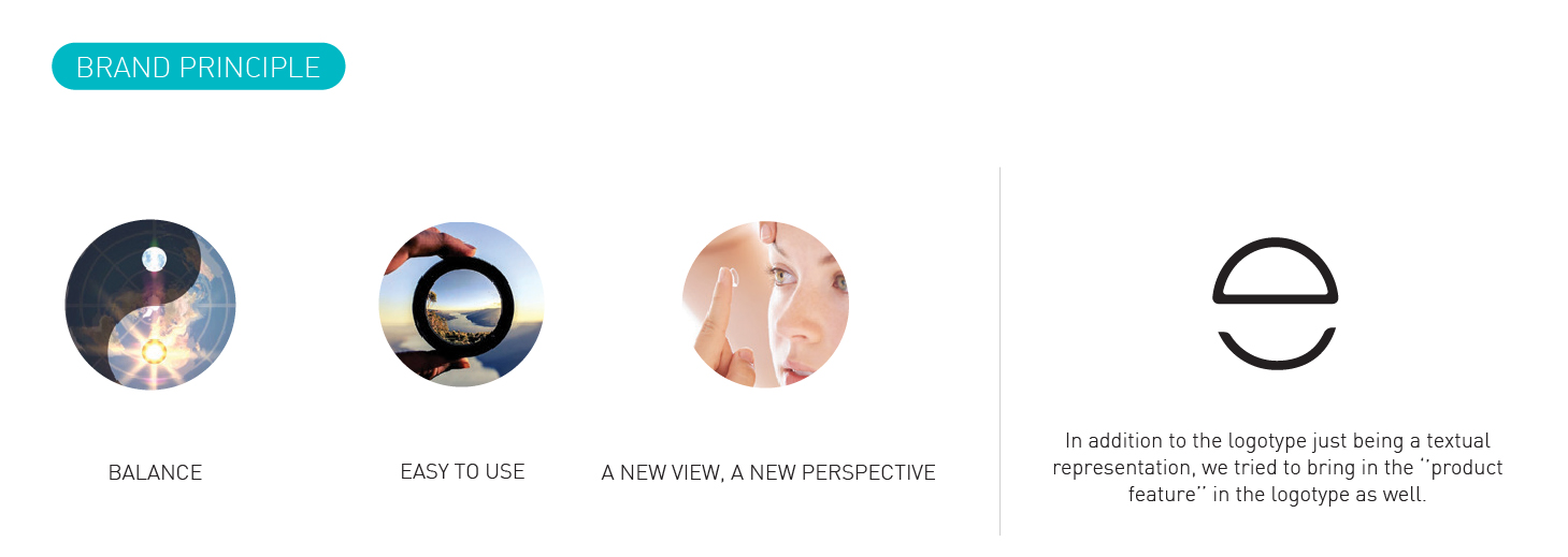
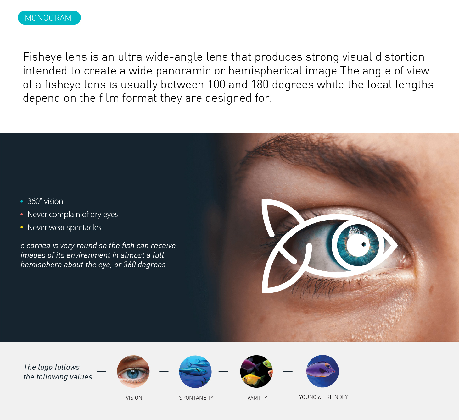
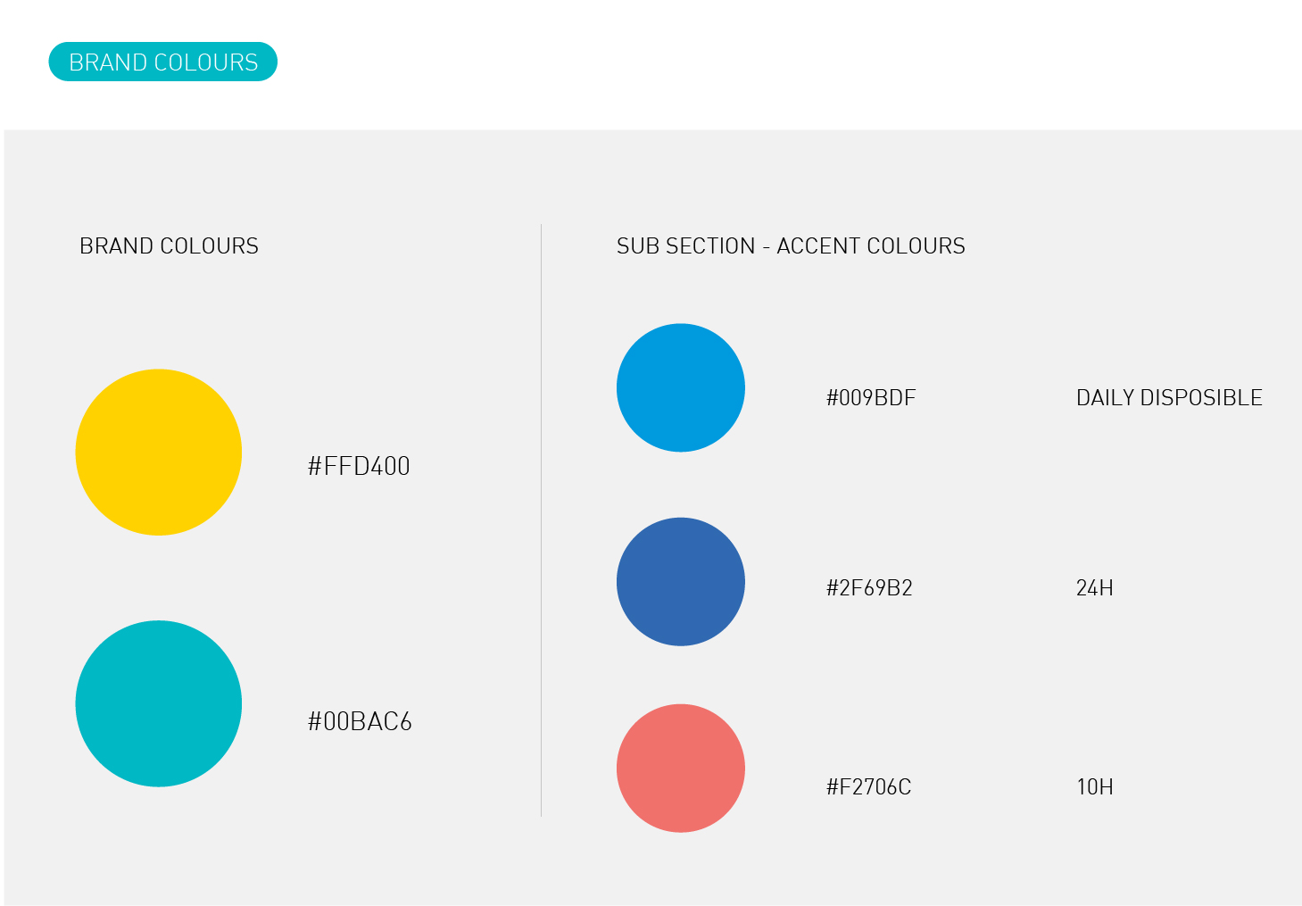
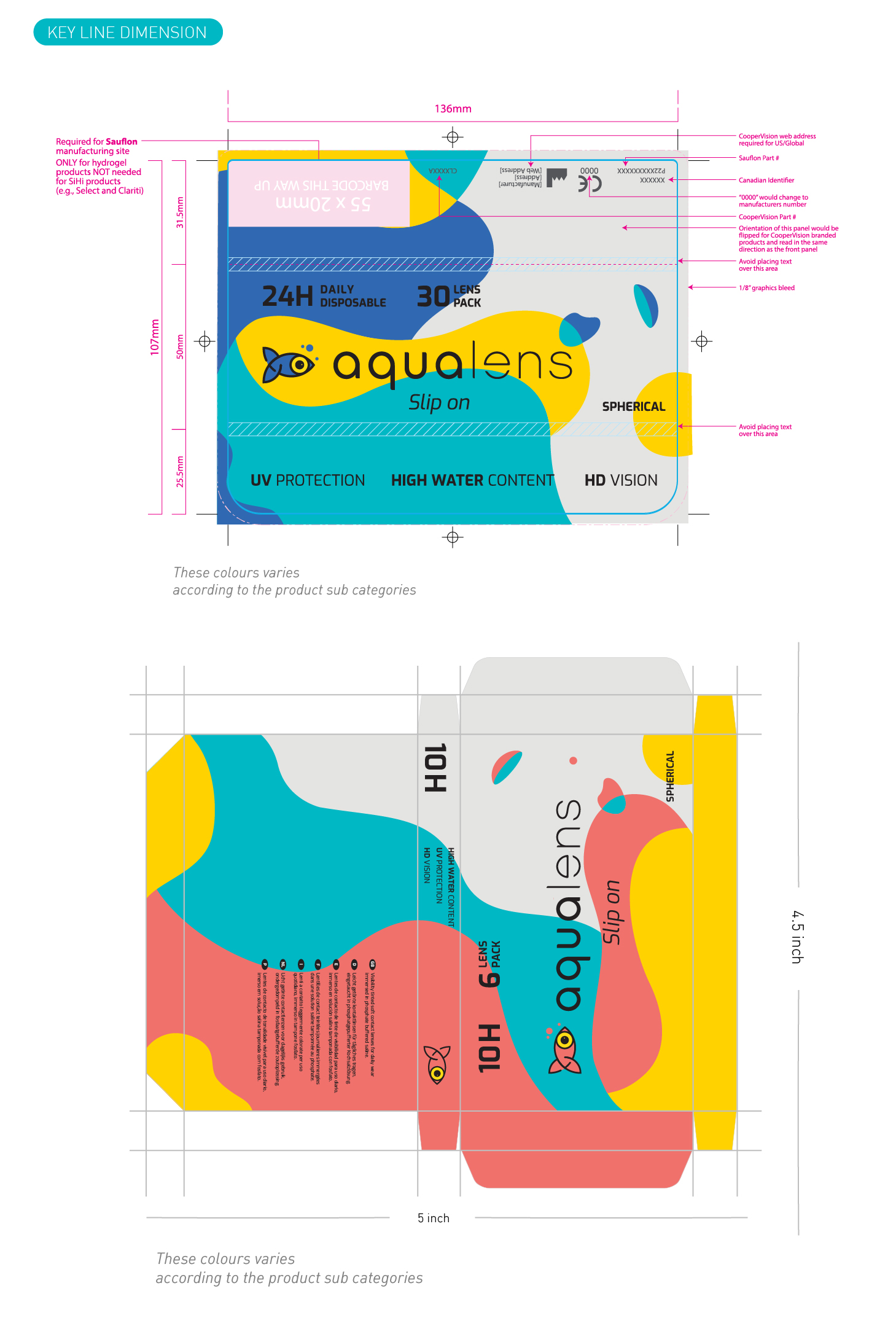
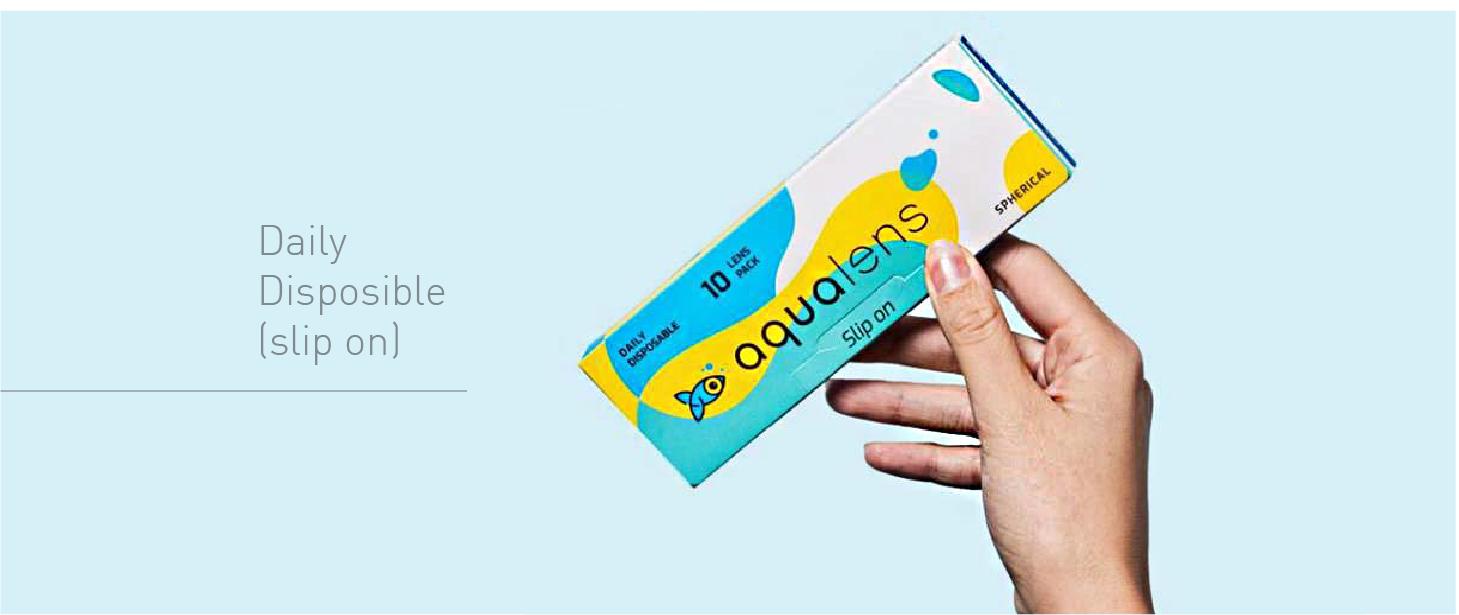
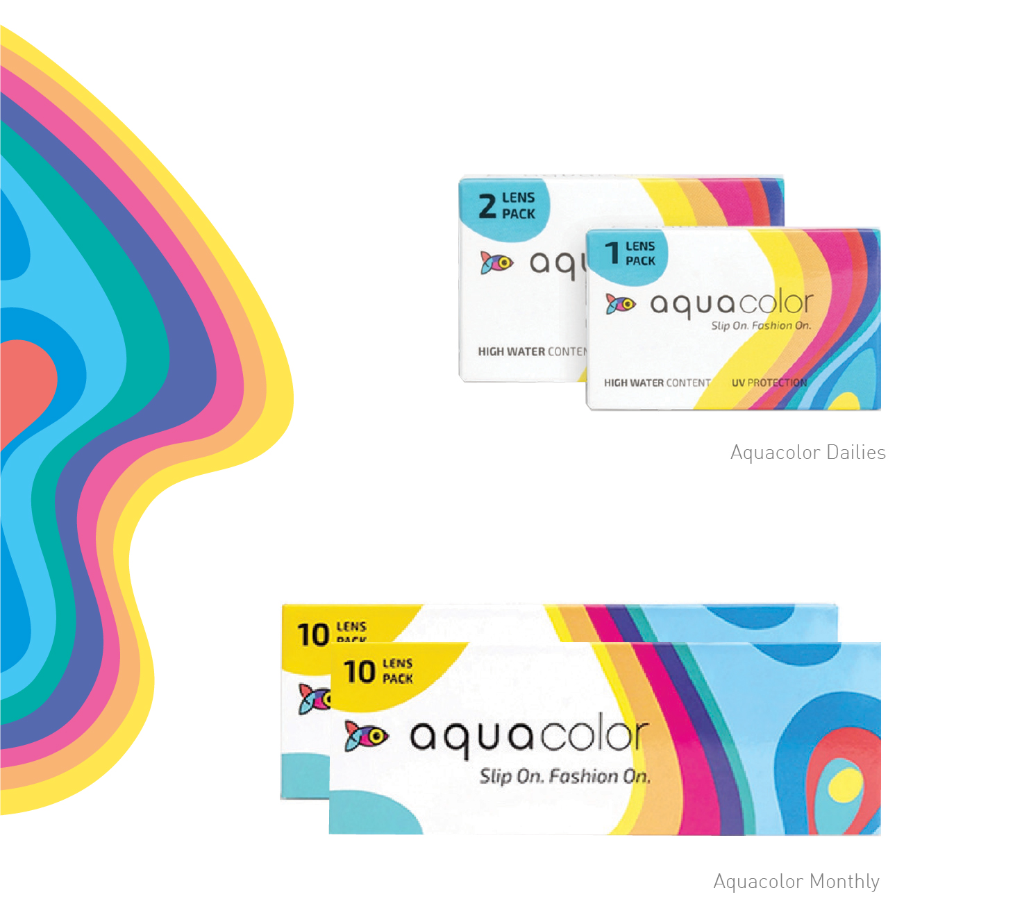
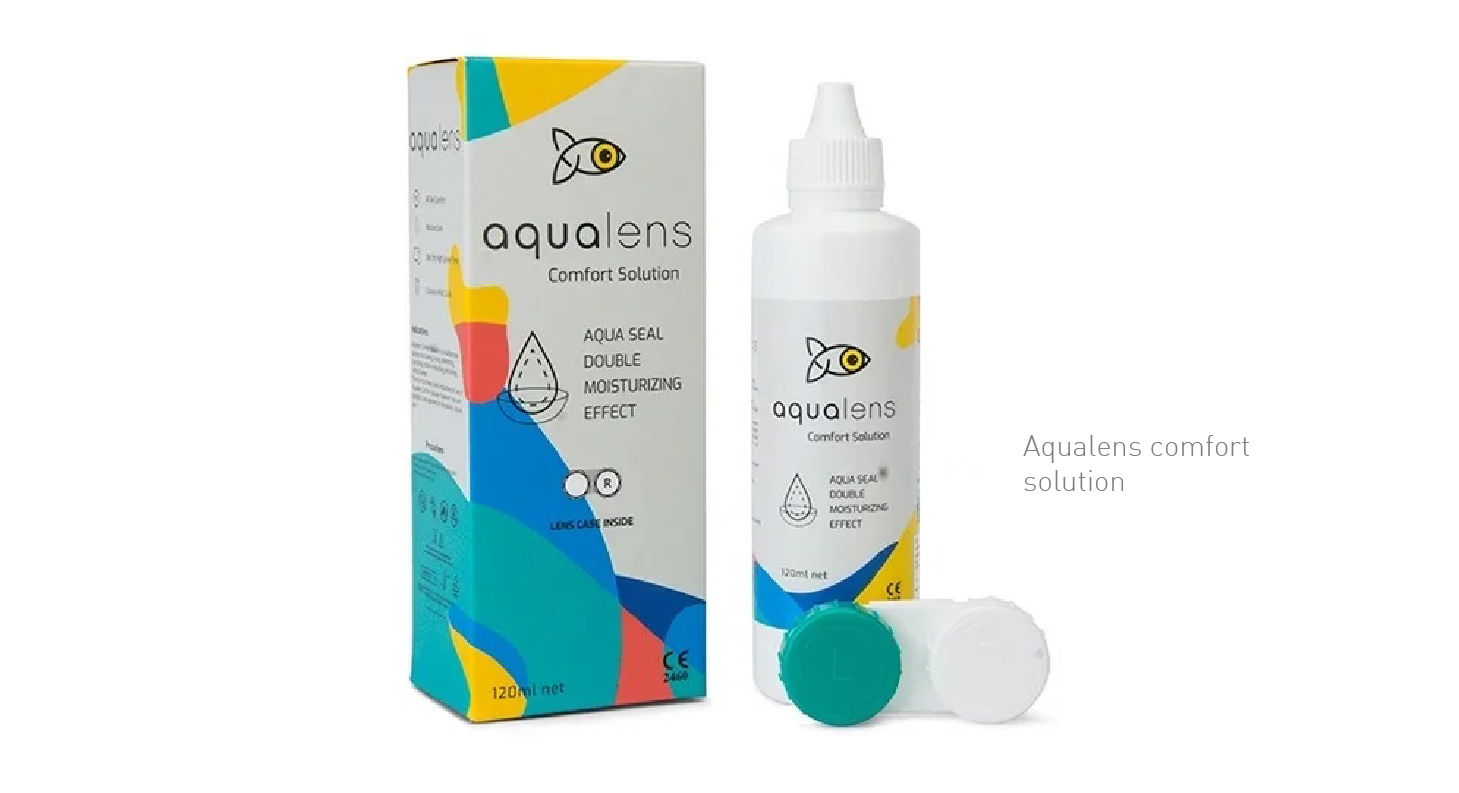
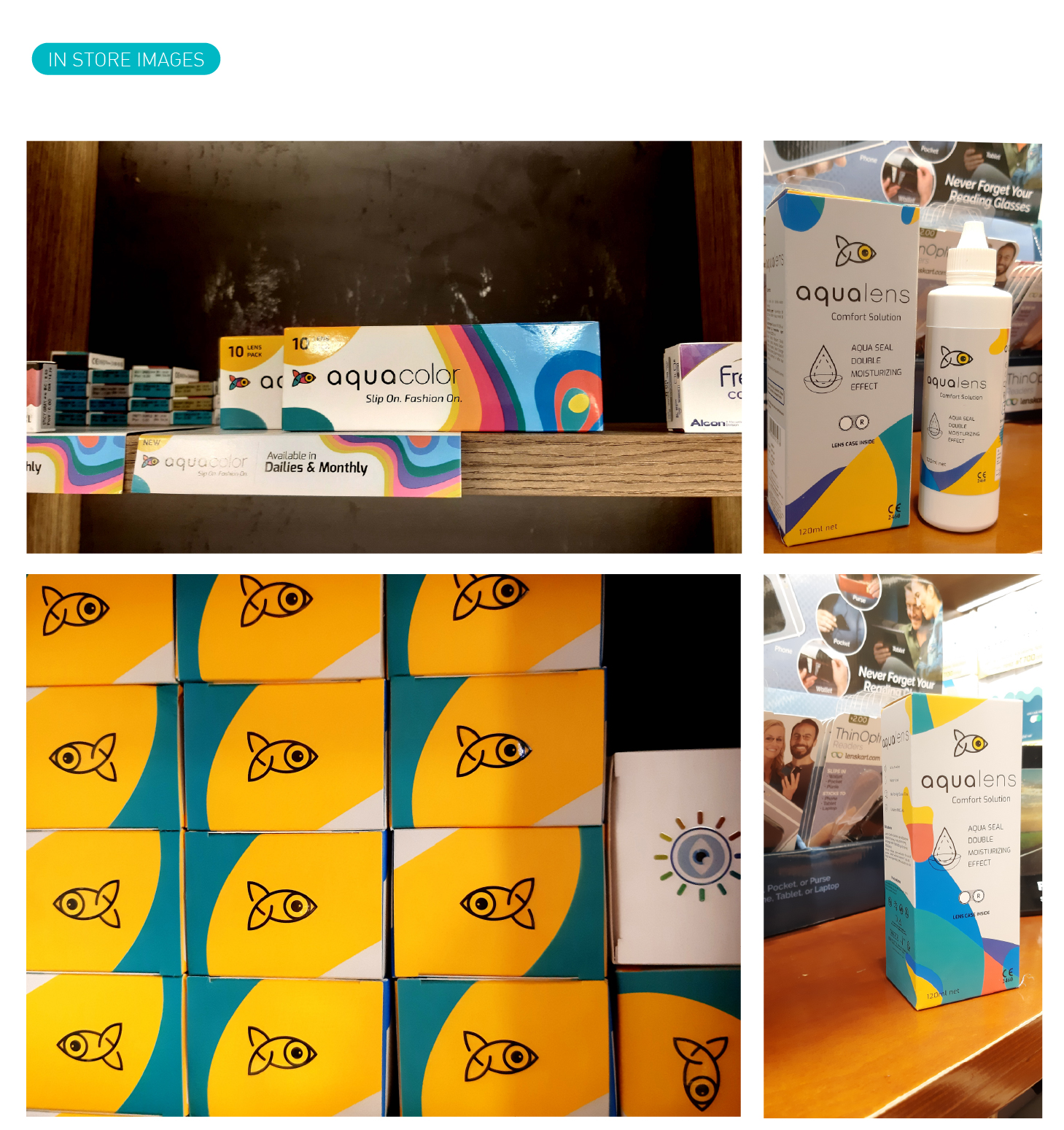
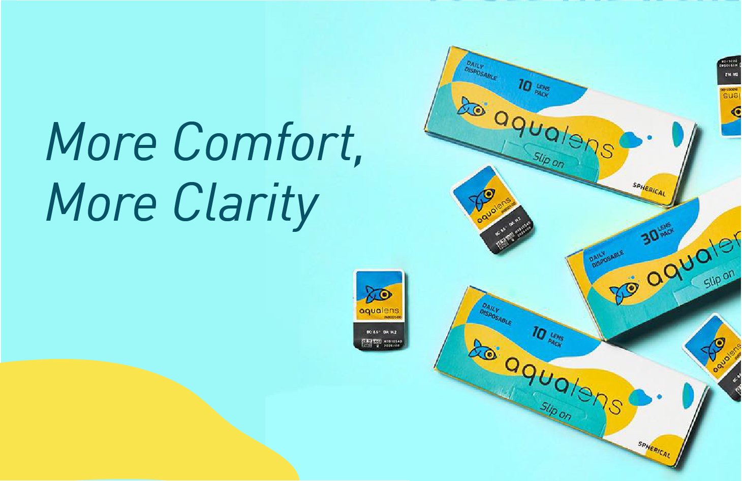
As the name suggests Aqualens is a contact lens brand, introduced by the market giant Lenskart. Aqualens contact lenses are specially developed using the latest technologies to keep our vision intact without letting our eyes feel burnt for it. Aqualens brings us monthly disposable lenses to give regular care to our eyes. The brand has been designed keeping these core USPs in mind to not only distinguish every product from each other but also maintaining its consistency. Aqualens being a relevant brand, understand the user’s day to day life, schedule and working ours to constantly evolving its products and also giving rise to variants that are just the best solution to a particular set of people. With such a massive product range it covers almost all kinds of the working class of people who needs lenses today.
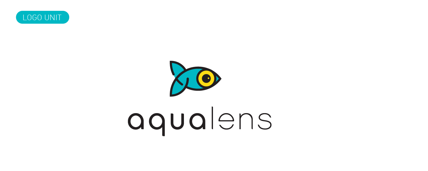
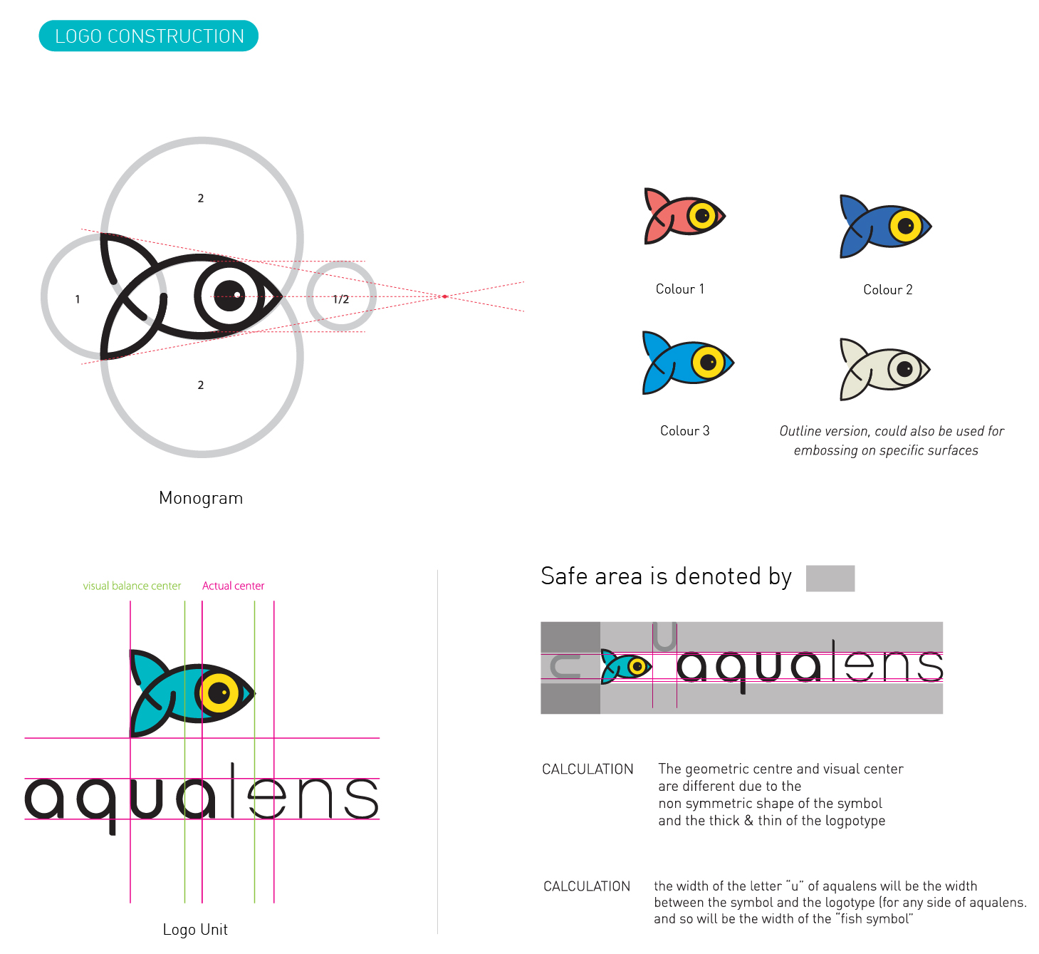
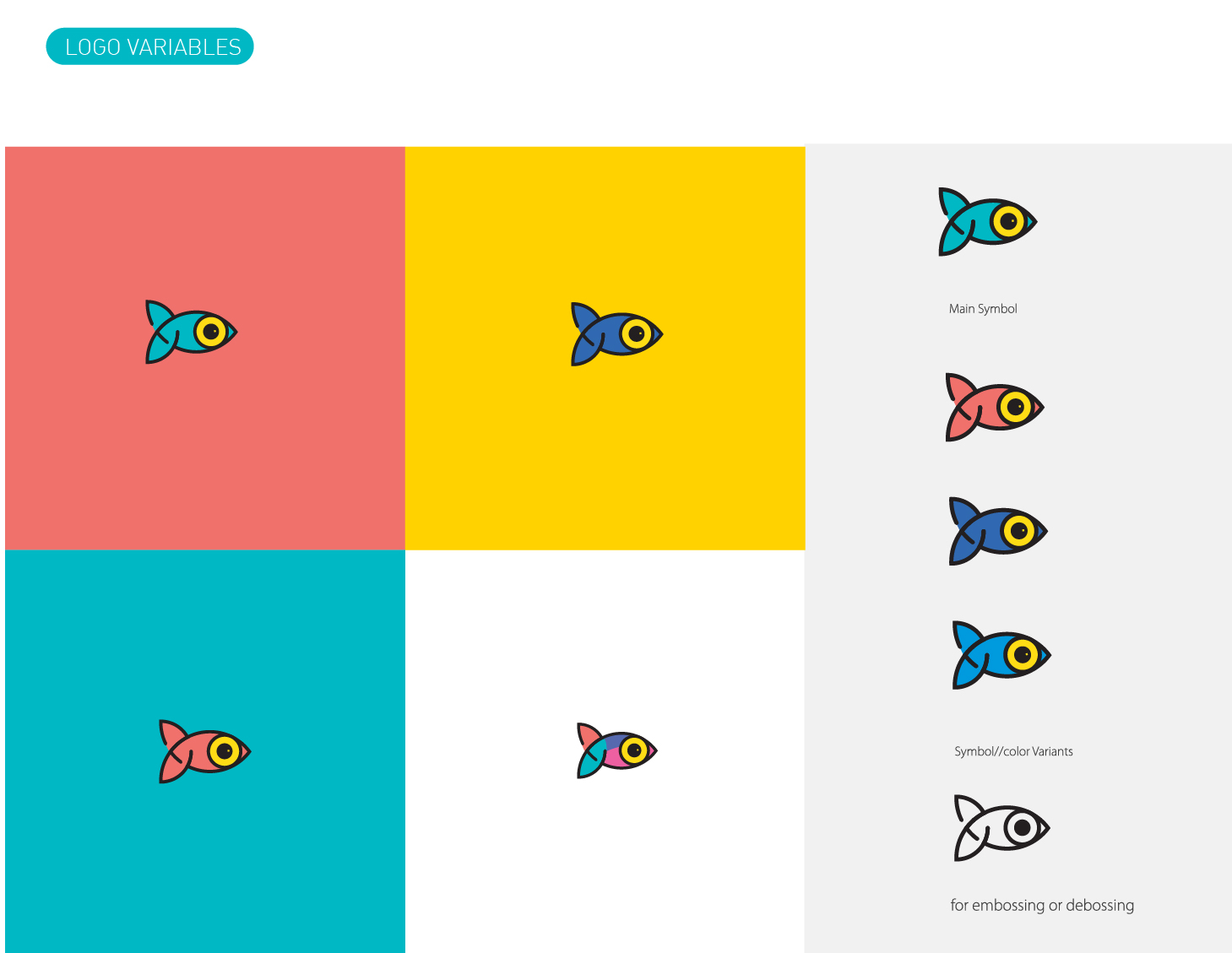
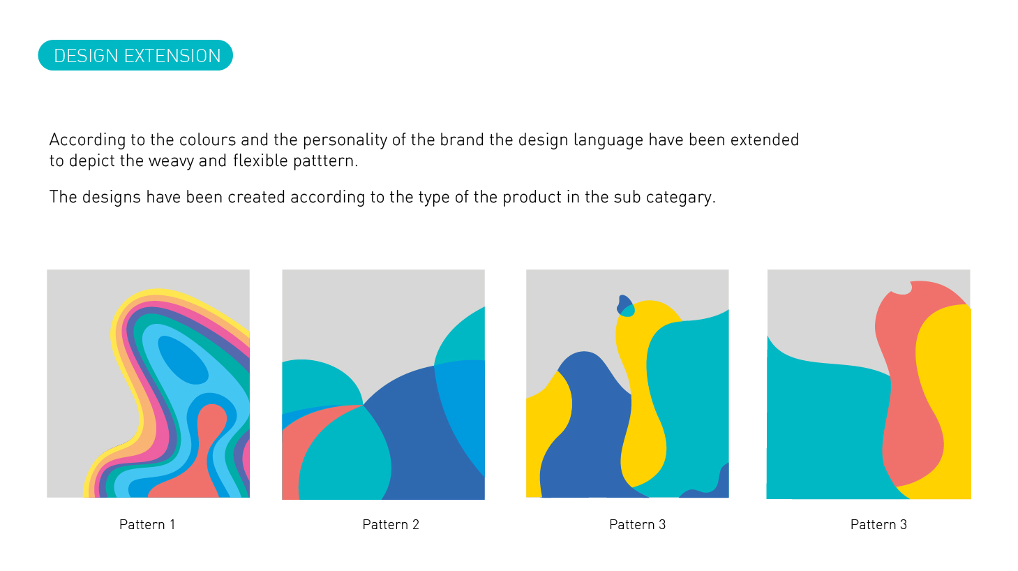
We started with the branding and following the story of its evolution, The symbol “fish” which is the brand career across all product li=nes, the logotype is also designed with a keep eye to detail. Making even the logotype symbolic to the brand. The fluid feel of the visual language goes well with the target group and also gives enough dynamic feel to the branding to create sub brands and a long-range of SKUs.
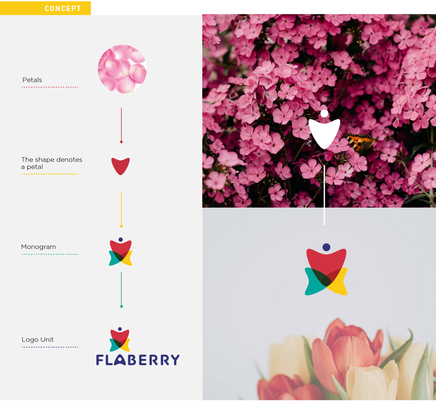
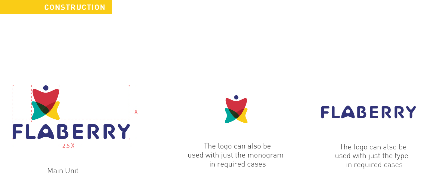
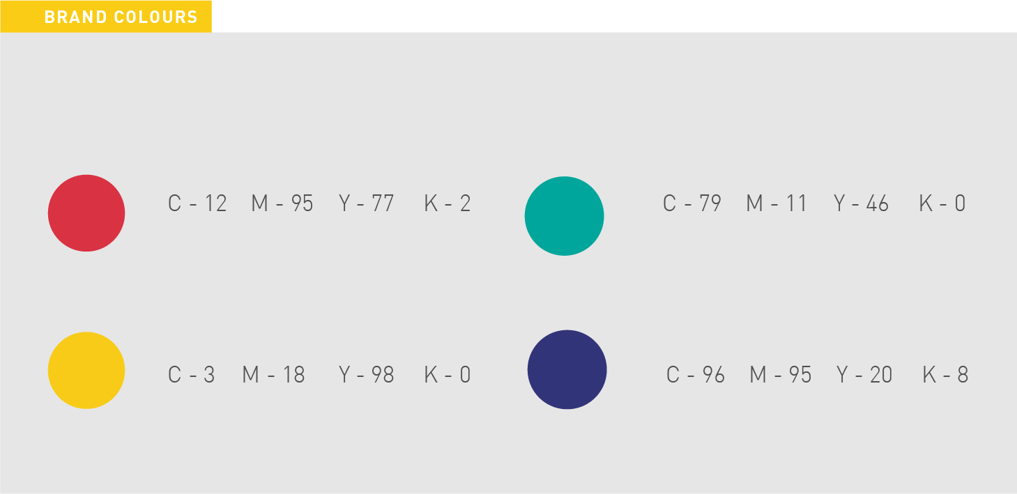
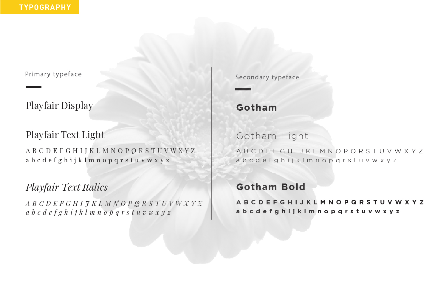
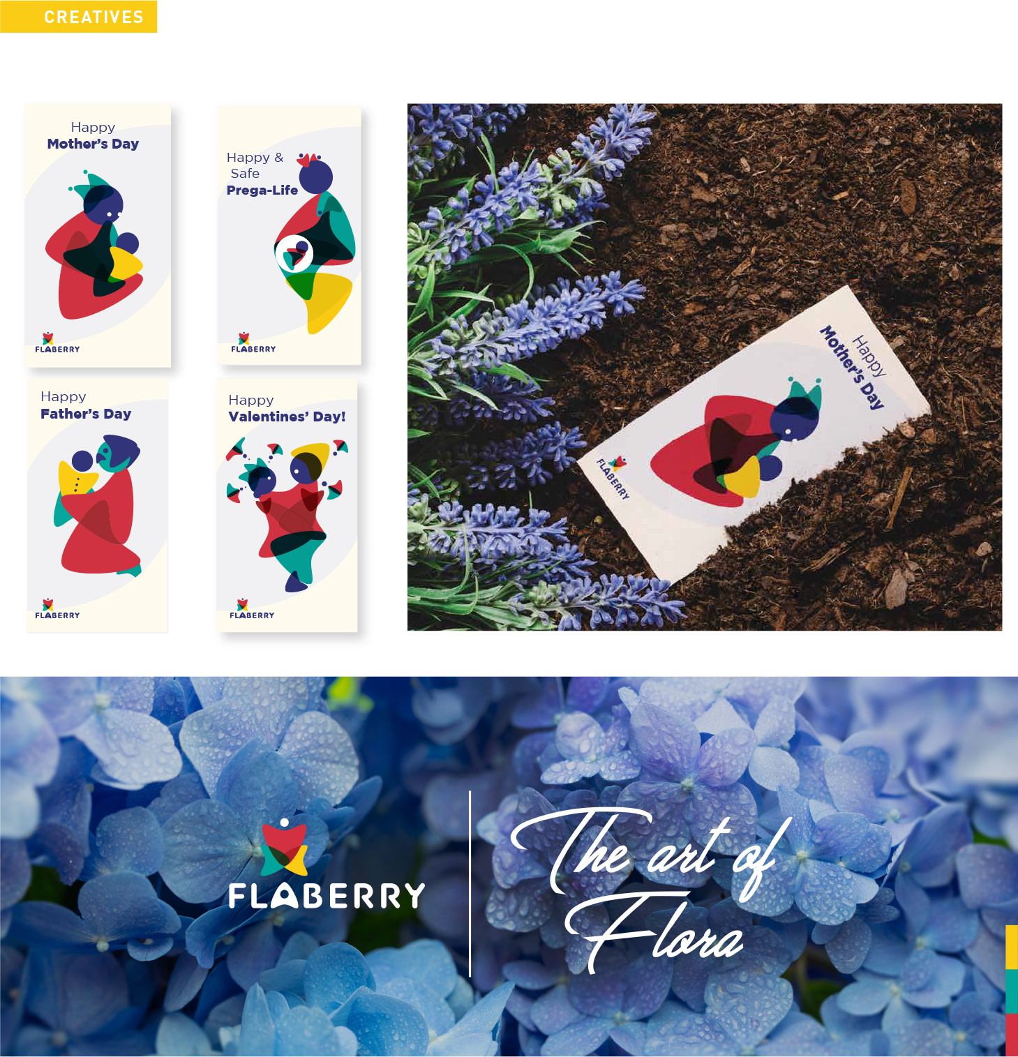
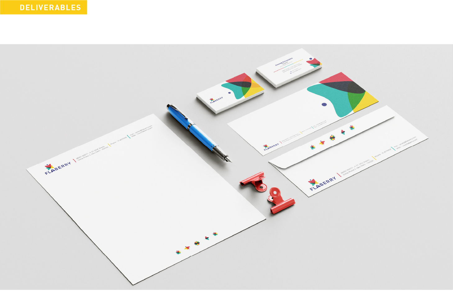
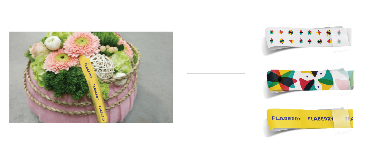
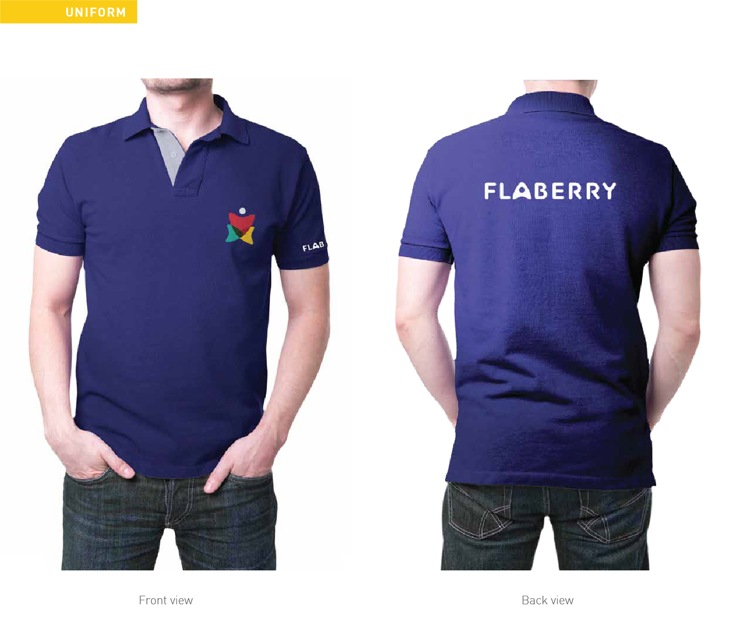
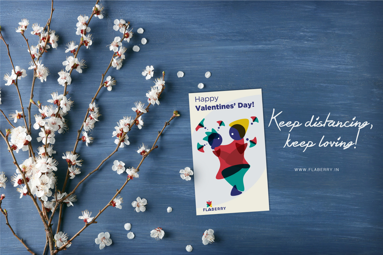
Flaberry is one of the first online flower and boutique delivery company/system in our country. Strategy wise moving head to head with one of the market leaders, Flaberry has ideas that might crack a new horizon for the brand and make it a No. 1 online Flower solution. Flaberry’s strength is its ability to get any kind of flower for its client, be it from India or abroad. and secondly a unique design team. The design team deal with just flower arrangements, and
Like similar online services, it has options to make combos with cards, chocolates, cakes. But The USP of the brand is Flowers and they want to stick to this uniqueness, so not providing more than 10% to any complimentary services. They are one of the leading & trusted Online florists delivering across India.
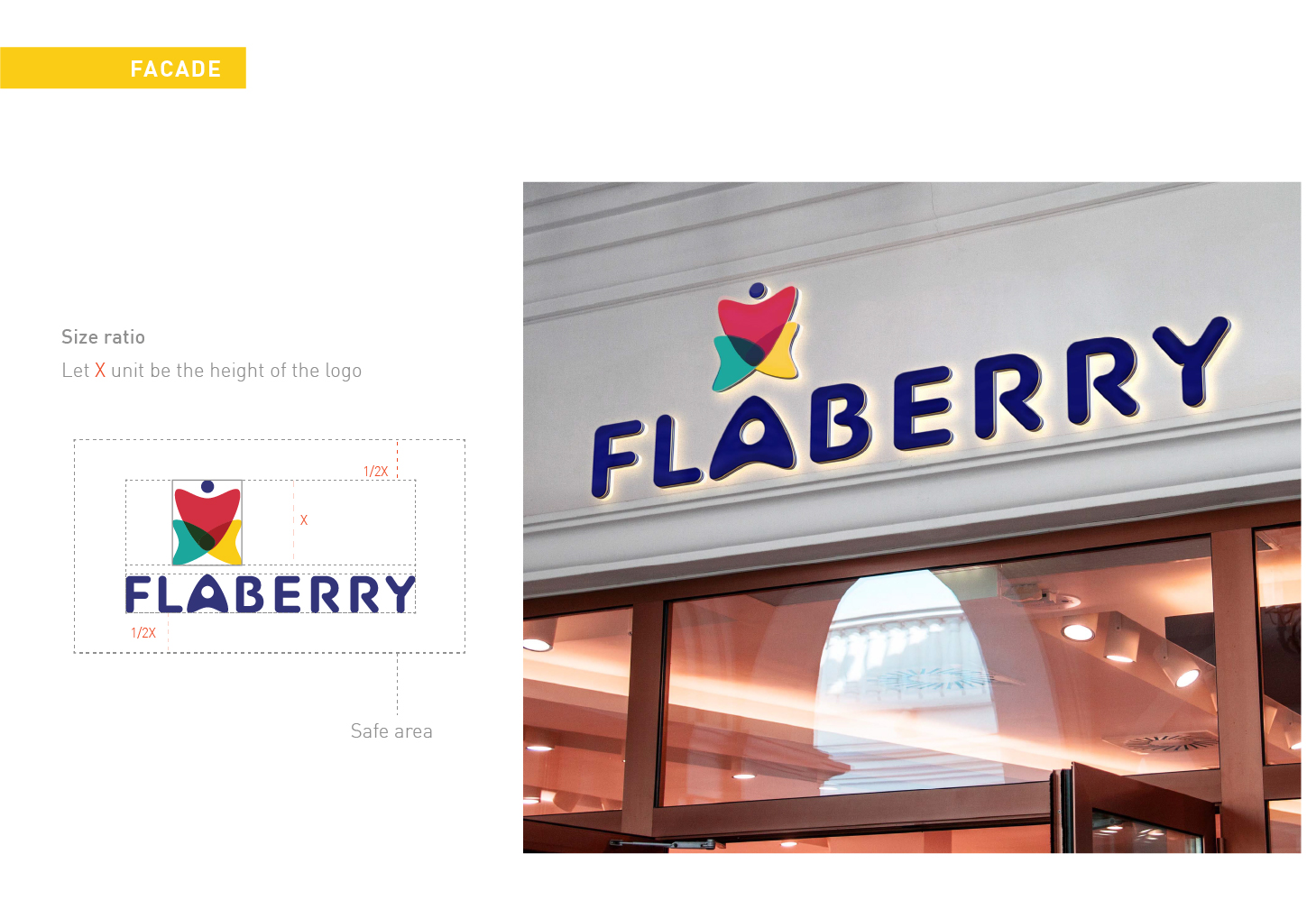
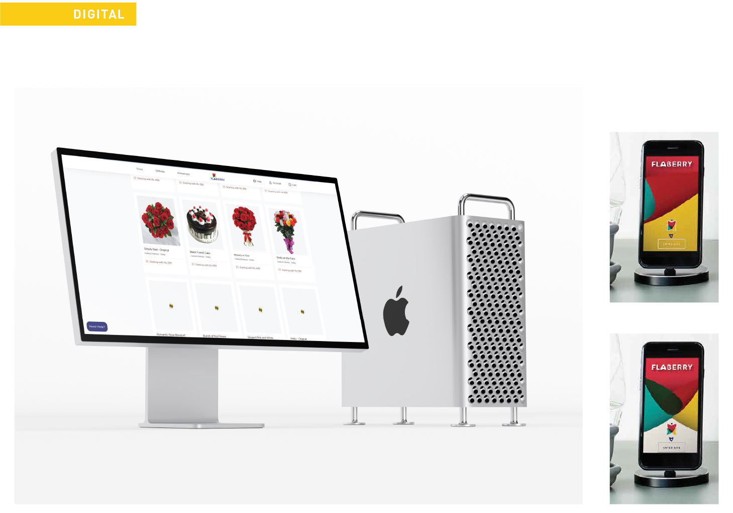
Since the brand wanted to become a household name for its flower services we have worked out a few very key aspects of the strategy to do so. Apart from doing a branding that would look modern, easy, fun, and adaptable design language. The idea is to be easy and communicative but be straight and relevant in the approach. Our idea of Karts added a few dimension to the business and we also plan to take things ahead to pierce through all possible target group
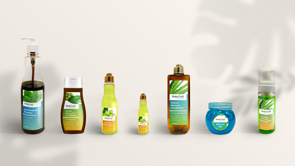
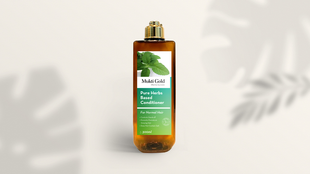
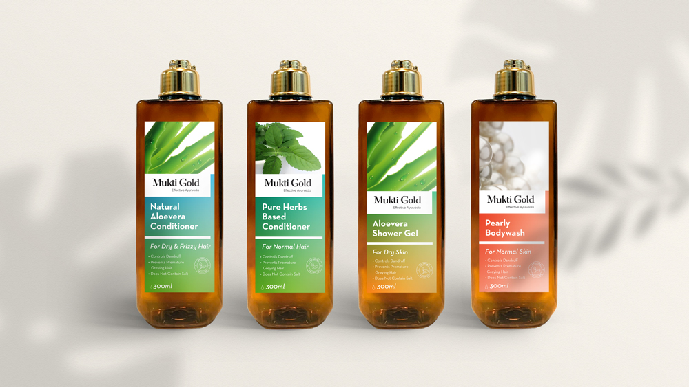
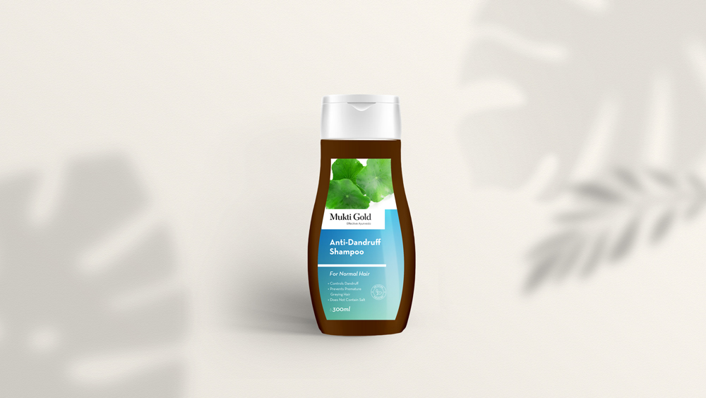
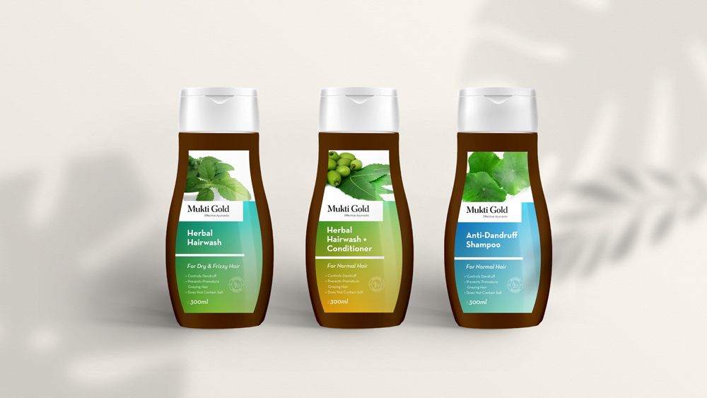
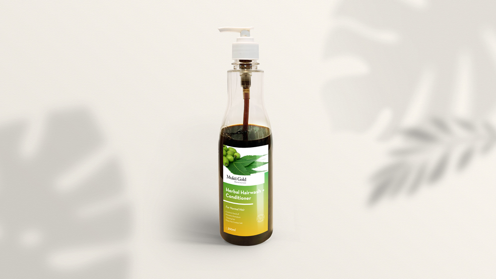
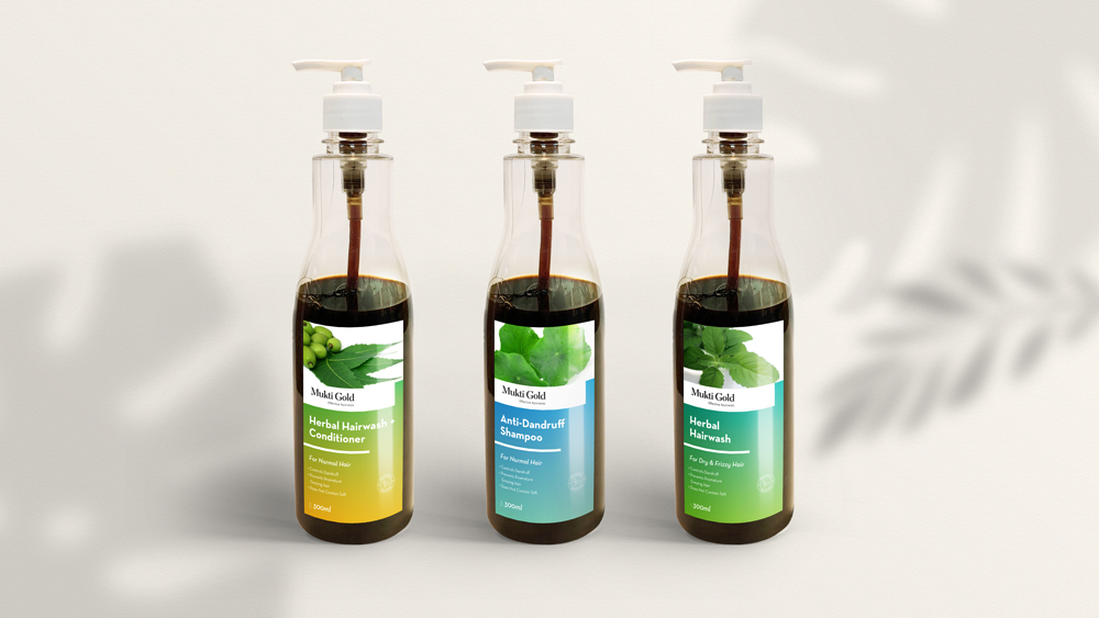
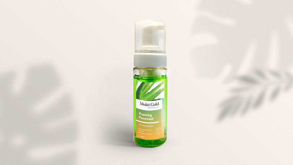
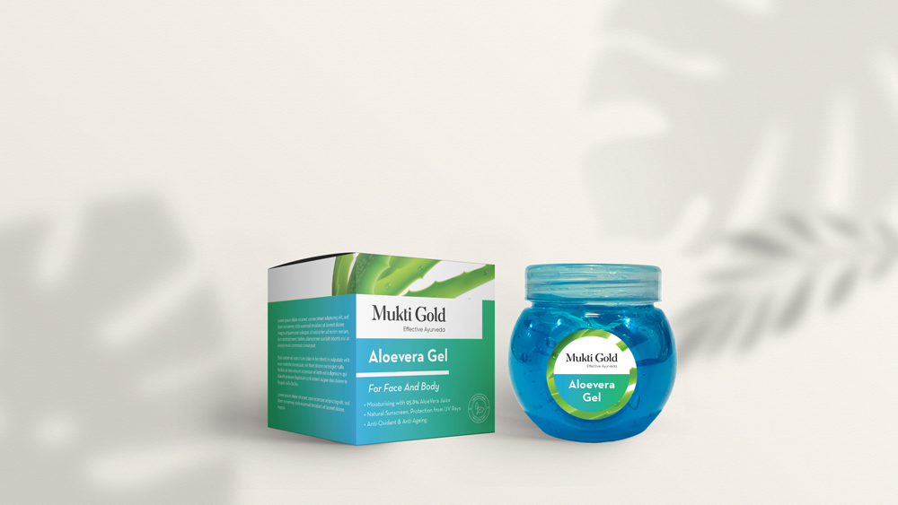
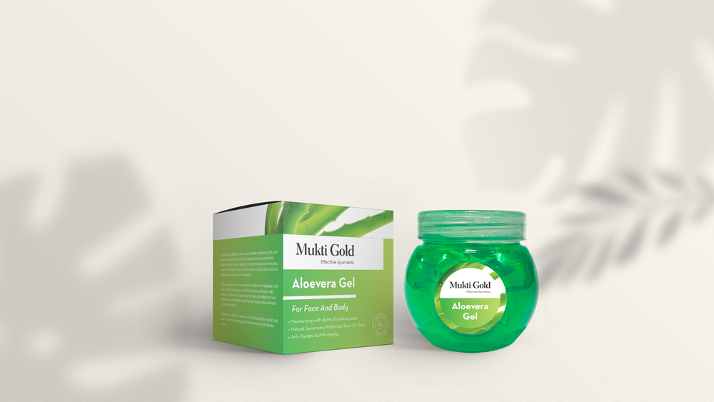
MuktiGold is an Ayurvedic cosmetic brand with a variety of products for Face, Body, and Hair Care. A trusted sub-brand of Axiom Ayurveda, we were approached to re-brand MuktiGold, to transform it from its traditional look to a modern approach, and to create a packaging design system for the entire product line of shampoos, conditioners, face and body washes, aloe vera gels etc. The challenge was to create a system design that is modern and at the same time, shows the ayurvedic ingredients present in the products. To understand the other products in the same sector, we did a market survey and a comparative analysis across the market sections to understand the visual attraction of different products on the shelves in the stores at a minimum of 3 mt distance. Based on the study, a system was designed and the overall visual elements were decided. Gradients were used as the main element of the system design, with different colors representing different ingredients. The ayurvedic ingredients are also directly represented through images on the label design, which makes it easily recognisable. The gradient provides a clean and contemporary feel, with the structure being able to be scaled or transformed into any size, with the space for images to be interchanged on the top portion of the label. This makes it easy to add new products to the existing system as well.
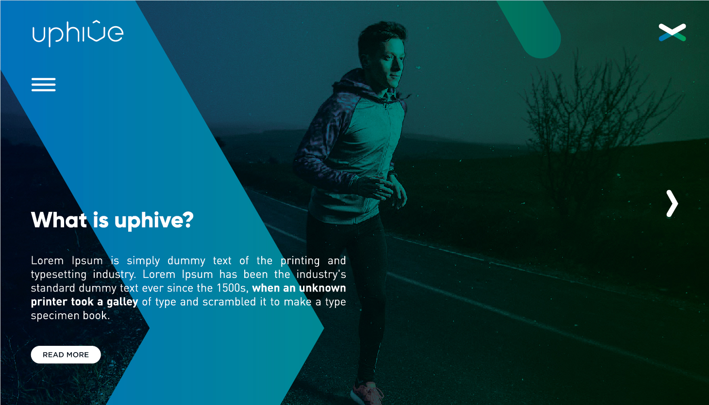
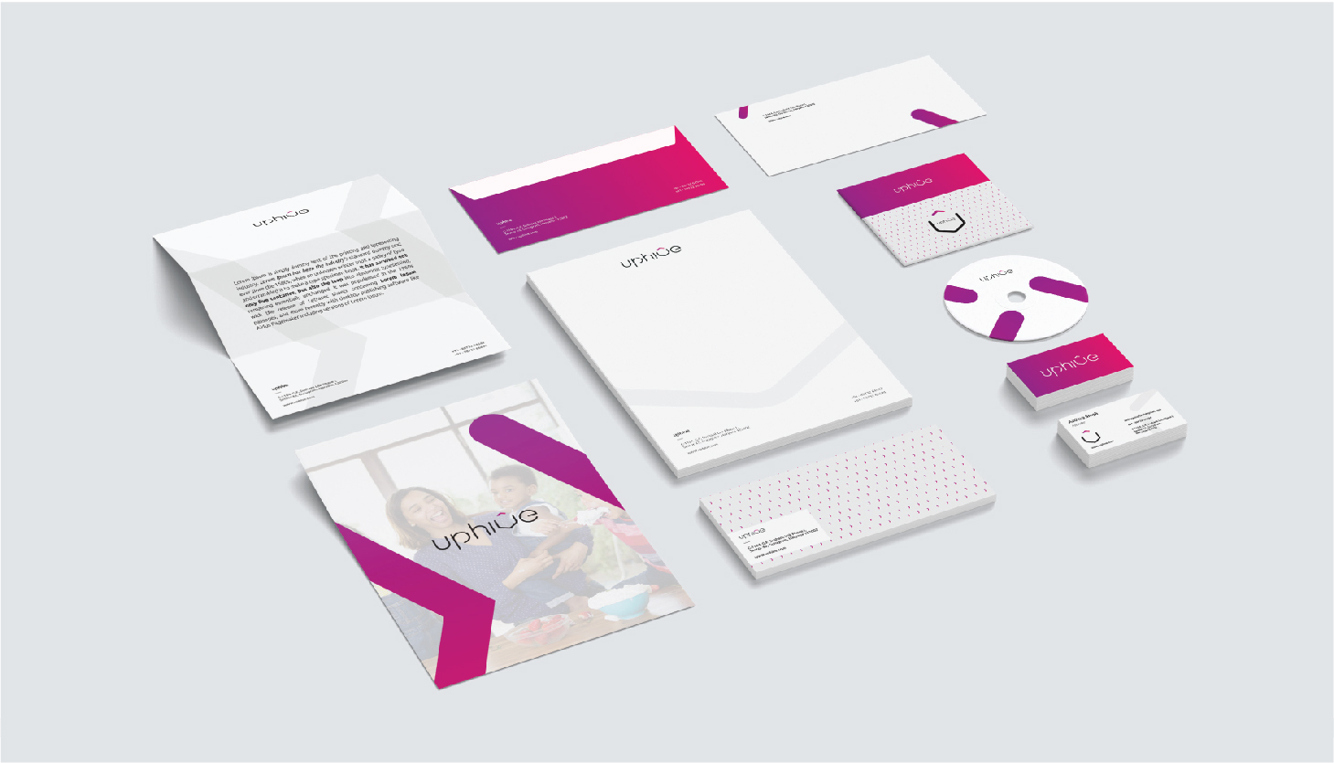
The objective behind this project was to design the branding/ branding language for an online platform/ agency called UPHIVE.The agency had a renewed turnover towards products that associated tagged as lifestyle wellness products.Once the brand had established it’s core area, it has expanded to food, cosmetics, medicines etc.
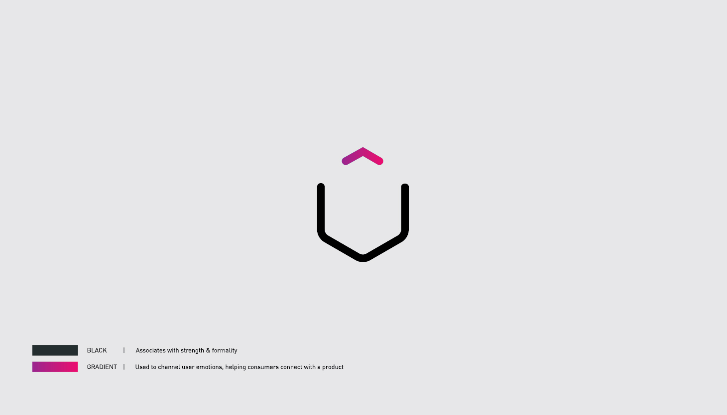
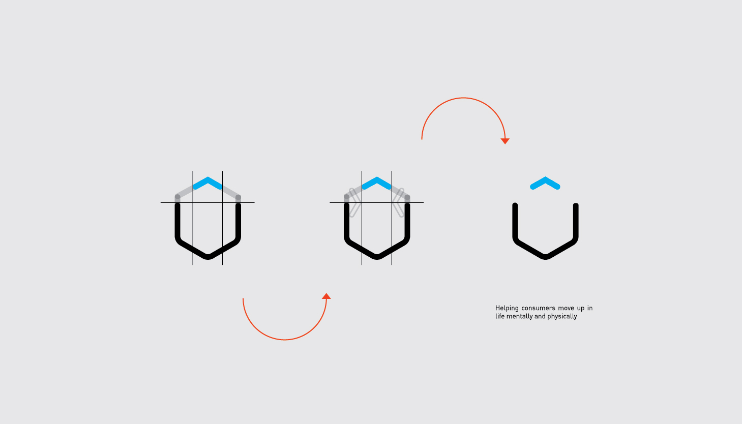
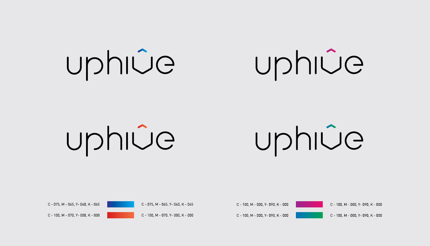
The logo was made in mind keeping up cycling and cohesiveness as major process element for a company of this nature with a touch of minimalism. The usage of colours was to give a idea of freshness and reassurance to the customers. A certain thickness considered while making the logotype for the form it would be an extension go the logotype and since the idea of an hive was primary in nature, we opted for a hexagonal shape ( form and logo as one)
The challenge was to use the shapes to construct the hexagons into a comprised ‘V’ as thr alphabet. 4 to 5 gradient styles for color palettes keeping the digital aspect in mindscope for brand extension, enabling thr brand to operate in the future to align themselves with specific product line
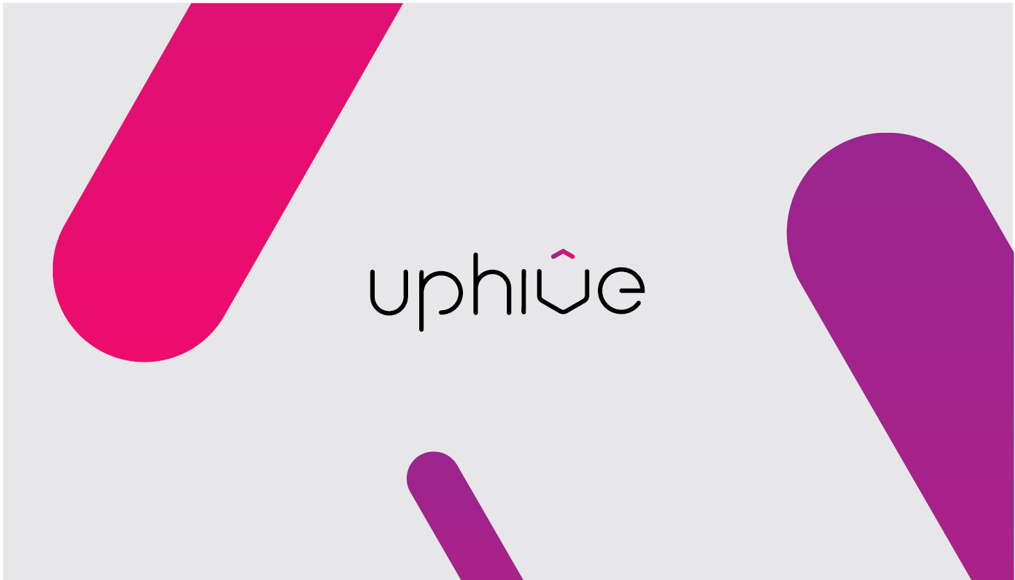
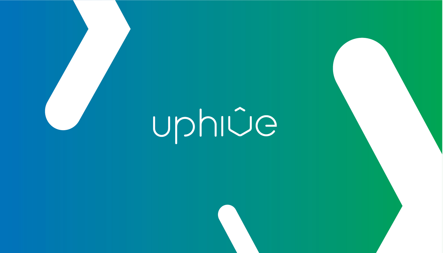
The collaterals below are showcased to exhibit the expansive nature of the brands
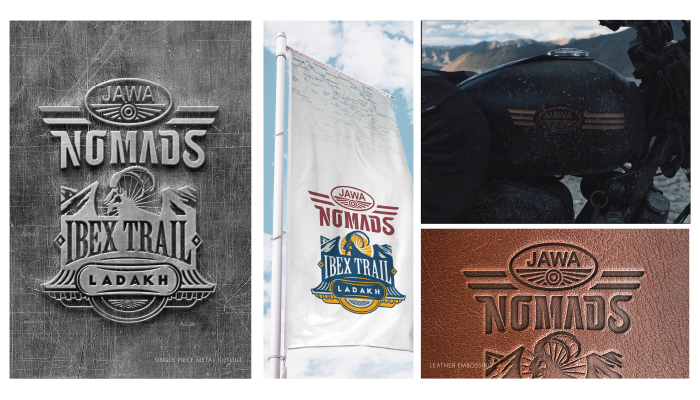
An anchored concept for all JAWA rides focusing on community engagement. The logo is to capture the essence of it being a subculture in itself. This project is focused on a niche target audience.
The logotype for Nomads is carefully hand-drawn. The idea was to make a logotype that romanticized vintage typography and become a visual connecting point between the user and its muse.
The signage or extension with the logo primarily focuses on the region for the specified ride. it emphasizes the topography, beauty and culture of the region.
The signages were further worked upon with explorations of new symbols and styles
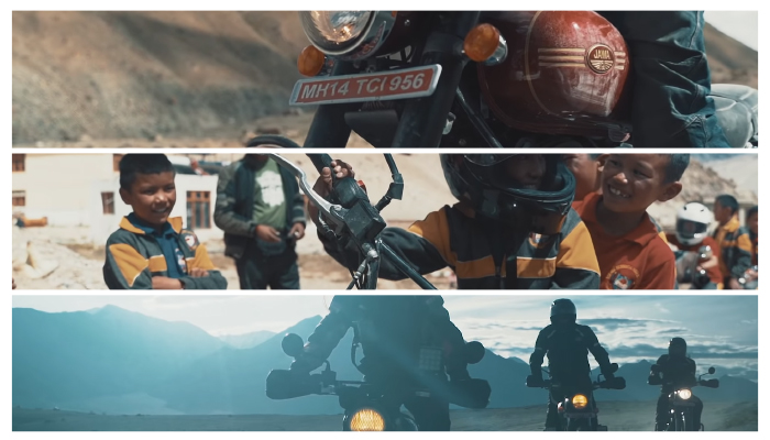
Further, collaterals are showcased to present a clear image about the brand extension itself
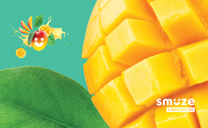
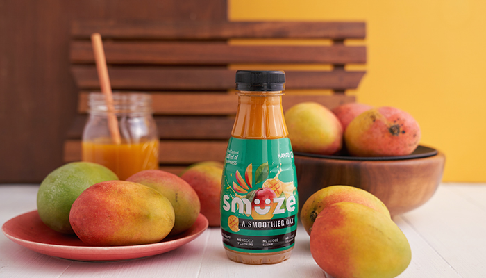
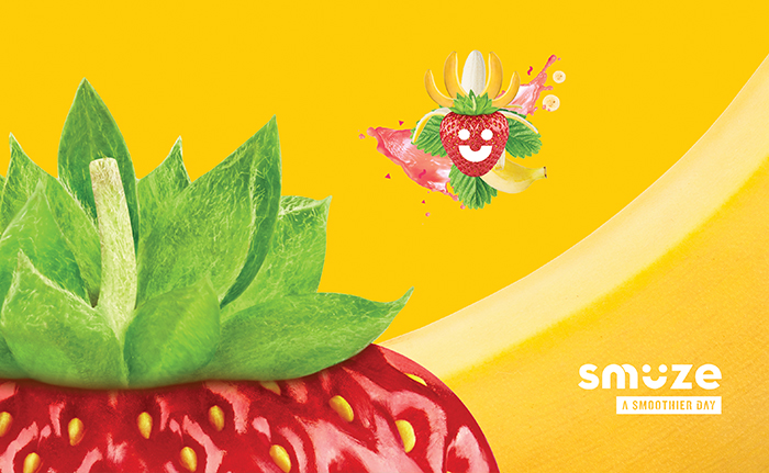
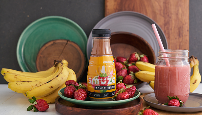
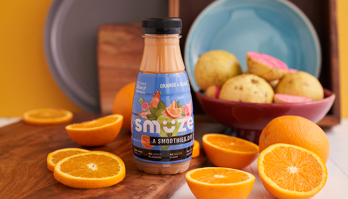
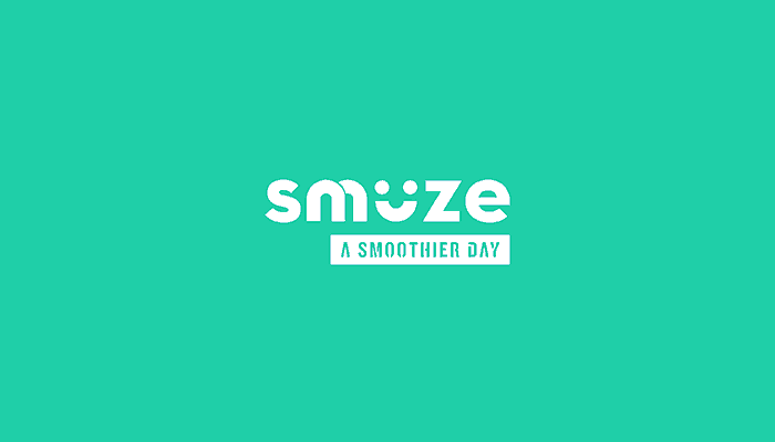
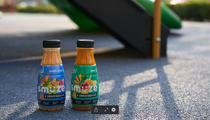
Presenting the first packaged smoothie brand to be retailed in the country, Smuze.
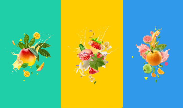
Unlike options currently available in the market, this smoothie is made entirely out of fruit juices, without any milk products and artificial sweeteners. A key property to guide the visual language for the brand.
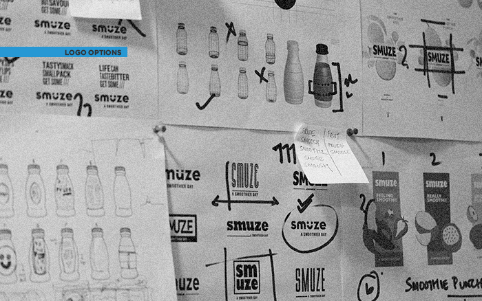
For their release in India, the communication framework had to start from scratch. We brainstormed a unique name which would effectively convey the product’s highlights. The name “Smuze” was coined for a refreshing and filling beverage which one can grab on-the-go in their active lifestyle.
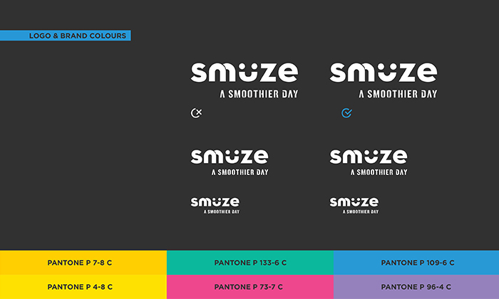
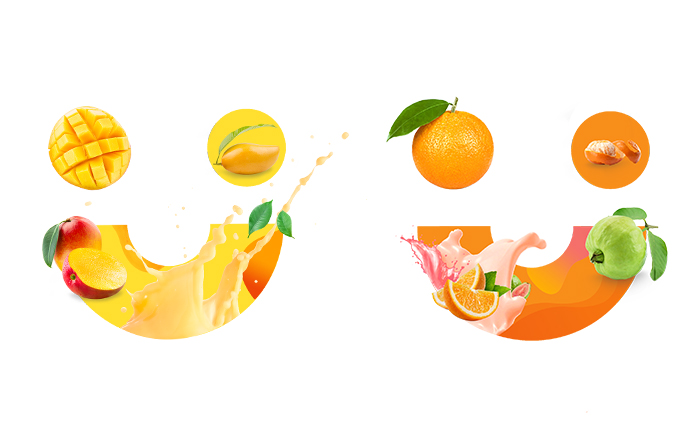
The logotype shapes rounded sans-serif typeface in small captions, the alphabet ‘u’ turns into an affirming smile. Composite copy has been used across the dynamic and playful brand language for print and digital mediums. Together they effectively communicate an overall friendly appeal of the brand. With the variety of flavours offered by the product, our visual language also extended to play around within each of these with different units within a flavour.
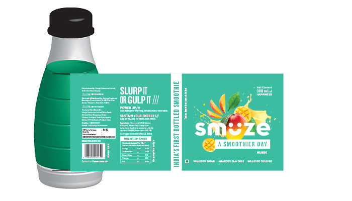
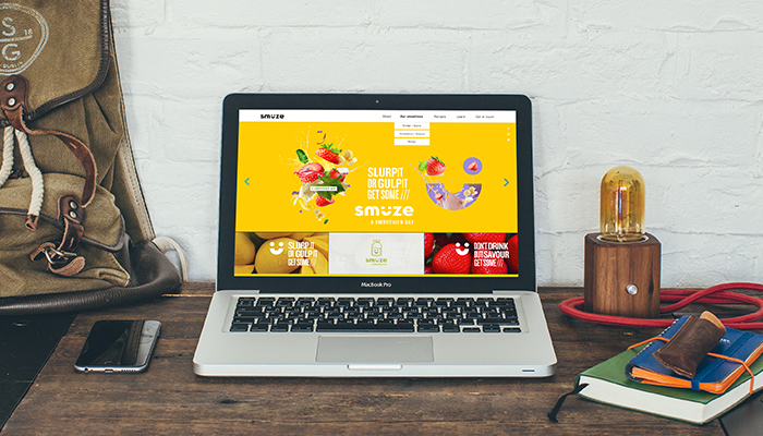
We worked closely with the production team to develop the appearance and shape and size of the bottle The smile symbol from the logo imprinted on the bottle caps adds more nuances to build recognition of the brand in a retail arrangement, while the attractive bottles can be spotted from a farther distance. A website curating engaging content and communication has also been developed for Smuze along with developing a marketing strategy for the product. We have also been strongly involved in art directing the marketing for the brand for its further strategy for communication online and on-ground.
The idea of Little Shelf has its inception from the ‘little shelf’ that families have at their home for kids. Kids, when introduced to books, can develop a love for reading at a very early age. This implies growth in curiosity and that further leads to growth in the collection on that little shelf. To make sure your little one’s collection is delightful, ‘Little Shelf’ was created to show them the bright and colourful world that exists within the pages of a book and lose oneself for a while in a beautiful, imaginary and wonderful place before getting back to reality. There is always a lot to learn from books – words, language, thoughts, experiences. Through the curated box by ‘Little Shelf,’ all these can be shared with future generation in the hope of making the world an extension of a little shelf – a cheerful place that holds wonderful thoughts.
Little Shelf’s brand language is light, fun and playful. Using primary colours, along with some vibrant colour variations, we built a brand that looks playful and also evokes curiosity among the kids. It also appeals to parents as Little Shelf provide quality books that are not easy to find. Since ‘Little Shelf’ doesn’t support the use and throw attitude towards children’s books, the brand language helps to make the collection memorable and make both parents and kids to keep the books forever.
The boxes are divided into the following categories :
0-3years: board, cloth books, toys
3-5years: storybooks to be enjoyed with parents
5+years: Books kids can read on their own
Little shelf is serviceable as a subscription model which offer different options for the customer to choose from. The constant communication and feedback from the consumer help the brand understand the requirement for the child to give them a more personalised experience during the time period of the subscription. The contents of the kit are then curated using the understanding of the possible progression of cognitive skills and emotional understanding of the child.
The box contains things like books, puzzle games, sudoku, action figures, toys and so on.
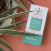
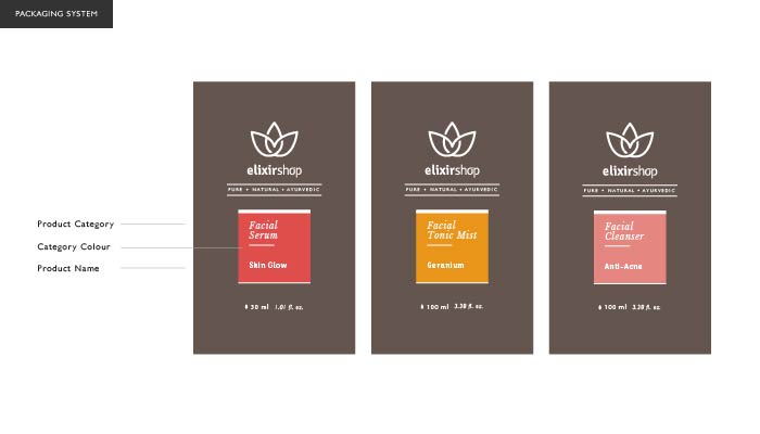
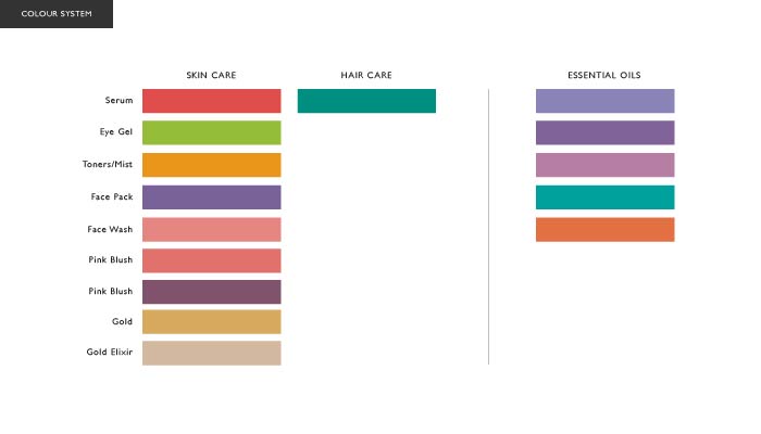
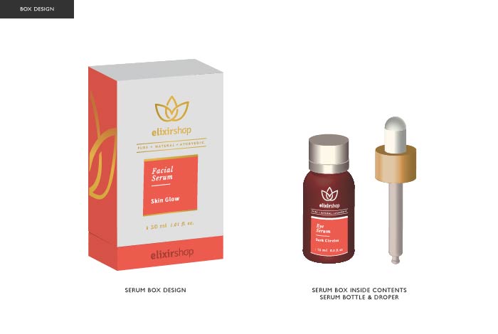
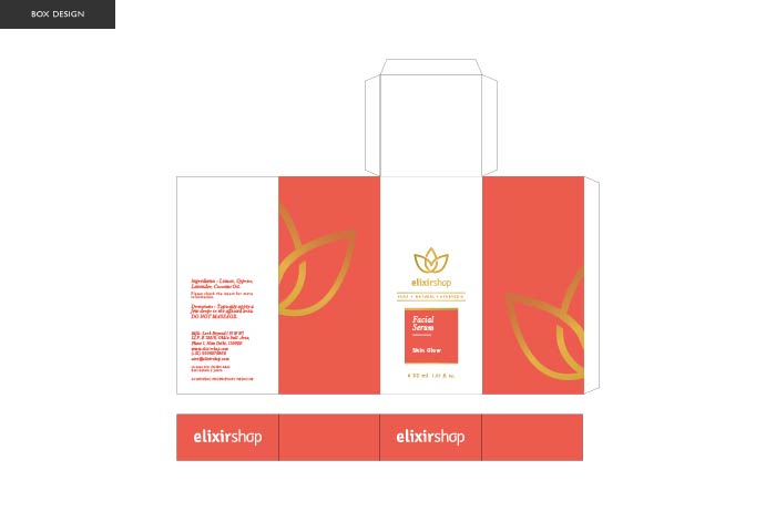
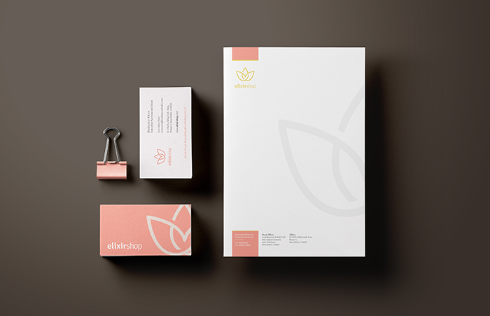
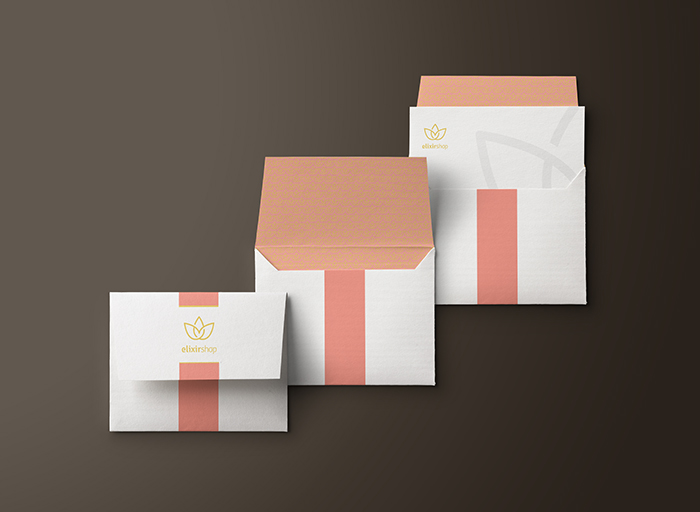
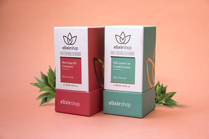
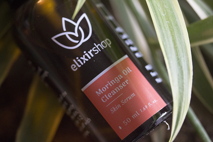
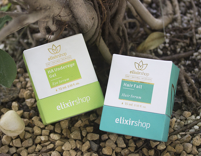
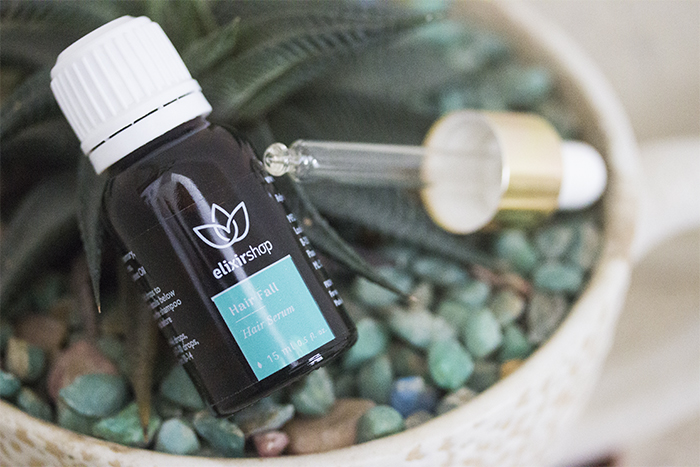
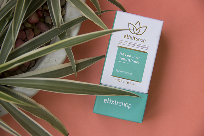
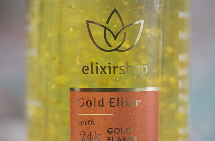
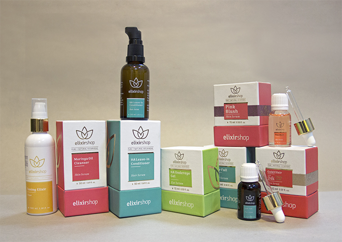
Elixir Shop is a wellness-brand dealing in skin, hair, and body care products – Their products are a 100% natural, have a chemical-free range, and also feature a unique blend of essential oils; making them a brand that focuses on a pure, transparent image that will make clients feel comfortable and at home using their products. We were approached to re-brand their entire product line, creating a unique brand identity system that accurately captures the simplistic, soft feel of the company – and to eventually translate this identity into new packaging design for all of their products – as the packaging is the most visible, and therefore most vital usage of the brand vocabulary that we established.
Lotus was the inspiration for their earlier logo as well. Our challenge was to keep the same concept of a lotus, and create a unique looking logo that will have a modern aesthetics working along with the rest of the design philosophy. The lotus symbol created is one continuous line, with cuts made strategically on places to give a flat yet three dimensional feel, the resultant shape is one single piece which makes it an ideal shape for embossing. We did a hand-drawn logotype with a fair amount of attention to detail, keeping it simple and pure nature of the brand in mind. The entire brand identity system is planned around the strategy of brand placement keeping in mind the target group. We also focused on the future perspective of the marketing goals of each product range and structured the colour system to identify various categories of the products, and a brand identity that holds well all of these categories together, hence providing a very strong visual vocabulary.
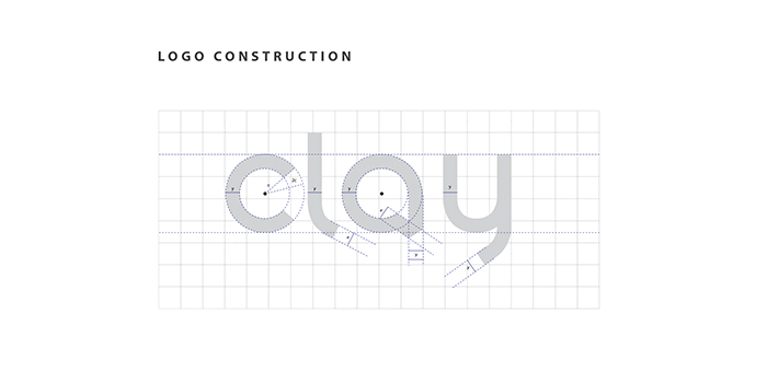
Klay is an upmarket interior and tiling company based in Gurgaon, India. We created a visual identity for the brand, which was then introduced into their showroom interiors, along with other print collaterals.
The idea behind the logo is simple – a reference to the common practice of stacking tiles. This concept was extremely well received by the client, as it has great potential to be translated into multiple mediums, and expressed through architecture, interior design, etc. The colour palette was made to keep a hint of a corporate brand, while the visual language of the lines breaks away from any ideas of rigidity.
The Klay showroom also displays a 12×8 foot tile print of an illustration of Ram, made by Prasun Mazumdar under the Sparrow banner. The piece adds a new dimension to the showroom, successfully hooking customers as it is the first thing they see as they walk through the door.
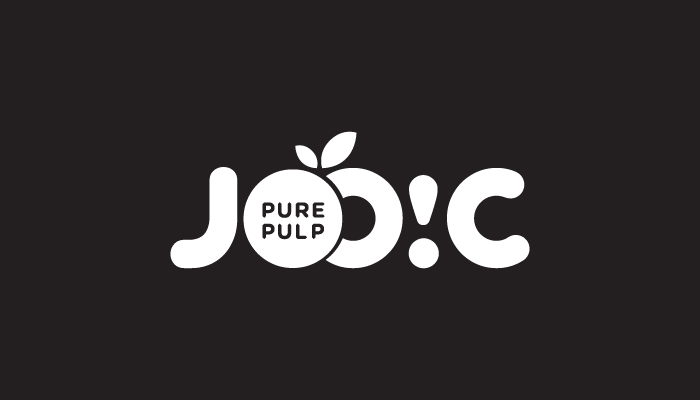
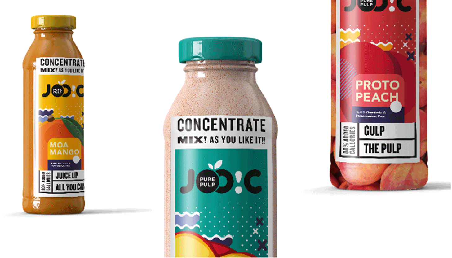
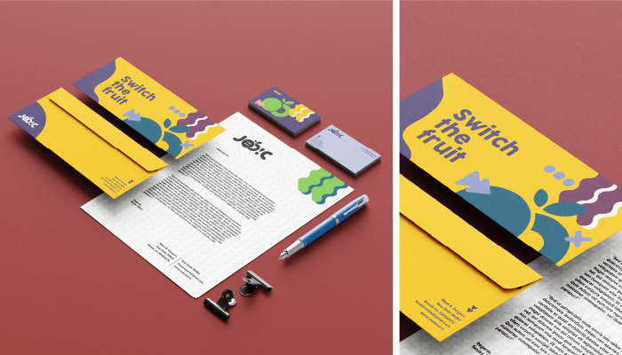
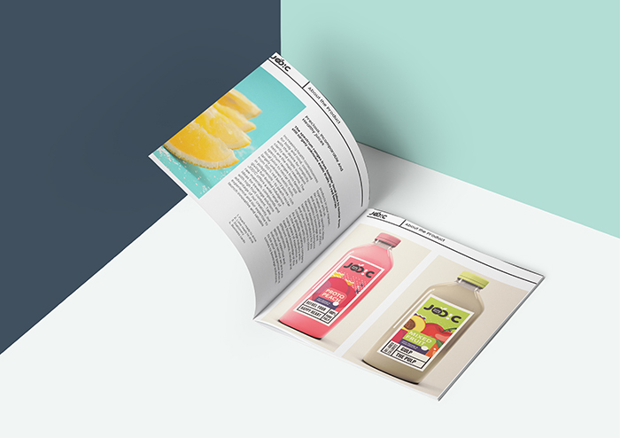
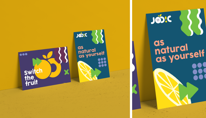
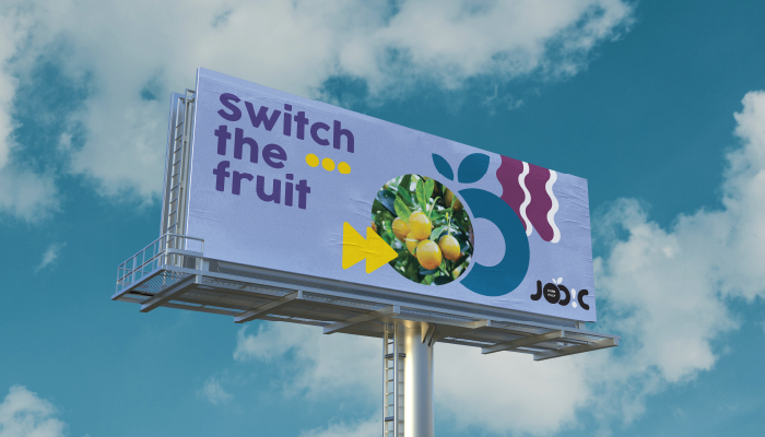
Joo!C stands out among other brands as it gives one of the best beverage solutions, acting as a full range supplier in the bubble of fruit based drinks, ranging from concentrates to juices. A pulpy fruit juice brand, it appears as funky and goofy but doesn’t compromise on authentication and natural aspect and doesn’t struggle to identify as a pure, ready to drink juice brand. Joo!C also has a wide portfolio of different fruits being incorporated naturally. The spectrum ranges from locally known food to some little more exotic category, which combined with the brand identity created by us provides the brand a very varied but consistent, clean, fun and playful look.
The word Joo!C is very evidently inspired by the name ‘juicy’ which is a very straightforward adjective, more so for a brand selling juice. Very familiar and direct in its pronunciation and very different in our iteration when it’s spelled out, it surely creates a unique space for itself and would resonate with its consumers more easily.
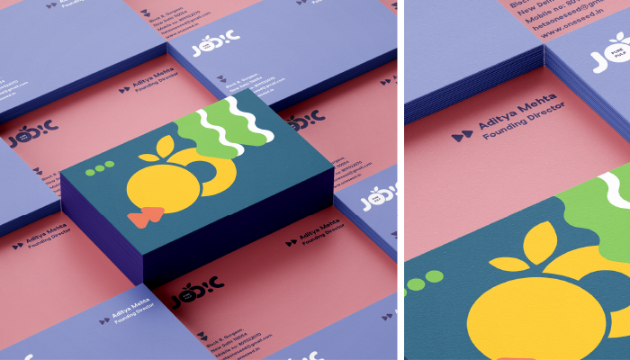
The logo is formed by rounded shapes that evoke joy and playfulness. All these forms are thus treated in a grid to appear of the same strength and so each form can stand out without disrupting the harmony of the logo unit. The two O’s are put very closely to each other to make it look like fruits, accompanied by two small leaves.
The label for each fruit is naturally inspired by the fruit color and its vibe. The varied colors are not interfered by the consistent brand language and have been used in a way to create an overall harmony throughout the brand language. None of the colors have any value of K so that the black and white label on the logo pops out.
Launched in October 2012, the Ashdeen label specializes in hand-embroidered saris that are inspired by centuries of Oriental and Persian hand embroidery techniques, craft and craftsmanship. The intricacies of these techniques are rendered flawlessly by a team of 150 craftspersons. Ashdeen creations have been featured in various fashion publications and worn by celebrity actresses and industrialists. They have also been shown at the Lakme Fashion Weeks in Mumbai (spring-summer 2013 and 2014, and winter-festive).
We were tasked with re-doing the Ashdeen brand – beginning with the logo and logo mark, to building a brand language, stationary, and finally packaging.
The brand we created is sleek, minimal, and extremely striking. Using a combination of black, white, and gold, we think the new brand language truly emulates the elegant clothes they represent and would make any of the brand’s esteemed customers want to take further interest in the brand.
We made a set of illustrations using elements which were either taken from or derivatives of various prints and patterns seen in Ashdeen collections.
These illustrations then went on to define the brand, becoming very central to the language across most collaterals.
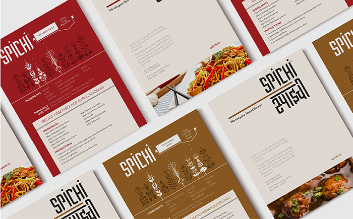
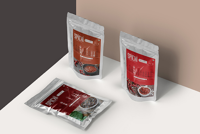
Presenting a pop of flavour, with Spichi. A packaged condiment & concentrates brand, with a variety of sauces to spice up your kitchen.
The communication wireframe had to be mapped out right from the beginning of the project. We were told to brand it like a mass market product, yet polished with clean design sensibility. We began by coming up with a product-specific name that directly suggests the ethos of the product. The name Spichi is short for “Spicy Chinese” – something which we feel has been embodied into the base and condiment dipping sauces. They are developed to bring the real essence of chinese flavors; whether it is to a hearty cooked meal at home or a gourmet dish at a pan Asian restaurant.
Unlike other products currently available in the market these base cooking pastes and condiment sauces provide any Chef assistance in reducing prep time as they are made using only fresh products. Spichi Sauces and Pastes are being used by many marquee clients in the B2B Horeca space Nationwide and are used in a number of Hotels, Banquets, Caterers, QSR’s and fine dine restaurants. Spichi is made by Chefs, for Chefs! We added the tagline, “your secret sauces”, to highlight this fact.
The communication was designed keeping the mass market feel of the product in mind. The logotype is stacked in a grid arrangement to resemble oriental script characters in a contemporary fashion. Accompanied by a Devanagari script version alongside, that would not just make the buyer feel at home, but also place the product in a different pedestal. A product specific brand language has been created – using different herbs/ingredients as elements of the design language. Together the design elements effectively communicate an overall appeal of the brand. With the variety of flavors offered by the product, our visual language extended to play around within each of these – using different units for each flavor, along with a variety of colours to give each of them a unique identity. We worked closely with the production team in order to build the appearance, shape and structure of the sachets. Spichi offers it’s B2B in the market since Dec 2017, with the B2C yet to hit the retail market.
Spice up your meal with this secret ingredient, it packs quite a ‘spichi’ punch!
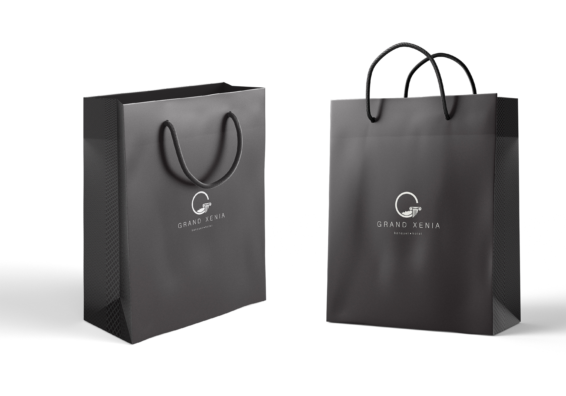
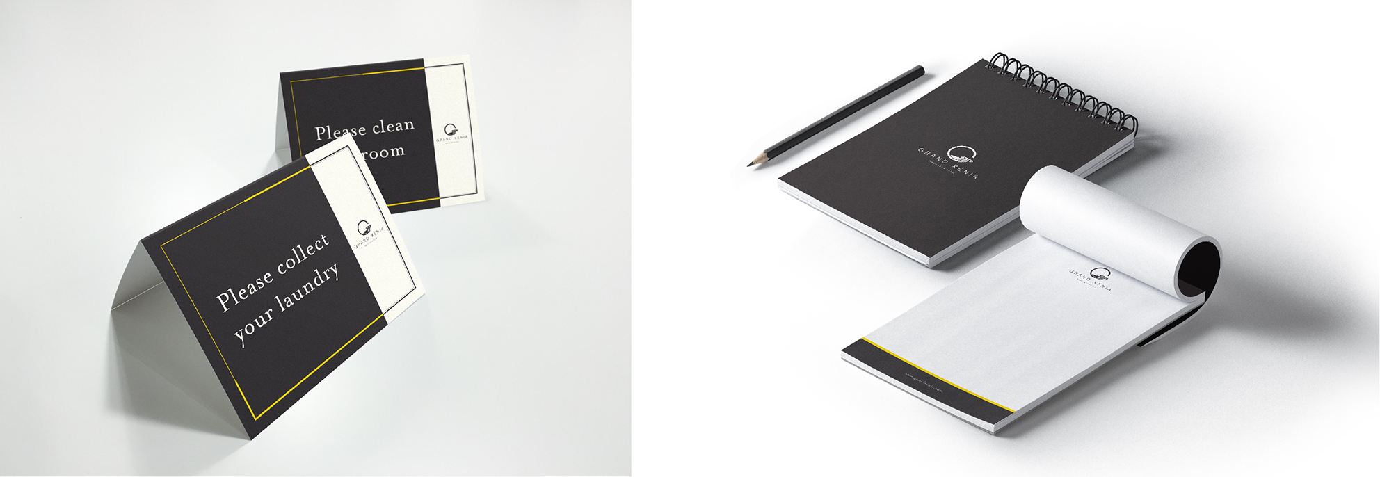
Grand Xenia is a luxury business and banquet hotel, located in Ajmer, Rajasthan, in India.
We were approached by them to create a brand language, as well as all hotel-essential-collaterals, to add to their existing logo.
We created a high-end brand, using black and gold/yellow as the primary colours, to maintain a minimal look across the collaterals, as well as the various other touchpoints that come with the hotel business. Using the ‘G’ from the logo, we created an illustrated icon-based visual style for the hotel, which was then used for signage, as well as various print collaterals appearing around the site. We also created an entire range of packaging for the hotel’s complimentary products and a few other services – from packaging for toiletries, to coasters, bill-books, and various others, we used our brand language to tie them together and elevate the image of the hotel automatically.
We made a promotional ‘brochure’, or a small coffee table book, as one might call it, to highlight the various aspects of the hotel and the facilities that they offer.
Grand Xenia consists of two unique restaurant/bars – Amuse; a resto-bar and Urban Table; a more formal rooftop restaurant. We branded both the restaurants, coming up with overall look and feel, menu cards, signage, and basically anything visual, related to wither of the spaces.
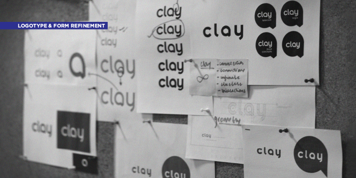
A humble beginning, Clay Telecom started operations with just five people in a cabin in Central Delhi in the year 2000. Almost two decades later, Clay Telecom is now a dynamic global service provider of wireless telecom solutions with Pan-India presence. Catering to both B2B and B2C market segments with worldwide and country-specific voice and data solutions. Twenty lakh (and growing) happy customers across India swear by its services. The reinvention for Clay adopts a spirit that is modern and bold, yet friendly. The new image for the brand captures the company’s approach towards technology, hospitality and innovation in today’s global times.
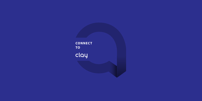
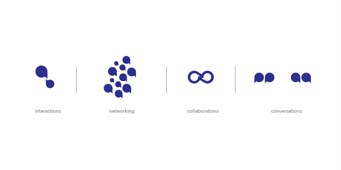
The logo mark “a” stands as the principal identity of the brand, and is also incorporated into the logotype. The letter is shaped like a talk bubble with a visible fold rendered to make the form appear as a continual. The geometric lower-case logotype is affable but professional with close attention to tangential cuts offering a modern sensibility. The language is created based on the essence of space, color, and typography of digital and interactive design. The extended language arising from this logotype is minimal but strong. Elements are restrained to the usage of the brand’s ultramarine blue and balanced grey’s with the logo mark. This approach creates visual homogeneity for the parent brand, thus creating a stronghold in its identity.
.
The new language speaks strongly of Clay’s international approach. It not only confers continuity and connectivity but also speaks of the contemporary and utilitarian aspect of the brand. This reinvention communicates a voice that is progressive and strong in its idea of connecting people and providing global solutions.
A one-stop destination for travel retail solutions, AVA Merchandising Solutions Ltd. has been a popular retailer in the
sub-continent with a large customer base. With the objective of providing high quality, affordable and convenient shopping possibilities. Our work with Ava entailed redesigning of the existing logo and its diverse applications across mediums, along with the look and feel of the brand. The free form used for the symbol delivers the idea of movement, which carries forward to the complimentary logotype.
To enhance customer engagement and experience, a mobile application “TRAVA” was designed, which is currently in its last development stage.
Outside of the corporate stationery, we also designed templates for their catalogues and other print material which are circulated on board reputed airlines such as Air India and Jet Airways. Concepts were also developed for staff uniform and branding directions of the retail stores spread out across the country.